Constrained Ordination and Permutation Testing
Building on the unconstrained ordination techniques explored in the previous tutorial, this article introduces constrained ordination methods and statistical approaches for testing hypotheses about relationships between a primary dataset (e.g., species composition, gene expression levels) and a set of explanatory (e.g., environmental, clinical, experimental) variables. These powerful tools allow researchers to directly examine how these explanatory variables relate to the patterns in their primary dataset and test the significance of these relationships through robust permutation procedures.
Introduction
Researchers are often interested in understanding how a set of explanatory variables (e.g., environmental factors, experimental treatments, clinical measurements) influence a primary multivariate dataset (e.g., species composition, gene expression profiles, chemical concentrations). While unconstrained ordination methods like PCA, CA, PCoA, and NMDS are excellent for visualizing patterns in the primary data, they don’t directly incorporate these explanatory variables into the analysis. This is where constrained ordination techniques become valuable.
Constrained ordination (also called direct gradient analysis) explicitly incorporates a set of explanatory variables into the ordination process. Rather than finding axes that are purely driven by the primary dataset alone (e.g., species composition, gene expression), constrained ordination finds axes that are linear combinations of the explanatory variables that best explain the variation in that primary dataset. In other words, we attempt to allow the primary dataset to be decomposed into latent components, but only in a way that considers explanatory variables and the additional context they provide to the scientific question. This approach allows us to:
- Directly test hypotheses about the relationships between the primary dataset and the explanatory variables
- Quantify how much variation in the primary dataset can be explained by the measured explanatory variables
- Visualize the relationships between the components of the primary dataset (e.g., species, genes), the samples/observations, and the explanatory variables/gradients simultaneously (e.g. CCA triplot)
Constrained Correspondence Analysis (CCA)
Constrained Correspondence Analysis (CCA) is one of the most widely used constrained ordination methods suitable for count or compositional data. It combines the principles of Correspondence Analysis (CA) with multiple regression to directly relate a primary dataset (e.g., species composition) to a set of explanatory variables.
To understand CCA, it’s helpful to recall what we learned about CA in the previous tutorial:
- CA finds axes that maximize the dispersion of scores representing the primary variables (e.g., species, operational taxonomic units)
- It assumes unimodal (bell-shaped) responses of the primary variables to underlying gradients
- CA uses chi-square distances, which address the double-zero problem
As the name suggests, the key difference between CA and CCA is that while CA is unconstrained, finding any axes that maximize the dispersion of the primary variable scores, CCA is constrained to find only those axes that are linear combinations of the provided explanatory variables.
This constraint means that CCA doesn’t necessarily capture the the maximum variation in the primary dataset (e.g., species composition) (as CA would), but rather the maximum variation in the primary dataset that can be explained by the explanatory variables you’ve measured. This makes CCA ideal when you have specific hypotheses about which explanatory factors are influencing your primary dataset.
Mathematically, CCA performs weighted linear regression of the CA sample/observation scores on the explanatory variables, followed by another CA on the fitted values from this regression. This creates a direct link between the primary dataset patterns and the explanatory variables/gradients.
CCA in vegan
The vegan package offers two different interfaces for performing CCA, each with its own advantages:
1. Matrix Interface
The matrix interface provides a more explicit method for specifying the primary data (i.e. species counts, gene expression profiles) and explanatory data matrices (e.g. environmental measurements, clinical parameters):
cca_result <- vegan::cca(
  X = primary_data_matrix,     # Your primary data matrix (e.g., species counts, gene expression)
  Y = explanatory_variables_matrix # Your matrix of explanatory variables
)
This approach is useful when you want precise control over the input matrices, such as when you need to transform either matrix beforehand or when working with more complex data structures.
2. Formula Interface
The formula interface follows the familiar R syntax for regression models:
cca_result <- vegan::cca(
  primary_data ~ var1 + var2 + var3,  # Formula relating primary data to explanatory variables
  data = explanatory_data_df              # Data frame containing the explanatory variables
)
This approach is generally more readable and flexible, and is the recommended approach even from the authors of the vegan package.
We’ll use the formula notation for this example:
cca_varechem <- vegan::cca(
  df_varespec ~ .,
  data = df_varechem # Dataframe of explanatory variables
)
summary(cca_varechem)
Call:
cca(formula = df_varespec ~ N + P + K + Ca + Mg + S + Al + Fe + Mn + Zn + Mo + Baresoil + Humdepth + pH + grazing, data = df_varechem)
Partitioning of scaled Chi-square:
Inertia Proportion
Total 2.0832 1.0000
Constrained 1.5573 0.7476
Unconstrained 0.5259 0.2524
Eigenvalues, and their contribution to the scaled Chi-square
Importance of components:
CCA1 CCA2 CCA3 CCA4 CCA5 CCA6 CCA7 CCA8 CCA9 CCA10 CCA11 CCA12 CCA13 CCA14 CCA15 CA1 CA2 CA3 CA4 CA5 CA6 CA7 CA8
Eigenvalue 0.4981 0.2920 0.16689 0.14804 0.13266 0.09575 0.07354 0.06107 0.03194 0.02325 0.012727 0.006841 0.006513 0.005209 0.002680 0.17148 0.12386 0.07079 0.05709 0.04754 0.03048 0.015105 0.009552
Proportion Explained 0.2391 0.1402 0.08011 0.07106 0.06368 0.04597 0.03530 0.02932 0.01533 0.01116 0.006109 0.003284 0.003126 0.002501 0.001287 0.08232 0.05946 0.03398 0.02741 0.02282 0.01463 0.007251 0.004585
Cumulative Proportion 0.2391 0.3793 0.45943 0.53049 0.59417 0.64014 0.67544 0.70475 0.72008 0.73125 0.737354 0.740638 0.743765 0.746265 0.747552 0.82987 0.88932 0.92331 0.95071 0.97353 0.98816 0.995415 1.000000
Accumulated constrained eigenvalues
Importance of components:
CCA1 CCA2 CCA3 CCA4 CCA5 CCA6 CCA7 CCA8 CCA9 CCA10 CCA11 CCA12 CCA13 CCA14 CCA15
Eigenvalue 0.4981 0.2920 0.1669 0.14804 0.13266 0.09575 0.07354 0.06107 0.03194 0.02325 0.012727 0.006841 0.006513 0.005209 0.002680
Proportion Explained 0.3199 0.1875 0.1072 0.09506 0.08519 0.06149 0.04722 0.03922 0.02051 0.01493 0.008172 0.004393 0.004182 0.003345 0.001721
Cumulative Proportion 0.3199 0.5074 0.6146 0.70964 0.79482 0.85631 0.90353 0.94275 0.96326 0.97819 0.986359 0.990752 0.994934 0.998279 1.000000The CCA output contains several key components that build upon what we’ve seen in the unconstrained CA output:
Partitioning of Chi-square
This section shows how the total variation (inertia) in the primary data is partitioned:
- Total: The total chi-square distance (inertia) in the primary data
- Constrained: The amount of variation explained by the explanatory variables (74.76% in this case)
- Unconstrained: The residual variation not explained by the explanatory variables, instead explained by the remaining primary data variation (25.24%)
Our explanatory variables explain almost 75% of the variation in the primary data patterns, which is quite high. However, as we’ll see later, this value may be inflated due to the large number of explanatory variables relative to our sample size. As a rule of thumb, we can generally permit ourselves 1 additional explanatory variable for every 5-10 samples, which we have not adhered to in this first example.
Eigenvalues
The eigenvalues table shows how the explained variation is distributed across different axes:
- CCA axes (CCA1, CCA2, etc.): These are the constrained axes, which represent linear combinations of explanatory variables that explain variation in the primary data patterns
- CA axes (CA1, CA2, etc.): These are the unconstrained axes, which represent residual variation not explained by the explanatory variables
Whether your CCA has explained enough variation depends on multiple factors: the field of study, the complexity of the system, the number of samples, etc. Do not be disheartened if your CCA doesn’t explain much variation (i.e. < 5%). This is actually more common than you might think and may simply indicate that there are more complex processes at play which you can’t curently capture.
Partial CCA
Sometimes we want to focus on the effects of certain explanatory variables while controlling for the influence of others. This is where partial CCA becomes useful.
Partial CCA allows you to “partial out” or remove the effects of specific variables (called “conditioning variables” or “covariables”) before analyzing the relationship between the primary data patterns and the remaining explanatory variables of interest. This is conceptually similar to how partial correlation works in traditional statistics.
There are several scenarios where partial CCA is particularly valuable:
- Controlling for spatial or temporal effects: When you want to examine influences of certain explanatory variables on the primary data structure after accounting for spatial autocorrelation or temporal trends
- Removing known gradients: When you want to identify secondary patterns after removing the effects of a dominant explanatory gradient
- Testing specific hypotheses: When you want to test the unique contribution of a particular explanatory variable after accounting for other factors
In vegan, partial CCA is implemented using the Condition() function within the formula interface. Variables inside the Condition() function are used as covariables, and their effects are removed before analyzing the effects of the remaining variables.
Let’s conduct a partial CCA by fitting a model to explain variability in the primary dataset (e.g. species) constrained to patterns in one explanatory variable (e.g. calcium concentration), but only after removing the effect of another (e.g. acidity/pH):
partial_cca_varechem <- vegan::cca(
  varespec ~ Ca + Condition(pH), # Condition() is used to remove the effect of the variable
  data = varechem
)
summary(partial_cca_varechem)
Call:
cca(formula = varespec ~ Ca + Condition(pH), data = varechem)
Partitioning of scaled Chi-square:
Inertia Proportion
Total 2.0832 1.0000
Conditioned 0.1458 0.0700
Constrained 0.1827 0.0877
Unconstrained 1.7547 0.8423
Eigenvalues, and their contribution to the scaled Chi-square
after removing the contribution of conditiniong variables
Importance of components:
CCA1 CA1 CA2 CA3 CA4 CA5 CA6 CA7 CA8 CA9 CA10 CA11 CA12 CA13 CA14 CA15 CA16 CA17 CA18 CA19 CA20 CA21
Eigenvalue 0.1827 0.3834 0.2749 0.2123 0.17599 0.17013 0.11613 0.10892 0.08797 0.06654 0.05186 0.03024 0.02177 0.016201 0.011124 0.009080 0.006079 0.004702 0.003126 0.002319 0.0009781 0.0008842
Proportion Explained 0.0943 0.1979 0.1419 0.1096 0.09084 0.08781 0.05994 0.05622 0.04541 0.03434 0.02677 0.01561 0.01124 0.008362 0.005742 0.004687 0.003138 0.002427 0.001614 0.001197 0.0005049 0.0004564
Cumulative Proportion 0.0943 0.2922 0.4341 0.5437 0.63453 0.72234 0.78228 0.83851 0.88391 0.91826 0.94503 0.96064 0.97187 0.980235 0.985977 0.990664 0.993802 0.996228 0.997842 0.999039 0.9995436 1.0000000
Accumulated constrained eigenvalues
Importance of components:
CCA1
Eigenvalue 0.1827
Proportion Explained 1.0000
Cumulative Proportion 1.0000In the summary output, notice the new “Partitioning of scaled Chi-square” section that now includes a “Conditioned” row to show the amount of variation explained by the conditioning variable (pH):
Variance Inflation Factor (VIF)
When building multivariate models, it’s important to check for multicollinearity among predictor variables. Multicollinearity occurs when predictor variables are highly correlated with each other, which can lead to unstable parameter estimates and make it difficult to determine the unique contribution of each variable.
In constrained ordination, we can assess multicollinearity using the Variance Inflation Factor (VIF). The VIF quantifies how much the variance of a regression coefficient is inflated due to multicollinearity in the model. The higher the VIF, the more severe the multicollinearity.
General guidelines for interpreting VIF values:
- VIF < 5: Minimal multicollinearity concern
- 5 < VIF < 10: Moderate multicollinearity
- 10 < VIF < 20: High multicollinearity – consider removing variables
- VIF > 20: Very high multicollinearity – variables should be removed
High VIF values indicate that a variable is strongly correlated with one or more other explanatory variables in the model. This doesn’t mean the variable isn’t scientifically important in its own right, but it suggests that its unique contribution may be difficult to separate from other correlated variables when they are included together in the model.
vegan offers a particular function, vif.cca, for assessing the VIF for explanatory variables by which the primary data variation is constrained during model fitting:
vegan::vif.cca(cca_varechem) N P K Ca Mg S Al Fe Mn Zn Mo Baresoil Humdepth pH grazingungrazed
1.988764 6.041702 13.264943 9.928573 10.624471 18.396500 27.526602 10.522527 5.509868 8.184218 4.654914 2.603083 6.252493 7.793036 3.211042 Looking at these VIF values, we can identify several explanatory variables with concerning levels of multicollinearity:
- High multicollinearity (10 < VIF < 20): K (13.26), Mg (10.62), S (18.40), Fe (10.52)
- Very high multicollinearity (VIF > 20): Al (27.53)
These high VIF values suggest that several variables, particularly aluminum (Al), are strongly correlated with other explanatory variables in our model. This multicollinearity could affect the stability and interpretability of our CCA results. When refitting the model, we would likely want to remove Al first (as it has the highest VIF), then reassess the remaining VIF values and possibly remove additional variables if they still show high multicollinearity.
This iterative approach helps identify a more parsimonious set of explanatory variables that effectively explain variation in the primary dataset without redundancy.
Adjusted R2 for CCA
After examining our full CCA model, you might be concerned about potential overfitting. With 15 explanatory variables and only 24 sites, our model has a high ratio of predictors to observations. This can lead to artificially high explanatory power (R²), similar to how adding more predictors to a linear regression model always increases the unadjusted R².
The standard R² in CCA represents the proportion of total inertia (variation) explained by the explanatory variables. However, this value is biased upward when the ratio of variables to observations is high. To address this issue, we use an adjusted R² that accounts for the number of predictor variables and sample size, similar to the adjusted R² in linear regression.
In vegan, we can calculate the adjusted R2 value for a CCA model using the RsquareAdj function:
vegan::RsquareAdj(cca_varechem)$r.squared
[1] 0.7475519
$adj.r.squared
[1] 0.2671973The results clearly demonstrate the impact of overfitting:
- Unadjusted R²: 0.7476 (74.76% variation explained)
- Adjusted R²: 0.2672 (26.72% variation explained)
The dramatic drop from 75% to 27% explained variation indicates substantial overfitting in our original model. This suggests that many of our explanatory variables may not be contributing meaningful explanatory power. When building predictive or explanatory models (e.g., in ecology, sociology, or other fields), the adjusted R² provides a more realistic assessment of how well these explanatory variables describe the primary dataset.
The large difference between unadjusted and adjusted R² values highlights the importance of model selection to identify a more parsimonious set of explanatory variables. This leads us to the next section on permutation tests and model selection techniques.
Permutation Tests for CCA
After building a constrained ordination model, a critical question remains: Is the relationship between our explanatory variables and primary dataset statistically significant, or could it have arisen by chance? Traditional parametric statistical approaches often aren’t suitable for certain types of multivariate data (e.g., ecological community data, some types of survey data) due to assumptions about normality and independence that such data frequently violate.
This is where permutation tests become invaluable. Permutation tests (also called randomization tests) are non-parametric methods that assess statistical significance by comparing observed results to those obtained under a null model where no relationship exists. The null model is created by randomly shuffling (permuting) the data many times.
In vegan, you can perform permutation tests for CCA using the anova.cca() function. This function offers several options for how the permutation is performed and what aspects of the model to test.
Permutation Models
There are three main approaches to permutation in vegan, specified by the model parameter:
- Direct permutation (
model = "direct"): Rows of the primary data are shuffled directly. This approach is appropriate when you have no conditioning variables (noCondition()term in the formula). - Full model permutation (
model = "full"): Residuals from the full model (Y = X + Z + e) are shuffled, where Y is the primary data, X is the constraints of interest, Z is the conditioning variables, and e is the error term. This tests whether the entire model structure (including constraints and conditions) captures meaningful variation. - Reduced model permutation (
model = "reduced"): Residuals from the reduced model (Y = Z + e) are shuffled. This tests whether the constraints capture meaningful variation after accounting for the conditioning variables.
For standard CCA without conditioning variables, the direct permutation approach is appropriate. For partial CCA with conditioning variables, either reduced or full model permutation should be used, with reduced being more common.
What to Test
The by parameter in anova.cca() controls which aspects of the model to test:
- Overall model significance (
by = NULL): Tests whether the entire set of constraints explains more variation than expected by chance - Significance of individual axes (
by = "axis"): Tests the significance of each constrained axis in sequence - Sequential term addition (
by = "terms"): Tests the significance of model terms in the order they appear in the model formula, after accounting for terms listed before them. This is generally not recommended unless terms are truly orthogonal, as the order of terms affects the results. - Marginal effects (
by = "margin"): Tests the unique contribution of each term after accounting for all other terms in the model. This is the most useful approach for assessing the importance of individual explanatory variables.
We will run our hypothesis testing via permutation tests using the provided anova.cca function. We will work with a more parsimonious model for this example involving only 3 explanatory variables, so let’s start with the omnibus test for the significance of the model itself:
cca_varchem_optim <- vegan::cca(df_varespec ~ K + P + grazing, data = df_varechem)
vegan::anova.cca(
  cca_varchem_optim,
  model = "direct", # "direct", "full", or "reduced"
  permutations = 9999, # More permutations for a more accurate p-value
  by = NULL # NULL, "axis", "terms", or "margin"
)
Permutation test for cca under direct model
Permutation: free
Number of permutations: 9999
Model: cca(formula = df_varespec ~ K + P + grazing, data = df_varechem)
Df ChiSquare F Pr(>F)
Model 3 0.7367 3.6475 1e-04 ***
Residual 20 1.3465
---
Signif. codes: 0 '***' 0.001 '**' 0.01 '*' 0.05 '.' 0.1 ' ' 1The results show that our model is highly significant (p < 0.001), indicating that the three explanatory variables collectively explain more variation in the primary dataset than would be expected by chance.
Next, let’s test which constrained axes significantly explain variation in the primary dataset:
vegan::anova.cca(
  cca_varchem_optim,
  model = "direct",
  permutations = 9999,
  by = "axis"
)
Permutation test for cca under direct model
Forward tests for axes
Permutation: free
Number of permutations: 9999
Model: cca(formula = df_varespec ~ K + P + grazing, data = df_varechem)
Df ChiSquare F Pr(>F)
CCA1 1 0.44971 6.6798 0.0001 ***
CCA2 1 0.17685 2.6268 0.0578 .
CCA3 1 0.11014 1.6359 0.9960
Residual 20 1.34650
---
Signif. codes: 0 '***' 0.001 '**' 0.01 '*' 0.05 '.' 0.1 ' ' 1The axis-based test reveals that:
- The first constrained axis (CCA1) is highly significant (p < 0.001)
- The second axis (CCA2) is trending towards significance (p ≈ 0.058)
- The third axis (CCA3) is not significant (p ≈ 0.996)
This suggests that we can generally use the first two axes for our interpretation.
Finally, let’s examine which explanatory variables contribute significantly to explaining the primary dataset:
vegan::anova.cca(
  cca_varchem_optim,
  model = "direct",
  permutations = 9999,
  by = "margin"
)
Permutation test for cca under direct model
Marginal effects of terms
Permutation: free
Number of permutations: 9999
Model: cca(formula = df_varespec ~ K + P + grazing, data = df_varechem)
Df ChiSquare F Pr(>F)
K 1 0.13401 1.9905 0.0451 *
P 1 0.17248 2.5619 0.0062 **
grazing 1 0.40441 6.0068 0.0001 ***
Residual 20 1.34650
---
Signif. codes: 0 '***' 0.001 '**' 0.01 '*' 0.05 '.' 0.1 ' ' 1The marginal effects test shows that all three explanatory variables significantly explain unique portions of the variation in the primary dataset, with grazing appearing to have the greatest effect size, as we have previously seen in ordinations of this dataset.
Triplots
A triplot is a powerful visualization technique for constrained ordination results that simultaneously displays three key elements in a single plot:
- Samples/Observations (often termed “Sites” in some contexts) – Represented as points showing their positions in the ordination space
- Primary variables (e.g., “Species” in ecology, genes in genomics) – Represented as points showing their optimal positions along the explanatory gradients
- Explanatory variables – Represented as arrows (for continuous variables) or centroids (for categorical variables)
The name “triplot” derives from these three components being plotted together, allowing for rich interpretation of the relationships between explanatory gradients and primary dataset patterns.
When interpreting a CCA triplot, several key principles apply:
- Explanatory arrows: The direction of an arrow indicates the direction of maximum change in the explanatory variable, while the length indicates the strength of correlation with the ordination axes. Longer arrows represent variables more strongly correlated with the displayed primary dataset patterns.
- Primary variable points: These represent the estimated optima for each primary variable along the explanatory gradients. Variables positioned near the tip of an explanatory arrow tend to be associated with high values of that explanatory variable.
- Sample/Observation points (Sites): These show the position of each sample/observation in the ordination space. Samples/observations positioned close together have similar primary dataset patterns, while those far apart have dissimilar patterns.
- Centroids: For categorical explanatory variables (like our grazing treatment example), centroids represent the average position of all samples/observations belonging to that category. They show the “center of gravity” for each group in the ordination space.
The relative positions of these elements carry important information:
- The proximity of a primary variable point to an explanatory arrow or centroid indicates the strength of association between that primary variable and that explanatory condition.
- The angle between explanatory arrows indicates their correlation: small angles suggest strong positive correlation, perpendicular arrows suggest no correlation, and opposite arrows suggest strong negative correlation.
- The relative positions of sample/observation points with respect to explanatory arrows indicate the values of the explanatory variables for those samples/observations.
Importantly, the scaling method used in the triplot affects interpretation. In the example below, we use “symmetric” scaling, which provides a compromise between primary variable and sample/observation scaling, making it suitable for interpreting both sample-explanatory and primary variable-explanatory relationships simultaneously.
df_varespec_scores <- vegan::scores(
  cca_varchem_optim,
  display = "all",
  scaling = "symmetric",
  tidy = TRUE
) %>%
  as_tibble()

ggplot() +
  # Add primary variables (e.g., species) as red points
  geom_point(
    data = df_varespec_scores %>%
      filter(score == "species"),
    aes(x = CCA1, y = CCA2),
    color = "red", alpha = 0.7, size = 2
  ) +
  # Add sample/observation points (sites) as blue
  geom_point(
    data = df_varespec_scores %>%
      filter(score == "sites"),
    aes(x = CCA1, y = CCA2),
    color = "blue", alpha = 0.7, size = 2
  ) +
  # Add centroids as larger squares
  geom_point(
    data = df_varespec_scores %>%
      filter(score == "centroids"),
    aes(x = CCA1, y = CCA2),
    color = "darkgreen", size = 4, shape = 15
  ) +
  # Add vectors (continuous explanatory variables) as black arrows
  geom_segment(
    data = df_varespec_scores %>%
      filter(score == "biplot"),
    aes(x = 0, y = 0, xend = CCA1 * 2, yend = CCA2 * 2),
    arrow = arrow(length = unit(0.3, "cm")),
    color = "black", linewidth = 1
  ) +
  # Add labels for vectors
  geom_text(
    data = df_varespec_scores %>%
      filter(score == "biplot"),
    aes(x = CCA1 * 2.2, y = CCA2 * 2.2, label = label),
    color = "black", fontface = "bold"
  ) +
  # Add labels for centroids
  geom_text(
    data = df_varespec_scores %>%
      filter(score == "centroids"),
    aes(x = CCA1, y = CCA2, label = label),
    color = "darkgreen", fontface = "bold",
    nudge_x = -0.01, nudge_y = 0.1
  ) +
  # Add labels for sites (samples/observations)
  ggrepel::geom_text_repel(
    data = df_varespec_scores %>%
      filter(score == "sites") %>%
      mutate(label = str_replace_all(label, "row", "Site ")), # Retain specific site labeling for example clarity
    aes(x = CCA1, y = CCA2, label = label),
    color = "blue",
    fontface = "bold"
  ) +
  # Add axis lines
  geom_hline(yintercept = 0, linetype = "dashed", color = "gray") +
  geom_vline(xintercept = 0, linetype = "dashed", color = "gray") +
  # Add labels for a subset of primary variables (e.g., species, based on higher weights, top 5)
  ggrepel::geom_text_repel(
    data = df_varespec_scores %>%
      filter(score == "species"),
    aes(x = CCA1, y = CCA2, label = label),
    color = "darkred", size = 3,
    box.padding = 0.5, max.overlaps = 20
  ) +
  ggthemes::theme_base() +
  labs(x = "CCA1", y = "CCA2") +
  theme(aspect.ratio = 1)
In this triplot example, we recapitulate our previous observation that the first axis is generally driven by the ‘grazing’ variable (an explanatory factor) and that our sample/observation data is largely separated into two larger clusters on this axis. Simultaneously, we can also visualize:
- Groupings of primary variables (e.g., species) and their relation to samples/observations (sites) given optimum conditions captured by the two axes
- The direction of the phosphorus and potassium explanatory variables expressed in ordination space, as vectors. This also allows us to ascertain if any groups of primary variables and/or samples/observations (sites) group together along, against, or perpendicular to these vectors, which may be useful depending on your research question.
PERMANOVA
In traditional multivariate statistics, Multivariate Analysis of Variance (MANOVA) is used to determine whether there are significant differences between groups across multiple dependent variables simultaneously. MANOVA works by splitting the total variation in the data into two components: variation between groups and variation within groups (error). It then tests whether the variation between groups is significantly larger than would be expected by chance, given the within-group variation.
While MANOVA is powerful, it relies on several assumptions that are often violated by certain types of multivariate data (e.g., ecological community data where species abundances may not follow linear relationships with explanatory variables, or other count-based/compositional datasets).
PERMANOVA (Permutational Multivariate Analysis of Variance) overcomes these limitations by applying the same partitioning of variation as MANOVA but using distance matrices and permutation tests to avoid such assumptions.
In vegan, PERMANOVA is implemented through the adonis2() function (an updated version of the older adonis() function).
Let’s demonstrate PERMANOVA using the dune dataset, which contains data on plant species abundances across different sites, along with corresponding site-level explanatory variables.
data("dune", "dune.env")

df_dune_species <- dune %>%
  as_tibble() # This is our primary dataset (species abundances)

df_dune_env <- dune.env %>%
  as_tibble() # This is our explanatory dataset
str(df_dune_env)
tibble [20 × 5] (S3: tbl_df/tbl/data.frame)
$ A1 : num [1:20] 2.8 3.5 4.3 4.2 6.3 4.3 2.8 4.2 3.7 3.3 ...
$ Moisture : Ord.factor w/ 4 levels "1"<"2"<"4"<"5": 1 1 2 2 1 1 1 4 3 2 ...
$ Management: Factor w/ 4 levels "BF","HF","NM",..: 4 1 4 4 2 2 2 2 2 1 ...
$ Use : Ord.factor w/ 3 levels "Hayfield"<"Haypastu"<..: 2 2 2 2 1 2 3 3 1 1 ...
$ Manure : Ord.factor w/ 5 levels "0"<"1"<"2"<"3"<..: 5 3 5 5 3 3 4 4 2 2 ...The dune dataset includes 20 sites (samples/observations) with measurements of 30 plant species (primary variables). The explanatory data (dune.env) contains five variables:
- A1: A soil variable representing thickness of the A1 horizon
- Moisture: A moisture ordination factor with levels from 1 (dry) to 5 (wet)
- Management: Land management type (BF = biological farming, HF = hobby farming, NM = nature conservation, SF = standard farming). This will be our grouping variable of interest for this section.
- Use: Land use ordination (Hayfield, Haypastu = hay pasture, Pasture)
- Manure: Manure application ordination from 0 (none) to 4 (high)
PERMONVA in vegan
The adonis2() function in vegan implements PERMANOVA with a formula interface similar to that used in linear models. The main arguments include:
- formula: A model formula with the primary data as the response and the explanatory variables on the right side
- data: A data frame containing the explanatory variables
- method: The distance measure to use (e.g., “bray”, “jaccard”, “euclidean”)
- permutations: The number of permutations for the test
- by: The type of test to perform (“terms”, “margin”, or NULL for overall test). This is the same as the
byargument inanova.cca().
Let’s test whether the marginal effect of Management type and soil thickness (A1) influence the primary data patterns (species composition) while assuming that there is also an interaction between the two:
vegan::adonis2(
  df_dune_species ~ Management * A1, # Formula of syntax: primary_data ~ explanatory_variables
  data = df_dune_env, # Explanatory data
  method = "bray", # Method to use for the distance matrix
  permutations = 999, # Number of permutations to run
  by = "margin" # NULL, "axis", "terms", or "margin"
)
Permutation test for adonis under reduced model
Marginal effects of terms
Permutation: free
Number of permutations: 999
vegan::adonis2(formula = df_dune_species ~ Management * A1, data = df_dune_env, permutations = 999, method = "bray", by = "margin")
Df SumOfSqs R2 F Pr(>F)
Management:A1 3 0.5892 0.13705 1.309 0.205
Residual 12 1.8004 0.41878
Total 19 4.2990 1.00000 In this case, the interaction is not significant (p = 0.205), suggesting that there is no significant combined effect of management type and A1 on the primary data patterns (species composition). Since the interaction is not significant, we can remove it and test the marginal effects without the interaction:
vegan::adonis2(
  df_dune_species ~ Management + A1,
  data = df_dune_env,
  method = "bray",
  permutations = 999,
  by = "margin"
)
Permutation test for adonis under reduced model
Marginal effects of terms
Permutation: free
Number of permutations: 999
vegan::adonis2(formula = df_dune_species ~ Management + A1, data = df_dune_env, permutations = 999, method = "bray", by = "margin")
Df SumOfSqs R2 F Pr(>F)
Management 3 1.1865 0.27600 2.4828 0.009 **
A1 1 0.4409 0.10256 2.7676 0.020 *
Residual 15 2.3895 0.55583
Total 19 4.2990 1.00000
---
Signif. codes: 0 '***' 0.001 '**' 0.01 '*' 0.05 '.' 0.1 ' ' 1As you can see, this time both main effects were tested, and both are indeed significant, suggesting that management type and soil thickness both independently influence the primary data patterns (species composition) in terms of Bray-Curtis dissimilarity.
Dispersion
While PERMANOVA is a powerful method for testing group differences in multivariate data (e.g., species composition), it has a key limitation: it can confound location effects (differences in group centroids) with dispersion effects (differences in group variability). When one group shows higher variability (dispersion) in its multivariate structure than another, PERMANOVA may detect this as a significant difference between groups, potentially leading to incorrect interpretations about differences in the mean structure.
You can think of this as similar to the T-test assumption of homogeneity of variances. Unfortunately, while the T-test has a Welch’s correction, PERMANOVA at the moment does not have an implemented correction in the event your data violates this assumption.
If the dispersion test is significant, it indicates that groups have different levels of variability, which could affect the interpretation of PERMANOVA results. In such cases, you should be cautious about attributing significant PERMANOVA results solely to differences in mean data structure (e.g., mean community composition), as they might also reflect differences in data heterogeneity. Of course, if your data is visually showing that the groups are different (i.e. very distinct separation of clusters in your ordination plot), then you can be more confident in your interpretation.
Finally, let’s visualize these findings with a PCoA plot that displays both the group centroids and the dispersion of sites around them:
# Get scores; PCoA is the default ordination method if the input is a distance matrix
df_dune_scores <- disp_dune %>%
  vegan::scores(
    display = "sites",
    scaling = "sites",
    choices = c(1, 2),
    tidy = TRUE
  ) %>%
  as_tibble() %>%
  bind_cols(
    df_dune_env
  )

# Get centroids
df_dune_centroids <- df_dune_scores %>%
  group_by(Management) %>%
  summarise(
    PCoA1 = mean(PCoA1),
    PCoA2 = mean(PCoA2)
  )

# Plot centroids and points
df_dune_scores %>%
  ggplot(
    aes(x = PCoA1, y = PCoA2, color = Management, fill = Management, label = Management)
  ) +
  geom_point() +
  ggrepel::geom_text_repel() +
  geom_point(
    data = df_dune_centroids,
    aes(x = PCoA1, y = PCoA2, color = Management),
    size = 5,
    shape = 15
  ) +
  ggforce::geom_mark_ellipse(
    alpha = 0.2,
    na.rm = TRUE
  ) +
  ggthemes::theme_base()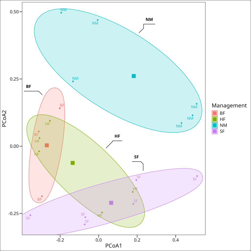
This visualization supports our statistical findings. The ellipses represent the dispersion of sites within each management type. While there appears to be some visual difference in dispersion among groups (with the Nature Conservation “NM” group potentially showing slightly greater dispersion), our statistical test confirmed that these differences are not significant. Instead, what stands out are the clear differences in the positions of the group centroids (large square markers), particularly between the Nature Conservation sites and the other management types, reinforcing our conclusion that management practices are associated with genuine differences in the primary data structure (e.g., community composition) rather than just differences in variability.
Conclusion
In this tutorial, we’ve explored powerful techniques for analyzing relationships between a primary multivariate dataset (e.g., species composition, gene expression levels) and a set of explanatory variables, as well as testing hypotheses about group differences in such multivariate data.
Key concepts covered include:
- Constrained ordination: Methods like CCA that directly incorporate explanatory variables to explain patterns in a primary dataset (e.g., species composition)
- Partial CCA: Techniques to control for the effects of specific variables while focusing on others
- Variance inflation factor: Tools to assess and address multicollinearity in explanatory data
- Adjusted R²: Methods to obtain more realistic estimates of explained variation
- Permutation tests: Non-parametric approaches to statistical inference for complex multivariate data (e.g., ecological data)
- PERMANOVA: Techniques for testing group differences in multivariate data structure (e.g., community composition)
- Dispersion analysis: Methods to assess whether group differences arise from centroids or dispersion
These methods expand your analytical toolkit beyond the unconstrained ordination techniques covered in the previous tutorial, allowing for more direct hypothesis testing and inference in studies involving multivariate data, such as in ecology, genomics, or sociology.
The vegan package offers a comprehensive implementation of these techniques with consistent interfaces that facilitate their use in various research fields. When applying these methods to your own data, remember to:
- Check for and address multicollinearity among explanatory variables
- Use appropriate permutation approaches based on your study design
- Consider multiple approaches to assess the robustness of your findings
- Interpret R² values cautiously, especially with small sample sizes
- Test for dispersion effects when using PERMANOVA
By combining these analytical approaches with domain-specific knowledge and thoughtful study design, you can gain deeper insights into the complex relationships between explanatory factors and multivariate data patterns in various scientific systems.