Ecological Diversity, Rarefaction and Dissimilarity
When studying ecological communities, we often need to answer questions like: How diverse is this community? How does it compare to other communities? And how do we account for differences in sampling effort? This article introduces the `vegan` package, a powerful tool for answering these questions through ecological diversity analysis, rarefaction, and dissimilarity measures.
Introduction
Understanding ecological communities requires us to quantify and compare their diversity. Whether you’re studying microbial communities in the gut, plant communities in a forest, or animal communities in a coral reef, you’ll need tools to measure diversity, account for sampling effort, and compare communities. The `vegan` package in R provides a comprehensive suite of functions for these analyses.
The vegan package is one of the most widely used packages in ecological data analysis. It provides functions for diversity analysis, ordination, and hypothesis testing. In this article, we’ll focus on three key aspects: measuring diversity, rarefaction (to account for sampling effort), and calculating dissimilarities between communities.
We’ll be working with a dataset from Väre, H., Ohtonen, R. and Oksanen, J. (1995) that examines the effects of reindeer grazing on understorey vegetation in dry Pinus sylvestris forests. This dataset is particularly interesting because it allows us to explore how grazing pressure affects plant community composition and diversity.
The vegan package expects data to be organized in two main components:
- community data (species counts or coverages)
- environmental data (metadata about the samples).
Let’s first load in the species data:
data(varespec) # Species data
df_varespec <- varespec %>%
  as_tibble()
str(df_varespec)
tibble [24 × 44] (S3: tbl_df/tbl/data.frame)
$ Callvulg: num [1:24] 0.55 0.67 0.1 0 0 ...
$ Empenigr: num [1:24] 11.13 0.17 1.55 15.13 12.68 ...
$ Rhodtome: num [1:24] 0 0 0 2.42 0 0 1.55 0 0.35 0.07 ...
$ Vaccmyrt: num [1:24] 0 0.35 0 5.92 0 ...
$ Vaccviti: num [1:24] 17.8 12.1 13.5 16 23.7 ...
$ Pinusylv: num [1:24] 0.07 0.12 0.25 0 0.03 0.12 0.1 0.1 0.05 0.12 ...
$ Descflex: num [1:24] 0 0 0 3.7 0 0.02 0.78 0 0.4 0 ...
$ Betupube: num [1:24] 0 0 0 0 0 0 0.02 0 0 0 ...
$ Vacculig: num [1:24] 1.6 0 0 1.12 0 0 2 0 0.2 0 ...
$ Diphcomp: num [1:24] 2.07 0 0 0 0 0 0 0 0 0.07 ...Followed by the environmental data:
data(varechem) # Environmental data
samples_grazed <- c(2, 3, 4, 5, 7, 8, 9, 11, 12, 13, 24)
samples_ungrazed <- c(1, 6, 10, 14, 15, 16, 17, 18, 19, 20, 21, 22, 23)
df_varechem <- varechem %>%
  as_tibble() %>%
  # Add grazing treatment as a factor
  mutate(
    grazing = factor(
      c(
        samples_grazed,
        samples_ungrazed
      ),
      labels = c(
        rep("grazed", length(samples_grazed)),
        rep("ungrazed", length(samples_ungrazed))
      )
    )
  )
df_varechem
# A tibble: 24 × 15
N P K Ca Mg S Al Fe Mn Zn Mo Baresoil Humdepth pH grazing
<dbl> <dbl> <dbl> <dbl> <dbl> <dbl> <dbl> <dbl> <dbl> <dbl> <dbl> <dbl> <dbl> <dbl> <fct>
1 19.8 42.1 140. 519. 90 32.3 39 40.9 58.1 4.5 0.3 43.9 2.2 2.7 ungrazed
2 13.4 39.1 167. 357. 70.7 35.2 88.1 39 52.4 5.4 0.3 23.6 2.2 2.8 grazed
3 20.2 67.7 207. 973. 209. 58.1 138 35.4 32.1 16.8 0.8 21.2 2 3 grazed
4 20.6 60.8 234. 834 127. 40.7 15.4 4.4 132 10.7 0.2 18.7 2.9 2.8 grazed
5 23.8 54.5 181. 777 126. 39.5 24.2 3 50.1 6.6 0.3 46 3 2.7 grazed
6 22.8 40.9 171. 692. 151. 40.8 105. 17.6 43.6 9.1 0.4 40.5 3.8 2.7 ungrazed
7 26.6 36.7 171. 739. 94.9 33.8 20.7 2.5 77.6 7.4 0.3 23 2.8 2.8 grazed
8 24.2 31 138. 395. 45.3 27.1 74.2 9.8 24.4 5.2 0.3 29.8 2 2.8 grazed
9 29.8 73.5 260 749. 105. 42.5 17.9 2.4 107. 9.3 0.3 17.6 3 2.8 grazed
10 28.1 40.5 314. 541. 119. 60.2 330. 110. 61.7 9.1 0.5 29.9 2.2 2.8 ungrazed
# ℹ 14 more rowsDiversity
Ecological diversity is a fundamental concept in community ecology. It’s not just about counting species – it’s about understanding how species are distributed within a community. The vegan package provides several ways to measure diversity, each capturing different aspects of community structure.
Species richness (S) is the simplest measure – it’s just the count of species in a community.
\text S = n_speciesBut this doesn’t tell us anything about how relatively abundant each species is, also known as species evenness. For that we look to various diversity indices.
The Shannon Index measures the uncertainty in predicting the species identity of a randomly chosen individual from a dataset. It accounts for both richness and evenness.
\text H = -\sum (p_i \cdot \ln(p_i))where pi is the proportion of individuals belonging to the i-th species.
Another common diversity index is the Simpson diversity index (D), which measures the probability that two individuals randomly selected from a sample will belong to the same species. It emphasizes dominance—more weight is given to common species. The Simpson index is defined as:
\text D = 1 - \sum (p_i^2)as before, where pi is the proportion of individuals belonging to the i-th species.
Finally, Pielou’s evenness (J) specifically measures how evenly individuals are distributed across species. It is derived from the Shannon Index and normalized by the maximum possible diversity (if all species were equally abundant):
\text J = \frac{\text H}{\log(\text S)}It ranges from 0 to 1, where 0 indicates a community with only one species and 1 indicates a community with equal abundances of all species.
In vegan, we can trivially calculate these diversity indices using the specnumber and diversity functions:
df_varespec_diversity <- tibble(
  S = vegan::specnumber(df_varespec), # Species richness
  H = vegan::diversity(df_varespec), # Shannon diversity index
  D = vegan::diversity(df_varespec, index = "simpson"), # Simpson diversity index
  J = H / log(S) # Pielou evenness
)
df_varespec_diversity
# A tibble: 24 × 4
S H D J
<int> <dbl> <dbl> <dbl>
1 29 2.02 0.822 0.599
2 26 1.84 0.763 0.564
3 23 1.83 0.781 0.585
4 25 1.87 0.744 0.581
5 26 2.15 0.841 0.659
6 28 1.98 0.818 0.594
7 27 2.01 0.803 0.611
8 27 2.04 0.825 0.619
9 27 1.24 0.560 0.376
10 31 1.97 0.818 0.573
# ℹ 14 more rowsLet’s see if grazing has a significant effect on species richness and Shannon diversity. We’ll use a sample one-way ANOVA to test this.
df_varespec_diversity %>%
  bind_cols(df_varechem %>% select(grazing)) %>%
  aov(S ~ grazing, data = .) %>%
  summary()
Df Sum Sq Mean Sq F value Pr(>F)
grazing 1 15.41 15.414 1.744 0.2
Residuals 22 194.42 8.837 df_varespec_diversity %>%
bind_cols(df_varechem %>% select(grazing)) %>%
aov(H ~ grazing, data = .) %>%
summary() Df Sum Sq Mean Sq F value Pr(>F)
grazing 1 0.8838 0.8838 8.991 0.00662 **
Residuals 22 2.1625 0.0983
---
Signif. codes: 0 ‘***’ 0.001 ‘**’ 0.01 ‘*’ 0.05 ‘.’ 0.1 ‘ ’ 1Interesting! So while grazing has not affected the overall counts for species (p = 0.2), there is an indication that diversity decreases as a function of grazing (p = 0.0066).
Let’s plot these outcomes as well!
df_varespec_diversity %>%
  bind_cols(df_varechem %>% select(grazing)) %>%
  pivot_longer(cols = H:J, names_to = "Index", values_to = "Diversity") %>%
  ggplot(aes(x = grazing, y = Diversity)) +
  geom_boxplot(outlier.shape = NA) +
  geom_jitter(alpha = 0.5) +
  labs(x = "Grazing", y = "Diversity") +
  facet_wrap(
    ~Index,
    scales = "free",
    labeller = labeller(Index = c(
      S = "Species Richness",
      H = "Shannon",
      D = "Simpson",
      J = "Pielou's Evenness"
    ))
  ) +
  ggthemes::theme_base()
Which appear to recapitulate our statistical tests and suggest that we may be looking at a case of overgrazing pressure which might lead to a few species becoming more dominant while others become rarer, reducing evenness without necessarily changing the total number of species present.
Renyi Diversity
Renyi diversity provides a unified framework for understanding many common diversity indices. Rather than calculating a single value, Renyi diversity calculates diversity across a range of scales, giving us a more complete picture of community structure.
The Renyi diversity index is parameterized by a scale parameter alpha, and is defined as:
H_{\alpha} = \frac{1}{1-\alpha} \log \left( \sum_{i=1}^{S} p_i^\alpha \right)Where pi represents the proportional abundance of species i. The value of alpha determines how the index treats rare versus common species:
- When alpha = 0, the index equals the logarithm of species richness (weights all species equally)
- As alpha approaches 1, the index approaches the Shannon diversity index (weights species by their frequency, but still gives rare species significant weight)
- When alpha = 2, the index equals the logarithm of the reciprocal Simpson index (gives more weight to common species)
- As alpha approaches infinity, the index is determined entirely by the most abundant species
This range of alpha values allows us to see how diversity changes as we give more or less weight to rare species. It’s particularly useful for comparing communities that might have the same value for one diversity index but different values for others.
The Renyi diversity index is implemented in vegan through the renyi function, which returns a specialized data structure that can be directly visualized:
varspec_renyi <- vegan::renyi(df_varespec)
varspec_renyi
0 0.25 0.5 1 2 4 8 16 32 64 Inf
1 3.367296 2.869202 2.470812 2.017763 1.724352 1.580836 1.5068766 1.4647490 1.4409678 1.4285651 1.4121872
2 3.258097 2.751645 2.336499 1.837101 1.438664 1.145838 0.9906146 0.9246103 0.8947842 0.8805813 0.8668222
3 3.135494 2.648179 2.267373 1.834652 1.518735 1.316793 1.1924340 1.1212539 1.0853630 1.0681356 1.0514460
4 3.218876 2.726105 2.353940 1.871294 1.363111 1.025080 0.8817439 0.8229682 0.7964208 0.7837792 0.7715327
5 3.258097 2.823251 2.510723 2.146992 1.839353 1.632819 1.5022427 1.4247306 1.3812816 1.3594084 1.3381677
6 3.332205 2.802796 2.400430 1.980967 1.704811 1.521643 1.4151268 1.3648125 1.3389827 1.3231019 1.3031047Looking at the output, we can see that Renyi diversity is calculated for each sample across various alpha values (from 0 to infinity). The renyi function returns an object with class "renyi", which has its own plotting method that produces an informative visualization:
plot(varspec_renyi)
The resulting plot shows Renyi diversity profiles for each site. The x-axis represents the scale parameter alpha, while the y-axis shows the corresponding diversity value. These profiles help us understand how diversity varies across different scales. The confidence intervals and median lines are reflective of all samples and help to identify which particular sites are driving significant deviations from the overall pattern.
In our dataset, we can see that certain sites such as sample 19 and 20 feature consistent lower diversity scores across all alpha values. Recall, these were impacted by grazing.
Rarefaction
A common challenge in ecological studies is comparing diversity across samples with different sampling efforts. Sampling effort refers to the amount of resources (time, number of samples, area sampled, etc.) used to collect the data. Samples with more individuals or greater sampling effort will naturally tend to contain more species, making direct comparisons misleading. Rarefaction addresses this issue by asking: if we had collected fewer samples, how many species would we expect to find? This will downweight the influence of samples collected with greater sampling effort.
The mathematical formula for rarefaction calculates the expected number of species in a random subsample of size n drawn from a larger sample of size N:
E(S_n) = \sum_{i=1}^{S} \left[ 1 - \frac{\binom{N-N_i}{n}}{\binom{N}{n}} \right]Where:
- E(Sn) is the expected number of species in a sample of size n
- S is the total number of species in the complete sample
- Ni is the number of individuals of species i in the complete sample
- N is the total number of individuals in the complete sample
This formula essentially calculates the probability of each species being included in the smaller subsample and sums these probabilities to estimate the expected number of species.
Basic Rarefaction
Rarefaction in vegan requires count data (integers representing the number of individuals), so we’ll switch to the Barro Colorado Island (BCI) dataset, which contains tree counts from 50 one-hectare plots.
data(BCI)
df_bci <- BCI %>%
  as_tibble()
str(df_bci)
tibble [50 × 225] (S3: tbl_df/tbl/data.frame)
$ Abarema.macradenia : int [1:50] 0 0 0 0 0 0 0 0 0 1 ...
$ Vachellia.melanoceras : int [1:50] 0 0 0 0 0 0 0 0 0 0 ...
$ Acalypha.diversifolia : int [1:50] 0 0 0 0 0 0 0 0 0 0 ...
$ Acalypha.macrostachya : int [1:50] 0 0 0 0 0 0 0 0 0 0 ...
$ Adelia.triloba : int [1:50] 0 0 0 3 1 0 0 0 5 0 ...
$ Aegiphila.panamensis : int [1:50] 0 0 0 0 1 0 1 0 0 1 ...
$ Alchornea.costaricensis : int [1:50] 2 1 2 18 3 2 0 2 2 2 ...There are numerous approaches to selecting the correct baseline for rarefaction. In our case, and that which is most commonly used, is to rarefy to the smallest sample size that is not likely an outlier. Let’s first get the quantiles for the sample sizes (row sums of the species table).
rs <- rowSums(df_bci)
quantile(rs)
0% 25% 50% 75% 100%
340.0 409.0 428.0 443.5 601.0 These are all substantial numbers of counts so there is no concern about trimming off bad samples. Therefore, we can proceed to use the smallest sample size as our baseline for rarefaction.
Let’s rarefy to this sample size.
bci_rarefied <- vegan::rarefy(
  df_bci,
  sample = min(rs) # rarefy to the smallest sample size
)
bci_rarefied[1:10]
[1] 84.33992 76.53165 79.11504 82.46571 86.90901 78.50953 76.34768 81.88136 83.26880 81.97148The resulting values represent the rarefied species richness for each plot. These values corrected for the sampling effort can now be used in subsequent analyses which we will cover in future tutorials.
All that said, rarefaction, like normalization, does remove information from the data. Rightfully, then, it can come under critique depending on the sub-discipline of interest. Therefore, as with anything in life, it is often worthwhile to plan (i.e. design your study carefully) before taking action (collecting data) to avoid this issue in the first place.
Rarefaction Curves
Speaking of which, one excellent approach to excellent ecological study design, assuming you have a small prototype/pilot dataset, is to use rarefaction curves. Think of these as power analyses for showcasing the sampling effort that would be required per sample to detect a certain number of species.
The rarecurve function in vegan makes it easy to generate these curves:
vegan::rarecurve(
  df_bci,
  label = TRUE,
  sample = min(rs)
)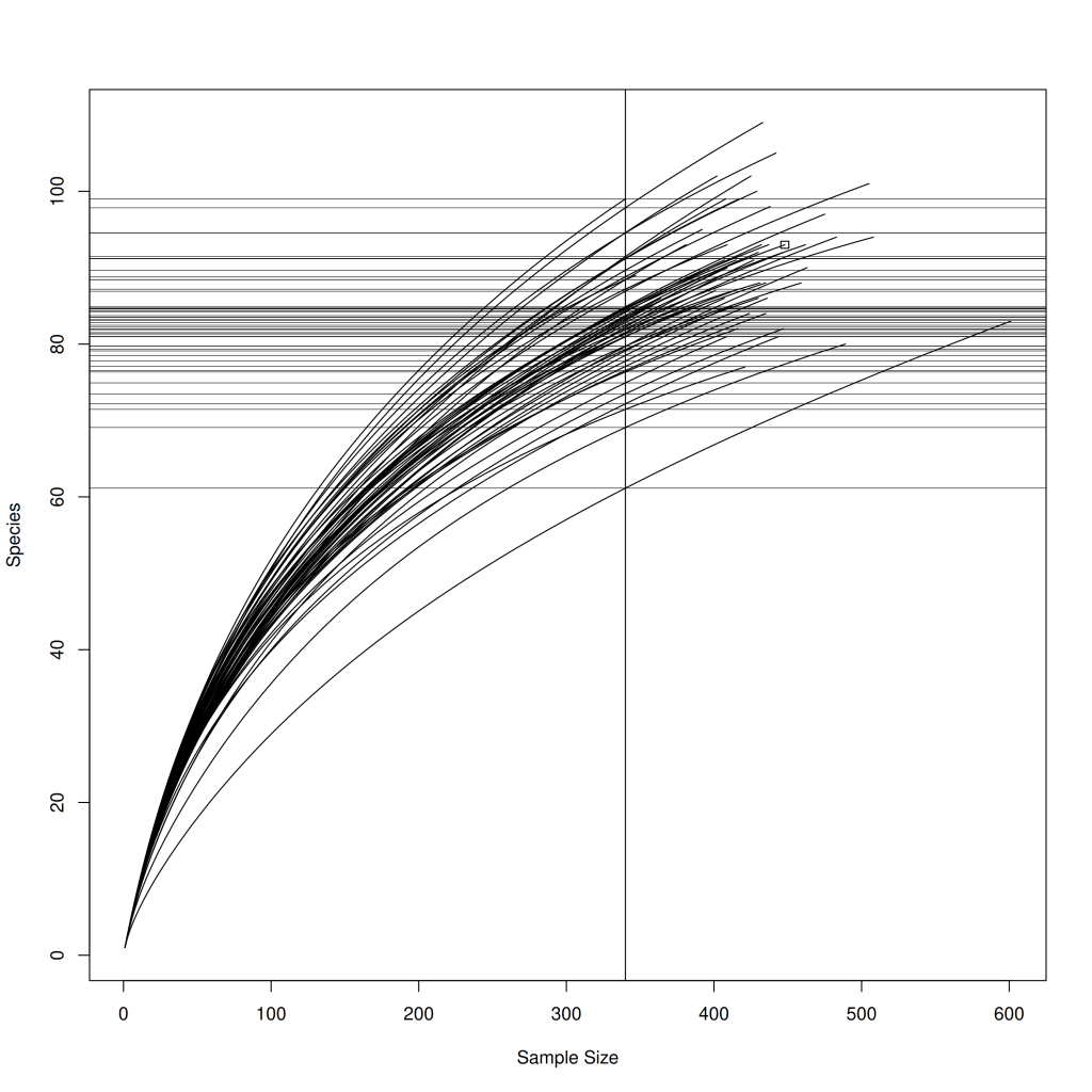
In the resulting plot, each curve represents a different plot from the BCI dataset. The x-axis shows the sample size (number of individuals), while the y-axis shows the expected number of species. The vertical line indicates the minimum sample size across all plots.
Looking at these curves, we can observe that:
- All curves show the characteristic shape of initially rapid species accumulation followed by a gradual flattening
- Most curves have not reached a clear asymptote, suggesting that additional sampling would reveal more species
Dissimilarity
While diversity indices tell us about the richness and evenness within individual communities, dissimilarity measures quantify how different communities are from each other. These measures are fundamental to many multivariate analyses in ecology, including ordination, cluster analysis, and hypothesis testing.
Dissimilarity (also known as “distance” in some other scientific fields) measures range from 0 (identical communities) to some maximum value, which depends on the measure used. Typically it will be either 1 or infinity.
Euclidean Distance
Euclidean distance is the straight-line distance in multidimensional space:
d_{ij} = \sqrt{\sum_{k} (x_{ik} - x_{jk})^2}While commonly used in many fields, Euclidean distance often performs poorly with ecological data unless appropriately transformed, as it’s sensitive to double-zeros and differences in sampling effort. It can extend to infinity to indicate complete dissimilarity.
Bray-Curtis Dissimilarity
Bray-Curtis dissimilarity quantifies the compositional dissimilarity between two communities based on counts at each site:
BC_{ij} = 1 - \frac{2 \sum_{k} \min(x_{ik}, x_{jk})}{\sum_{k} (x_{ik} + x_{jk})}Where xik and xjk are the counts of species k in samples i and j. This measure is sensitive to both species presence/absence and abundances, making it popular for community composition studies. A distance of 1 indicates that the two samples are completely different.
Jaccard Dissimilarity
Jaccard dissimilarity focuses on species presence/absence, ignoring abundances:
J_{ij} = 1 - \frac{|A_i \cap A_j|}{|A_i \cup A_j|}Where Ai and Aj are the sets of species in samples i and j. This measure is useful when species identities are more important than their abundances. As with Bray-Curtis, a distance of 1 indicates that the two samples are completely different.
Basic Dissimilarity Calculation in vegan
The vegdist function in vegan makes it easy to calculate dissimilarity matrices using various measures. Let’s calculate Bray-Curtis dissimilarity for our vegetation dataset:
dist_varespec_bray <- vegdist(df_varespec, method = "bray")
class(dist_varespec_bray)
[1] "dist"The result is a distance matrix object, which is a specialized data structure used in R for storing pairwise distances between samples. This object can be directly used in many multivariate analyses, such as cluster analysis and ordination.
Transformations and Standardization
Before calculating dissimilarities, it’s often necessary to transform or standardize the data to address issues like differences in sampling effort, skewed distributions, or the influence of abundant species. The decostand function in vegan offers various transformation methods.
One particularly useful transformation for community data is the Hellinger transformation, which divides the species abundances by the sample total, then takes the square root. This transformation gives less weight to abundant species and addresses the “double-zero” problem (where two samples share the absence of many species, which shouldn’t necessarily make them similar).
Here’s an example of applying the Hellinger transformation before calculating Euclidean distances:
df_varespec %>%
  vegan::decostand(method = "hellinger") %>%
  vegdist(method = "euclidean") %>%
  as.matrix() %>%
  `[`(1:5, 1:5) # Special notation for subsetting a matrix
1 2 3 4 5
1 0.0000000 0.6885085 0.8832262 0.7910534 0.5081880
2 0.6885085 0.0000000 0.6510691 0.6375933 0.5086377
3 0.8832262 0.6510691 0.0000000 0.7940364 0.7408735
4 0.7910534 0.6375933 0.7940364 0.0000000 0.6271162
5 0.5081880 0.5086377 0.7408735 0.6271162 0.0000000This approach—Hellinger transformation followed by Euclidean distance— is a popular choice for ordination methods like Principal Component Analysis (PCA) when working with community data. PCA will be covered in the subsequent tutorial on unconstrained ordination methods.
Plotting Dissimilarities
Dissimilarity matrices can be visualized using various techniques, with hierarchical clustering (dendrograms) being one of the most common. Dendrograms group samples based on their dissimilarity, with closely related samples clustered together.
To create a dendrogram, we first calculate the dissimilarity matrix, then perform hierarchical clustering using a method like Ward’s method, which minimizes the variance within clusters:
df_varespec %>%
  vegan::decostand(method = "hellinger") %>%
  vegdist(method = "euclidean") %>%
  hclust(method = "ward.D2") %>%
  plot(ylab = "Euclidean Distance", xlab = "Samples")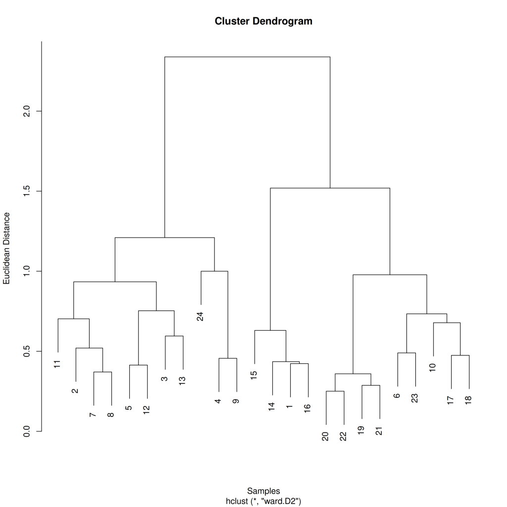
In this dendrogram, each leaf represents a sample, and the height of the connecting branches indicates the dissimilarity between samples or clusters. Samples that are more similar to each other are connected at lower heights, while more dissimilar samples or clusters join at greater heights.
The clustering pattern in the dendrogram can reveal natural groupings in the data and relationships between samples. For instance, we might see samples from similar habitats or with similar environmental conditions clustered together, suggesting ecological similarity.
Conclusion
In this article, we’ve explored three fundamental concepts in community ecology: diversity indices, rarefaction, and dissimilarity measures. The vegan package provides powerful tools for analyzing these aspects of ecological communities.
Through diversity indices, we can quantify different facets of community structure, from simple species richness to more complex measures that incorporate species abundances. Rarefaction allows us to compare communities with different sampling efforts by estimating diversity at a standardized sample size. Dissimilarity measures quantify differences between communities, forming the basis for multivariate analyses.
In the next article, we’ll build on these foundations to explore ordination techniques and hypothesis testing using permutation tests, which allow us to visualize community patterns and test ecological hypotheses about community structure and environmental relationships.