Dimensionality Reduction Techniques
Dimensionality reduction techniques are essential statistical tools that help ecologists and evolutionary biologists visualize and analyze complex, high-dimensional datasets. These methods transform data with many variables into a smaller number of dimensions while preserving important patterns, enabling researchers to identify ecological gradients, visualize community structure, and interpret biological variation.
Introduction
High-dimensional datasets are common across many scientific disciplines. Researchers often grapple with understanding complex systems by measuring numerous variables across multiple samples or observations. For example, ecologists might measure hundreds of species across various sites, geneticists might analyze thousands of gene expression levels across different experimental conditions, or chemists might record numerous spectral bands for different material samples. Ordination techniques are powerful statistical tools that help tackle this challenge by reducing this complexity to a manageable number of dimensions, revealing the most important patterns and relationships within the data.
The term “ordination” comes from the Germanic word ordnen, which means “to put in order.” This is precisely what these methods aim to do – they arrange data along underlying axes that maximally preserve certain aspects of the data’s structure (e.g., variance, dissimilarity). Ordination is particularly valuable when dealing with datasets where variables might be correlated, where datasets are sparse (containing many zeros, such as in species abundance data or certain types of survey data), or where complex interactions between underlying factors influence the observed variables.
“Ordination is a collective term for multivariate techniques which summarize a multidimensional data set in such a way that when it is projected onto a low dimensional space, any intrinsic pattern the data may possess becomes apparent upon visual inspection“
(Pielou, 1984)
Central to the concept of ordination is the idea of underlying gradients or structuring axes. In many systems, observed variables (e.g., species abundances, gene expression levels, chemical concentrations, survey responses) rarely respond to a single isolated factor but rather to complex combinations of factors that create gradients or patterns. These gradients might represent changes in experimental conditions, resource availability, temporal progression, socio-economic factors, or other influential characteristics that determine the state or behavior of the system being studied. Ordination methods help us identify these gradients – which can be thought of as “latent variables” that represent the primary patterns of variation in our data.
Ordination methods can be broadly categorized into two types: unconstrained and constrained. Unconstrained ordination (also called indirect gradient analysis) explores patterns in a primary dataset (e.g., a species-by-site matrix, a gene-by-sample matrix) without direct reference to a set of explanatory variables. These methods identify the main axes of variation in the primary data and arrange samples accordingly. In contrast, constrained ordination (direct gradient analysis) explicitly incorporates a secondary set of explanatory variables (e.g., environmental measurements, clinical parameters, experimental treatments), identifying axes of variation in the primary data that are directly related to these measured factors. This article will focus on unconstrained ordination methods, while constrained methods will be covered in a future tutorial.
We’ll explore four main unconstrained ordination techniques in this article:
- Principal Component Analysis (PCA): A linear method that preserves variance in the dataset, decomposing it into orthogonal components.
- Correspondence Analysis (CA): Adapts to unimodal responses of variables to underlying gradients, preserving chi-square distances between samples.
- Principal Coordinates Analysis (PCoA): Allows the use of various distance measures, preserving the chosen dissimilarity or distance measures as closely as possible in fewer dimensions.
- Non-Metric Multidimensional Scaling (NMDS): Focuses on preserving the rank order of dissimilarities or distances rather than their actual values, often providing the most robust representation of underlying data structures or sample relationships.
We will continue to use the reindeer grazing dataset from the previous tutorial on vegan
Principal Component Analysis (PCA)
Principal Component Analysis (PCA) is one of the most widely used dimensionality reduction techniques in science. It transforms a set of potentially correlated variables into a smaller set of uncorrelated variables called principal components. While widely used, PCA’s assumption of linear relationships between variables and underlying gradients can be a limitation in fields where non-linear responses are common (e.g., species responses to environmental gradients in ecology, dose-response curves in toxicology, or growth patterns in developmental biology). In such cases, the linear projections of PCA might not fully capture the complexity of the data.
At its core, PCA is a mathematical procedure that identifies the directions (principal components) along which the data shows the maximum variation. These principal components are orthogonal to each other and arranged in decreasing order of variance. In other words, the first principal component captures the most variation, the second captures the second most, and so on. This allows us to reduce many variables to a few meaningful dimensions while preserving as much of the original variation as possible.
Understanding PCA requires familiarity with two key concepts: eigenvectors and eigenvalues. Eigenvectors determine the direction of the principal components in the original variable space – they represent the “new axes” of our reduced data. Each eigenvector has a corresponding eigenvalue, which is a reflection of how much variance is explained by that principal component. Larger eigenvalues indicate principal components that capture more of the original data’s variation, making them more important for interpretation.
PCA in vegan
In vegan, we can perform a PCA using the pca function:
pca_varespec <- df_varespec %>%
  vegan::decostand(method = "hellinger") %>%
  vegan::pca(scale = TRUE)
pca_varespec
Call: vegan::pca(X = ., scale = TRUE)
-- Model Summary --
Inertia Rank
Total 44
Unconstrained 44 23
Inertia is correlations
-- Eigenvalues --
Eigenvalues for unconstrained axes:
PC1 PC2 PC3 PC4 PC5 PC6 PC7 PC8
8.603 5.134 4.576 3.714 3.245 2.779 2.626 2.221
(Showing 8 of 23 unconstrained eigenvalues)This will be the typical output for most of the ordination techniques we will discuss. Let’s break down this output:
The model summary provides us with two pieces of key information:
- Inertia:
veganuses the term “inertia” to refer to the variation within the dataset. In this case, the total variation is 44, and, as is typical with PCA, the full PCA model can explain all of it. - Rank: Of course, the PCA model would be useless if it took as many dimenions to meaningfully represent the data as there are variables. Fortunately, it generally doesn’t, and in this case as can explain the entire variation in the data with 23 dimensions rather than the full 44.
The “Inertia is correlations” line tells us that our analysis is based on the correlation matrix rather than the covariance matrix, which is a result of using scale = TRUE. This ensures that all variables contribute equally to the analysis regardless of their original scale. When running PCA, this argument should generally be set to TRUE unless you have a very good reason to allow the variables to have different scales, and thereby different influences on the PCA axes.
The eigenvalues represent the amount of variance explained by each principal component. We can see that the first principal component (PC1) explains the most variance (8.603 units), followed by PC2 (5.134 units), and so on. These values will help us decide how many components to retain for further analysis.
Selecting the number of Principal Components
One of the most important decisions in PCA is determining how many principal components to retain for further analysis. A common approach is to examine the screeplot, which plots the eigenvalues in decreasing order. We’re looking for an “elbow” in the plot – a point where the rate of decrease in eigenvalues levels off, indicating that additional components capture relatively little extra variance.
To create a screeplot, we first need to calculate the proportion of variance explained by each principal component. This is simply the eigenvalue for that component divided by the sum of all eigenvalues:
Proportion\;of\;Variance\;Explained = \frac{\lambda_i}{\sum_{j=1}^{p} \lambda_j}Where λi is the eigenvalue for the i-th principal component and p is the total number of principal components. Let’s calculate this for our data:
n_pcs <- length(pca_varespec$CA$eig)

df_explained_variance <- tibble(
  PC = seq_len(n_pcs) %>% as.factor(),
  prop_var = as.numeric(vegan::eigenvals(pca_varespec)) / sum(as.numeric(vegan::eigenvals(pca_varespec))),
  model = "Observed PCs"
)
df_explained_variance
# A tibble: 23 × 3
PC prop_var model
<fct> <dbl> <chr>
1 1 0.196 Observed PCs
2 2 0.117 Observed PCs
3 3 0.104 Observed PCs
4 4 0.0844 Observed PCs
5 5 0.0737 Observed PCs
6 6 0.0632 Observed PCs
7 7 0.0597 Observed PCs
8 8 0.0505 Observed PCs
9 9 0.0381 Observed PCs
10 10 0.0376 Observed PCs
# ℹ 13 more rowsLet’s plot it:
df_explained_variance %>%
  ggplot(aes(x = PC, y = prop_var)) +
  geom_bar(stat = "identity") +
  geom_text(
    aes(x = PC, y = prop_var, label = round(prop_var, 2)),
    vjust = -0.5,
    size = 3
  ) +
  labs(x = "Principal Component", y = "Proportion of Variance Explained") +
  ggthemes::theme_base()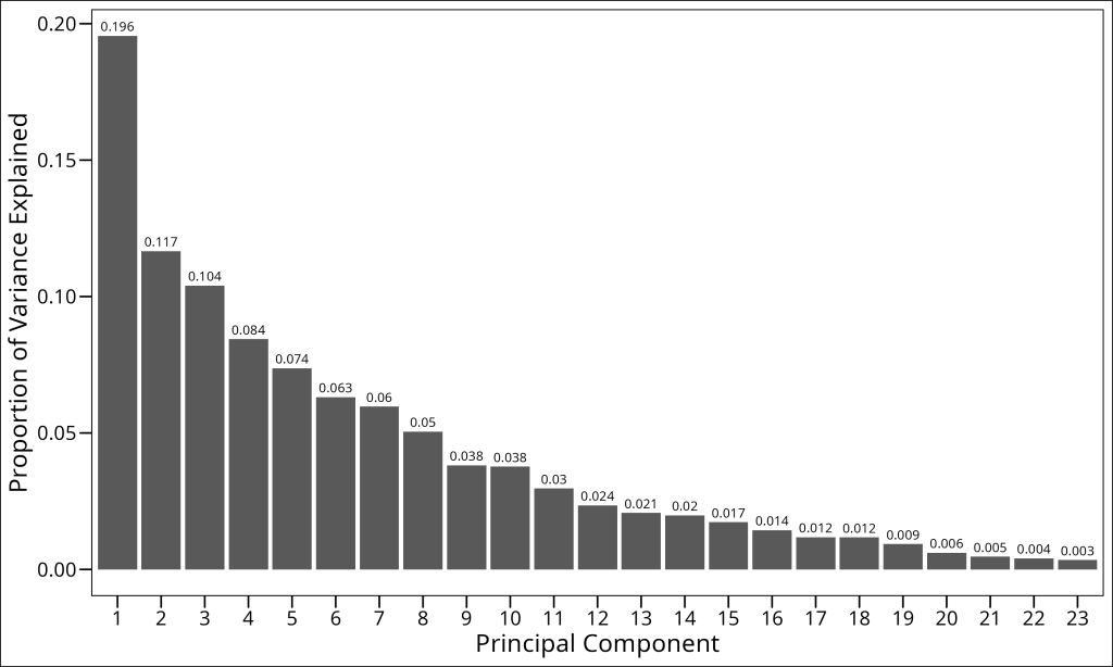
Looking at this screeplot, we need to decide how many principal components to retain. Several approaches can guide this decision:
- Variance explained: Retain components until a certain percentage (e.g., 70-80%) of total variance is explained
- Visual inspection: Look for an “elbow” in the screeplot where the curve flattens
- Broken stick model: Compare the observed eigenvalues to those expected by random chance
The broken stick model is a particularly useful approach for ecological data. It compares the observed eigenvalues to those that would be expected if the total variance were randomly distributed among the components. Components with eigenvalues higher than predicted by the broken stick model are considered significant.
# Calculate the broken stick model
n_pcs <- length(pca_varespec$CA$eig)

df_broken_stick <- tibble(
  PC = seq_len(n_pcs) %>% as.factor(),
  prop_var = 0,
  model = "Broken stick model"
)
for (i in 1:n_pcs) {
  bstick_value <- sum(1 / seq(i, n_pcs))
  df_broken_stick$prop_var[i] <- bstick_value / n_pcs
}
df_broken_stick
# A tibble: 23 × 3
PC prop_var model
<fct> <dbl> <chr>
1 1 0.162 Broken stick model
2 2 0.119 Broken stick model
3 3 0.0971 Broken stick model
4 4 0.0827 Broken stick model
5 5 0.0718 Broken stick model
6 6 0.0631 Broken stick model
7 7 0.0558 Broken stick model
8 8 0.0496 Broken stick model
9 9 0.0442 Broken stick model
10 10 0.0394 Broken stick model
# ℹ 13 more rowsLet’s combine the two models and plot them on the same screeplot:
df_explained_variance %>%
  bind_rows(df_broken_stick) %>%
  mutate(
    model = factor(model, levels = c("Observed PCs", "Broken stick model"))
  ) %>%
  ggplot(aes(x = PC, y = prop_var, color = model, fill = model)) +
  geom_bar(stat = "identity", position = "dodge") +
  labs(x = "Principal Component", y = "Proportion of Variance Explained") +
  ggthemes::theme_base()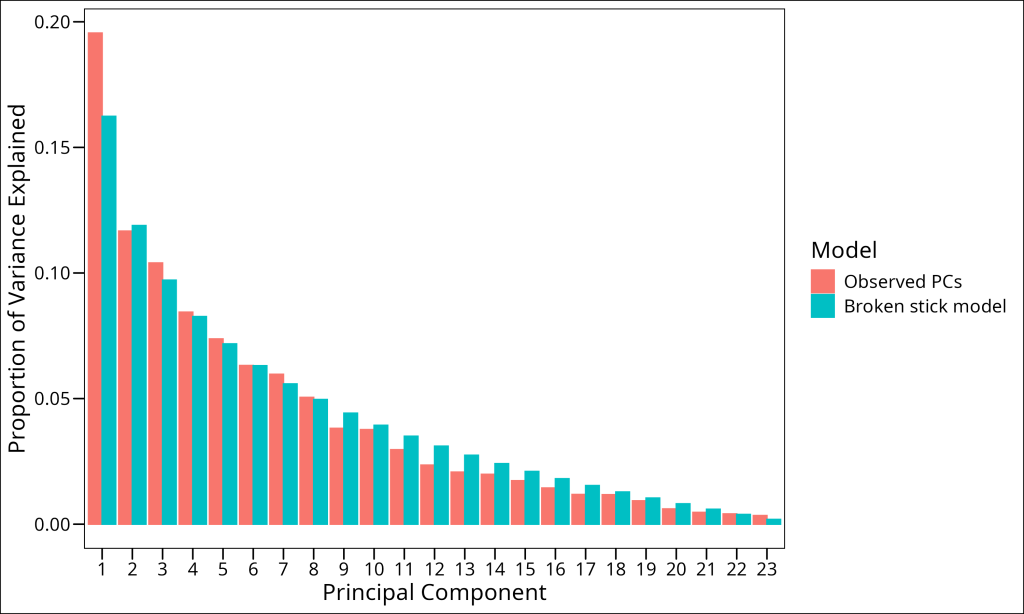
By comparing our observed eigenvalues with those from the broken stick model, we can determine which components to retain. Principal components with observed variance explained (blue bars) higher than the broken stick model’s predicted variance (orange bars) are considered significant. In our case, we see that the first 8 principal components exceed what would be expected by random chance. We would therefore retain the first 8 principal components for subsequent analysis.
Projecting data into ordination space
After we’ve constructed an ordination model, we need to visualize our data in the reduced dimensional space. This process is called projection, and it involves calculating the position of our original data points along the new axes (i.e., principal components) defined by our ordination. Mathematically, projection is the process of calculating the coordinates of each data point in the new ordination space by multiplying the original data by the eigenvectors.
When interpreting ordination results, we’re typically interested in projecting two types of elements from our original data matrix into the new ordination space:
- Samples/Observations: These are the individual items or experimental units that form the rows of our data matrix (e.g., sampling locations in ecology, patients in a clinical study, individual experiments). Projecting these into ordination space allows us to see which samples are similar in terms of their measured variables.
- Variables/Features: These are the characteristics measured for each sample, forming the columns of our data matrix (e.g., species abundances in ecology, gene expression levels, sensor readings). Projecting these into ordination space can reveal relationships between variables (like correlations or co-occurrence) and which variables drive the main patterns in the dataset.
In vegan, we control which objects to project using the display parameter in the scores function. Common options include:
"sites": Returns the coordinates of sites in ordination space"species": Returns the coordinates of species in ordination spacec("sites", "species"): Returns both sets of coordinates"all": Returns all available scores (for some ordination methods, this might include additional types like “constraints” or “biplot” axes)
A critical concept in ordination is how the scores are scaled relative to each other. This scaling affects the interpretation of distances and relationships in the ordination plot. In vegan, we control this with the scaling parameter within several functions:
"sites": Emphasizes distances between sites (samples or rows of the species data matrix) at the expense of species. The distances between site points in the ordination approximate their ecological distances. Species arrows point from the origin toward sites where they have high abundance."species": Emphasizes correlations between species (variables or columns of the species data matrix) at the expense of sites. The angles between species vectors reflect their correlations. Sites are positioned at the centroid (weighted average) of species that occur there."symmetric": A compromise between the above options, scaling both sites and species by the square root of the eigenvalues. This is often a good default choice for visualization.
The scores function in vegan is the primary tool for extracting these projections from an ordination object. Let’s break down its key parameters:
x: The ordination object from which to extract scoresdisplay: What type of scores to return (“sites”, “species”, etc.)choices: Which ordination axes to return (default isc(1,2)for the first two axes)scaling: How to scale the scores (as described above)tidy: Whether to return a tidy data frame suitable for ggplot2 (TRUE) or a matrix (FALSE)
Here’s an example of extracting scores from our PCA analysis:
pca_varespec_species_scores <- vegan::scores(
  pca_varespec,
  display = "species", # The type of scores to return
  scaling = "symmetric", # The scaling of the scores
  choices = c(1, 2) # Which axes/components to apply the scaling to
)
head(pca_varespec_species_scores)
PC1 PC2
Callvulg -0.3148898 0.1655522
Empenigr 0.6233082 0.2545862
Rhodtome 1.0071325 -0.2782015
Vaccmyrt 0.9305195 -0.3103794
Vaccviti 0.7394208 0.7055727
Pinusylv 0.2751616 0.2820577Correspondence Analysis (CA)
While PCA is a powerful technique, its assumptions can be limiting for certain types of datasets, such as those found in ecology or other fields dealing with count-based or compositional data.
The Double Zero Problem
One limitation of methods relying on Euclidean distance (like standard PCA) is their sensitivity to the double-zero problem. This occurs when two samples/observations both register an absence (a ‘zero’) for a particular variable/feature. Euclidean distance treats this shared absence as an indication of similarity. However, in many contexts (e.g., species absence at ecological sites, non-expression of a gene in biological samples, absence of a specific keyword in text documents), a shared absence might not imply similarity in the same way a shared presence does. Two samples might both lack a feature for entirely different underlying reasons. For instance, two distinct environments might both lack a specific species due to different limiting factors, not because the environments themselves are similar. Similarly, two unrelated text documents might both lack a specific technical term, which doesn’t necessarily make them similar in content.
This asymmetry in the meaning of joint presences versus joint absences can be problematic. Chi-square distance, used in Correspondence Analysis, addresses this issue by giving less weight to double-zeros, focusing instead on the pattern of features that are actually present or have non-zero values. Other dissimilarity measures like Bray-Curtis and Jaccard (which we will use in just a bit for Principal Coordinates Analysis) also handle the double-zero problem more appropriately by excluding joint absences from their calculations altogether.
Unimodal Responses
Secondly, PCA assumes linear relationships between variables and the underlying gradients. In reality, many types of variables exhibit unimodal (bell-shaped) or other non-linear responses to such gradients. This means that as one moves along a gradient (e.g., an environmental factor, a dosage level, a time series), the value of a variable (e.g., species abundance, a physiological reading, expression of a gene) might increase to an optimum and then decrease. Of course, other non-linear responses are also possible.
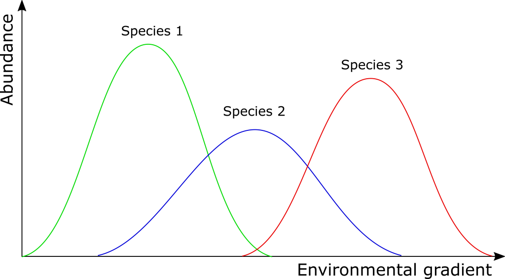
Correspondence Analysis (CA), by contrast, is designed to handle such unimodal responses to underlying gradients. It’s particularly well-suited for analyzing count-based or compositional data (e.g., species abundance data in community ecology, word counts in text analysis, or certain types of survey data with discrete response categories), especially when dealing with data presented as frequencies or counts rather than continuous measurements.
Correspondence Analysis in vegan
So, what about fitting models, projecting data into this ordination space, plotting, etc.? Great news – essentially nothing changes among the different ordination methods.
Let’s fit a CA model. We use vegan‘s cca function to accomplish this:
ca_varespec <- df_varespec %>%
  vegan::cca()
ca_varespec
Call: cca(X = .)
-- Model Summary --
Inertia Rank
Total 2.083
Unconstrained 2.083 23
Inertia is scaled Chi-square
-- Eigenvalues --
Eigenvalues for unconstrained axes:
CA1 CA2 CA3 CA4 CA5 CA6 CA7 CA8
0.5249 0.3568 0.2344 0.1955 0.1776 0.1216 0.1155 0.0889
(Showing 8 of 23 unconstrained eigenvalues)The model summary for CA differs from PCA in a key aspect: the inertia (total variance) is now expressed as “scaled Chi-square” rather than correlations. This reflects the different distance measure used by CA. The Chi-square distance is appropriate for count data and gives less weight to rare items or low counts, which in some contexts (like rare species in ecological samples or infrequent words in documents) might have less influence on the overall structure or might be disproportionately affected by sampling effort if weighted heavily.
The eigenvalues in CA have a different interpretation than in PCA. While they still represent the amount of variance explained by each axis, the values tend to be smaller because CA models unimodal rather than linear responses. The first CA axis (CA1) captures 0.5249 units of chi-square distance, which is the most important gradient in our data.
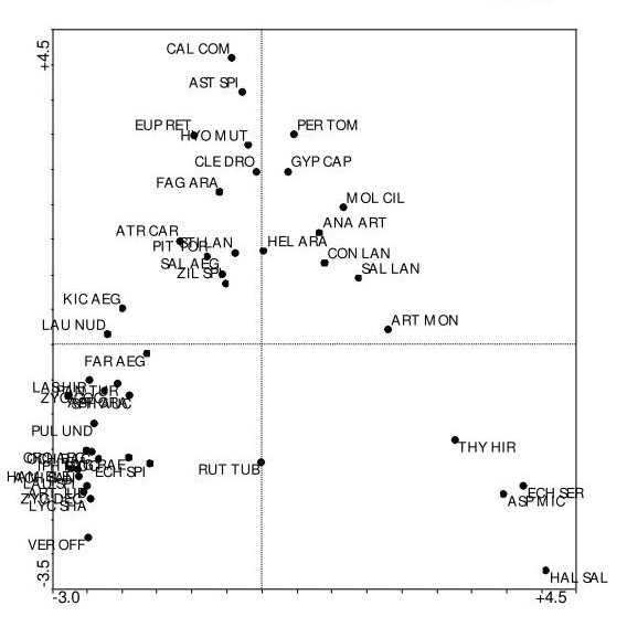
Let’s project the data into ordination space and make a biplot
# Getting the scores
ca_varespec_scores <- vegan::scores(
  ca_varespec, # The ordination object
  choices = c(1, 2), # The axes/components/eigenvectors to return; default is c(1, 2)
  scaling = "symmetric", # The scaling of the scores
  display = "all", # The type of scores to return; default is "all"
  tidy = TRUE,
  hill = FALSE # For CA, whether to return Hill's scaling scores (negative scaling); default is FALSE
) %>%
  as_tibble()

# Biplot
ca_varespec_scores %>%
  ggplot(aes(x = CA1, y = CA2, color = score)) +
  geom_point() +
  ggrepel::geom_text_repel(aes(label = label), show.legend = FALSE) +
  coord_fixed() +
  labs(
    x = "CA1",
    y = "CA2",
    color = "Data Type"
  ) +
  ggthemes::theme_base()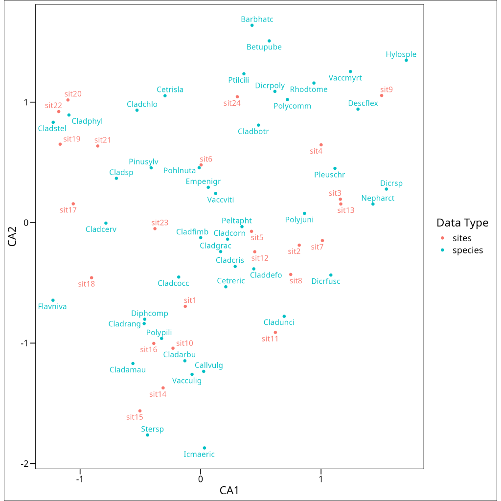
Interpreting a CA biplot requires a slightly different approach than PCA. In CA:
- Samples/Observations are positioned at the weighted average of the variables/features that characterize them. Samples close to a variable point typically have high values or frequencies of that variable.
- Variables/Features are positioned at the weighted average of the samples/observations where they are prominent. Variables close to a sample point typically have high values or frequencies in that sample.
- The distance between samples/observations approximately represents their chi-square distance – samples far apart have different variable compositions.
- The distance between variables/features represents their co-occurrence patterns – variables close together tend to occur prominently in the same samples.
Principal Coordinates Analysis (PCoA)
Horseshoe Effect
While CA addresses the linear relationship limitation of PCA, it can introduce its own distortion, known as the “arch effect” or “horseshoe effect,” particularly when dealing with datasets structured along a single, dominant underlying gradient where samples at the extremes are highly dissimilar. The horseshoe effect occurs due to the mathematical properties of distance-based ordination methods when applied to data with such strong, simple gradient structures. When variables (e.g., species, gene expression levels) show unimodal responses to a single dominant gradient, samples/observations at opposite ends of this gradient will have very different variable profiles (high dissimilarity). However, these extreme samples are both dissimilar to samples in the middle of the gradient, creating a mathematical constraint that can force the ordination to “bend” the representation of this primary gradient into an arch shape in a two-dimensional plot, where the second axis becomes a curved function of the first rather than representing an independent structuring factor. The horseshoe effect is particularly problematic when analyzing data with such dominant gradients, as it can obscure or distort the interpretation of the second ordination axis. Detrended Correspondence Analysis (DCA) was developed specifically to address this for count data by computationally “flattening” the arch, but PCoA with appropriate distance measures and NMDS are often preferred modern alternatives for handling such structures more broadly.
Principal Coordinates Analysis (PCoA, also known as metric multidimensional scaling) offers a more flexible approach to ordination. Instead of being tied to a specific distance measure like Euclidean (PCA) or chi-square (CA), PCoA allows you to choose the dissimilarity or distance measure that best suits your data and research question. This flexibility makes PCoA valuable across many fields, as specialized distance measures (e.g., Bray-Curtis in ecology, Jaccard for binary data, Manhattan distance for other contexts) can be more appropriate than standard Euclidean distance for particular data types or theoretical considerations.
PCoA finds a low-dimensional representation of the data that preserves the chosen distances between objects as closely as possible. It works by first calculating a distance matrix using your chosen distance measure, then finding a configuration of points in a reduced space that approximates these distances. Interestingly, PCA can be considered a special case of PCoA where Euclidean distance is used.
PCoA in vegan
We can conduct a Principal Coordinates Analysis in vegan using the wcmdscale function:
pcoa1_varespec <- df_varespec %>%
  vegdist(method = "bray") %>%
  vegan::wcmdscale(eig = TRUE)
pcoa1_varespec
Call: vegan::wcmdscale(d = ., eig = TRUE)
Inertia Rank
Total 4.544
Real 4.803 15
Imaginary -0.259 8
Results have 24 points, 15 axes
Eigenvalues:
[1] 1.7552 1.1334 0.4429 0.3698 0.2454 0.1961 0.1751 0.1284 0.0972 0.0760 0.0637 0.0583 0.0395 0.0173 0.0051 -0.0004 -0.0065 -0.0133 -0.0254 -0.0375 -0.0480 -0.0537 -0.0741
Weights: ConstantThe PCoA output provides several key pieces of information:
- Inertia: The total variance or squared distances in the dataset
- Real vs. Imaginary Inertia: The variance represented in real Euclidean space versus “imaginary” space
- Rank: The number of positive eigenvalues, indicating the dimensions of the solution
- Eigenvalues: The amount of variance explained by each axis
Lingoes Correction
A critical issue to notice in the output is the presence of negative eigenvalues. This indicates a fundamental challenge in PCoA: not all distance matrices can be perfectly represented in Euclidean space. When using non-Euclidean distance measures like Bray-Curtis (which we used here), the resulting configuration may require “imaginary” dimensions to perfectly preserve all distances.
These negative eigenvalues represent distortion in our ordination – the distances in our reduced space don’t perfectly match the original ecological distances. If the negative eigenvalues are large relative to the positive ones, this indicates substantial distortion and suggests that our ordination may not reliably represent the original ecological relationships.
Fortunately, there are methods to address this issue. The Lingoes correction adds a constant to the off-diagonal elements of the distance matrix, making it more Euclidean while preserving the rank order of distances. This correction effectively shifts all eigenvalues to be more positive.
We can use the add argument within the wcmdscale function to implement this correction:
pcoa2_varespec <- df_varespec %>%
  vegdist(method = "bray") %>%
  vegan::wcmdscale(eig = TRUE, add = "lingoes")
pcoa2_varespec
Call: vegan::wcmdscale(d = ., eig = TRUE, add = "lingoes")
Inertia Rank
Total 6.25 22
additive constant 0.07413903 (method lingoes)
Results have 24 points, 22 axes
Eigenvalues:
[1] 1.8294 1.2076 0.5170 0.4439 0.3195 0.2702 0.2493 0.2026 0.1713 0.1501 0.1379 0.1325 0.1136 0.0914 0.0792 0.0737 0.0677 0.0608 0.0487 0.0366 0.0261 0.0204
Weights: ConstantAfter applying the Lingoes correction, we can see that all eigenvalues are now positive. The output also shows the additive constant (0.07413903) that was used to correct the distance matrix. Note that while the total inertia has increased (from 4.544 to 6.25) because we’ve added this constant to the distances, the relative relationships between points are preserved.
One characteristic of PCoA is that it directly provides coordinates (scores) for the samples/observations (i.e., the items used to compute the input distance matrix), but not directly for the original variables/features. This is because PCoA operates on the pre-calculated distance matrix between samples, not the original sample-by-variable data matrix. While methods exist to project variable/feature information onto a PCoA ordination post-hoc (e.g., by correlating variables with sample scores), this is not an intrinsic part of the PCoA algorithm in the same way variable scores are derived in PCA or CA.
Let’s visualize the PCoA ordination using the sample/observation scores. Note: The vegan::scores function with display = c("species") used in the example code below for a wcmdscale object might be a misnomer if PCoA primarily yields sample scores; typically, one would extract the point coordinates directly or use a display argument appropriate for sample scores if available. For this illustration, we assume the code extracts the primary coordinates representing the samples/observations.
vegan::scores(
  pcoa2_varespec,
  display = c("species"),
  scaling = "symmetric",
  tidy = TRUE,
  choices = c(1, 2)
) %>%
  as_tibble() %>%
  mutate(
    label = paste0("Site ", label)
  ) %>%
  ggplot(aes(x = Dim1, y = Dim2)) +
  geom_point() +
  ggrepel::geom_text_repel(aes(label = label), show.legend = FALSE) +
  coord_fixed() +
  labs(
    x = "PCoA1",
    y = "PCoA2"
  ) +
  ggthemes::theme_base()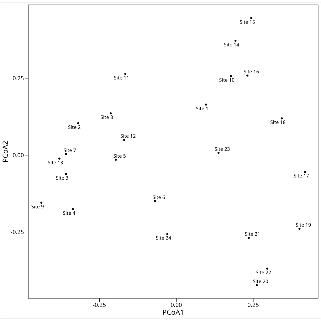
The PCoA plot shows the relationships between our samples/observations based on their variable profiles (e.g., species composition, gene expression patterns), using the chosen dissimilarity measure (e.g., Bray-Curtis in this example). Samples/observations that are close together in the plot have similar profiles, while those far apart are dissimilar according to that measure. Unlike PCA, which is influenced by absolute abundances, a PCoA based on Bray-Curtis dissimilarity (often used in ecology) focuses on the proportional abundances, making it less sensitive to differences in sampling effort.
Often, patterns in PCoA plots can be related back to known groupings or characteristics of the samples. For example, in our ecological dataset, we might observe clustering that corresponds to an experimental treatment like ‘grazing’:
vegan::scores(
  pcoa2_varespec,
  display = c("species"),
  scaling = "symmetric",
  tidy = TRUE,
  choices = c(1, 2)
) %>%
  as_tibble() %>%
  mutate(
    label = paste0("Site ", label)
  ) %>%
  bind_cols(
    df_varechem %>%
      select(grazing)
  ) %>%
  ggplot(aes(x = Dim1, y = Dim2, color = grazing)) +
  geom_point() +
  stat_ellipse(
    geom = "polygon",
    alpha = 0.1,
    aes(fill = grazing)
  ) +
  ggrepel::geom_text_repel(aes(label = label), show.legend = FALSE) +
  coord_fixed() +
  labs(
    x = "PCoA1",
    y = "PCoA2",
    color = "Grazing",
    fill = "Grazing"
  ) +
  ggthemes::theme_base()
Non-Metric Multidimensional Scaling (NMDS)
Non-Metric Multidimensional Scaling (NMDS) is quite different from our previous ordination methods in that it doesn’t assume linear or unimodal responses of variables to underlying gradients, nor does it rely on preserving exact distances. Instead, NMDS focuses on preserving the rank order of dissimilarities or distances between samples/observations, making it highly flexible and resistant to the distortions that can affect other ordination methods.
The key advantages of NMDS include:
- Flexibility: Works with any dissimilarity measure, not just Euclidean distances
- Robustness: Less sensitive to outliers and can handle non-linear variable responses
- No assumption of specific gradient shapes: Unlike PCA (linear) and CA (unimodal), NMDS doesn’t assume that the main variation in the data is structured along specific types of continuous gradients.
The main disadvantage is that NMDS is an iterative algorithm that can sometimes fail to converge on a stable solution, and unlike PCA or CA, the axes in NMDS don’t have inherent meaning – they’re just dimensions that best preserve the rank-order of distances.
Stress
A critical concept in NMDS is “stress,” which measures how well the ordination configuration represents the original dissimilarities or distances. Specifically, stress is the sum of squared differences between the original distance ranks and the distance ranks in the ordination space. The general rules of thumb for assessing the reported stress are:
- >0.2 = Terrible
- 0.15 – 0.2 = Okay
- 0.1 – 0.15 = Good
- <0.1 = Excellent
Since NMDS works with a dissimilarity matrix, we need to choose an appropriate dissimilarity/distance measure for our data. If external variables or known gradients are relevant to the data being ordinated, the rankindex function in vegan can help evaluate how well different distance measures (calculated from the primary data matrix, e.g., df_varespec) correlate with these external variables (e.g., df_varechem):
vegan::rankindex(
  df_varechem, # Matrix/dataframe of external variables (e.g., environmental, clinical)
  df_varespec, # Primary data matrix (e.g., species counts, gene expression)
)
euc man gow bra kul
0.3775842 0.4370297 0.2430679 0.4652668 0.4642508 The output shows correlation coefficients between different distance measures and our external variable data. Higher values indicate stronger correlations. In our case, the Bray-Curtis (bra) dissimilarity has the highest correlation (0.4653), closely followed by Kulczynski’s index (kul) at 0.4643. This suggests that Bray-Curtis, for this particular dataset and set of external variables, captures relationships that align well with those external measurements.
NMDS in vegan
In vegan we run an NMDS using the metaMDS function:
set.seed(123) # Set seed for reproducibility
nmds1_varespec <- df_varespec %>%
  vegan::metaMDS(
    comm = ., # Primary data matrix (e.g., species counts, gene expression)
    distance = "bray", # Dissimilarity index to use
    k = 2, # Number of dimensions
    trymax = 100, # Maximum number of attempts to find the best solution
  )
nmds1_varespec
Call:
vegan::metaMDS(comm = ., distance = "bray", k = 2, trymax = 100)
global Multidimensional Scaling using monoMDS
Data: wisconsin(sqrt(.))
Distance: bray
Dimensions: 2
Stress: 0.1843196
Stress type 1, weak ties
Best solution was repeated 1 time in 20 tries
The best solution was from try 9 (random start)
Scaling: centring, PC rotation, halfchange scaling
Species: expanded scores based on 'wisconsin(sqrt(.))' The NMDS output provides several important pieces of information:
- Data preprocessing: NMDS automatically applied the Wisconsin double standardization and square root transformation to our data, which are common preprocessing steps for certain types of count or compositional data (often used in ecology but applicable elsewhere).
- Distance measure: Bray-Curtis dissimilarity was used as specified.
- Dimensions: We requested a 2-dimensional solution (k=2).
- Stress: The final stress value is 0.1843, which is acceptable (below 0.2) but not excellent (which would be below 0.1).
- Convergence: The best solution was found in the 9th attempt and was only repeated once in 20 tries, suggesting some instability in the solution.
It is generally recommended to try multiple different seeds and ascertain a similar final stress is achieved before settling on a given seed value and running that NMDS model.
Visualizing NMDS
One way to assess the quality of an NMDS solution is through a stress plot, which shows how well the ordination distances match the original dissimilarities or distances:
vegan::stressplot(nmds1_varespec)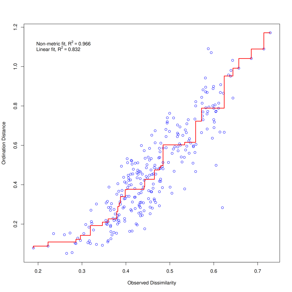
The stressplot shows the relationship between the original dissimilarities or distances (x-axis) and the ordination distances (y-axis). The closer the points follow a straight line, the better the ordination represents the original distances. The plot also reports two goodness-of-fit measures: the linear R² (0.832) and the non-metric R² (0.966). These values suggest that our NMDS solution captures the original distance structure reasonably well, especially the rank-order of distances (non-metric R²).
As with the other ordination methods, we can visualize the NMDS results using a biplot:
nmds1_varespec %>%
  vegan::scores(
    display = c("species", "sites"),
    scaling = "symmetric",
    tidy = TRUE,
    choices = c(1, 2)
  ) %>%
  as_tibble() %>%
  ggplot(aes(x = NMDS1, y = NMDS2, color = score)) +
  geom_point() +
  ggrepel::geom_text_repel(aes(label = label), show.legend = FALSE) +
  coord_fixed() +
  labs(
    x = "NMDS1",
    y = "NMDS2",
    color = "Score Type"
  ) +
  ggthemes::theme_base()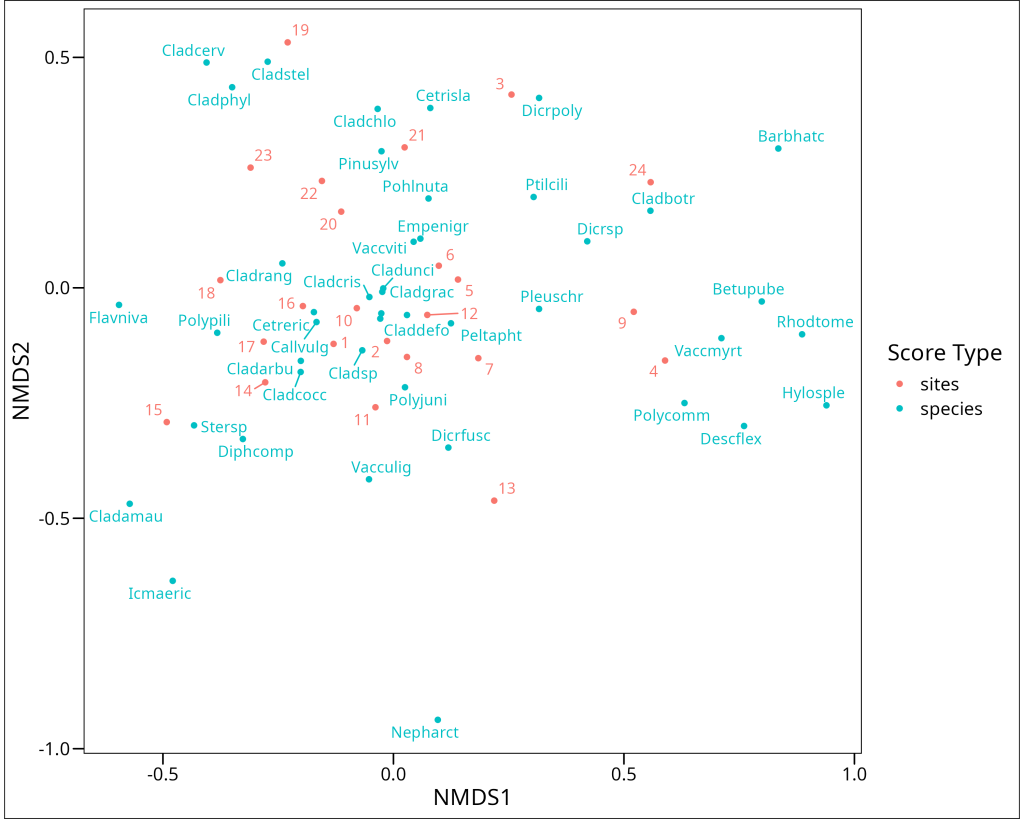
Interpreting an NMDS biplot requires a slightly different approach than other ordination methods. In NMDS:
- The axes themselves have no inherent meaning – they’re simply dimensions that best preserve the rank-order distances between samples/observations.
- The orientation of the plot is arbitrary – it can be rotated or reflected without changing the interpretation.
- Sample/Observation proximity reflects similarity based on the chosen dissimilarity measure – samples/observations close together have similar variable profiles.
- Variable/Feature positions indicate their association with different samples/observations – variables/features near a sample/observation point are typically more abundant or have higher values in those samples/observations.
Vector Fitting
Okay, these ordinations are nice and all, but what if we have other data collected for the samples/observations, such as extrinsic variables (e.g., environmental measurements, clinical parameters, experimental conditions), and we want to investigate whether there can be relationships between the patterns in our primary data (e.g., variation in species composition, gene expression profiles) and these extrinsic variables?
vegan offers an answer to this in the form of the envfit function. It will project these extrinsic variables as vectors (for continuous data) or as centroids (for factor variables) onto the ordination space and use permutation tests in order to assess the significance of the projected relationship
There are two ways to use envfit in vegan:
- Separate objects:
envfit(ord, env)whereordis an ordination object andenvis a dataframe of extrinsic variables - Formula interface:
envfit(ord ~ var1 + var2, env)which allows you to specify which extrinsic variables to include in a more explicit way
The formula notation is generally recommended as it provides more flexibility (i.e. if your hypothesis involves interactions) and clarity. Let’s illustrate this by investigating how a set of example extrinsic variables (e.g., aluminum, iron, pH, and a categorical variable ‘grazing’ from our ecological dataset) relate to the principal components from a PCA:
pca_varespec <- df_varespec %>%
  vegan::decostand(method = "hellinger") %>%
  vegan::pca(scale = TRUE)

varespec_envfit <- vegan::envfit(
  pca_varespec ~ Al + Fe + pH + grazing, # ordination object
  df_varechem, # dataframe of extrinsic variables
  choices = c(1, 2), # axes to fit
  scaling = "symmetric", # scaling of the scores
  permutations = 1000 # number of permutations for the significance test
)
varespec_envfit
***VECTORS
PC1 PC2 r2 Pr(>r)
Al -0.64541 -0.76384 0.3168 0.01898 *
Fe -0.56956 -0.82195 0.3536 0.01499 *
pH -0.34311 -0.93929 0.0881 0.35465
---
Signif. codes: 0 '***' 0.001 '**' 0.01 '*' 0.05 '.' 0.1 ' ' 1
Permutation: free
Number of permutations: 1000
***FACTORS:
Centroids:
PC1 PC2
grazinggrazed 0.3950 0.3255
grazingungrazed -0.3342 -0.2755
Goodness of fit:
r2 Pr(>r)
grazing 0.2134 0.001998 **
---
Signif. codes: 0 '***' 0.001 '**' 0.01 '*' 0.05 '.' 0.1 ' ' 1
Permutation: free
Number of permutations: 1000The envfit output contains two main sections:
- VECTORS: Results for continuous extrinsic variables (Al, Fe, pH)
- FACTORS: Results for categorical variables (grazing)
For continuous variables, the output shows:
- Direction cosines: The values in PC1 and PC2 columns are essentially the x and y coordinates of a unit vector pointing in the direction of increasing values for that extrinsic variable.
- r²: The squared correlation coefficient between the extrinsic variable and the ordination axes, indicating the strength of the relationship.
- p-value: The statistical significance of the relationship, determined by permutation tests.
For categorical variables, the output shows:
- Centroids: The average position of sites belonging to each level of the factor.
- r²: A measure of how well the factor explains variation in the ordination.
- p-value: The statistical significance of the relationship.
In our results, we can see that both aluminum (Al) and iron (Fe) show significant correlations with the first two PCA axes (p < 0.05), while pH does not. The grazing factor is highly significant (p < 0.01), indicating a strong relationship between the ‘grazing’ factor and the primary data patterns.
The direction of the vectors would indicate how the continuous extrinsic variables change across the ordination plot. The centroids for categorical factors show the average position of samples/observations belonging to each level of the factor. For example, in our ecological dataset, the vectors might indicate that both Al and Fe increase toward one area of the PCA plot, and centroids might show that ‘grazed’ samples/observations tend to be located in a different area than ‘ungrazed’ ones. This could suggest potential relationships between these extrinsic factors and the underlying structure of the primary data (e.g., that ‘grazing’ is associated with certain chemical profiles, or that specific chemical conditions are more prevalent in samples/observations that also exhibit certain primary data characteristics).
Vector fitting provides a powerful tool for interpreting ordination results in the context of relevant extrinsic variables. By connecting primary data patterns to these extrinsic factors, we can begin to understand potential influences or correlates of the observed structure in our primary dataset and develop testable hypotheses.
Summary
Dimensionality reduction techniques are essential tools for visualizing and analyzing complex, high-dimensional data across various scientific fields. By transforming high-dimensional data into a lower-dimensional space, these methods help researchers identify patterns, test hypotheses, and communicate findings effectively.
In this article, we’ve explored four major unconstrained ordination methods, each with its own strengths and limitations:
- Principal Component Analysis (PCA): Best for data with linear relationships, particularly sets of continuous variables that are expected to have roughly linear interrelationships. Preserves Euclidean distances and maximizes variance.
- Correspondence Analysis (CA): Adapts to unimodal responses of variables to underlying gradients, preserving chi-square distances between samples.
- Principal Coordinates Analysis (PCoA): Allows the use of various distance measures, preserving the chosen dissimilarity or distance measures as closely as possible in fewer dimensions.
- Non-Metric Multidimensional Scaling (NMDS): Focuses on preserving the rank order of dissimilarities or distances rather than their actual values, often providing the most robust representation of underlying data structures or sample relationships.
We’ve also seen how vector fitting can enhance these ordinations by connecting primary data patterns to extrinsic variables, providing deeper insights into the system under study.
When choosing an ordination method for your own data, consider the nature of your data and the expected relationships between variables, the types of distances or dissimilarities that are most meaningful for your study system and data type, and the specific questions you’re asking. Often, it’s valuable to apply multiple methods and compare their results for a more complete understanding of your data.
In the next tutorial, we’ll explore constrained ordination techniques, which explicitly incorporate a set of explanatory (extrinsic) variables into the ordination process, allowing for direct testing of relationships between these explanatory variables and the patterns in the primary dataset.