Facetting & Combining Plots
Learn how to create multi-panel visualizations and combine plots to effectively communicate complex ecological data.
Why Use Faceting?
When analyzing ecological data, we often need to compare patterns across different categories, time periods, or variables. While it’s ideal to present all information in a single panel, this can quickly become cluttered and difficult to interpret.
This is where faceting comes in – a powerful technique that splits your data into multiple panels based on a categorical variable. Each panel shows the same type of plot for a different subset of your data, making comparisons much easier.
We will be working with the Luquillo stream chemistry dataset (luq_streamchem), which contains stream flow chemistry data for the Quebrada Sonadora (QS) site within the Espiritu Santo drainage basin and the El Verde Research area of the Luquillo Experimental Forest (LEF) in Puerto Rico.
Our goal is to visualize how various chemical concentrations in the stream water change over the years, examining patterns for different elements and molecules to better understand the stream ecosystem dynamics.
Starting Without Facets
Let’s first get our dataset ready. We will load in the packages of interest, pivot the dataframe into a long format that works best for plotting, and extract out the year variable for the x-axis:
# Load required packages
library(tidyverse)
library(lterdatasampler)

# Load data
df <- lterdatasampler::luq_streamchem
str(df)
# tibble [317 x 22] (S3: tbl_df/tbl/data.frame)
# $ sample_id : chr [1:317] "QS" "QS" "QS" "QS" ...
# $ sample_date: Date[1:317], format: "1987-01-05" "1987-01-13" "1987-01-20" "1987-01-27" ...
# $ gage_ht : num [1:317] 2.82 2.66 2.61 2.58 2.8 2.63 2.84 2.68 2.76 2.64 ...
# $ temp : num [1:317] 20 20 20 20 20 20 20 19 20 20 ...
# $ p_h : num [1:317] 7.22 7.34 7.12 7.19 7.36 7.19 NA 6.93 7.02 7.17 ...
# $ cond : num [1:317] 48.2 49.8 50.3 50.4 49.6 53.3 43.7 48.4 48.4 49.9 ...
# $ cl : num [1:317] 7.3 7.5 7.5 7.3 7.3 7.2 7 7.3 7.6 7.3 ...
# $ no3_n : num [1:317] 97 114 115 117 103 110 94 90 86 97 ...
# $ so4_s : num [1:317] 0.52 0.73 NA NA 0.85 NA NA NA NA NA ...
# $ na : num [1:317] 4.75 4.81 5.19 5.08 4.86 5.11 4.8 5.08 4.9 4.89 ...
# $ k : num [1:317] 0.18 0.19 0.2 0.18 0.17 0.18 0.17 0.18 0.2 0.2 ...
# $ mg : num [1:317] 1.5 1.58 1.66 1.64 1.49 1.59 1.44 1.6 1.64 1.51 ...
# $ ca : num [1:317] 2.46 6.53 2.6 2.67 2.39 2.55 2.33 2.48 2.55 2.81 ...
# $ nh4_n : num [1:317] 14 20 25 30 25 30 7 6 NA NA ...
# $ po4_p : num [1:317] NA NA NA NA NA NA NA NA NA NA ...
# $ doc : num [1:317] 0.72 0.74 0.69 0.62 0.75 0.61 1.78 1.85 1.49 1.29 ...
# $ dic : num [1:317] 3.37 3.35 4.42 3.3 5.03 4.18 2.4 2.9 2.46 3.34 ...
# $ tdn : num [1:317] NA NA NA NA NA NA NA NA NA NA ...
# $ tdp : num [1:317] NA NA NA NA NA NA NA NA NA NA ...
# $ si_o2 : num [1:317] 11.8 12.2 12.5 12.4 10.9 12.2 11.1 12.5 11.8 12.3 ...
# $ don : num [1:317] NA NA NA NA NA NA NA NA NA NA ...
# $ tss : num [1:317] 2.3 0.72 1.05 1.05 1.6 1.32 1.23 1.18 1.2 0.96 ...# Change the data to a format for plotting.
df_elements <- df %>%
# select columns of interest
dplyr::select(sample_date, temp, p_h, na, k, ca, mg, cl) %>%
tidyr::pivot_longer(
# specify which columns to join together
cols = c(na, k, ca, mg, cl),
# specify what the new name of the grouping variable will be
names_to = "element",
# specify what the new name of the values will be
values_to = "concentration"
) %>%
# change the grouping variable to a factor
dplyr::mutate(
element = factor(element, levels = c("na", "k", "ca", "mg", "cl")),
year = factor(lubridate::year(sample_date))
)
df_elementsLet’s first look at what happens when we try to show all elements in a single plot:
df_elements %>%
  ggplot(aes(x = year, y = concentration, fill = element)) +
  geom_boxplot() +
  labs(x = "Year", y = "Concentration (mg/L)", fill = "Element") +
  ggthemes::theme_base() +
  # NB: place custom theme alterations after a baseline theme to overwrite appropriately
  theme(axis.text.x = element_text(angle = 45, hjust = 1))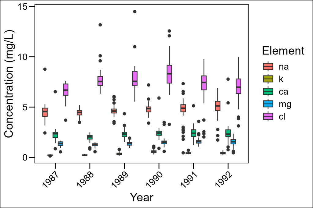
While this plot includes all our data, it’s hard to see patterns for each element because:
- The concentration ranges vary dramatically across elements
- The colors are the only way to distinguish elements
- It’s difficult to focus on trends for any single element
Basic Faceting
Let’s improve this by introducing faceting, in which data is grouped and plotted on separate panels per group. In ggplot2 this is accomplished with the facet_wrap layer. It uses a formula notation: ~grouping_var in which the grouping variable is the column by which data will be assigned to different panels. In our case, let’s assign each element to be in a different panel:
df_elements %>%
  ggplot(aes(x = year, y = concentration)) +
  geom_boxplot() +
  facet_wrap(~element) +
  labs(x = "Year", y = "Concentration (mg/L)") +
  ggthemes::theme_base() +
  theme(axis.text.x = element_text(angle = 45, hjust = 1))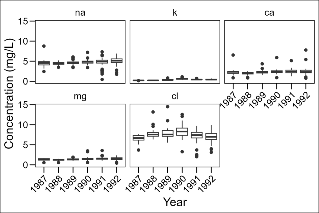
This is much better! Now we can see each element separately. However, there’s still a problem – all panels use the same y-axis scale, so elements with lower concentrations (like potassium) appear nearly flat.
Freeing Up the Scales
We can allow each panel to have its own scale with the scales = "free" parameter:
df_elements %>%
  ggplot(aes(x = year, y = concentration)) +
  geom_boxplot() +
  facet_wrap(~element, scales = "free") +
  labs(x = "Year", y = "Concentration (mg/L)") +
  ggthemes::theme_base() +
  theme(axis.text.x = element_text(angle = 45, hjust = 1))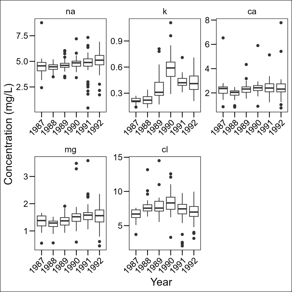
Now we can see the patterns for each element clearly! The scales parameter can be set to:
"fixed": Same scales for all panels (default)"free_x": Different scales for x-axis only"free_y": Different scales for y-axis only"free": Different scales for both axes
Controlling Layout
We can control how panels are arranged using the ncol or nrow parameters:
df_elements %>%
  ggplot(aes(x = year, y = concentration)) +
  geom_boxplot() +
  facet_wrap(~element, ncol = 2, scales = "free") +
  labs(x = "Year", y = "Concentration (mg/L)") +
  ggthemes::theme_base() +
  theme(axis.text.x = element_text(angle = 45, hjust = 1))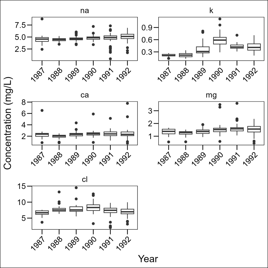
This gives us more control over the aspect ratio of our panels, which can be important when looking for specific patterns in the data.
Improving Facet Labels
The default labels (na, k, ca, etc.) aren’t very informative. We can create more readable labels using the labeller parameter:
abbrev_to_full <- c(
  "na" = "Sodium",
  "k" = "Potassium",
  "ca" = "Calcium",
  "mg" = "Magnesium",
  "cl" = "Chloride"
)

df_elements %>%
  ggplot(aes(x = year, y = concentration)) +
  geom_boxplot() +
  facet_wrap(
    ~element,
    ncol = 3, scales = "free",
    labeller = ggplot2::as_labeller(abbrev_to_full)
  ) +
  labs(x = "Year", y = "Concentration (mg/L)") +
  ggthemes::theme_base() +
  theme(axis.text.x = element_text(angle = 45, hjust = 1))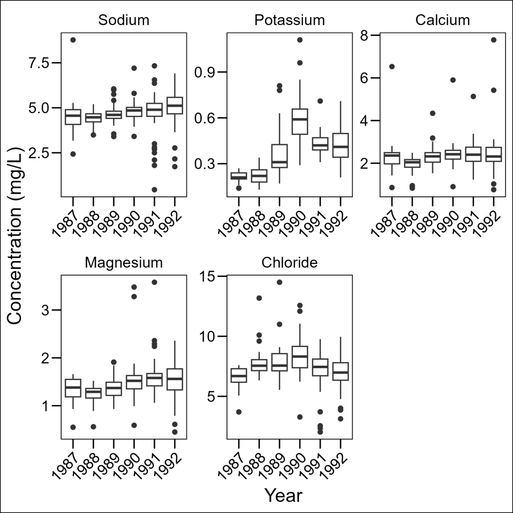
Much better! Note that we needed to use as_labeller() to convert our named vector to a function that the faceting system can use.
Okay, before moving onto combining plots, let’s save a wide version (1 row, 5 columns) of this plot.
plot_elements <- df_elements %>%
  ggplot(aes(x = year, y = concentration)) +
  geom_boxplot() +
  facet_wrap(~element,
    nrow = 1, scales = "free_y",
    labeller = ggplot2::as_labeller(abbrev_to_full)
  ) +
  labs(x = "Year", y = "Concentration (mg/L)") +
  ggthemes::theme_base() +
  theme(axis.text.x = element_text(angle = 45, hjust = 1))
Combining Multiple Plots
Sometimes we need to combine entirely different plots rather than just faceting within a single plot. The patchwork package makes this surprisingly easy.
We will follow the same steps as in the previous section to create a facetted plot for molecules:
df_molecules <- df %>%
  dplyr::select(sample_date, temp, p_h, no3_n, so4_s, nh4_n, po4_p, si_o2) %>%
  tidyr::pivot_longer(
    cols = c(no3_n, so4_s, nh4_n, po4_p, si_o2),
    names_to = "molecule",
    values_to = "concentration"
  ) %>%
  dplyr::mutate(
    molecule = factor(molecule, levels = c("no3_n", "so4_s", "nh4_n", "po4_p", "si_o2")),
    year = factor(lubridate::year(sample_date))
  )

molec_abbrev_to_full <- c(
  "no3_n" = "Nitrate",
  "so4_s" = "Sulfate",
  "nh4_n" = "Ammonium",
  "po4_p" = "Phosphate",
  "si_o2" = "Silica"
)

plot_molecules <- df_molecules %>%
  ggplot(aes(x = year, y = concentration)) +
  geom_boxplot() +
  facet_wrap(
    ~molecule,
    nrow = 1, scales = "free",
    labeller = ggplot2::as_labeller(molec_abbrev_to_full)
  ) +
  labs(
    x = "Year",
    y = "Concentration (mg/L)"
  ) +
  ggthemes::theme_base() +
  theme(axis.text.x = element_text(angle = 45, hjust = 1))
And now comes the lovely magic of patchwork. When loaded in, it will add new functionality to the common arithmetic operators (i.e.+, /) to glue plots together. This provides a seamless way to build larger figures.
With patchwork, you can:
- Use
/to stack plots vertically - Use
|to arrange plots horizontally - Use
+to add plots in a grid-filling order - Use parentheses to control grouping:
(plot1 | plot2) / plot3
For our purposes, since we are working with two wide plots, let’s stack them vertically one on top of the other:
library(patchwork)

# Combine vertically with the / operator
plot_elements / plot_molecules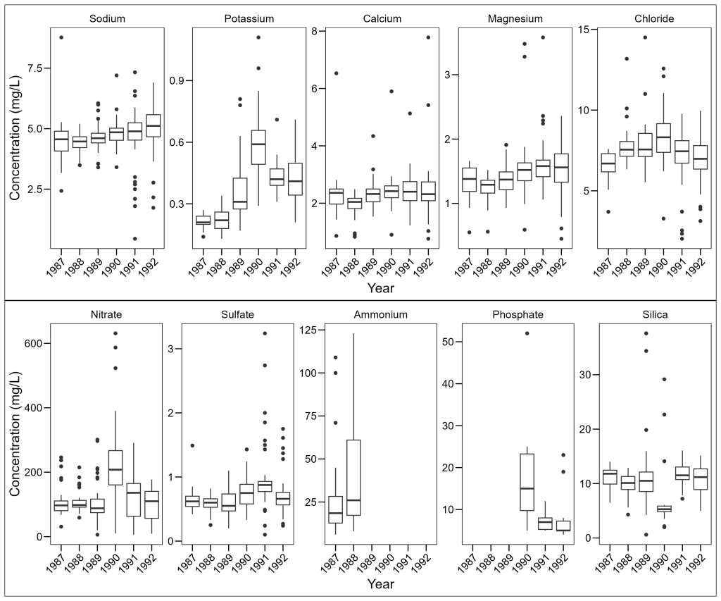
Adding Plot Annotations
For publications, we often need to label panels with letters or numbers. Patchwork makes this easy too:
(plot_elements / plot_molecules) +
  plot_annotation(tag_levels = "A")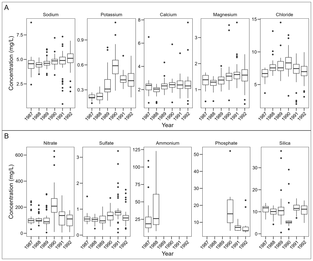
The tag_levels parameter can be:
"A"for uppercase letters (A, B, C, …)"a"for lowercase letters (a, b, c, …)"1"for numbers (1, 2, 3, …)"I"for uppercase Roman numerals (I, II, III, …)"i"for lowercase Roman numerals (i, ii, iii, …)
You are invited to visit the patchwork website to find out more about combining your plots together in more complex ways by visiting this link.