Geographical Mapping
Spatial visualization is fundamental in ecology and evolutionary biology for understanding species distributions, habitat preferences, and spatial patterns in biological data. This article explores techniques for creating geographical maps using R, demonstrating these concepts with a dataset on American pika populations from Niwot Ridge, Colorado.
Introduction to Geospatial Plotting
Geospatial visualization is essential in ecology and evolutionary biology for several reasons:
- Understanding species distributions and habitat preferences
- Identifying spatial patterns in biological data
- Visualizing environmental gradients
- Communicating field study locations and sampling designs
- Analyzing spatial relationships between different variables
Creating effective geographical visualizations requires understanding several key concepts:
- Coordinate systems and their transformations
- Map projections and their properties
- Spatial data structures
- Integration of different data types (points, polygons, rasters)
The Dataset: Niwot Ridge American Pika
We’ll be working with data from a study of American pikas (Ochotona princeps) at Niwot Ridge, Colorado. The dataset includes stress hormone measurements from pika fecal samples collected between June and September 2018, along with spatial information about sampling locations.
Let’s load the required packages and examine the data:
library(tidyverse)
library(lterdatasampler) # for the data
library(ggmap)           # for map-based visualization
library(sf)              # for spatial data handling
library(viridis)         # for color palettes

# Load the data
df_pikas <- lterdatasampler::nwt_pikas
str(df_pikas)
tibble [109 × 8] (S3: tbl_df/tbl/data.frame)
$ date : Date[1:109], format: "2018-06-08" "2018-06-08" "2018-06-08" "2018-06-13" ...
$ site : Factor w/ 3 levels "Cable Gate","Long Lake",..: 1 1 1 3 3 3 3 3 3 3 ...
$ station : Factor w/ 20 levels "Cable Gate 1",..: 1 2 3 14 15 16 17 18 19 9 ...
$ utm_easting : num [1:109] 451373 451411 451462 449317 449342 ...
$ utm_northing : num [1:109] 4432963 4432985 4432991 4434093 4434141 ...
$ sex : Factor w/ 1 level "male": 1 1 1 1 1 NA 1 NA 1 1 ...
$ concentration_pg_g: num [1:109] 11563 10629 10924 10414 13531 ...
$ elev_m : num [1:109] 3343 3353 3358 3578 3584 ...The dataset contains the following variables:
- date: Observation date of the fecal sample
- site: Location where the sample was collected within Niwot Ridge
- station: Specific sampling station
- utm_easting: GPS East-West coordinate (UTM NAD83, Zone 13)
- utm_northing: GPS North-South coordinate (UTM NAD83, Zone 13)
- sex: Sex of the observed pika
- concentration_pg_g: Glucocorticoid metabolite concentration
- elev_m: Elevation in meters
Coordinate Systems and Spatial Data Processing
One of the most critical aspects of geographical mapping is handling coordinate systems correctly. Our data comes with coordinates in the Universal Transverse Mercator (UTM) system, but we’ll need to work with different coordinate systems for various purposes.
Converting to a Spatial Object
First, we’ll convert our data frame into a spatial object using the sf (Simple Features) package:
# Convert to sf object
df_pikas <- st_as_sf(x = nwt_pikas,
                     coords = c("utm_easting", "utm_northing"))
df_pikas
Simple feature collection with 109 features and 6 fields
Geometry type: POINT
Dimension: XY
Bounding box: xmin: 448884 ymin: 4432963 xmax: 451617 ymax: 4435616
CRS: NA
# A tibble: 109 × 7
date site station sex concentration_pg_g elev_m geometry
<date> <fct> <fct> <fct> <dbl> <dbl> <POINT>
1 2018-06-08 Cable Gate Cable Gate 1 male 11563. 3343. (451373 4432963)
2 2018-06-08 Cable Gate Cable Gate 2 male 10629. 3353. (451411 4432985)
3 2018-06-08 Cable Gate Cable Gate 3 male 10924. 3358. (451462 4432991)
4 2018-06-13 West Knoll West Knoll 3 male 10414. 3578. (449317 4434093)
5 2018-06-13 West Knoll West Knoll 4 male 13531. 3584. (449342 4434141)
6 2018-06-13 West Knoll West Knoll 5 NA 7799. 3595. (449323 4434273)
7 2018-06-13 West Knoll West Knoll 6 male 4715. 3603. (449243 4434156)
8 2018-06-13 West Knoll West Knoll 7 NA 2087. 3616. (449223 4434233)
9 2018-06-13 West Knoll West Knoll 8 male 12899. 3606. (449244 4434292)
10 2018-06-13 West Knoll West Knoll 10 male 11329. 3567. (449438 4434201)This conversion creates a geometry column containing points instead of separate coordinate columns. Note the CRS: NA line. At this stage, the points don’t have any information about their coordinate reference system (CRS).
Understanding Coordinate Reference Systems
A Coordinate Reference System (CRS) is fundamental in spatial data handling. It defines:
- How the Earth’s 3D surface is represented in 2D (spatial projection)
- How the Earth’s shape is modeled (datum)
- The units of measurement
- The orientation of the coordinate axes
For more information please visit: https://www.earthdatascience.org/courses/earth-analytics/spatial-data-r/intro-to-coordinate-reference-systems/
Our data uses the UTM system, specifically Zone 13 with the NAD83 datum, which can be found by looking up the metadata of this dataset with ?nwt_pikas.
We can set this using the EPSG code 26913:
# Set the coordinate reference system to UTM 13N
EPSG_CODE_UTM_13N <- 26913
df_pikas <- st_set_crs(df_pikas, EPSG_CODE_UTM_13N)
df_pikas
Simple feature collection with 109 features and 6 fields
Geometry type: POINT
Dimension: XY
Bounding box: xmin: 448884 ymin: 4432963 xmax: 451617 ymax: 4435616
Projected CRS: NAD83 / UTM zone 13N
# A tibble: 109 × 7
date site station sex concentration_pg_g elev_m geometry
* <date> <fct> <fct> <fct> <dbl> <dbl> <POINT [m]>
1 2018-06-08 Cable Gate Cable Gate 1 male 11563. 3343. (451373 4432963)
2 2018-06-08 Cable Gate Cable Gate 2 male 10629. 3353. (451411 4432985)
3 2018-06-08 Cable Gate Cable Gate 3 male 10924. 3358. (451462 4432991)
4 2018-06-13 West Knoll West Knoll 3 male 10414. 3578. (449317 4434093)
5 2018-06-13 West Knoll West Knoll 4 male 13531. 3584. (449342 4434141)
6 2018-06-13 West Knoll West Knoll 5 NA 7799. 3595. (449323 4434273)
7 2018-06-13 West Knoll West Knoll 6 male 4715. 3603. (449243 4434156)
8 2018-06-13 West Knoll West Knoll 7 NA 2087. 3616. (449223 4434233)
9 2018-06-13 West Knoll West Knoll 8 male 12899. 3606. (449244 4434292)
10 2018-06-13 West Knoll West Knoll 10 male 11329. 3567. (449438 4434201)Notice the updated Projected CRS: NAD83 / UTM zone 13N which confirms the assignment of a CRS has been successful.
Transforming Between Coordinate Systems
For web mapping and integration with various mapping services, we need to transform our coordinates to the WGS84 system (EPSG:4326), which uses latitude and longitude. This is the standard system used by GPS and most online mapping services:
# Transform to WGS84 (standard GPS latitude/longitude)
EPSG_CODE_UNIVERSAL_GPS <- 4326
df_pikas <- st_transform(df_pikas, EPSG_CODE_UNIVERSAL_GPS)
df_pikas
Simple feature collection with 109 features and 6 fields
Geometry type: POINT
Dimension: XY
Bounding box: xmin: -105.5993 ymin: 40.0455 xmax: -105.5672 ymax: 40.06931
Geodetic CRS: WGS 84
# A tibble: 109 × 7
date site station sex concentration_pg_g elev_m geometry
* <date> <fct> <fct> <fct> <dbl> <dbl> <POINT [°]>
1 2018-06-08 Cable Gate Cable Gate 1 male 11563. 3343. (-105.57 40.0455)
2 2018-06-08 Cable Gate Cable Gate 2 male 10629. 3353. (-105.5696 40.0457)
3 2018-06-08 Cable Gate Cable Gate 3 male 10924. 3358. (-105.569 40.04576)
4 2018-06-13 West Knoll West Knoll 3 male 10414. 3578. (-105.5942 40.05556)
5 2018-06-13 West Knoll West Knoll 4 male 13531. 3584. (-105.5939 40.05599)
6 2018-06-13 West Knoll West Knoll 5 NA 7799. 3595. (-105.5942 40.05718)
7 2018-06-13 West Knoll West Knoll 6 male 4715. 3603. (-105.5951 40.05612)
8 2018-06-13 West Knoll West Knoll 7 NA 2087. 3616. (-105.5954 40.05682)
9 2018-06-13 West Knoll West Knoll 8 male 12899. 3606. (-105.5951 40.05735)
10 2018-06-13 West Knoll West Knoll 10 male 11329. 3567. (-105.5928 40.05654)And once again we can confirm an appropriate transformation due to the presence of this line: Geodetic CRS: WGS 84.
One last thing before plotting, let’s extract out the longitude and latitude to their own columns:
df_pikas$lon <- st_coordinates(df_pikas)[, 1]
df_pikas$lat <- st_coordinates(df_pikas)[, 2]
Plotting without a map underlay
Before overlaying our spatial data onto a geographical map, it’s often insightful to visualize the distribution of our sampling locations on their own. This helps us understand the spatial spread and any inherent patterns in the coordinates themselves. We can achieve this using a standard scatter plot, where the x and y axes represent longitude and latitude, respectively.
A modified scatterplot
In this step, we use ggplot2 to create a scatter plot of the pika sampling stations. We map longitude to the x-axis and latitude to the y-axis. The points are colored by the site variable to distinguish between the different general sampling areas. We use shape = 21 for the points, which allows us to have a fill color (determined by site) and a separate outline color (set to black for better visibility, especially when we later add a map background). The coord_sf(crs = EPSG_CODE_UNIVERSAL_GPS) function is important here; it ensures that the plot respects the geographic nature of the coordinates, using an appropriate aspect ratio so that distances are represented consistently across the plot.
ggplot(df_pikas, aes(x = lon, y = lat, fill = site)) +
  # shape 21 and color black are an excellent choice when we want fill to define the color
  # of the points rather than "color". In this case, the outline of the points is black, for
  # better visibility down the line when we add the map background.
  geom_point(
    size = 2,
    shape = 21,
    color = "black"
  ) +
  labs(
    title = "Location of Sampling Stations (no background map)",
    x = "Longitude (Degrees)",
    y = "Latitude (Degrees)",
    fill = "Site"
  ) +
  # Changes latitude and longitude to degrees
  coord_sf(crs = EPSG_CODE_UNIVERSAL_GPS) +
  ggthemes::theme_base()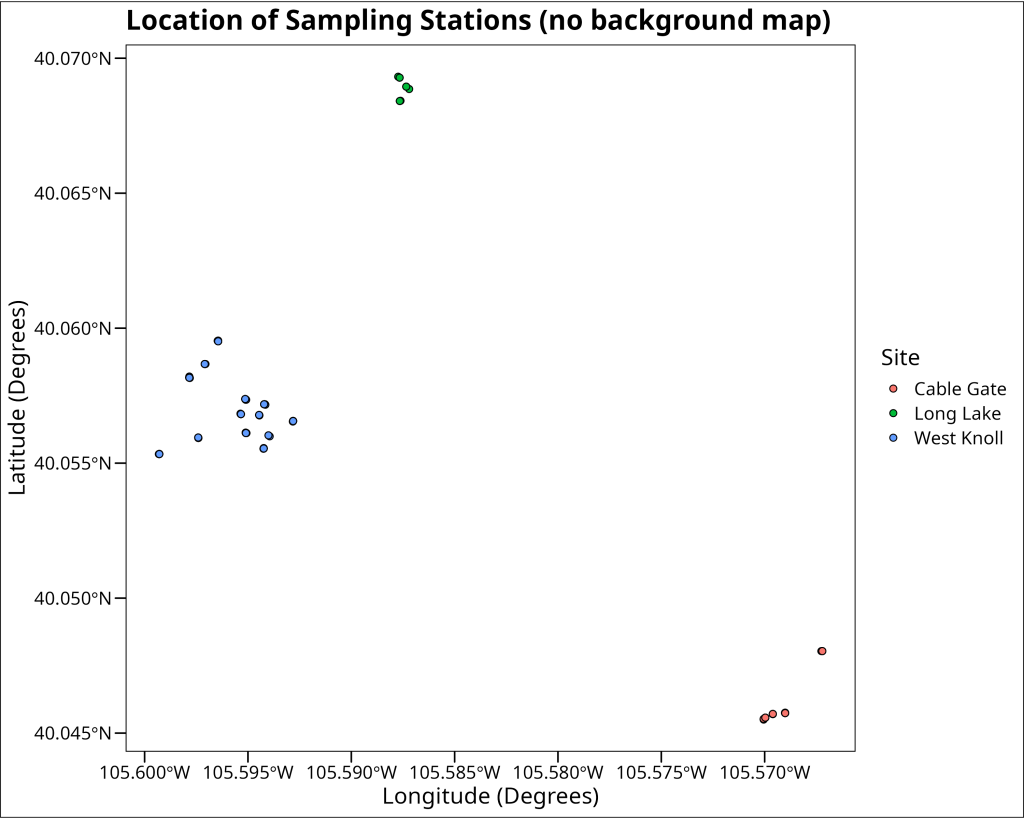
Plotting with a map underlay
While the scatter plot gives us a sense of the spatial arrangement of our data points, adding a geographical map as a background layer provides crucial context. This underlay helps us relate our sampling locations to real-world geographical features like terrain, water bodies, and human-made structures.
Bounding Boxes
To fetch an appropriate map tile to serve as our background, we first need to tell the mapping service the specific geographical area we’re interested in. This is typically done by defining a ‘bounding box’ – a rectangular area defined by its minimum and maximum longitude (west and east boundaries) and minimum and maximum latitude (south and north boundaries). In the R code provided in the accompanying R script, we calculate this bounding box directly from the range of our pika data coordinates, adding a small buffer (0.01 degrees) to ensure all our points are comfortably within the map area. The code looks like this:
# Get the bounding box for the map
bbox <- c(
  left = min(df_pikas$lon) - 0.01,
  bottom = min(df_pikas$lat) - 0.01,
  right = max(df_pikas$lon) + 0.01,
  top = max(df_pikas$lat) + 0.01
)
Map APIs
Various online services, often called Application Programming Interfaces (APIs), provide map tiles that we can integrate into our plots. For this example, we use Stamen Maps, accessed via the ggmap package. Some services may require you to register for an API key; here, ggmap::register_stadiamaps() is used to set up access using a pre-obtained key. The get_stadiamap() function then fetches the actual map tile. We provide our calculated bbox (bounding box), specify the maptype (e.g., stamen_terrain for a terrain map), and set a zoom level to control the map’s detail. The R code to fetch the map is:
# Register for Stadiamaps API key (replace with your actual key if needed)
# You might need to create an account at stadiamaps.com to get a free key.
# ggmap::register_stadiamaps("YOUR_API_KEY_HERE")
# For this example, a key is pre-loaded in the R script.

# Get the map from Stadia Maps (which hosts Stamen tiles)
map <- get_stadiamap(
  bbox,
  maptype = "stamen_terrain",
  zoom = 12
)
The ggmap() function then takes this downloaded map object and prepares it as a base layer for a ggplot2 plot. We can then add our data points (e.g., using geom_point()) on top of this map, ensuring we use coord_sf() again to maintain correct spatial alignment. This results in our pika sampling locations being displayed over a contextual terrain map.
ggmap::ggmap(map) +
  geom_point(
    data = df_pikas,
    aes(x = lon, y = lat, fill = site),
    size = 2,
    shape = 21,
    color = "black"
  ) +
  coord_sf(crs = EPSG_CODE_UNIVERSAL_GPS) +
  labs(
    title = "Location of Sampling Stations (with map background)",
    x = "Longitude (Degrees)",
    y = "Latitude (Degrees)",
    color = "Site",
    fill = "Site"
  ) +
  ggthemes::theme_base()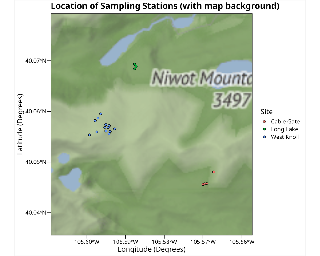
Adding contours
Beyond just plotting points, we can visualize the spatial density of our sampling locations. This can help identify clusters or areas with a higher concentration of observations. One way to achieve this is by plotting High-Density Regions (HDR) as contour lines. The ggdensity package provides geom_hdr_lines(), which calculates and draws these density contours. In the code, the probs argument within geom_hdr_lines specifies the probability levels for which to draw contours (e.g., probs = c(0.5, 0.95) would draw lines enclosing 50% and 95% of the highest density regions). We use aes(color = after_stat(probs)) to map these probability levels to the color aesthetic, allowing us to distinguish different density contours. The resulting plot overlays these density lines on the map along with the individual sampling points, giving a clearer picture of where pika observations are most concentrated.
ggmap::ggmap(map) +
  ggdensity::geom_hdr_lines(
    data = df_pikas,
    # Here we define the percentiles to be used for the HDR lines
    probs = c(0.01, 0.05, 0.1, 0.2, 0.5, 0.8, 0.9, 0.95, 0.99),
    # after_stat() is used to access the calculated values from the geom_hdr_lines() function
    # probs is an internal reference to the probs argument we defined above
    aes(x = lon, y = lat, color = after_stat(probs)),
    alpha = 0.7
  ) +
  geom_point(
    data = df_pikas,
    aes(x = lon, y = lat, fill = site),
    size = 2,
    shape = 21,
    color = "black"
  ) +
  coord_sf(crs = EPSG_CODE_UNIVERSAL_GPS) +
  labs(
    title = "Location of Sampling Stations (with HDR lines)",
    x = "Longitude (Degrees)",
    y = "Latitude (Degrees)",
    color = "Percentile Geospatial Density",
    fill = "Site"
  ) +
  ggthemes::theme_base() +
  # Make the legend taller
  theme(legend.key.height = unit(1, "cm"))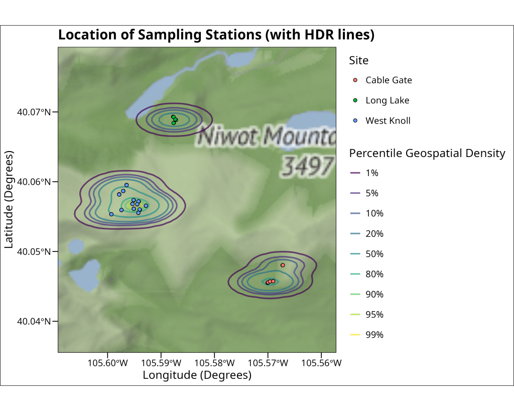
Concluding Points
In this article, we’ve walked through the essential steps for creating geographical maps in R with ggplot2 and associated spatial packages. We covered the importance of Coordinate Reference Systems (CRS), how to transform spatial data, and various methods for visualization—from simple scatter plots of coordinates to overlaying points and density contours on rich basemaps fetched from online APIs. Effective geographical mapping is a powerful skill, enabling ecologists and evolutionary biologists to explore spatial patterns, communicate research findings clearly, and gain deeper insights from their data. With these foundational techniques, you are now better equipped to incorporate spatial context into your data visualizations.

End of Module
Excellent plotting! You’ve gotten an overall taste for the grammar of graphics with ggplot2 and can now create compelling visualizations. Having explored and visualized your data, you’re ready to dive into formal statistical analysis. The next module will cover fundamental statistical tests and modeling techniques commonly used in ecology and evolutionary biology, all implemented within R.
Whenever you’re ready, click the link below to proceed to the next module: