Introduction to the ggplot2 Package
When working with ecological data, visualization is crucial for understanding patterns and communicating results. The ggplot2 package provides a powerful and flexible way to create publication-quality plots in R. The “gg” in ggplot2 stands for “Grammar of Graphics,” which means it follows a systematic approach to building plots layer by layer.
The Grammar of Graphics
Think of creating a plot like building with LEGO blocks. Each piece (or layer) builds upon the previous one to create the final structure. In ggplot2, we build plots using seven fundamental layers:
- Data: The dataset you want to visualize
- Aesthetics: How your data maps to visual properties (x and y positions, colors, sizes, etc.)
- Geometries: The type of plot you want to create (points, lines, bars, etc.)
- Facets: How to split your plot into multiple panels
- Statistics: Statistical transformations of your data
- Coordinates: The coordinate system for your plot
- Theme: The overall appearance of your plot
For now, we’ll focus on the first three layers (data, aesthetics, and geometries) to create a basic plot. We’ll explore the other layers in more detail in the next section.
The + Operator in ggplot2
Unlike other tidyverse functions that use the pipe operator (%>%), ggplot2 uses the + operator to add layers to your plot. This is because we’re not transforming data (like with pipes), but rather building up a plot by adding visual elements:
# Adding multiple layers with +
ggplot(data = df_vert) +
  geom_point(aes(x = length_1_mm, y = weight_g)) +  # First layer
  geom_smooth(aes(x = length_1_mm, y = weight_g))   # Second layer
Each + adds a new layer to your plot, building it up piece by piece. This is different from the pipe operator, which passes data from one function to another.
Creating Your First Plot
Let’s create a simple scatter plot using data about vertebrates from the Andrews Forest Long Term Ecological Research site. First, we need to load our required packages and data:
# Load required packages
library(tidyverse) # Automatically loads ggplot2
library(lterdatasampler) # Contains the data we'll use

# Load the data
df_vert <- lterdatasampler::and_vertebrates

# Look at the structure of our data
str(df_vert)
tibble [32,209 × 16] (S3: tbl_df/tbl/data.frame)
$ year : num [1:32209] 1987 1987 1987 1987 1987 ...
$ sitecode : chr [1:32209] "MACKCC-L" "MACKCC-L" "MACKCC-L" "MACKCC-L" ...
$ section : chr [1:32209] "CC" "CC" "CC" "CC" ...
$ reach : chr [1:32209] "L" "L" "L" "L" ...
$ pass : num [1:32209] 1 1 1 1 1 1 1 1 1 1 ...
$ unitnum : num [1:32209] 1 1 1 1 1 1 1 1 1 1 ...
$ unittype : chr [1:32209] "R" "R" "R" "R" ...
$ vert_index : num [1:32209] 1 2 3 4 5 6 7 8 9 10 ...
$ pitnumber : num [1:32209] NA NA NA NA NA NA NA NA NA NA ...
$ species : chr [1:32209] "Cutthroat trout" "Cutthroat trout" "Cutthroat trout" "Cutthroat trout" ...
$ length_1_mm: num [1:32209] 58 61 89 58 93 86 107 131 103 117 ...
$ length_2_mm: num [1:32209] NA NA NA NA NA NA NA NA NA NA ...
$ weight_g : num [1:32209] 1.75 1.95 5.6 2.15 6.9 5.9 10.5 20.6 9.55 13 ...
$ clip : chr [1:32209] "NONE" "NONE" "NONE" "NONE" ...
$ sampledate : Date[1:32209], format: "1987-10-07" "1987-10-07" "1987-10-07" "1987-10-07" ...
$ notes : chr [1:32209] NA NA NA NA ...Now, let’s create a scatter plot showing the relationship between fish length and weight. We’ll build this plot layer by layer:
# Create the plot
ggplot() +  # Start with an empty plot
  geom_point(  # Add points
    data = df_vert,  # Specify the data
    aes(  # Define the aesthetics
      x = length_1_mm,  # Map length to x-axis
      y = weight_g  # Map weight to y-axis
    )
  )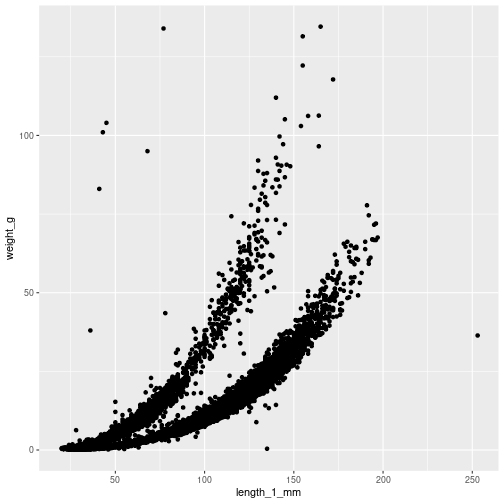
Let’s break down what we just did:
ggplot(): Creates a new plot objectgeom_point(): Adds points to the plot (other options includegeom_line(),geom_bar(), etc.)data = df_vert: Specifies which dataset to useaes(): Defines how variables in the data map to visual properties
Two Ways to Specify Data
There are two ways to specify which data to use in your plot:
- Global data: Specify the data once in the
ggplot()function. This data will be used by all layers unless overridden:
# Using global data
ggplot(data = df_vert) +  # Data specified here
geom_point(aes(x = length_1_mm, y = weight_g)) # No need to specify data again- Layer-specific data: Specify the data in each layer. This is useful when you want to use different datasets in different layers:
# Using layer-specific data
ggplot() +  # No global data
  geom_point(
    data = df_vert,  # Data specified here
    aes(x = length_1_mm, y = weight_g)
  )
Key Points to Remember
- ggplot2 uses a layered approach to building plots
- Each layer adds a new element to your plot
- Layers are added using the
+operator (not the pipe%>%) - You can specify data globally in
ggplot()or locally in each layer - The basic structure is:
ggplot() + geom_*()
In the next section, we’ll explore how to make this basic plot more informative and visually appealing by adding more layers and customizing its appearance.