Iterative Plotting
Iterative plotting is a key process in data visualization using ggplot2. It involves building plots step-by-step, adding and refining elements one at a time. This approach allows for careful control over the final appearance of the figure, making it easier to troubleshoot issues and progressively enhance the plot towards publication quality. By observing the outcome of each change, you can ensure that every component (like axis labels, colors, themes, and legends) contributes effectively to a clear and aesthetically pleasing visual representation of your data.
Iterative Plotting for Easy and Aesthetic Figures
When making a plot, it’s best to build your plot iteratively: make a version of the plot, observe the outcome, and then make changes or add an element and replot. This helps us catch mistakes as they occur (typos, color problems, etc.) and prevents small problems from creating big, difficult-to-diagnose problems in a long set of code.
For our example, let’s use the example from the Intro to ggplot2 section, looking at salamanders and trout:
# Load required packages
library(tidyverse)
library(lterdatasampler)

# Load the data
df_vert <- lterdatasampler::and_vertebrates

# Look at the structure of our data
str(df_vert)
tibble [32,209 × 16] (S3: tbl_df/tbl/data.frame)
$ year : num [1:32209] 1987 1987 1987 1987 1987 ...
$ sitecode : chr [1:32209] "MACKCC-L" "MACKCC-L" "MACKCC-L" "MACKCC-L" ...
$ section : chr [1:32209] "CC" "CC" "CC" "CC" ...
$ reach : chr [1:32209] "L" "L" "L" "L" ...
$ pass : num [1:32209] 1 1 1 1 1 1 1 1 1 1 ...
$ unitnum : num [1:32209] 1 1 1 1 1 1 1 1 1 1 ...
$ unittype : chr [1:32209] "R" "R" "R" "R" ...
$ vert_index : num [1:32209] 1 2 3 4 5 6 7 8 9 10 ...
$ pitnumber : num [1:32209] NA NA NA NA NA NA NA NA NA NA ...
$ species : chr [1:32209] "Cutthroat trout" "Cutthroat trout" "Cutthroat trout" "Cutthroat trout" ...
$ length_1_mm: num [1:32209] 58 61 89 58 93 86 107 131 103 117 ...
$ length_2_mm: num [1:32209] NA NA NA NA NA NA NA NA NA NA ...
$ weight_g : num [1:32209] 1.75 1.95 5.6 2.15 6.9 5.9 10.5 20.6 9.55 13 ...
$ clip : chr [1:32209] "NONE" "NONE" "NONE" "NONE" ...
$ sampledate : Date[1:32209], format: "1987-10-07" "1987-10-07" "1987-10-07" "1987-10-07" ...
$ notes : chr [1:32209] NA NA NA NA ...Building a Basic Plot
Let’s again plot a scatter plot of length_1_mm vs. weight_g. We’ll start out with the absolute minimum number of arguments:
- The call to
ggplot() - The mappings (i.e., what variables we want on the x- and y-axis)
- The `geom_` function denoting what *type* of plot we’re going for
ggplot() +
  geom_point(
    data = df_vert,
    mapping = aes(x = length_1_mm, y = weight_g)
  )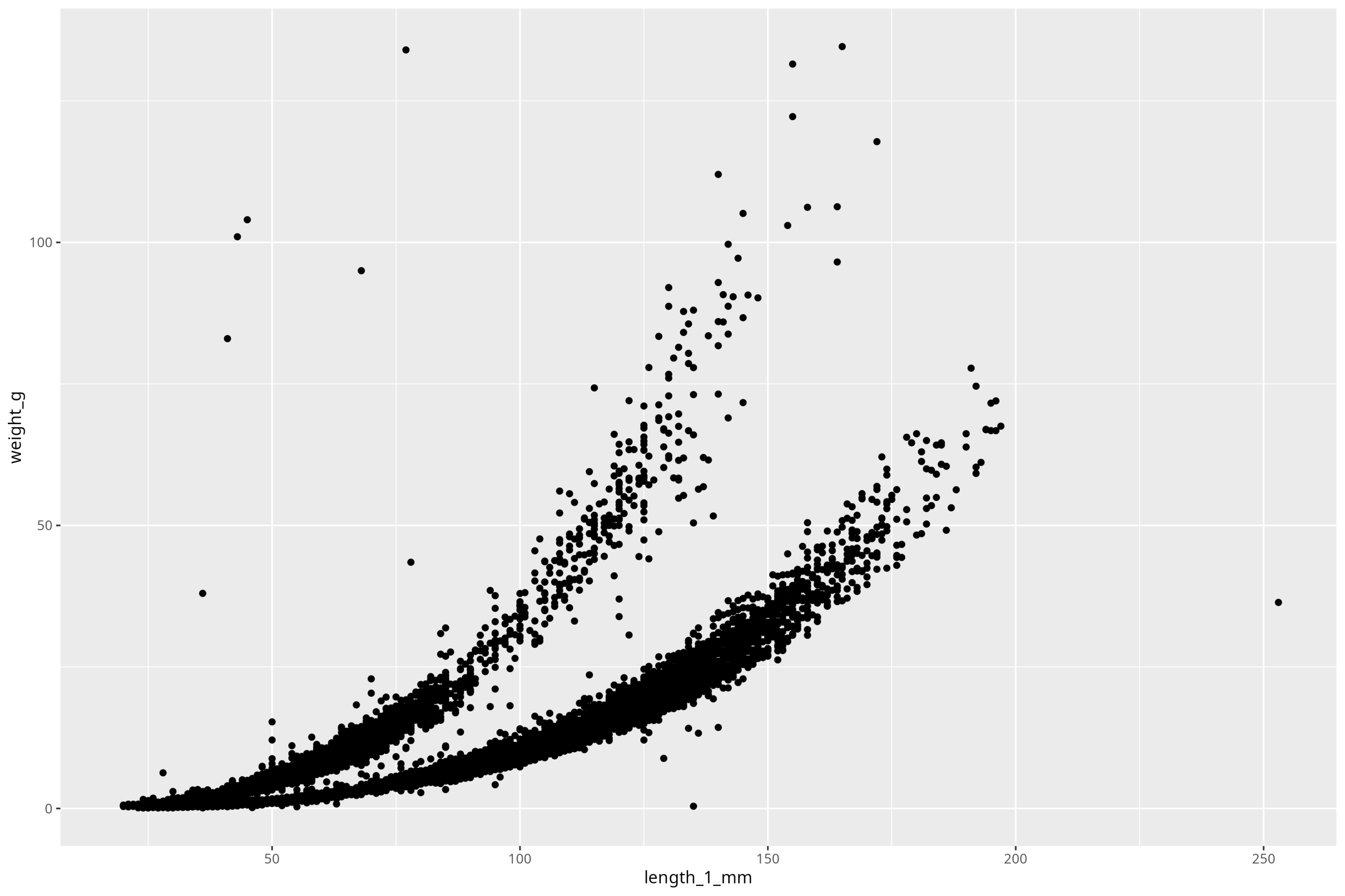
Ok, so we see our plot! Perfect. So the first thing to do, before we make any stylistic additions, is to deal with the components of the plot that are must-haves to have a legible, complete plot. First step is the axis labels. Also, note that units ALWAYS go on axis labels. So to iteratively work up our plot, we’ll add that one component on by using the new function labs():
ggplot() +
  geom_point(
    data = df_vert,
    mapping = aes(x = length_1_mm, y = weight_g)
  ) +
  labs(x = "Length (mm)", y = "Weight (g)")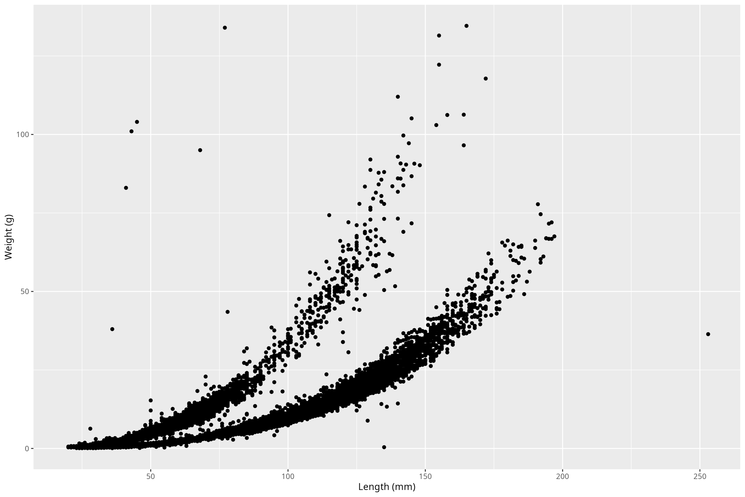
Climate Change Sentinels
Fish and Amphibians, such as the ones in our example dataset, are often among the first taxa to be affected by disturbances to their ecosystems. While those in our example dataset are from a long-term study site in Oregon, USA, there is in fact a long-term ecological research program on amphibians and other vertebrates in Algonquin Park, ON, run in part by EEB professor Dr. Njal Rollinson.

The research performed in Algonquin Park and at U of T specifically tackles tough questions like the adaptive significance of ectotherm biology and the effects anthropogenic change has on these organisms.
OK, good. Now, this is more aesthetic than anything, but we might want to change the appearance of this plot away from this ugly grey background and grid lines. This is a more personal decision regarding what exactly you want your plot to look like, along with the fact that different fields have different conventions regarding how they want their plot to look. In biology, we almost always don’t want a grey background, nor horizontal grid lines. There are lots of themes available in the ggplot2 package to choose from that will help us make a plot that aligns with our goals. For example, we could use the theme_classic() like so:
ggplot() +
  geom_point(
    data = df_vert,
    mapping = aes(x = length_1_mm, y = weight_g)
  ) +
  labs(x = "Length (mm)", y = "Weight (g)") +
  theme_classic()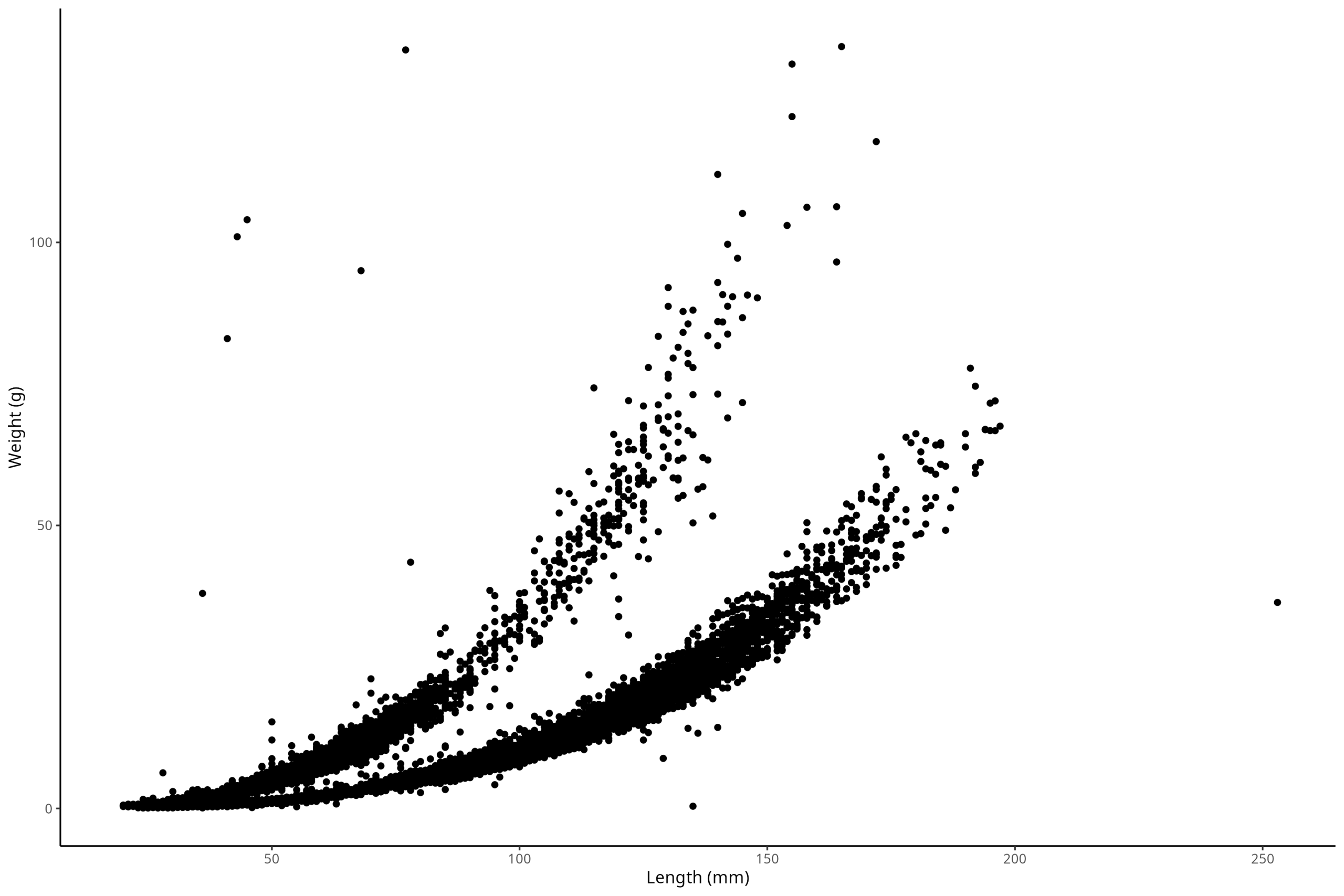
But I personally prefer a different theme that comes in the ggthemes package, which we can install now:
#install.packages("ggthemes")
library(ggthemes)
Now, let’s use the theme_base() option, which will give us a very classic look and feel to the plot:
ggplot() +
  geom_point(
    data = df_vert,
    mapping = aes(x = length_1_mm, y = weight_g)
  ) +
  labs(x = "Length (mm)", y = "Weight (g)") +
  ggthemes::theme_base()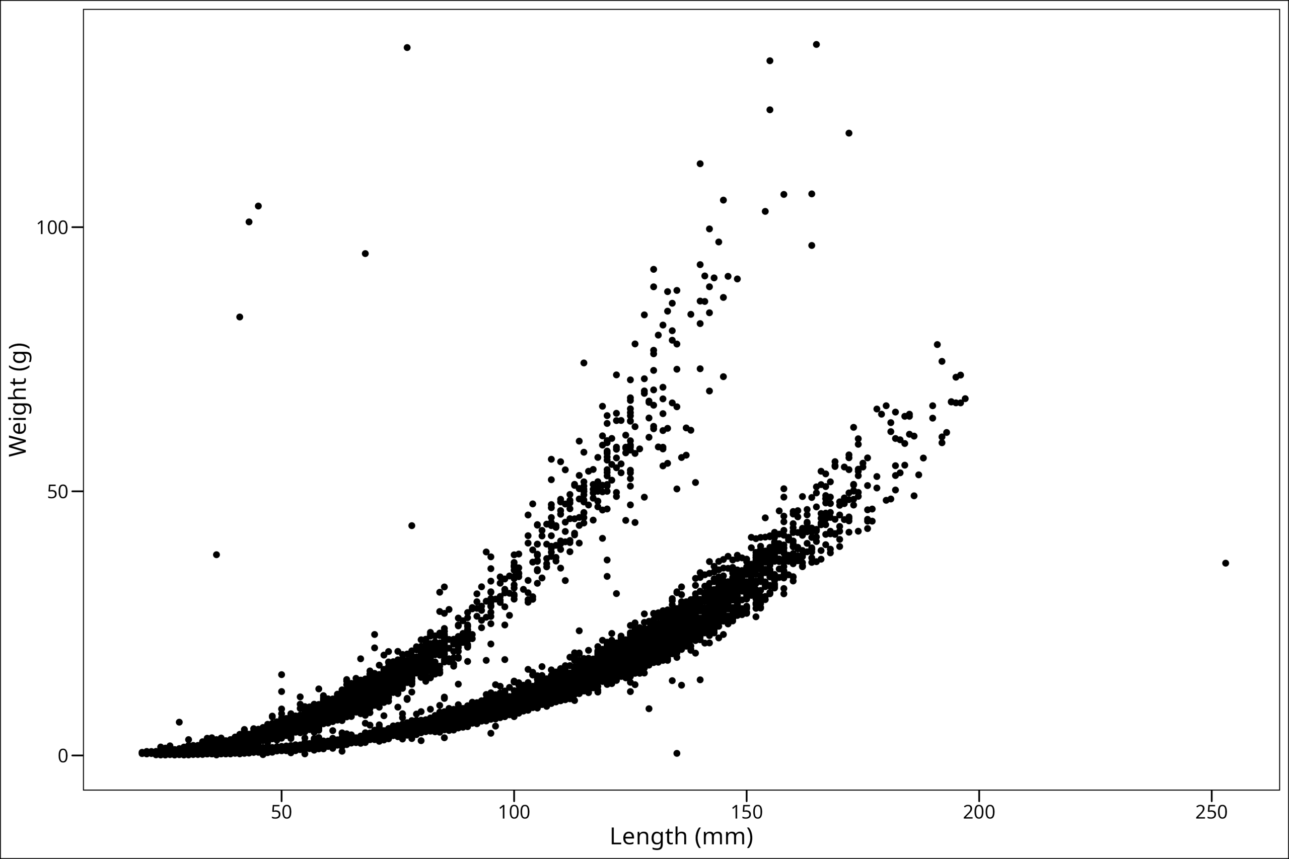
Perfect! You’ll also notice the text sizes are now larger, which is preferable for reading on a screen or in a report.
Adding Color & Shape
Let’s now add a color to our points and change the shape we’re using as well.
Note: Arguments like this go outside the aes() section when you are setting a static value (e.g., all points red). If you were mapping a variable to color, it would go inside aes(). To start, we’ll just make the color red, change the shape to my personal favorite, and up the size just a smidge:
ggplot() +
  geom_point(
    data = df_vert,
    mapping = aes(x = length_1_mm, y = weight_g),
    colour = "red", # The color of the points
    shape = 21, # The shape of the points
    size = 2 # The size of the points
  ) +
  labs(x = "Length (mm)", y = "Weight (g)") +
  ggthemes::theme_base()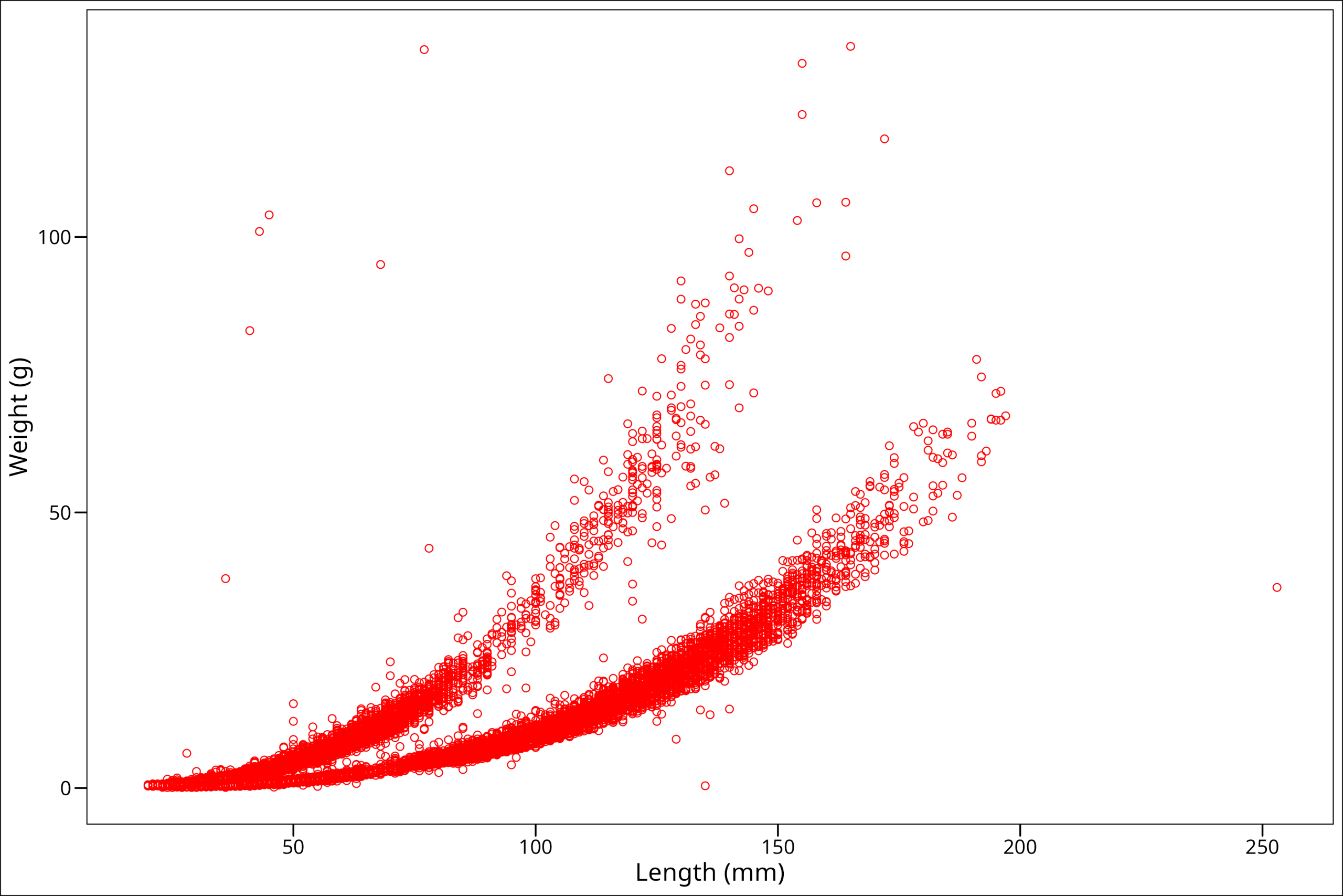
So this is interesting! We see that somehow we’ve made our points hollow on the inside. Well, that has to do with the shape we picked. There are lots of options for shapes we could use, and we can see all our options in this handy graphic here:
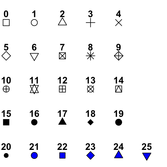
So notice we specified point # 21. This point has a dark outer circle and a fill color in the middle. When using a point option with an outer boundary and an inner fill, the argument colour refers to the outer boundary line, and the argument fill refers to the color filling inside. Let’s see how this works by changing colour = "black" and fill = "red":
ggplot() +
  geom_point(
    data = df_vert,
    mapping = aes(x = length_1_mm, y = weight_g),
    colour = "black", # The color of the points' outline
    fill = "red", # The fill color of the points
    shape = 21, # The shape of the points
    size = 2 # The size of the points
  ) +
  labs(x = "Length (mm)", y = "Weight (g)") +
  ggthemes::theme_base()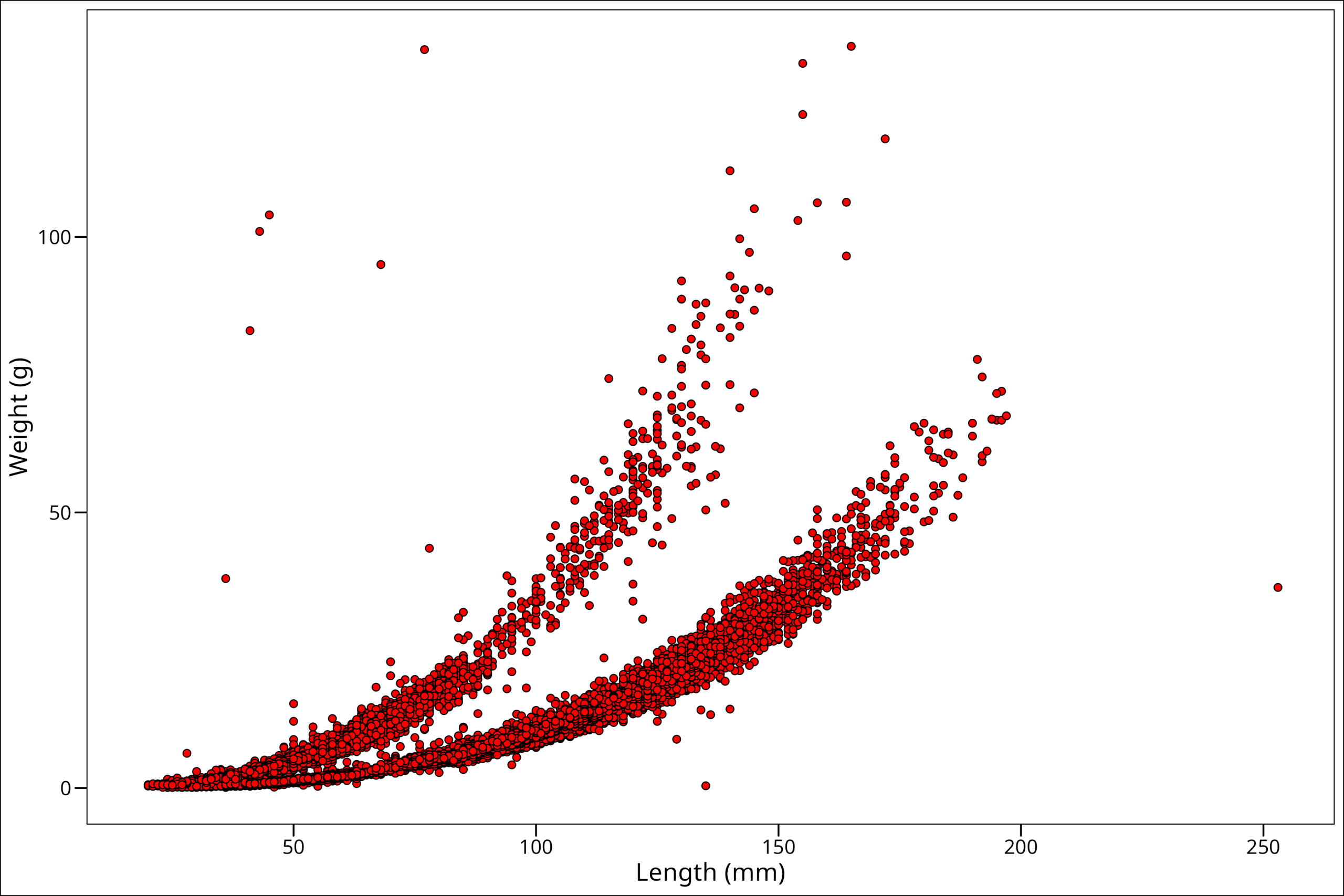
Okay, so this looks like maybe more along the lines of what we were expecting! One more thing though is that some spots on the plot have a high density of points. To better identify those high-density areas, let’s make our points slightly transparent with the alpha command:
ggplot() +
  geom_point(
    data = df_vert,
    mapping = aes(x = length_1_mm, y = weight_g),
    colour = "black", # The color of the points' outline
    fill = "red", # The fill color of the points
    shape = 21, # The shape of the points
    alpha = 0.2, # The transparency of the points
    size = 2 # The size of the points
  ) +
  labs(x = "Length (mm)", y = "Weight (g)") +
  ggthemes::theme_base()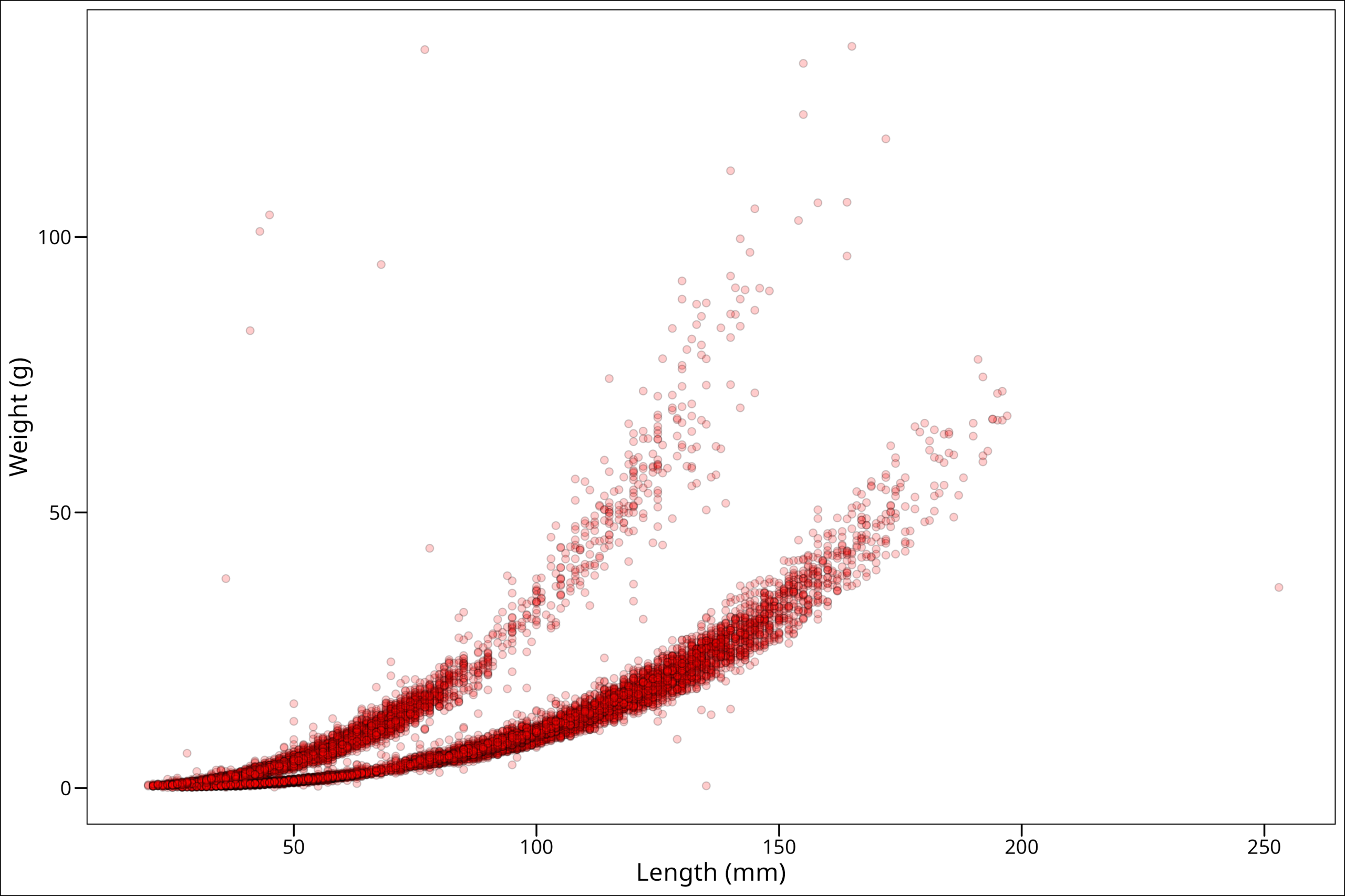
And now we can see where there really are many points.
Variables by Group
One of the most useful things to be able to do is group our points by either shape, fill, color, or even size to show some difference between them. For example, in these data, we can see two very clearly different trends. To map a variable to an aesthetic (like fill color), we place that mapping inside the aes() function.
ggplot() +
  geom_point(
    data = df_vert,
    mapping = aes(
      x = length_1_mm, # Maps the x-axis to the length_1_mm variable
      y = weight_g, # Maps the y-axis to the weight_g variable
      fill = species # Maps the fill color to the species variable
    ),
    colour = "black", # The color of the points' outline
    shape = 21, # The shape of the points
    alpha = 0.4, # The transparency of the points
    size = 2 # The size of the points
  ) +
  labs(x = "Length (mm)", y = "Weight (g)") +
  ggthemes::theme_base()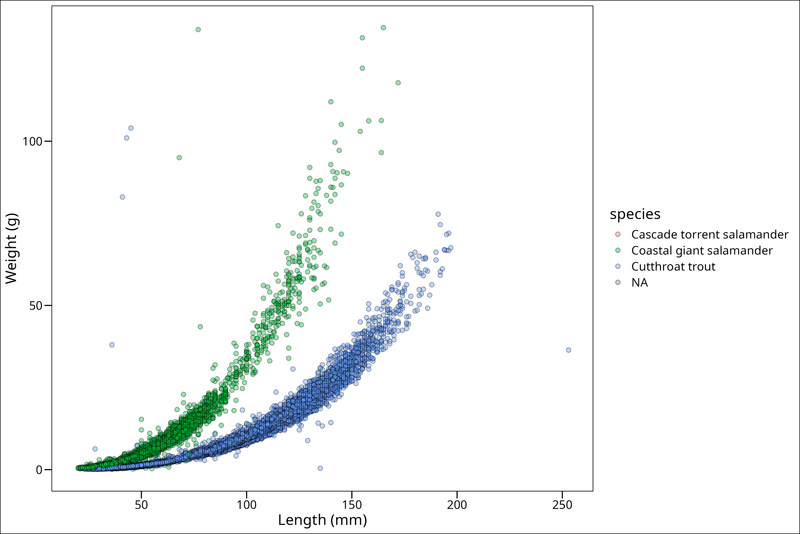
Looking at this plot, this brings up a few common tasks we might want to do from here. First of all, it’s clear from this plot that the vast majority of these points are only from two species. We can see how the samples in our dataframe fall out with the simple table() function:
table(df_vert$species)Cascade torrent salamander Coastal giant salamander Cutthroat trout
15 11758 20433 So there are only 15 of the Cascade salamanders, and we know from our plot, at least a few NAs. Now the following decisions depend HIGHLY on what message one is trying to communicate with the plot, but we could imagine a scenario wherein perhaps it’s actually important to have the Cascade salamander points be visible. But, it’s clear from our plot, we may first want to get rid of NAs, at least for this plot. So let’s do that via a filter(). Learn more on that here.
df_filtered <- df_vert %>%
  filter(!is.na(species))

df_filtered
# A tibble: 32,206 × 16
year sitecode section reach pass unitnum unittype vert_index pitnumber species length_1_mm length_2_mm weight_g clip sampledate notes
<dbl> <chr> <chr> <chr> <dbl> <dbl> <chr> <dbl> <dbl> <chr> <dbl> <dbl> <dbl> <chr> <date> <chr>
1 1987 MACKCC-L CC L 1 1 R 1 NA Cutthroat trout 58 NA 1.75 NONE 1987-10-07 NA
2 1987 MACKCC-L CC L 1 1 R 2 NA Cutthroat trout 61 NA 1.95 NONE 1987-10-07 NA
3 1987 MACKCC-L CC L 1 1 R 3 NA Cutthroat trout 89 NA 5.6 NONE 1987-10-07 NA
4 1987 MACKCC-L CC L 1 1 R 4 NA Cutthroat trout 58 NA 2.15 NONE 1987-10-07 NA
5 1987 MACKCC-L CC L 1 1 R 5 NA Cutthroat trout 93 NA 6.9 NONE 1987-10-07 NA
6 1987 MACKCC-L CC L 1 1 R 6 NA Cutthroat trout 86 NA 5.9 NONE 1987-10-07 NA
7 1987 MACKCC-L CC L 1 1 R 7 NA Cutthroat trout 107 NA 10.5 NONE 1987-10-07 NA
8 1987 MACKCC-L CC L 1 1 R 8 NA Cutthroat trout 131 NA 20.6 NONE 1987-10-07 NA
9 1987 MACKCC-L CC L 1 1 R 9 NA Cutthroat trout 103 NA 9.55 NONE 1987-10-07 NA
10 1987 MACKCC-L CC L 1 1 R 10 NA Cutthroat trout 117 NA 13 NONE 1987-10-07 NA
# ℹ 32,196 more rowsOkay, let’s go ahead and make our plot again:
ggplot() +
  geom_point(
    data = df_filtered,
    mapping = aes(x = length_1_mm, y = weight_g, fill = species),
    colour = "black", shape = 21, alpha = 0.4, size = 2
  ) +
  labs(x = "Length (mm)", y = "Weight (g)") +
  ggthemes::theme_base()
This looks better. Now, perhaps one way we could make the Cascade salamander points stand out is by making them significantly larger in size. We can do that by scaling our size manually according to the levels of our grouping variable. Note that scaling, whether manually or otherwise, can be done for all grouping aesthetics such as fill, color, alpha, etc. Further documentation on this topic can be found on the ggplot2 website.
Since we see that the Cascade Torrent Salamander is first in our list of the legend, that means we will need to make the larger size first up in our values argument in scale_size_manual(). Remember to also map size to species within aes():
ggplot() +
  geom_point(
    data = df_filtered,
    mapping = aes(
      x = length_1_mm, y = weight_g,
      fill = species, size = species # Map size to species here
    ),
    colour = "black", shape = 21, alpha = 0.4
  ) +
  labs(x = "Length (mm)", y = "Weight (g)") +
  ggthemes::theme_base() +
  # Size of the data points
  # Vector of sizes for each unique value of the species variable
  # Order corresponds to the factor levels of 'species'
  scale_size_manual(values = c("Cascade torrent salamander" = 4,
                               "Coastal giant salamander" = 2,
                               "Cutthroat trout" = 2)) # Assign sizes by name for clarity
Hmm. We can vaguely see in the bottom corner the points we want, but they’re hard to see. Why is this? Well, the problem here is that ggplot() will automatically plot data in the order they are passed. We can see by a quick head() call …
head(df_filtered)# A tibble: 6 × 16
year sitecode section reach pass unitnum unittype vert_index pitnumber species length_1_mm length_2_mm weight_g clip sampledate notes
<dbl> <chr> <chr> <chr> <dbl> <dbl> <chr> <dbl> <dbl> <chr> <dbl> <dbl> <dbl> <chr> <date> <chr>
1 1987 MACKCC-L CC L 1 1 R 1 NA Cutthroat trout 58 NA 1.75 NONE 1987-10-07 NA
2 1987 MACKCC-L CC L 1 1 R 2 NA Cutthroat trout 61 NA 1.95 NONE 1987-10-07 NA
3 1987 MACKCC-L CC L 1 1 R 3 NA Cutthroat trout 89 NA 5.6 NONE 1987-10-07 NA
4 1987 MACKCC-L CC L 1 1 R 4 NA Cutthroat trout 58 NA 2.15 NONE 1987-10-07 NA
5 1987 MACKCC-L CC L 1 1 R 5 NA Cutthroat trout 93 NA 6.9 NONE 1987-10-07 NA
6 1987 MACKCC-L CC L 1 1 R 6 NA Cutthroat trout 86 NA 5.9 NONE 1987-10-07 NA That the first species in the list is Cutthroat trout, and with a quick tail() call (tail() returns the last six rows instead of the first six) …
tail(df_filtered)# A tibble: 6 × 16
year sitecode section reach pass unitnum unittype vert_index pitnumber species length_1_mm length_2_mm weight_g clip sampledate notes
<dbl> <chr> <chr> <chr> <dbl> <dbl> <chr> <dbl> <dbl> <chr> <dbl> <dbl> <dbl> <chr> <date> <chr>
1 2012 MACKOG-U OG U 1 16 SC 2 NA Cascade torrent salamander 26 47 0.5 NONE 2012-09-07 NA
2 2013 MACKCC-L CC L 2 2 SC 12 NA Cascade torrent salamander 34 59 0.8 NONE 2013-09-03 NA
3 2013 MACKOG-U OG U 1 14 P 1 NA Cascade torrent salamander 41 71 NA NONE 2013-09-06 NA
4 2017 MACKCC-L CC L 1 2 SC 29 NA Cascade torrent salamander 39 67 1.3 NONE 2017-09-05 NA
5 2017 MACKOG-M OG M 1 8 SC 20 NA Cascade torrent salamander 30 51 0.65 NONE 2017-09-07 NA
6 2019 MACKOG-M OG M 1 8 SC 17 NA Cascade torrent salamander 28 52 0.8 NONE 2019-09-04 Torrent salamander…we can see that the Coastal giant salamander is the last. That means that the Coastal giant salamander will be plotted after (i.e., “on top of”) our focal larger points. Luckily, this is an easy fix by simply rearranging the dataframe such that the focal species is the last one to be plotted. This can be accomplished with dplyr::arrange(). We’ll pass first the dataframe we’re working with, then the column we want to sort by. To check that this will work, let’s print the call to tail() from the dplyr::arrange() version of our dataframe.
tail(dplyr::arrange(df_filtered, species))# A tibble: 6 × 16
year sitecode section reach pass unitnum unittype vert_index pitnumber species length_1_mm length_2_mm weight_g clip sampledate notes
<dbl> <chr> <chr> <chr> <dbl> <dbl> <chr> <dbl> <dbl> <chr> <dbl> <dbl> <dbl> <chr> <date> <chr>
1 2019 MACKOG-U OG U 2 16 C 1 NA Cutthroat trout 45 47 1 NONE 2019-09-05 NA
2 2019 MACKOG-U OG U 2 16 C 2 NA Cutthroat trout 42 44 0.8 NONE 2019-09-05 NA
3 2019 MACKOG-U OG U 2 16 C 3 NA Cutthroat trout 46 48 1.1 NONE 2019-09-05 NA
4 2019 MACKOG-U OG U 2 16 C 4 1043522 Cutthroat trout 118 127 19.8 NONE 2019-09-05 NA
5 2019 MACKOG-U OG U 2 16 C 5 1043513 Cutthroat trout 89 95 7.4 NONE 2019-09-05 NA
6 2019 MACKOG-U OG U 2 16 C 6 1043521 Cutthroat trout 78 83 5.6 NONE 2019-09-05 NA That doesn’t work! That’s because dplyr::arrange() will automatically default to sorting alphabetically. Luckily, we can convert this column into a factor to change the order in a custom way. Let’s do so like this (and again check with tail()):
df_filtered %>%
  dplyr::arrange(factor(species,
    levels = c(
      "Cutthroat trout",
      "Coastal giant salamander",
      "Cascade torrent salamander"
    )
  )) %>%
  tail()
# A tibble: 6 × 16
year sitecode section reach pass unitnum unittype vert_index pitnumber species length_1_mm length_2_mm weight_g clip sampledate notes
<dbl> <chr> <chr> <chr> <dbl> <dbl> <chr> <dbl> <dbl> <chr> <dbl> <dbl> <dbl> <chr> <date> <chr>
1 2012 MACKOG-U OG U 1 16 SC 2 NA Cascade torrent salamander 26 47 0.5 NONE 2012-09-07 NA
2 2013 MACKCC-L CC L 2 2 SC 12 NA Cascade torrent salamander 34 59 0.8 NONE 2013-09-03 NA
3 2013 MACKOG-U OG U 1 14 P 1 NA Cascade torrent salamander 41 71 NA NONE 2013-09-06 NA
4 2017 MACKCC-L CC L 1 2 SC 29 NA Cascade torrent salamander 39 67 1.3 NONE 2017-09-05 NA
5 2017 MACKOG-M OG M 1 8 SC 20 NA Cascade torrent salamander 30 51 0.65 NONE 2017-09-07 NA
6 2019 MACKOG-M OG M 1 8 SC 17 NA Cascade torrent salamander 28 52 0.8 NONE 2019-09-04 Torrent salamanderAnd we see our friend the Cascade salamander is at the end. Now we don’t necessarily want to reassign our dataframe to take this rearranged form, so we can simply wrap our call to the dataframe df_filtered in our dplyr::arrange() function and see if that works:
ggplot() +
  geom_point(
    data = df_filtered %>%
      dplyr::arrange(factor(species,
        levels = c(
          "Cutthroat trout",
          "Coastal giant salamander",
          "Cascade torrent salamander"
        )
      )),
    mapping = aes(
      x = length_1_mm, y = weight_g,
      fill = species, size = species
    ),
    colour = "black", shape = 21, alpha = 0.4
  ) +
  labs(x = "Length (mm)", y = "Weight (g)") +
  ggthemes::theme_base() +
  scale_size_manual(values = c("Cascade torrent salamander" = 4,
                               "Coastal giant salamander" = 2,
                               "Cutthroat trout" = 2))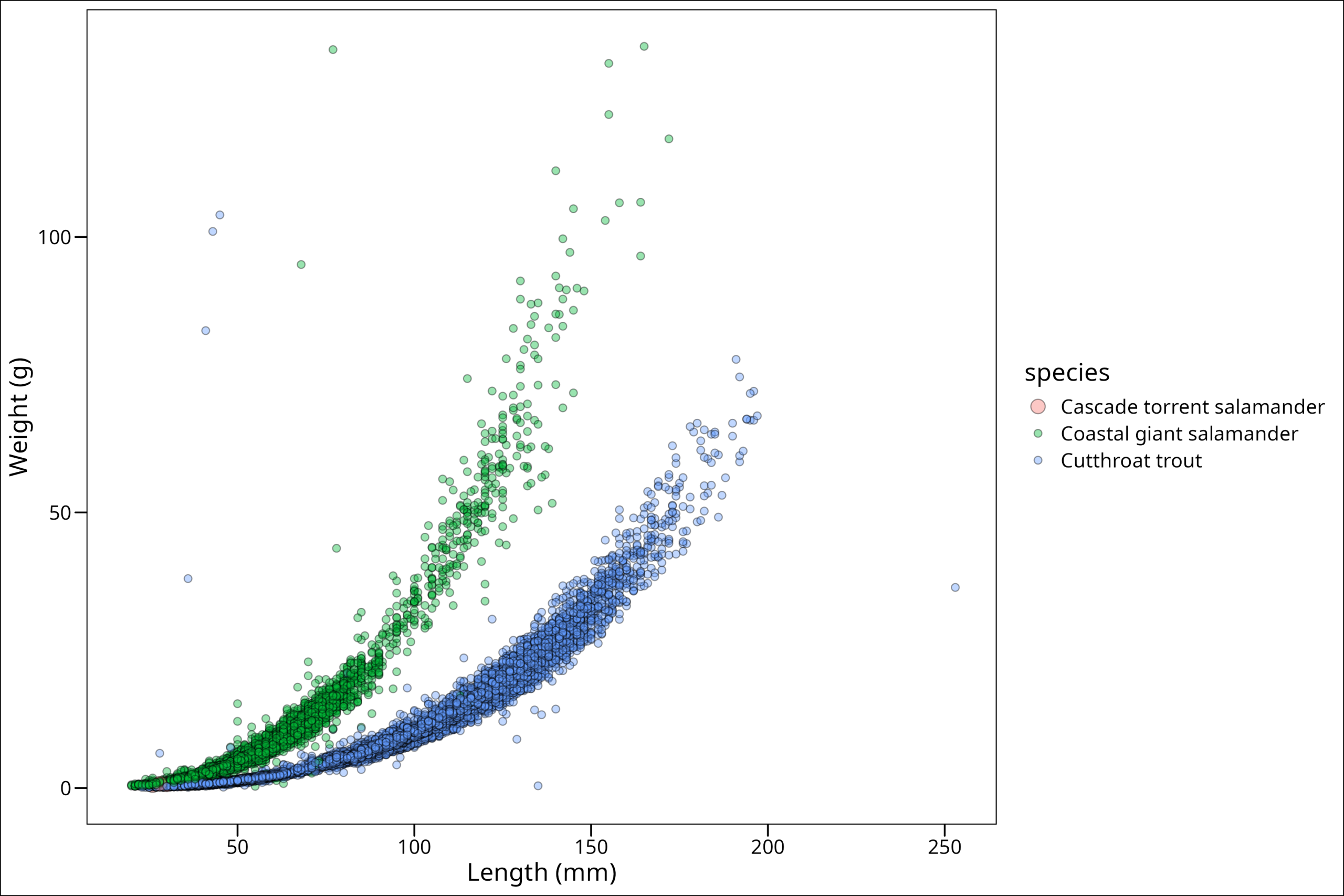
We can now see our Cascade salamander data points! While we could stop here, there are a few other things we can do. We can capitalize the legend title easily enough by simply adding it as the first argument in the scale_size_manual() function. We put it here since the size parameter is what’s being displayed in our plot legend for size:
ggplot() +
  geom_point(
    data = df_filtered %>%
      dplyr::arrange(factor(species,
        levels = c(
          "Cutthroat trout",
          "Coastal giant salamander",
          "Cascade torrent salamander"
        )
      )),
    mapping = aes(
      x = length_1_mm, y = weight_g,
      fill = species, size = species
    ),
    colour = "black", shape = 21, alpha = 0.4
  ) +
  labs(x = "Length (mm)", y = "Weight (g)") +
  ggthemes::theme_base() +
  scale_size_manual("Species", values = c("Cascade torrent salamander" = 4,
                                      "Coastal giant salamander" = 2,
                                      "Cutthroat trout" = 2))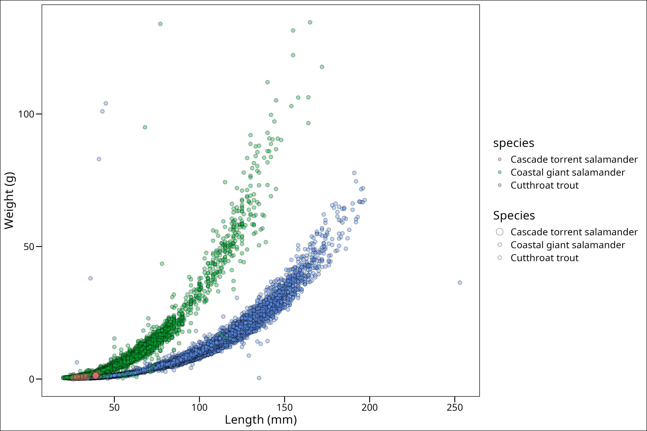
Ahh! Now we’ve run into a new problem. We have two legends! This is annoying. However, we can fix this, but first, let’s choose different colors; these are not my favorite. We can do that (in this case) with scale_fill_manual(). We use the fill because the color for all the points is black since it refers to the outer border of the points.
SIDE NOTE: Note that when making figures, when possible, choose colors that if printed in black and white are still differentiable, and that also are distinguishable for colorblind people.
Also, note that often the easiest way to add in specific colors (if you’re only using a handful of specific ones like we are here) is to pass the hexadecimal (hex) code for that color. If you have never heard of hex colors, essentially it’s a code of alphanumeric characters that form a specific color on the color wheel. Learn more on hex colors here.
ggplot() +
  geom_point(
    data = df_filtered %>%
      dplyr::arrange(factor(species,
        levels = c(
          "Cutthroat trout",
          "Coastal giant salamander",
          "Cascade torrent salamander"
        )
      )),
    mapping = aes(
      x = length_1_mm, y = weight_g,
      fill = species, size = species
    ),
    colour = "black", shape = 21, alpha = 0.8
  ) +
  labs(x = "Length (mm)", y = "Weight (g)") +
  ggthemes::theme_base() +
  scale_size_manual("Species", values = c("Cascade torrent salamander" = 4,
                                      "Coastal giant salamander" = 2,
                                      "Cutthroat trout" = 2)) +
  scale_fill_manual("Species", values = c("Cascade torrent salamander" = "#ffe119",
                                      "Coastal giant salamander" = "#f032e6",
                                      "Cutthroat trout" = "#42d4f4"))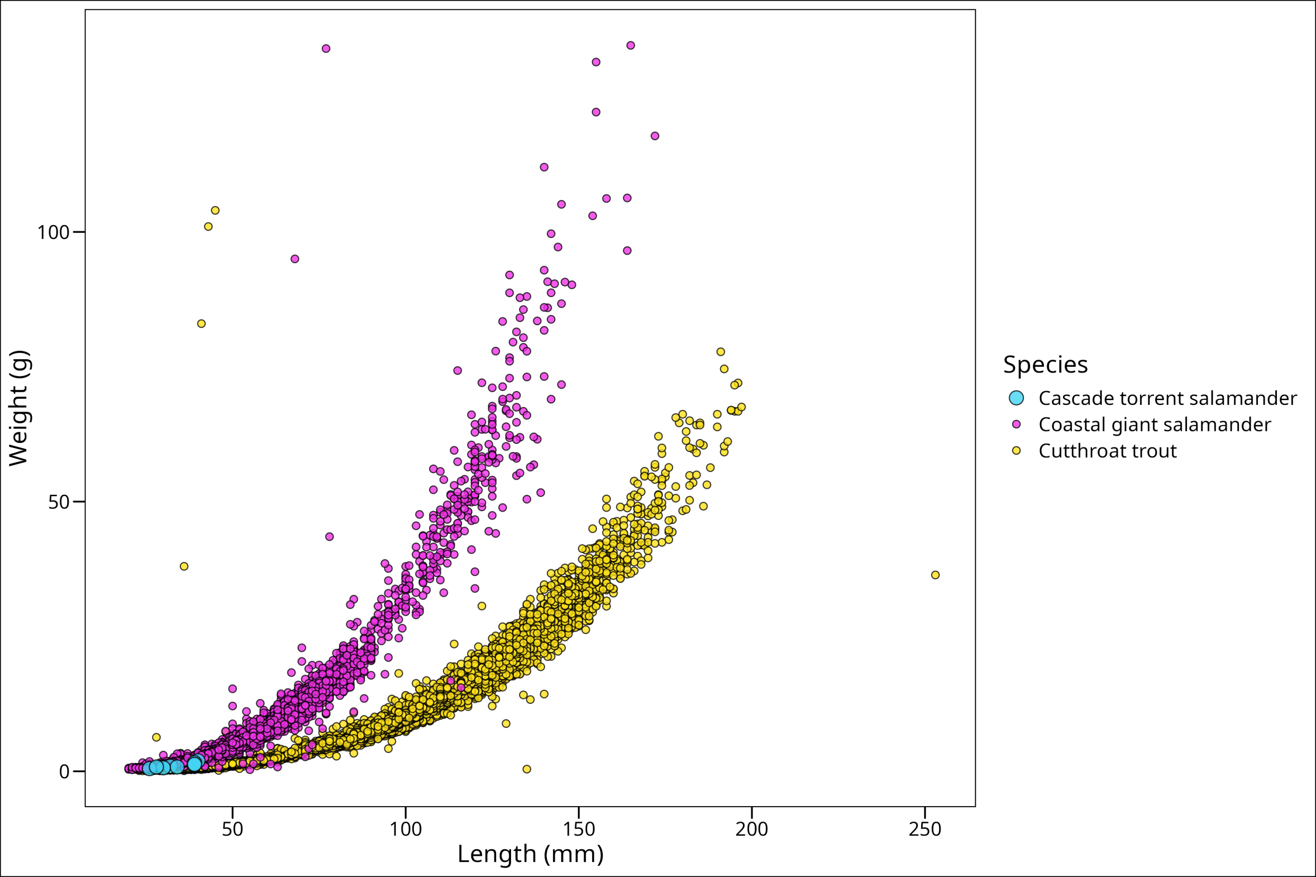
While these colors are harsh, they’re easy to see. We could choose others if we want to be more aesthetic 🙂 Also, we notice that our legend problem is gone! Why? Well, what created the problem before was having technically two different legends being asked for from our aes() arguments – size & fill. However, by manually providing values for both and then giving them the same legend title (“Species”), we fixed up the problem. On your own, try adding a different title for one of them and see what happens!.
Conforming Our Plot to Discipline/Journal Standards
Similar to citation styles, there are often discipline-specific protocols to follow when making plots. While the plot we’ve made here may look perfectly fine for our use in a class presentation or for an informal report, it’s important to consider these additional requirements when making a figure in a more formal context. As always, usually we are not the ones who get to make the calls on what these standards should be, so default to whatever your instructor/supervisor/discipline standard/journal submission guidelines outline as what they want.
Let’s use an example to show how we might go about this. Here are the journal format guidelines on figures for the journal Ecology. They will give a general idea for what type of guidelines you may want to follow.
Two common things that are asked are to move the legend and/or change the alignment of the x-axis text. All specific changes like this that fall outside of basic changes are usually done in the theme() call of the plot. If you’re looking for how to make small edits to a ggplot, you almost ALWAYS will need to make use of the theme. That reference is here in the ggplot2 documentation.
To change our legend position we’ll use the theme argument legend.position and for the axis text we’ll use the argument axis.text.x. So let’s do that one at a time (in our theme of working iteratively!). Starting with our previously existing plot, we’ll add a call to theme, and then make our call to the legend.position. Now we want to make sure that our legend does not cover any of the actual data being plotted, so we will simply have to try and find a place to put it, and if we can’t, content ourselves with it being outside of the plot box. The positioning of legend.position happens in two arguments, the first position being for the x-location, and the second for the y-location, with both of them representing proportions of the axis. Therefore, a value of c(0.1, 0.1) would put the legend in the bottom left corner. Let’s try the bottom right corner, c(0.8, 0.1), which means 80% from the left and 10% from the bottom.
ggplot() +
  geom_point(
    data = df_filtered %>%
      dplyr::arrange(factor(species,
        levels = c(
          "Cutthroat trout",
          "Coastal giant salamander",
          "Cascade torrent salamander"
        )
      )),
    mapping = aes(
      x = length_1_mm, y = weight_g,
      fill = species, size = species
    ),
    colour = "black", shape = 21, alpha = 0.8
  ) +
  labs(x = "Length (mm)", y = "Weight (g)") +
  ggthemes::theme_base() +
  scale_size_manual("Species", values = c("Cascade torrent salamander" = 4,
                                      "Coastal giant salamander" = 2,
                                      "Cutthroat trout" = 2)) +
  scale_fill_manual("Species", values = c("Cascade torrent salamander" = "#ffe119",
                                      "Coastal giant salamander" = "#f032e6",
                                      "Cutthroat trout" = "#42d4f4")) +
  theme(legend.position = c(0.8, 0.15))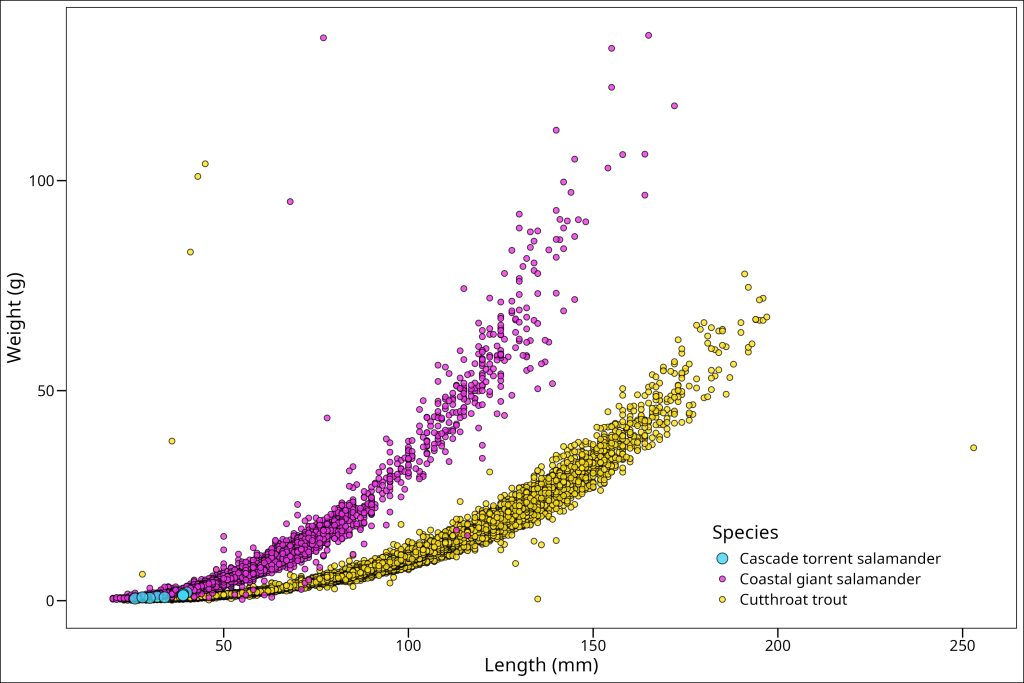
That will work well enough for now! Let’s move on to changing the orientation of the x-axis text. This is most often required if you’re plotting a time-series with years on the x-axis, as they will take up quite a bit of space if all displayed, so are rotated 90 degrees so they don’t overlap. We don’t have that here, however, we’ll still rotate ours 90 degrees here for practice using axis.text.x = element_text(angle = 90).
ggplot() +
  geom_point(data = (df_filtered %>%
               dplyr::arrange(factor(species,
                        levels = c("Cutthroat trout",
                                "Coastal giant salamander",
                                "Cascade torrent salamander")))),
            mapping = aes(x = length_1_mm, y = weight_g,
                        fill = species, size = species),
            colour = "black", shape = 21, alpha = 0.8)+
  labs(x = "Length (mm)", y = "Weight (g)") +
  ggthemes::theme_base() +
  scale_size_manual("Species", values = c("Cascade torrent salamander" = 4,
                                      "Coastal giant salamander" = 2,
                                      "Cutthroat trout" = 2)) +
  scale_fill_manual("Species", values = c("Cascade torrent salamander" = "#ffe119",
                                      "Coastal giant salamander" = "#f032e6",
                                      "Cutthroat trout" = "#42d4f4")) +
  theme(
    legend.position = c(0.8, 0.15),
    axis.text.x = element_text(angle = 90, vjust = 0.5, hjust=1)
  )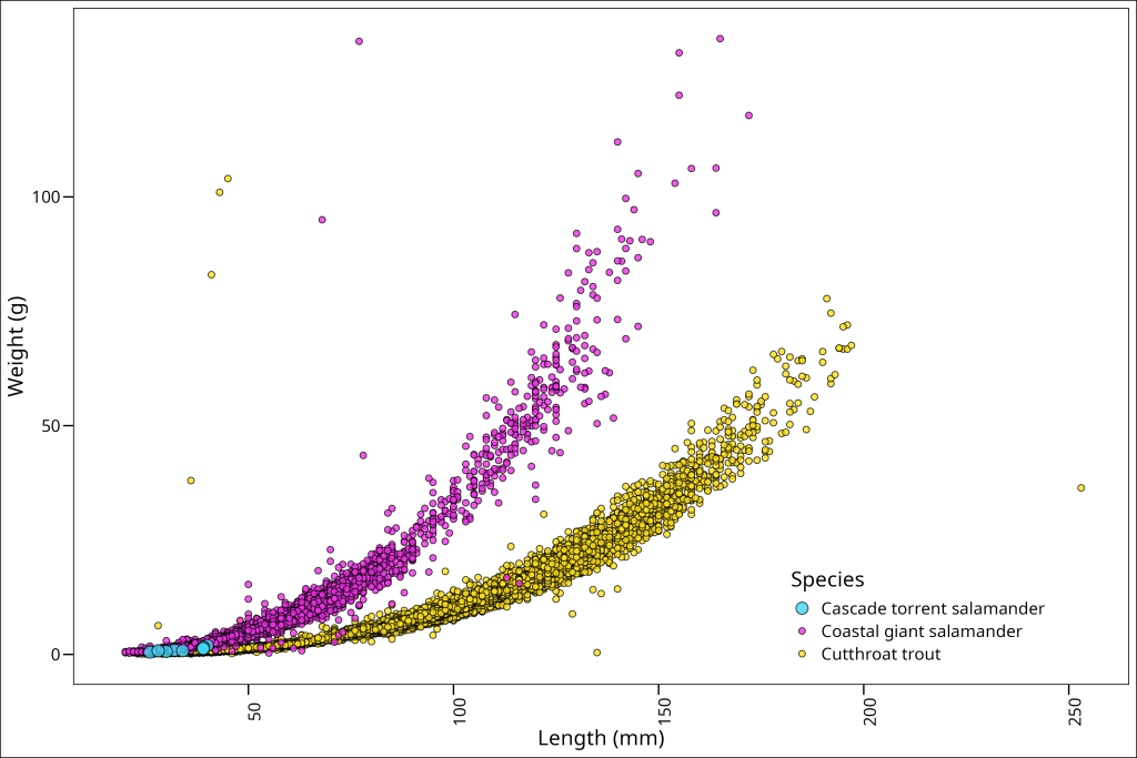
Okay, that worked, but we can now see that the numbers don’t quite line up with the axis ticks. What should we do about this? Well, we can simply adjust them vertically (vjust) and horizontally (hjust) with respect to the text itself. For rotated text, vjust = 0.5 centers the text vertically on the tick, and hjust=1 aligns the end of the text with the tick mark.
ggplot() +
  geom_point(data = (df_filtered %>%
            dplyr::arrange(factor(species,
                        levels = c("Cutthroat trout",
                                "Coastal giant salamander",
                                "Cascade torrent salamander")))),
            mapping = aes(x = length_1_mm, y = weight_g,
                        fill = species, size = species),
            colour = "black", shape = 21, alpha = 0.8)+
  labs(x = "Length (mm)", y = "Weight (g)") +
  ggthemes::theme_base() +
  scale_size_manual("Species", values = c("Cascade torrent salamander" = 4,
                                      "Coastal giant salamander" = 2,
                                      "Cutthroat trout" = 2)) +
  scale_fill_manual("Species", values = c("Cascade torrent salamander" = "#ffe119",
                                      "Coastal giant salamander" = "#f032e6",
                                      "Cutthroat trout" = "#42d4f4")) +
  theme(
    legend.position = c(0.8, 0.15),
    axis.text.x = element_text(angle = 90, vjust = 0.5, hjust=1)
  )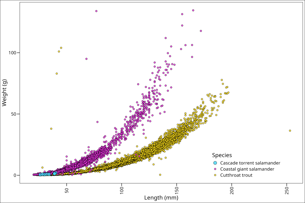
And voila!
For this plot, we are pretty much done! This looks good to go. This section has hopefully showed you how to iteratively add components to your plot to troubleshoot throughout and end up with a nice plot quickly. At this point, we can save our plot if we want to (and if it has been assigned to a variable). See info about saving plots here.