Parts of a Whole Comparisons
In ecological studies, we often need to visualize how different components contribute to a whole. These “parts of a whole” comparisons are essential for understanding community composition, species distributions, and ecosystem structure. This article explores common visualization techniques for these types of data, including treemaps, stacked barplots, and grouped barplots. We’ll demonstrate these techniques using a microbiome dataset from the human gut.
Introduction to Parts of a Whole Visualizations
When studying ecological communities, we often need to visualize how different species or taxonomic groups contribute to the overall community. These “parts of a whole” comparisons are fundamental in ecology for understanding:
- Community composition and structure
- Species diversity and evenness
- Changes in community composition across environmental gradients
- Temporal changes in community structure
Several visualization techniques are commonly used for these comparisons:
- Treemaps: Hierarchical visualizations that show proportions through nested rectangles
- Stacked barplots: Show the composition of different groups across categories
- Grouped barplots: Compare the same components across different groups
- Dendrograms: Show hierarchical relationships between samples based on their composition (not covered in this article)
In this article, we’ll explore these visualization techniques using a microbiome dataset from the human gut. We’ll focus on treemaps, stacked barplots, and grouped barplots, which are particularly useful for visualizing taxonomic composition data.
The Dataset: Human Gut Microbiome
We’ll be using the Baxter colorectal cancer (CRC) dataset (Baxter et al., 2016), which includes stool samples from patients with different disease statuses. This dataset is particularly interesting because it allows us to explore how the gut microbiome composition varies across different disease states.
The dataset consists of three main components that we’ll join together:
- Metadata: Information about each sample, including the disease status of the patient
- OTU Counts: The abundance of each Operational Taxonomic Unit (OTU) in each sample
- Taxonomic Information: The taxonomic classification of each OTU
Understanding Microbiome Data
Before diving into the visualizations, let’s understand some key concepts in microbiome research:
- Operational Taxonomic Units (OTUs): These are clusters of similar DNA sequences that are used as proxies for species in microbiome studies. OTUs are typically defined by a similarity threshold (often 97%) in their DNA sequences.
- Taxonomic Ranks: Biological classification follows a hierarchical structure: Kingdom → Phylum → Class → Order → Family → Genus → Species. In microbiome studies, we often focus on higher taxonomic ranks (like phylum) because species-level identification can be challenging.
- Relative Abundance: The proportion of each OTU or taxonomic group relative to the total community. This is often expressed as a percentage and is useful for comparing communities with different total abundances.
Data Preprocessing – Loading, Cleaning, and Joining Data
Let’s load and examine each component of our dataset. Since this is a tutorial on plotting, we will not go into too great detail on the cleaning steps performed here. You are welcome to start with the raw dataset yourself and see how each step impacts the outcome.
In this first step, we will download the metadata and subset it to only include the indentifier of the sample and their disease status.
# Load the metadata
df_metadata <- read_tsv(
  "https://raw.githubusercontent.com/riffomonas/minimalR-raw_data/refs/heads/master/baxter.metadata.tsv",
  col_types = cols(
    sample = col_character(),
    Dx_Bin = col_character()
  )
) %>%
  select(sample, Dx_Bin) %>%
  rename(disease_status = Dx_Bin) %>%
  drop_na(disease_status) %>% # Drop rows with NA disease status
  mutate(
    disease_status = fct_relevel(disease_status, c("Normal", "High Risk Normal", "Adenoma", "Adv Adenoma", "Cancer"))
  )

# Assess the counts of disease status
df_metadata %>%
  group_by(disease_status) %>%
  count()
# A tibble: 5 × 2
# Groups: disease_status [5]
disease_status n
<fct> <int>
1 Normal 122
2 High Risk Normal 50
3 Adenoma 89
4 Adv Adenoma 109
5 Cancer 120We can see that patients can be classified into 5 different disease statuses: Normal, High Risk Normal, Adenoma, Adv Adenoma, and Cancer. Next, we will load the OTU count information and pivot it into tidy (long) format.
# Load the OTU counts
df_otu <- read_tsv(
  "https://raw.githubusercontent.com/riffomonas/minimalR-raw_data/refs/heads/master/baxter.subsample.shared",
  col_types = cols(
    Group = col_character(),
    .default = col_double()
  )
) %>%
  select(Group, starts_with("Otu")) %>%
  rename(sample = Group) %>% # This will be used to join with the metadata
  pivot_longer(cols = starts_with("Otu"), names_to = "otu", values_to = "count")

df_otu %>% head()
# A tibble: 6 × 3
sample otu count
<chr> <chr> <dbl>
1 2003650 Otu000001 346
2 2003650 Otu000002 267
3 2003650 Otu000003 289
4 2003650 Otu000004 243
5 2003650 Otu000005 263
6 2003650 Otu000006 681The OTU counts data shows the raw abundance of each OTU in each sample. For example, in sample 2003650, OTU000001 has a count of 346, OTU000002 has a count of 267, and so on. We’ve used `pivot_longer()` to convert the data from wide format (where each OTU is a column) to long format (where each row represents a sample-OTU combination), which is more suitable for many visualization and analysis tasks.
# Load the taxa information
df_taxa <- read_tsv(
  "https://raw.githubusercontent.com/riffomonas/minimalR-raw_data/refs/heads/master/baxter.cons.taxonomy"
) %>%
  select(OTU, Taxonomy) %>%
  rename(
    otu = OTU, # This will be used to join with the OTU counts
    taxonomy = Taxonomy
  ) %>%
  mutate(
    taxonomy = str_replace_all(taxonomy, "\\(\\d+\\)", ""), # Remove bracketed numbers
    taxonomy = str_replace_all(taxonomy, "unclassified", "NA"), # Replace unclassified with "NA" will become R's NA
    taxonomy = str_replace_all(taxonomy, ";$", "") # Remove trailing semicolon
  ) %>%
  # Separate the taxonomy into separate columns via the ";" delimiter
  separate(
    taxonomy,
    into = c("kingdom", "phylum", "class", "order", "family", "genus"),
    sep = ";",
    remove = TRUE, # Remove the original taxonomy column
    convert = TRUE # Convert "NA" to NA
  )

df_taxa %>% head()
In database terminology, we can think of this as an association table, as it contains both the identifier of the patient/sample and the OTU identifier. This will ultimately allow us to combine all three dataframes together. But before that, we still need to get the taxonomic information:
# A tibble: 6 × 7
  otu       kingdom  phylum          class            order              family              genus
  <chr>     <chr>    <chr>           <chr>            <chr>              <chr>               <chr>
1 Otu000001 Bacteria Firmicutes      Clostridia       Clostridiales      Lachnospiraceae     Blautia
2 Otu000002 Bacteria Bacteroidetes   Bacteroidia      Bacteroidales      Bacteroidaceae      Bacteroides
3 Otu000003 Bacteria Bacteroidetes   Bacteroidia      Bacteroidales      Bacteroidaceae      Bacteroides
4 Otu000004 Bacteria Verrucomicrobia Verrucomicrobiae Verrucomicrobiales Verrucomicrobiaceae Akkermansia
5 Otu000005 Bacteria Firmicutes      Clostridia       Clostridiales      Lachnospiraceae     Roseburia
6 Otu000006 Bacteria Firmicutes      Clostridia       Clostridiales      Ruminococcaceae     Faecalibacterium
A lot of data cleaning was done here. Once again, you are welcome to view the raw data yourself to get a better understanding of what was done. What should be noted is that the `tidyverse` offers a very powerful function for such cases called `separate()`, which is used to split a column into multiple columns based on a delimiter. In this case, we had split the taxonomy string into separate columns for each taxonomic rank, which makes it easier to analyze and visualize the data at different taxonomic levels.
Ok, now that we have the three dataframes, we can join them together to create a single comprehensive dataset:
# We can now join the metadata, OTU counts, and taxa information
df_combined <- df_otu %>%
  inner_join(df_taxa, by = "otu") %>%
  inner_join(df_metadata, by = "sample")

df_combined
# A tibble: 2,683,240 × 10
sample otu count kingdom phylum class order family genus disease_status
<chr> <chr> <dbl> <chr> <chr> <chr> <chr> <chr> <chr> <fct>
1 2003650 Otu000001 346 Bacteria Firmicutes Clostridia Clostridiales Lachnospiraceae Blautia High Risk Normal
2 2003650 Otu000002 267 Bacteria Bacteroidetes Bacteroidia Bacteroidales Bacteroidaceae Bacteroides High Risk Normal
3 2003650 Otu000003 289 Bacteria Bacteroidetes Bacteroidia Bacteroidales Bacteroidaceae Bacteroides High Risk Normal
4 2003650 Otu000004 243 Bacteria Verrucomicrobia Verrucomicrobiae Verrucomicrobiales Verrucomicrobiaceae Akkermansia High Risk Normal
5 2003650 Otu000005 263 Bacteria Firmicutes Clostridia Clostridiales Lachnospiraceae Roseburia High Risk Normal
6 2003650 Otu000006 681 Bacteria Firmicutes Clostridia Clostridiales Ruminococcaceae Faecalibacterium High Risk Normal
7 2003650 Otu000007 244 Bacteria Bacteroidetes Bacteroidia Bacteroidales Bacteroidaceae Bacteroides High Risk Normal
8 2003650 Otu000008 88 Bacteria Firmicutes Clostridia Clostridiales Lachnospiraceae Anaerostipes High Risk Normal
9 2003650 Otu000009 108 Bacteria Firmicutes Clostridia Clostridiales Lachnospiraceae Blautia High Risk Normal
10 2003650 Otu000010 253 Bacteria Firmicutes Clostridia Clostridiales NA NA High Risk NormalThe combined dataset now contains all the information we need: the sample ID, OTU ID, count, taxonomic classification, and disease status. This allows us to analyze and visualize the microbiome composition across different disease statuses.
Data Preprocessing – Calculating Relative Abundance
Before creating our visualizations, we need to preprocess the data. For microbiome studies, a common preprocessing step is to calculate the relative abundance of each taxonomic group within each sample. This allows us to compare samples with different total abundances.
Let’s calculate the relative abundance of each phylum for each sample:
# For most of the plots, we will be working with the relative abundance of each phylum per disease status.
df_rel_abund_phylum <- df_combined %>%
  select(disease_status, sample, phylum, count) %>%
  drop_na(phylum) %>%
  # Calculate the relative abundance of each phylum per sample
  # First, by updating the counts to be the sum of the counts per sample
  group_by(disease_status, sample, phylum) %>%
  summarise(count = sum(count)) %>%
  ungroup() %>%
  # Then, by calculating the relative abundance
  group_by(sample) %>%
  mutate(rel_abund = count / sum(count)) %>%
  ungroup()

df_rel_abund_phylum
# A tibble: 8,330 × 5
disease_status sample phylum count rel_abund
<fct> <chr> <chr> <dbl> <dbl>
1 Normal 2013660 Acidobacteria 0 0
2 Normal 2013660 Actinobacteria 908 0.0864
3 Normal 2013660 Bacteroidetes 1162 0.111
4 Normal 2013660 Candidatus_Saccharibacteria 0 0
5 Normal 2013660 Deferribacteres 0 0
6 Normal 2013660 Deinococcus-Thermus 0 0
7 Normal 2013660 Elusimicrobia 0 0
8 Normal 2013660 Firmicutes 7679 0.731
9 Normal 2013660 Fusobacteria 0 0
10 Normal 2013660 Lentisphaerae 0 0 For some visualizations, we’ll also pool rare phyla (those with less than 5% relative abundance) into an “Other” category to simplify the visualization:
# We will also pool categories with less than 5% relative abundance into "Other".
df_rel_abund_phylum_pooled <- df_rel_abund_phylum %>%
  # Calculate the mean relative abundance of each phylum per disease status
  group_by(disease_status, phylum) %>%
  summarise(mean_rel_abund = 100 * mean(rel_abund)) %>%
  # Pool categories with less than 5% relative abundance into "Other"
  mutate(phylum = ifelse(mean_rel_abund < 5, "Other", phylum)) %>%
  # To account for the pooling, we will sum the mean relative abundances
  ungroup() %>%
  group_by(disease_status, phylum) %>%
  summarise(mean_rel_abund = sum(mean_rel_abund), .groups = "drop")
# A tibble: 15 × 3
disease_status phylum mean_rel_abund
<fct> <chr> <dbl>
1 Normal Bacteroidetes 23.6
2 Normal Firmicutes 66.8
3 Normal Other 9.59
4 High Risk Normal Bacteroidetes 27.5
5 High Risk Normal Firmicutes 63.5
6 High Risk Normal Other 8.98
7 Adenoma Bacteroidetes 29.8
8 Adenoma Firmicutes 62.3
9 Adenoma Other 7.85
10 Adv Adenoma Bacteroidetes 23.4
11 Adv Adenoma Firmicutes 66.0
12 Adv Adenoma Other 10.6
13 Cancer Bacteroidetes 24.7
14 Cancer Firmicutes 64.0
15 Cancer Other 11.4 Note the use of the `.groups = “drop”` argument in the `summarise()` function. This argument controls what happens to the grouping variables after the summarization. Setting it to “drop” means that all grouping variables are removed, resulting in an ungrouped data frame. This is useful when you want to perform further operations on the data without the grouping structure.
Treemaps
Treemaps are hierarchical visualizations that display proportions through nested rectangles. They are particularly useful for visualizing hierarchical data where you want to show both the overall structure and the relative sizes of components.
In ecology, treemaps are often used to visualize:
- Taxonomic composition of communities
- Biomass distribution across species
- Energy flow through food webs
- Habitat composition
Let’s create a treemap to visualize the relative abundance of bacterial phyla across different disease statuses:
treemap::treemap(df_rel_abund_phylum,
  index = c("disease_status", "phylum"),
  vSize = "rel_abund",
  type = "index",
  algorithm = "pivotSize",
  title = "Relative Abundance of Bacterial Phylums per Disease Status",
  fontsize.title = 24,
  fontsize.labels = 14
)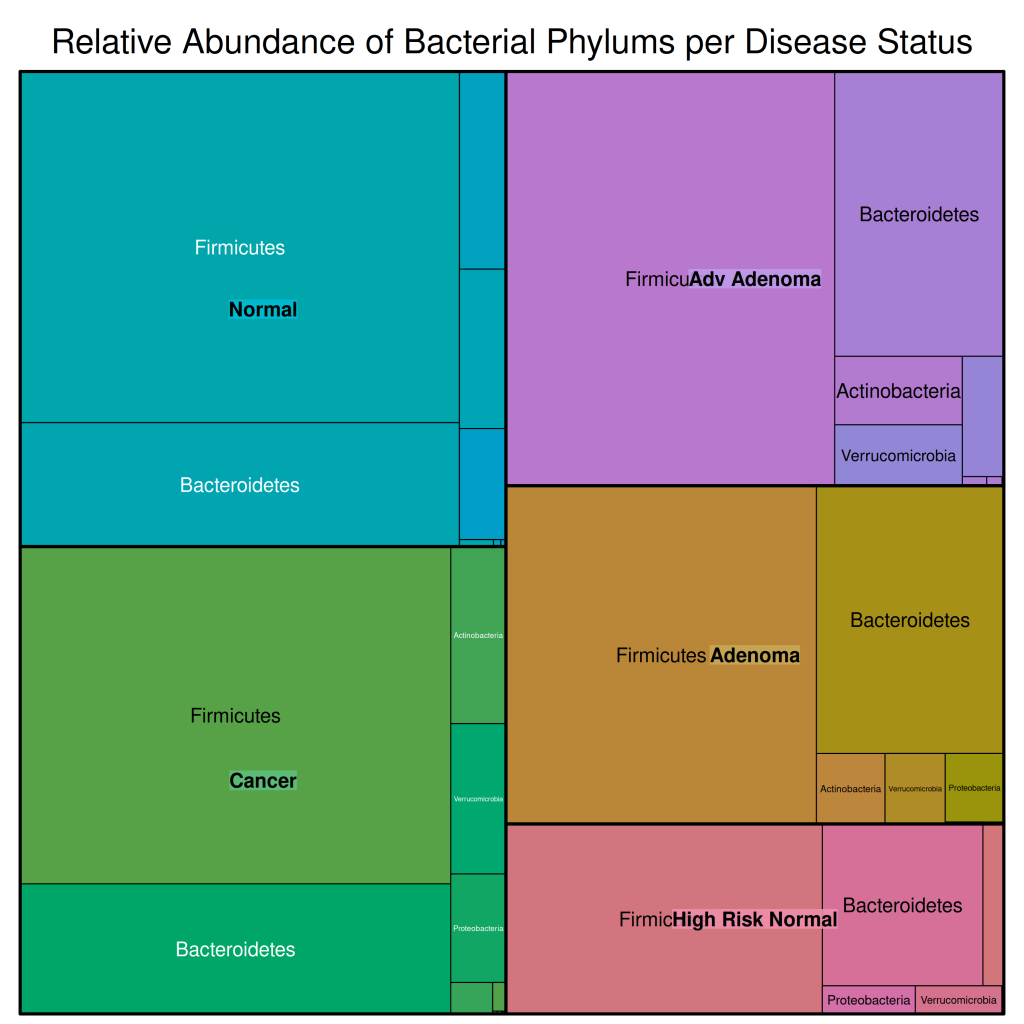
In this treemap:
- The outer rectangles represent the different disease statuses
- The inner rectangles represent the different bacterial phyla
- The size of each rectangle is proportional to the relative abundance of that phylum in that disease status
From this visualization, we can see that:
- Firmicutes and Bacteroidetes are the dominant phyla across all disease statuses
- There are some differences in the relative abundances of these phyla across disease statuses
- Most other phyla have very low relative abundances, making them difficult to see in the treemap
This is why we have pooled rarer phyla into an “Other” category for our subsequent visualizations.
Barplots
Barplots are versatile visualizations that can be used to compare quantities across categories. For parts of a whole comparisons, two common types of barplots are stacked barplots and grouped barplots.
Stacked Barplots
Stacked barplots show the composition of different groups across categories. They are particularly useful when you want to show the proportion of different components within each category, especially when proportions add up to 100%.
In ecology, stacked barplots are commonly used to visualize:
- Species composition across different sites or time points
- Taxonomic composition across different samples or treatments
- Functional group composition across different ecosystems
Let’s create a stacked barplot to visualize the mean relative abundance of bacterial phyla across different disease statuses. In `ggplot2`, we use the `geom_bar()` function to create a stacked barplot. Within this function, we specify the `stat = “identity”` argument to ensure that the y-axis values are the actual mean relative abundances. If we did not specify this argument, the y-axis would represent the count of each phylum, which is not what we want. There is an argument within `geom_bar` called `position` which is what controls whether the bars are stacked or grouped. Since the default is to stack the bars, we do not need to specify this argument:
df_rel_abund_phylum_pooled %>%
  ggplot(aes(x = disease_status, y = mean_rel_abund, fill = phylum)) +
  geom_bar(stat = "identity") +
  labs(
    title = "Mean Relative Abundance of Bacterial Phylums per Disease Status",
    x = "Disease Status",
    y = "Mean Relative Abundance (%)",
    fill = "Phylum"
  ) +
  scale_fill_manual(
    values = c(
      "Firmicutes" = "blue",
      "Bacteroidetes" = "red",
      "Other" = "grey"
    )
  ) +
  ggthemes::theme_base()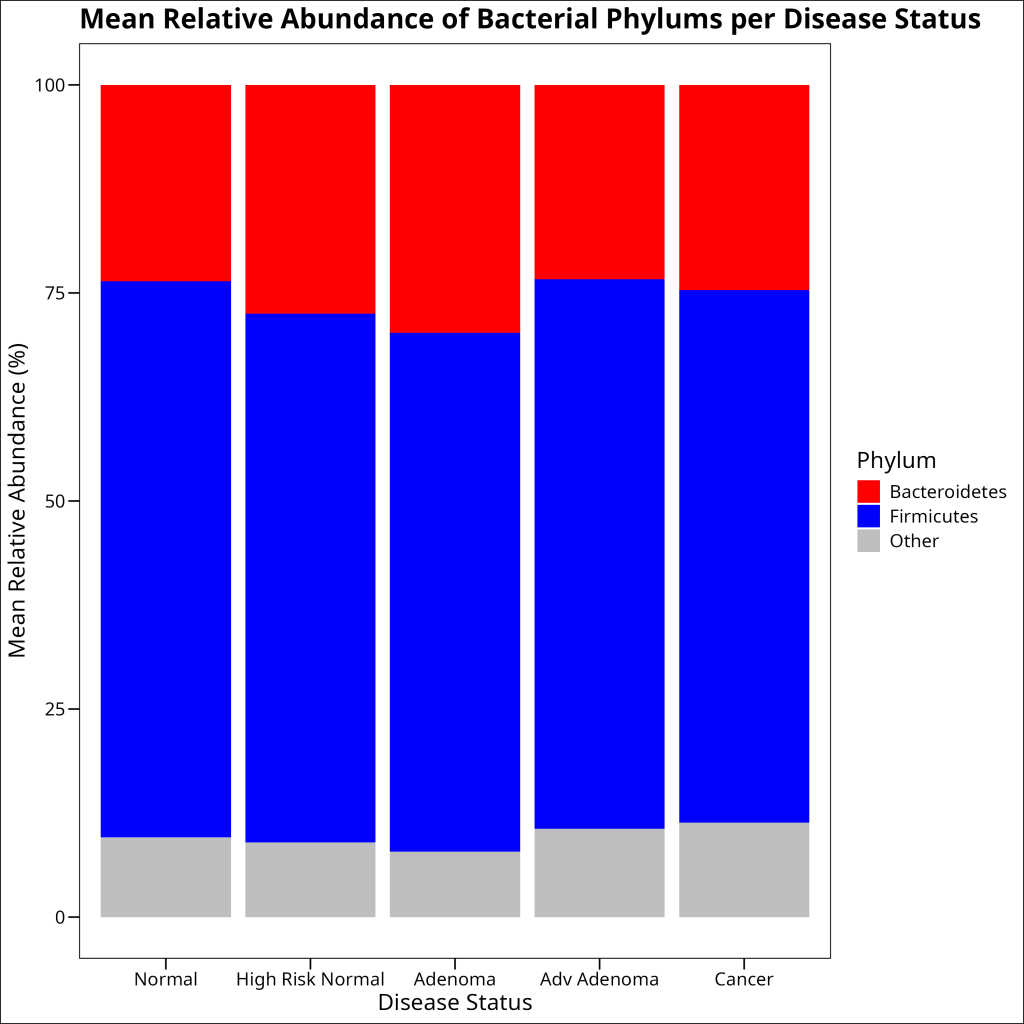
Grouped Barplots
Grouped barplots are meant for more direct comparisons of counts across different groups, without particular emphasis on showcasing proportions adding up to 100%.
In ecology, grouped barplots are commonly used to visualize the abundance of different species or groups across different sites or conditions.
SUPER IMPORTANT: Never use a grouped barplot as a substitute for boxplots. Boxplots are the better choice in showing the distribution of a continous outcome variable and comparing this outcome variable across different groups. Grouped barplots are better for count data.
Let’s create a grouped barplot to compare the mean relative abundance of bacterial phyla across different disease statuses. In `ggplot2`, we can use the `position = “dodge”` argument to create a grouped barplot:
df_rel_abund_phylum_pooled %>%
  ggplot(aes(x = phylum, y = mean_rel_abund, fill = disease_status)) +
  geom_bar(stat = "identity", position = "dodge", color = "black") +
  scale_fill_manual(
    values = c(
      "Normal" = "blue",
      "High Risk Normal" = "green",
      "Adenoma" = "yellow",
      "Adv Adenoma" = "orange", "Cancer" = "red"
    )
  ) +
  labs(
    title = "Mean Relative Abundance of Bacterial Phylums per Disease Status",
    x = "Phylum",
    y = "Mean Relative Abundance (%)",
    fill = "Disease Status"
  ) +
  ggthemes::theme_base()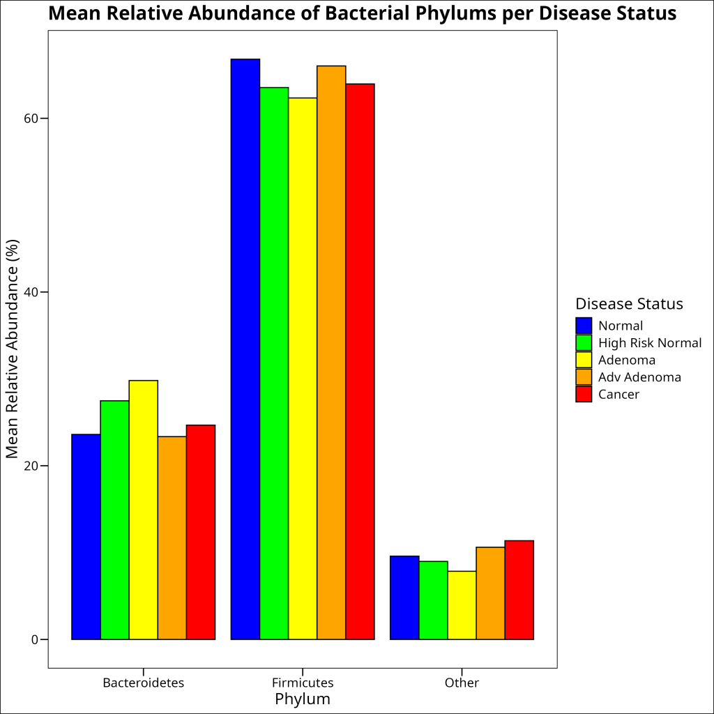
Conclusion
In this article, we’ve explored three common visualization techniques for parts of a whole comparisons in ecology: treemaps, stacked barplots, and grouped barplots. We’ve demonstrated these techniques using a microbiome dataset from the human gut, showing how the composition of bacterial phyla varies across different disease statuses.
Each visualization technique has its strengths:
- Treemaps are excellent for visualizing hierarchical data and showing proportions through nested rectangles.
- Stacked barplots are great for showing the proportions of different components within each category, especially when proportions add up to 100%.
- Grouped barplots are ideal for comparing the same components across different groups.
There are many other visualization techniques that can be used for parts of a whole comparisons in ecology, including:
- Heatmaps: Show the abundance of components across samples using color intensity
- Scatter plots: Show the relationship between different components
- Dendrograms: Show hierarchical relationships between samples based on their composition
The choice of visualization technique depends on the specific question you’re trying to answer and the characteristics of your data. By using a combination of these techniques, you can gain a comprehensive understanding of the composition and structure of ecological communities.