Plotting Distributions
Understanding your data begins with understanding its distribution. We’ll explore histograms, density plots (both 1D and 2D), ridgeline plots, boxplots, and violin plots. Each visualization type has its strengths and use cases, from showing raw data counts to displaying smooth distributions and statistical summaries. We’ll use a dataset about sugar maple health to demonstrate these different approaches.
Understanding Data Distributions
When working with data, one of the first things we want to understand is how our data are distributed. Are they spread out evenly? Are they clustered in certain areas? Are there any unusual patterns or outliers? These questions are crucial for everything from quality control to hypothesis testing, and visualization is often the best way to answer them.
In this tutorial, we’ll explore different ways to visualize distributions using R and ggplot2. We’ll use a dataset about sugar maple health from the Hubbard Brook Experimental Forest, which includes measurements like leaf area, stem length, and various mass measurements.
Histograms: The Classic Distribution Plot
Histograms are probably the most familiar way to visualize distributions. They work by dividing your data into bins (like sorting marbles into different-sized containers) and showing how many data points fall into each bin. This gives you a quick sense of where your data are concentrated and what shape they take. In ggplot, histograms are added as a layer to the plot via geom_histogram.
Let’s start with a basic histogram of leaf area:
ggplot(df_maples, aes(x = corrected_leaf_area)) +
  geom_histogram() +
  labs(
    x = "Corrected Leaf Area (cm²)",
    y = "Count",
    title = "Basic Histogram",
    fill = "Watershed"
  ) +
  ggthemes::theme_base()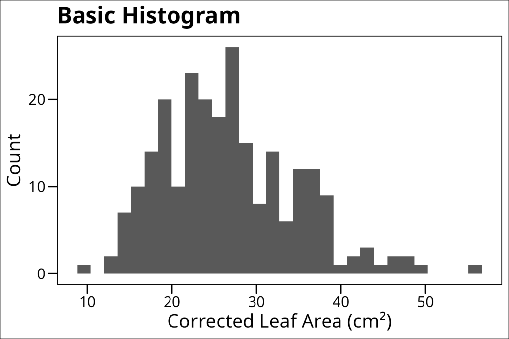
One of the most important decisions when making a histogram is choosing the binwidth. Too narrow, and you might see too much noise. Too wide, and you might miss important patterns, as seen in the example below when we try a larger binwidth:
ggplot(df_maples, aes(x = corrected_leaf_area)) +
  geom_histogram(binwidth = 5) +
  labs(
    x = "Corrected Leaf Area (cm²)",
    y = "Count",
    title = "Histogram with Increased Binwidth",
    fill = "Watershed"
  ) +
  ggthemes::theme_base()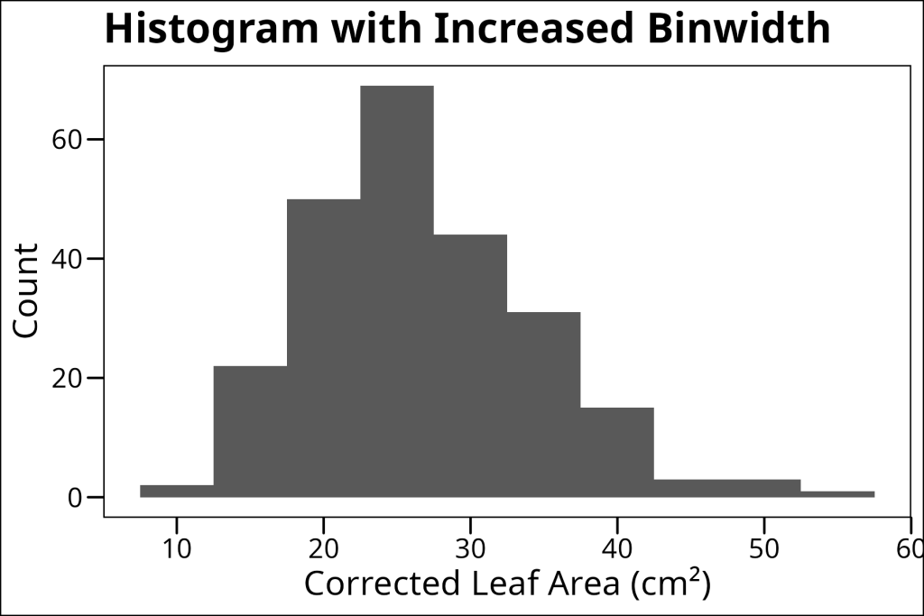
Therefore, be careful when choosing a bin width and try to find a balance between too much noise and too much detail.
Histograms can do more than just show single distributions – they’re also great for comparing distributions between groups. We can do this in several ways:
1. Overlapping histograms (good for direct comparison):
ggplot(df_maples, aes(x = corrected_leaf_area, fill = watershed)) +
  geom_histogram(position = "identity", alpha = 0.5) +
  labs(
    x = "Corrected Leaf Area (cm²)",
    y = "Count",
    title = "Overlapping Histogram",
    fill = "Watershed"
  ) +
  ggthemes::theme_base()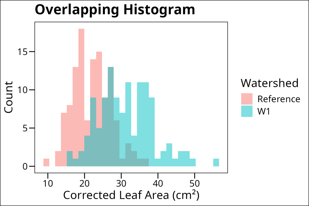
2. Stacked histograms (good for showing absolute proportions alongside totals per bin):
ggplot(df_maples, aes(x = corrected_leaf_area, fill = watershed)) +
  geom_histogram() +
  labs(
    x = "Corrected Leaf Area (cm²)",
    y = "Count",
    title = "Stacked Histogram",
    fill = "Watershed"
  ) +
  ggthemes::theme_base()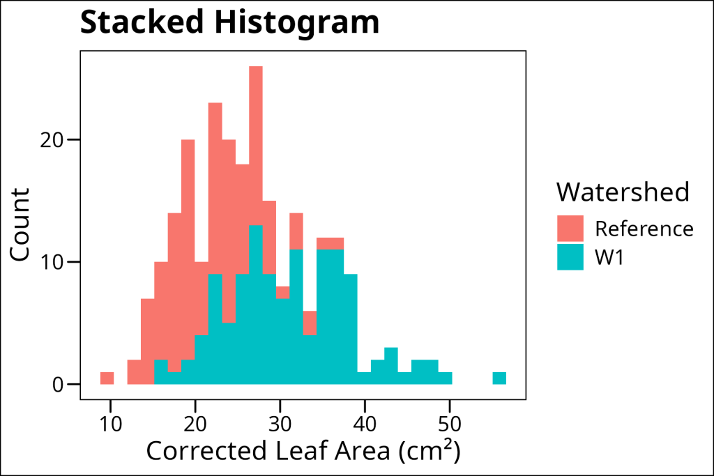
3. Filled histograms (good for comparing relative proportions across bins):
ggplot(df_maples, aes(x = corrected_leaf_area, fill = watershed)) +
  geom_histogram(position = "fill") +
  labs(
    x = "Corrected Leaf Area (cm²)",
    y = "Proportion",
    title = "Filled Histogram",
    fill = "Watershed"
  ) +
  ggthemes::theme_base()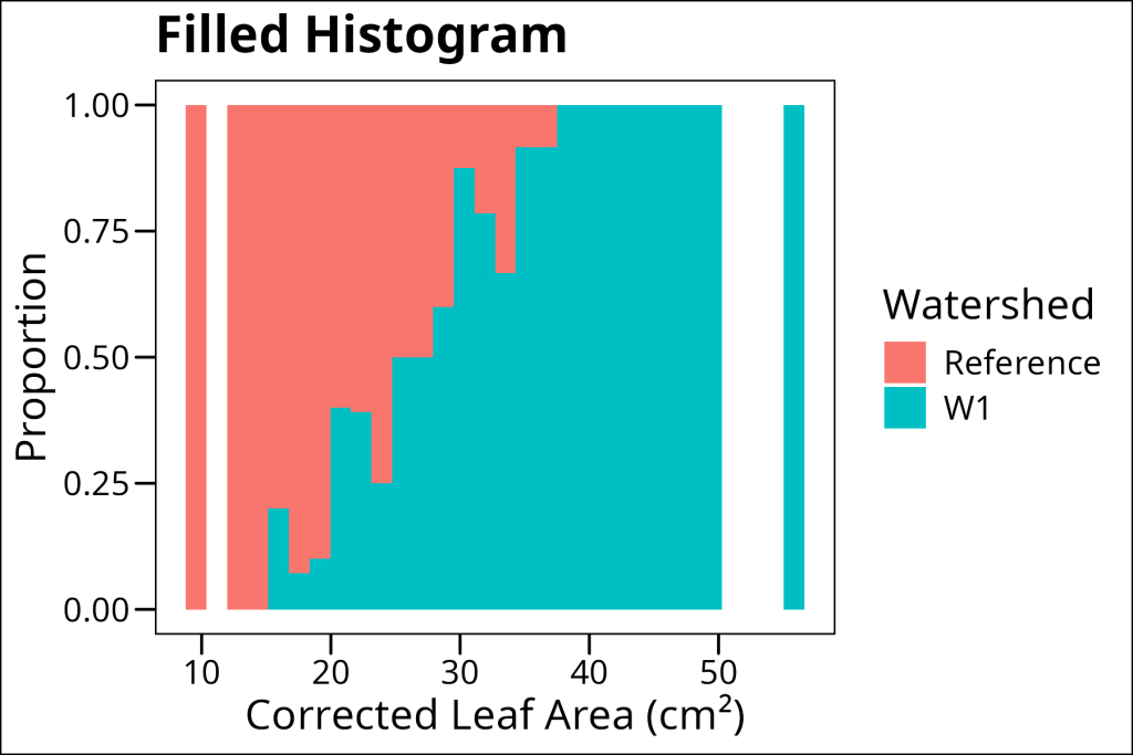
Each of these approaches has its strengths. Overlapping histograms are great for direct comparison of counts, stacked histograms show the total distribution while maintaining group separation, and filled histograms make it easy to see how proportions change across the range of values.
Density Plots: Smoothing Out the Details
1D (Classical) Density Plots
While histograms are great, they can sometimes be a bit “chunky” due to the binning process. Density plots offer a smoother alternative by using kernel density estimation to create a continuous curve. This can make it easier to see the overall shape of your distribution, especially when you have a lot of data points.
In ggplot we use the geom_density layer to add this form of data visualization to the plot. Here’s a basic example:
ggplot(df_maples, aes(x = corrected_leaf_area)) +
  geom_density() +
  labs(
    x = "Corrected Leaf Area (cm²)",
    y = "Density",
    title = "Basic Density Plot"
  ) +
  ggthemes::theme_base()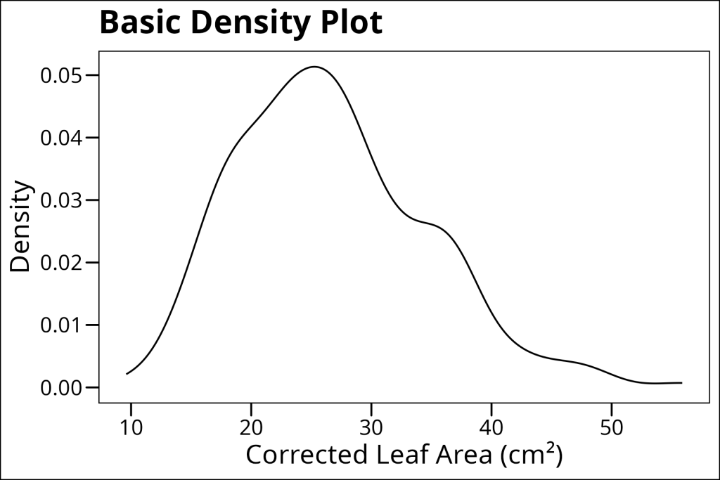
One of the cool things about density plots is that they work really well with grouping variables. We can show multiple density curves for different groups, either filled or stacked:
ggplot(df_maples, aes(x = corrected_leaf_area, fill = watershed)) +
  geom_density(alpha = 0.5) +
  labs(
    x = "Corrected Leaf Area (cm²)",
    y = "Density",
    title = "Filled Density Curves",
    fill = "Watershed"
  ) +
  ggthemes::theme_base()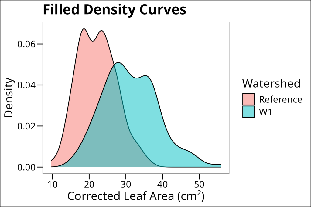
Stacked density plots show the total density distribution while maintaining the separation between groups. Each group’s density curve is stacked on top of the previous one, making it easy to see both the individual group distributions and their contribution to the overall distribution. This is particularly useful when you want to show how different groups contribute to the total distribution while maintaining their individual characteristics.
ggplot(df_maples, aes(x = corrected_leaf_area, fill = watershed)) +
  geom_density(position = "stack") +
  labs(
    x = "Corrected Leaf Area (cm²)",
    y = "Density",
    title = "Stacked Density Curves",
    fill = "Watershed"
  ) +
  ggthemes::theme_base()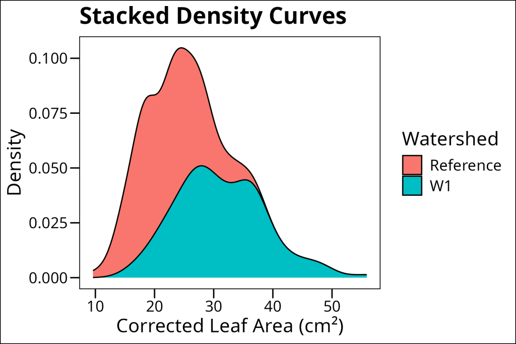
Sometimes, you might want to combine a histogram with a density plot to get the best of both worlds – the actual data points from the histogram and the smooth curve from the density plot:
ggplot(df_maples, aes(x = corrected_leaf_area, fill = watershed)) +
  geom_histogram(aes(y = ..density..), binwidth = 2, alpha = 1, position = "identity") +
  geom_density(color = "black", size = 0.5, alpha = 0.2) +
  labs(
    x = "Corrected Leaf Area (cm²)",
    y = "Density",
    title = "Density Plot with Histogram Overlay",
    fill = "Watershed"
  ) +
  ggthemes::theme_base()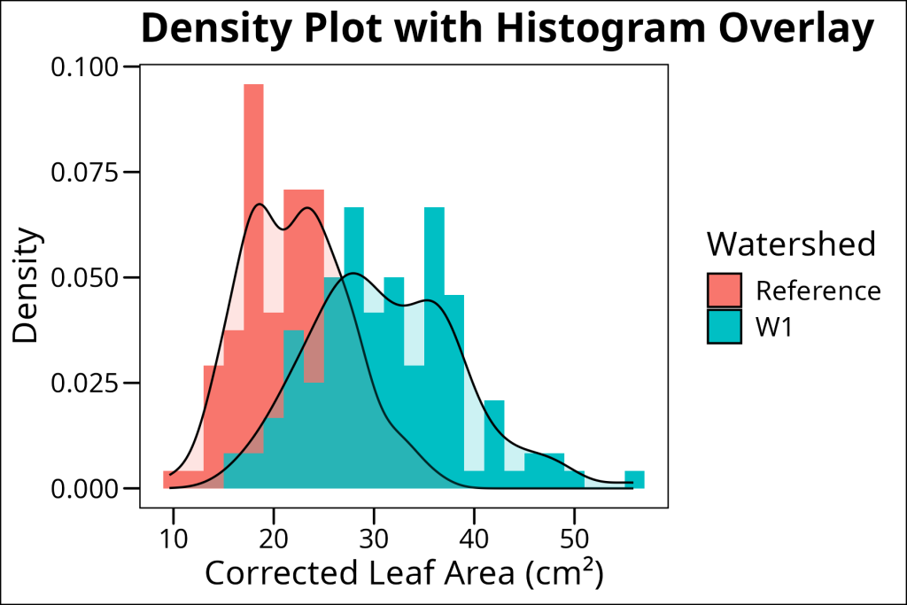
Note the aes(y = ..density..) in the histogram – this scales the histogram to match the density plot’s scale. Without this, the histogram would show counts instead of density, making it hard to compare with the density curve.
2D Density Plots
2D density plots extend the concept of density plots to two dimensions, showing how two continuous variables are jointly distributed. These plots are particularly useful for visualizing relationships between two variables and identifying clusters or patterns in the data. The ggdensity package provides specialized functions for creating these plots, offering more flexibility and better performance than base ggplot2 for 2D density estimation.
install.packages("ggdensity")We will use the geom_hdr() layer to create a 2D density plot showing the relationship between leaf area and stem length, with points colored by watershed. The alpha transparency helps us see both the density contours and the individual data points. This visualization reveals not only the overall relationship between these variables but also how different watersheds cluster in this two-dimensional space.
library(ggdensity)
ggplot(df_maples, aes(x = corrected_leaf_area, y = stem_length, fill = watershed, color = watershed)) +
  geom_hdr(alpha = 0.25) +
  geom_point(colour = "black", pch = 21, size = 1) + # Add actual data points (points have outline)
  labs(
    x = "Corrected Leaf Area (cm²)",
    y = "Stem Length (mm)",
    title = "2D Density Plot",
    fill = "Watershed",
    color = "Watershed"
  ) +
  ggthemes::theme_base()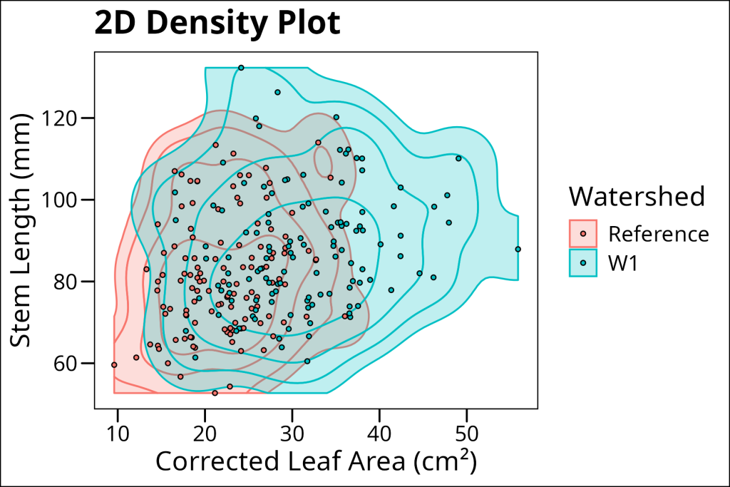
Ridgelines: A Series of Distributions
Ridgeline plots (also known as joy plots) are a modern way to visualize multiple distributions simultaneously. They stack density curves vertically, creating a landscape-like visualization that makes it easy to compare distributions across different groups. This is particularly useful when you have many groups to compare or when you want to see how distributions change across a categorical variable.
As with 2D density plots, it will be most convenient to use a 3rd party library called ggridges to do most of the hard work:
install.packages("ggridges")Here is an example of a basic ridgeline plot to economically showcase each sample’s individual distribution of corrected leaf area using the geom_density_ridges layer:
library(ggridges)
ggplot(df_maples, aes(x = corrected_leaf_area, y = sample)) +
  geom_density_ridges() +
  labs(
    x = "Corrected Leaf Area (cm²)",
    y = "Sample",
    title = "Basic Ridgeline Plot"
  ) +
  ggthemes::theme_base()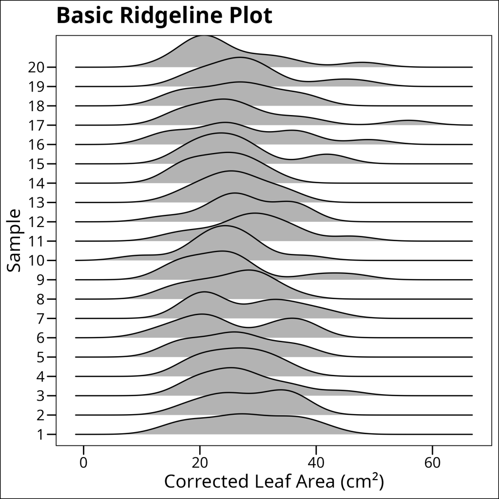
Much better than multiple facets.
When working with ridgeline plots, grouping can add another layer of information. By adding a fill aesthetic based on a grouping variable, we can see how different categories are distributed within each ridge. This is particularly useful when you have nested categorical variables or when you want to show multiple levels of grouping simultaneously.
ggplot(df_maples, aes(x = corrected_leaf_area, y = sample, fill = watershed)) +
  geom_density_ridges(alpha = 0.5) +
  labs(
    x = "Corrected Leaf Area (cm²)",
    y = "Sample",
    title = "Grouped Ridgeline Plot",
    fill = "Watershed"
  ) +
  ggthemes::theme_base()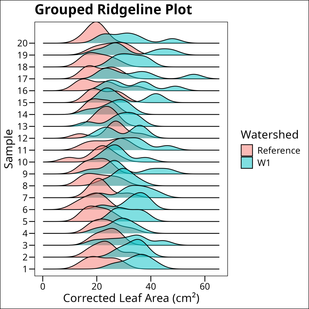
Boxplots: The King of Statistical Summary
Boxplots are a powerful tool for visualizing the distribution of data across groups. Let’s break down their anatomy:
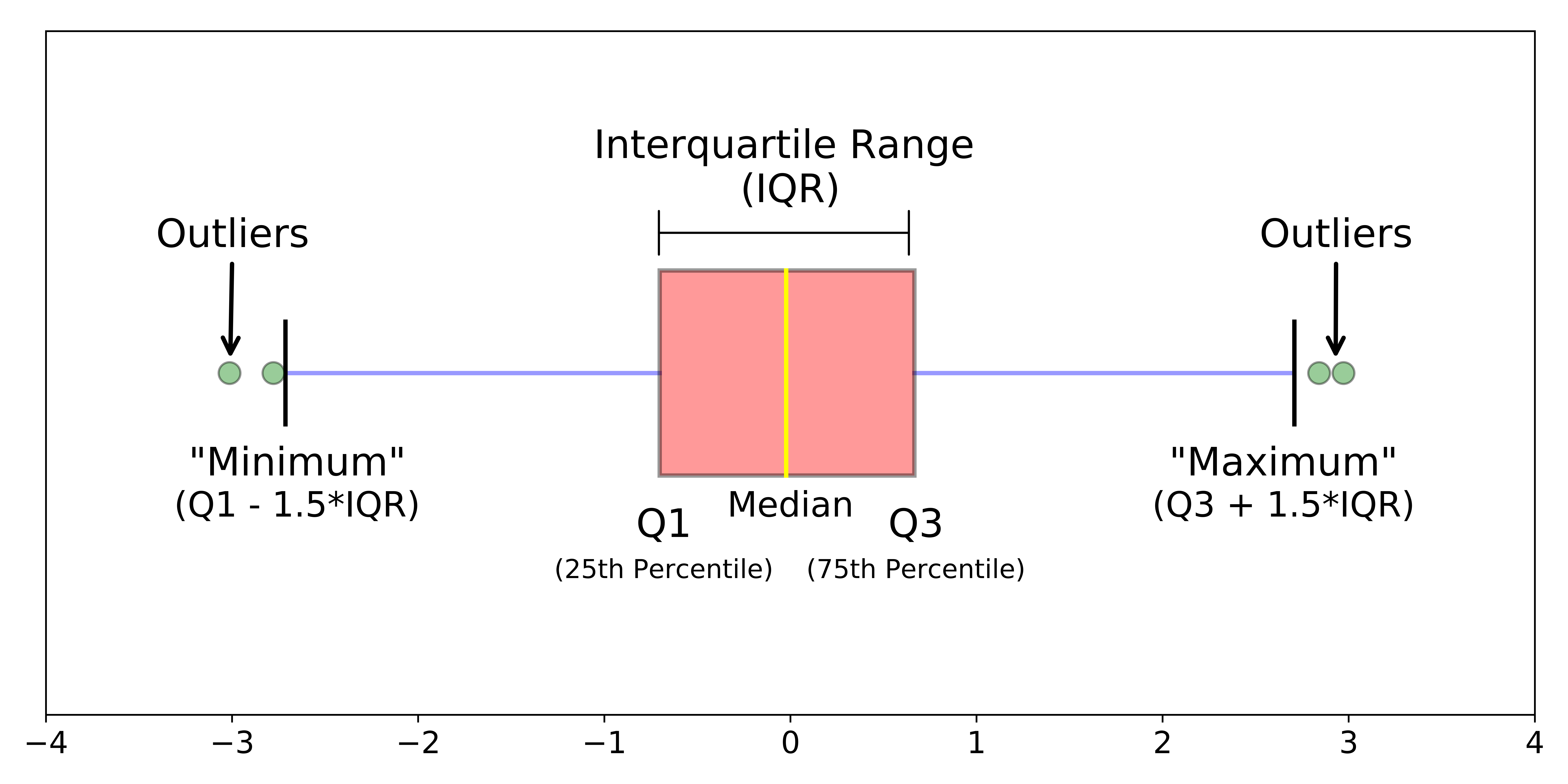
- Median (middle line): The central tendency of the data
- Box (interquartile range): Contains 50% of the data, bounded by the first (25th) and third (75th) quartiles
- Whiskers: Extend to the most extreme non-outlier points (typically 1.5 times the interquartile range)
- Outliers: Individual points beyond the whiskers, shown as individual dots
This compact visualization provides a wealth of information about the distribution’s shape, spread, and presence of outliers, making it an essential tool for exploratory data analysis.
Using ggplot a basic boxplot can be plotted using geom_boxplot:
ggplot(df_maples, aes(x = watershed, y = corrected_leaf_area)) +
  geom_boxplot() +
  labs(
    x = "Watershed",
    y = "Corrected Leaf Area (cm²)",
    title = "Basic Boxplot"
  ) +
  ggthemes::theme_base()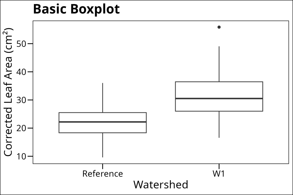
One common enhancement is to add individual data points on top of the boxplot. However, we need to be careful about double-plotting outliers (points that the boxplot already shows). Here’s how to do it right:
ggplot(df_maples, aes(x = watershed, y = corrected_leaf_area)) +
  geom_boxplot(outlier.shape = NA) +  # Remove outliers from boxplot
  geom_jitter(alpha = 0.5, color = "black", size = 1) +  # Add all points
  labs(
    x = "Watershed",
    y = "Corrected Leaf Area (cm²)",
    title = "Boxplot with Jittered Points"
  ) +
  ggthemes::theme_base()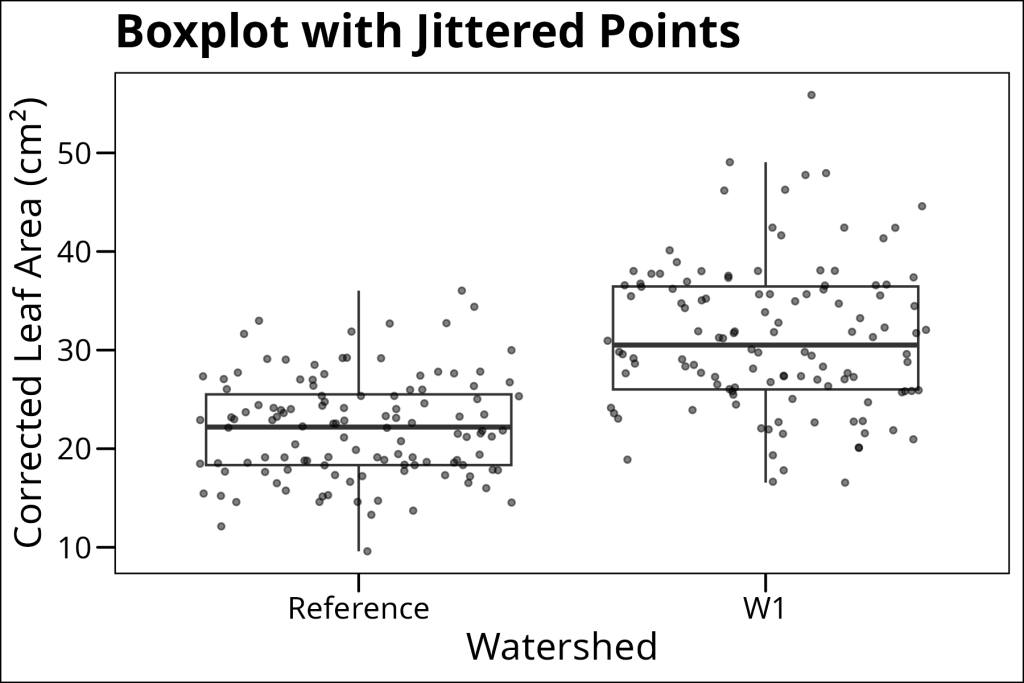
When you have multiple grouping variables, things get a bit more complex. Here’s how to create a grouped boxplot with jittered points:
ggplot(df_maples %>% drop_na(elevation), aes(x = watershed, y = corrected_leaf_area, fill = elevation)) +
  geom_boxplot(outlier.shape = NA) +
  geom_jitter(
    color = "black", alpha = 0.9, size = 1, pch = 21,
    position = position_jitterdodge(
      jitter.width = 0.4,  # Controls horizontal spread of points
      dodge.width = 0.75,  # Controls spacing between groups
      seed = 42  # For reproducibility
    )
  ) +
  labs(
    x = "Watershed",
    y = "Corrected Leaf Area (cm²)",
    title = "Grouped Boxplot with Jittered Points",
    fill = "Elevation",
    color = "Elevation"
  ) +
  ggthemes::theme_base()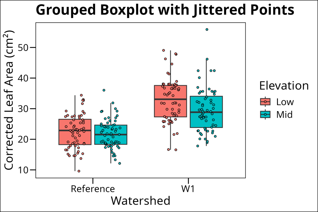
The position_jitterdodge() function is crucial here – it handles both the jittering of points and the dodging (separation) of groups. The seed parameter ensures that the jittering is reproducible.
Violin Plots: The black sheep of the distribution plot family.
Violin plots combine the smoothness of density plots with the statistical summary of boxplots. They show the full distribution shape while also indicating where the data are concentrated. This makes them particularly useful when you want to see both the overall shape and the key statistical features.
In ggplot, violin plots can be added using geom_violin.
Unfortunately, violin plots in the recent past have been often abused by researchers desiring to have these fancy density outlines in their publications. When paired with data lacking enough data points, violin plots often result in spurious multimodal curves, which has irritated many a reviewer and earned these plots a poor reputation. As such, these should be used when there is a sufficient amount of data to demonstrate the expected distribution (i.e. Gaussian). Often, these can be paired with a complementary distribution plot, such as a boxplot, as overlay.
ggplot(df_maples %>% drop_na(elevation), aes(x = watershed, y = corrected_leaf_area, fill = elevation)) +
  geom_violin(
    position = position_dodge(width = 0.75),  # Controls spacing between violins
    width = 0.5,  # Controls thickness of violins
    alpha = 0.9
  ) +
  geom_boxplot(
    position = position_dodge(width = 0.75),  # Controls spacing between boxplots
    width = 0.15  # Controls thickness of boxplots
  ) +
  labs(
    x = "Watershed",
    y = "Corrected Leaf Area (cm²)",
    title = "Violin Plot with Boxplot Overlay",
    fill = "Elevation"
  ) +
  ggthemes::theme_base()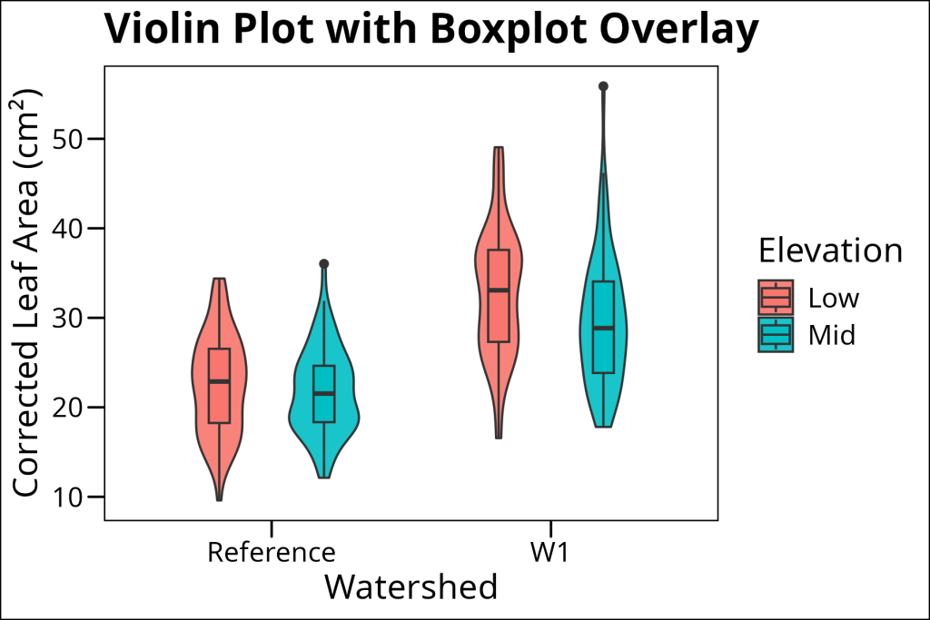
Note how we carefully control the width of both the violin and boxplot to make them look balanced. The violin plot shows the full distribution shape, while the boxplot provides the statistical summary (median, quartiles, etc.).
Concluding Thoughts
Each type of distribution plot has its strengths:
- Histograms are great for showing actual counts and work well with both small and large datasets. They’re particularly useful when you want to see the raw data distribution.
- Density plots provide a smooth view of the distribution and are excellent for comparing distributions between groups. They work best with larger datasets.
- Ridgeline plots allow for an economic alternative to facetted density plots. Ideal for plotting distributions over a categorical variable with many levels, such as a sample grouping.
- Boxplots are perfect for showing statistical summaries and comparing distributions across groups. They’re especially useful when you have many groups or when you want to focus on key statistical features.
- Violin plots can be a two-edged sword. They work most ideally when you have a sufficient amount of data such that it avoids multi-modal curvature. They’re great when you want to show both the overall shape and key statistical features.
Remember that the best plot type depends on your specific needs and your audience. Sometimes, you might want to use multiple types of plots to tell your story effectively. And always remember to include proper labels, units, and legends to make your plots clear and informative!