Plotting Relationships
Learn how to visualize relationships between variables using scatterplots, line plots, and more powerful visualization tools to discover patterns in ecological data.
Visualizing Relationships in Ecological Data
Exploring relationships between variables is a fundamental part of ecological data analysis. Whether you’re examining how body size relates to weight, tracking population changes over time, or looking for correlations across multiple measurements, R provides powerful tools for visualizing these relationships.
In this tutorial, we’ll explore several approaches to relationship visualization using two ecological datasets:
- The Andrews Forest stream vertebrate data, containing measurements of salamanders and trout
- The Palmer Penguins dataset, with morphological measurements of three penguin species
Getting Started with the Data
Let’s begin by loading our first dataset containing measurements of cutthroat trout and coastal giant salamanders from the Andrews Forest LTER:
# Load packages
library(tidyverse)
library(lterdatasampler)

# Load data
df <- lterdatasampler::and_vertebrates %>%
  as_tibble()

# Check species
df %>%
  count(species) %>%
  arrange(desc(n))
# A tibble: 2 x 2
species n
<chr> <int>
1 Cutthroat trout 20433
2 Coastal giant salamander 11758# There are very few Cascade torrent salamanders in the dataset, so we will stick
# with only the data for cutthroat trout and coastal giant salamanders.
df <- df %>%
filter(species == "Cutthroat trout" | species == "Coastal giant salamander")
str(df)tibble [32,191 x 16] (S3: tbl_df/tbl/data.frame)
$ year : num [1:32191] 1987 1987 1987 1987 1987 ...
$ sitecode : chr [1:32191] "MACKCC-L" "MACKCC-L" "MACKCC-L" "MACKCC-L" ...
$ section : chr [1:32191] "CC" "CC" "CC" "CC" ...
$ reach : chr [1:32191] "L" "L" "L" "L" ...
$ pass : num [1:32191] 1 1 1 1 1 1 1 1 1 1 ...
$ unitnum : num [1:32191] 1 1 1 1 1 1 1 1 1 1 ...
$ unittype : chr [1:32191] "R" "R" "R" "R" ...
$ vert_index : num [1:32191] 1 2 3 4 5 6 7 8 9 10 ...
$ pitnumber : num [1:32191] NA NA NA NA NA NA NA NA NA NA ...
$ species : chr [1:32191] "Cutthroat trout" "Cutthroat trout" "Cutthroat trout" "Cutthroat trout" ...
$ length_1_mm: num [1:32191] 58 61 89 58 93 86 107 131 103 117 ...
$ length_2_mm: num [1:32191] NA NA NA NA NA NA NA NA NA NA ...
$ weight_g : num [1:32191] 1.75 1.95 5.6 2.15 6.9 5.9 10.5 20.6 9.55 13 ...
$ clip : chr [1:32191] "NONE" "NONE" "NONE" "NONE" ...
$ sampledate : Date[1:32191], format: "1987-10-07" "1987-10-07" "1987-10-07" "1987-10-07" ...
$ notes : chr [1:32191] NA NA NA NA ...Scatterplots: Visualizing Relationships Between Two Variables
Scatterplots are the most basic and versatile way to visualize the relationship between two continuous variables. Let’s create a scatterplot to examine the relationship between length and weight for our aquatic species.
Basic Scatterplot
Scatterplots are the foundation of relationship visualization in ecology. They allow us to see how two continuous variables relate to each other by plotting each observation as a point on a coordinate system. This is particularly useful when trying to understand how one characteristic (like body size) might influence another (like weight) across different species or populations.
Let’s create a basic scatterplot to examine the relationship between length and weight for our aquatic species:
df %>%
  ggplot(aes(x = length_1_mm, y = weight_g, color = species)) +
  geom_point(alpha = 0.5) +
  labs(
    title = "Basic Scatterplot",
    x = "Length (mm)",
    y = "Weight (g)",
    color = "Species"
  ) +
  ggthemes::theme_base()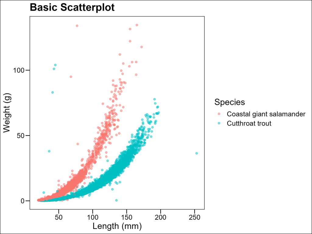
Nice start, but there’s a high probability that our target audience will want to see some trendlines. Let’s see how we can make that happen.
Adding Regression Lines
To visualize trends we can add regression lines using the geom_smooth() layer.
The geom_smooth() function fits a model to your data and plots the predictions along with confidence intervals (by default). When used with method = "lm", it fits a linear regression model, showing the best-fitting straight line through your data. This helps identify overall trends, assuming the relationship is linear.
df %>%
  drop_na(weight_g, length_1_mm, species) %>%
  ggplot(aes(x = length_1_mm, y = weight_g, color = species)) +
  geom_point(alpha = 0.5) +
  # Add a linear regression line with confidence interval
  geom_smooth(method = "lm", se = TRUE) +
  labs(
    title = "Weight vs. Length with Linear Regression",
    x = "Length (mm)",
    y = "Weight (g)",
    color = "Species"
  ) +
  theme_minimal()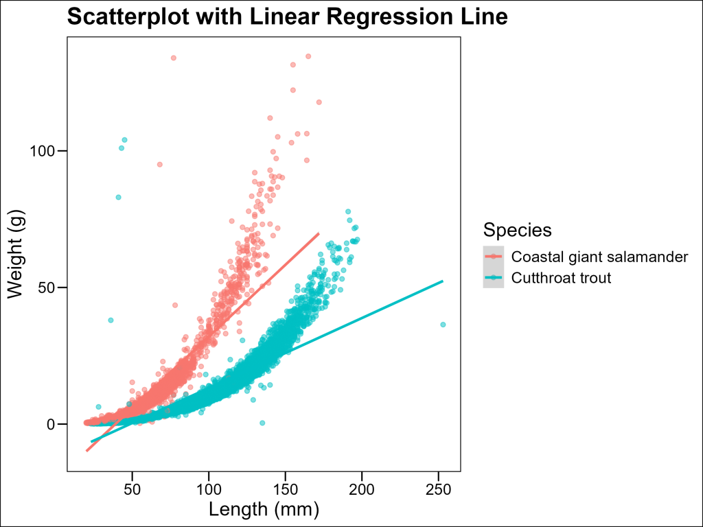
And in this case, the linear trend is not a good fit for the data. In biology, weight often scales with length according to a power function of the form:
W = a \times L^bwhere b is often close to 3 for many organisms (since volume scales with the cube of length).
One quick approach is to opt for a loess trendline instead of a linear one.
LOESS (Locally Estimated Scatterplot Smoothing) is a non-parametric regression method that fits a smooth curve through points in a scatter plot. Unlike linear regression, it doesn’t assume the relationship follows any particular functional form (like a straight line or polynomial). Instead, it fits simple models to localized subsets of the data to build a curve that describes the deterministic part of the variation in the data.
LOESS is particularly useful in ecology when relationships between variables don’t follow simple linear patterns. The span parameter controls the degree of smoothing – smaller values produce wigglier lines that follow the data points more closely, while larger values create smoother lines that capture broader trends.
df %>%
  ggplot(aes(x = length_1_mm, y = weight_g, color = species)) +
  geom_point(alpha = 0.5) +
  # Add a smoothed curve that's more appropriate for the length-weight relationship
  geom_smooth(method = "loess", se = TRUE) +
  labs(
    title = "Scatterplot with Smoothed Curve",
    subtitle = "Showing the power relationship between length and weight",
    x = "Length (mm)",
    y = "Weight (g)",
    color = "Species"
  ) +
  ggthemes::theme_base()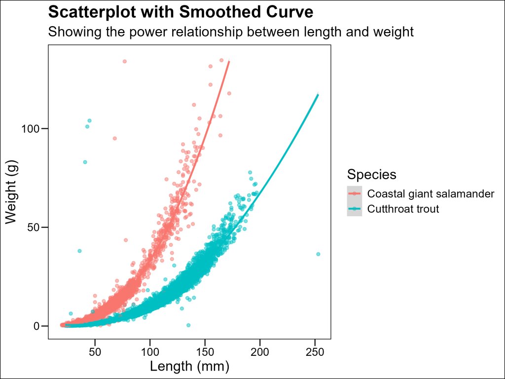
However, LOESS should not be abused: it is a series of fits and therefore has no meaningful coefficients for statistical testing. Therefore, it should only be used for general visualization purposes. The alternative we will explore returns us to the realm of linear fit, which carries the benefits of coefficients for future statistical analysis.
Log-Log Transformation for Allometric Relationships
Log-log transformations are valuable because they convert power relationships into linear ones. When we plot log(weight) against log(length), a power relationship becomes:
\log(W) = \log(a) + b \times \log(L)which is linear with slope b. This allows us to:
- Visualize power relationships more clearly
- Estimate the scaling exponent b (which has biological significance)
- More easily compare scaling relationships across species or groups
With ggplot2 we can easily adjust the x and/or y axes to be in a logarithmic scale using layers such as scale_x_log10 and scale_y_log10:
df %>%
  ggplot(aes(x = length_1_mm, y = weight_g, color = species)) +
  geom_point(alpha = 0.5) +
  geom_smooth(method = "lm", se = TRUE) +
  scale_x_log10() + # Log-transform the x-axis
  scale_y_log10() + # Log-transform the y-axis
  labs(
    title = "Scatterplot with Log-Log Scale",
    x = "Length (mm) - Log Scale",
    y = "Weight (g) - Log Scale",
    color = "Species"
  ) +
  ggthemes::theme_base()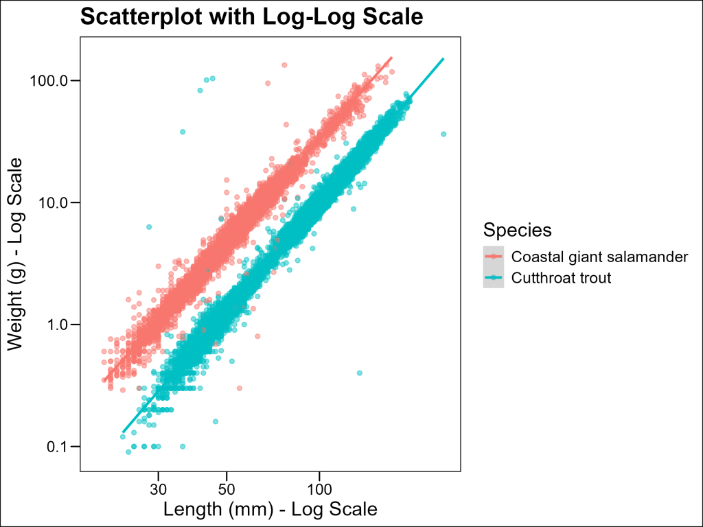
On the log-log scale, the relationship becomes much more linear, indicating that the power law model is appropriate.
Advanced: Fitting Power Functions to Length-Weight Data
Some audiences may have difficulties with log-log data. Can we get the best of both worlds: avoiding logspace and having coefficients to our model? Yes, given that we know this data follows the power law.
We can use nonlinear regression to directly fit this model using the nls() function in R, create predictions from those models, then plot those predictions as the trendlines:
# Prepare clean data for each species (removing NAs)
cutthroat_data <- df %>%
  filter(species == "Cutthroat trout") %>%
  drop_na(weight_g, length_1_mm)

salamander_data <- df %>%
  filter(species == "Coastal giant salamander") %>%
  drop_na(weight_g, length_1_mm)

# Fit a power function to each species with better starting values
# For length-weight relationships, b is typically close to 3
fit_salamander <- nls(weight_g ~ a * length_1_mm^b,
  data = salamander_data,
  start = list(a = 0.00001, b = 3),
  control = nls.control(maxiter = 100)
)
fit_cutthroat <- nls(weight_g ~ a * length_1_mm^b,
  data = cutthroat_data,
  start = list(a = 0.00001, b = 3),
  control = nls.control(maxiter = 100)
)

# Extract the coefficients
coefs_cutthroat <- coef(fit_cutthroat)
coefs_salamander <- coef(fit_salamander)

# Prepare strings for subtitle in markdown format (i.e. "Cutthroat: W = 0.00001 x L3")
salamander_subtitle <- paste0(
  "Salamander: W = ", round(coefs_salamander["a"], 6), " x L", round(coefs_salamander["b"], 2), ""
)
cutthroat_subtitle <- paste0(
  "Cutthroat: W = ", round(coefs_cutthroat["a"], 6), " x L", round(coefs_cutthroat["b"], 2), ""
)

# Create a new dataset with predictions for each species
prediction_data <- bind_rows(
  cutthroat_data %>%
    mutate(predicted_weight = coefs_cutthroat["a"] * length_1_mm^coefs_cutthroat["b"]),
  salamander_data %>%
    mutate(predicted_weight = coefs_salamander["a"] * length_1_mm^coefs_salamander["b"])
)
# Plot with fitted power curves
p5 <- ggplot() +
  geom_point(data = prediction_data, aes(x = length_1_mm, y = weight_g, color = species), alpha = 0.5) +
  # Plot our predicted data as a geom_line layer
  geom_line(
    data = prediction_data, # Remember to use the prediction_data dataset!
    aes(x = length_1_mm, y = predicted_weight, color = species),
    linewidth = 1.2
  ) +
  labs(
    title = "Scatterplot with Fitted Power Functions",
    subtitle = paste0(cutthroat_subtitle, "
", salamander_subtitle),
    x = "Length (mm)",
    y = "Weight (g)",
    color = "Species"
  ) +
  ggthemes::theme_base() +
  # Use ggtext to format the subtitle
  theme(
    plot.subtitle = ggtext::element_markdown(size = 10)
  )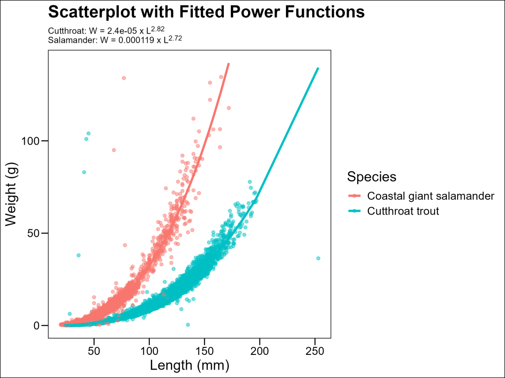
The resulting models quantify the exact relationship between length and weight for each species.
Line Plots: Tracking Changes Over Time
Line plots are specifically designed to show changes or trends across an ordered series, such as time periods or sequential measurements. Unlike scatterplots, which show relationships between two continuous variables without implying a specific order, line plots connect points in a specified sequence to emphasize the progression or change.
When should you use line plots instead of scatterplots?
- Time series data: When monitoring population sizes, climate measurements, or any variables that change over time
- Sequential measurements: When data points have a natural order (like elevational gradients)
- Trend visualization: When the pattern of change between consecutive measurements is more important than the individual values
- Comparative trajectories: When comparing how different groups change over the same sequence
Let’s examine how the populations of our two species have changed over time in different forest sections.
Preparing Time-Series Data
First, we need to aggregate our data to get counts per year, species, and forest section:
# Group by year, species, and section to get counts
df_counts <- df %>%
  drop_na(year, species, section) %>%
  group_by(year, species, section) %>%
  summarise(count = n())
df_counts
# A tibble: 120 x 4
# Groups: year, species [60]
year species section count
<dbl> <chr> <chr> <int>
1 1987 Cutthroat trout CC 384
2 1987 Cutthroat trout OG 219
3 1988 Cutthroat trout CC 193
4 1988 Cutthroat trout OG 109
5 1989 Cutthroat trout CC 190
6 1989 Cutthroat trout OG 118
7 1990 Cutthroat trout CC 288
8 1990 Cutthroat trout OG 225
9 1991 Cutthroat trout CC 374
10 1991 Cutthroat trout OG 252
# i 110 more rowsBasic Line Plot
Now we can create a line plot showing population trends:
df_counts %>%
  ggplot(aes(x = year, y = count, color = species)) +
  geom_line() +
  geom_point() +
  # Facet by section; if this is unfamiliar to you, revisit the Facetting and Combining Plots
  # article
  facet_wrap(
    ~section,
    labeller = labeller(section = c("CC" = "Clear Cut", "OG" = "Old Growth"))
  ) +
  labs(
    title = "Abundance Counts Over Time",
    subtitle = "By species and forest section",
    x = "Year",
    y = "Count",
    color = "Species"
  ) +
  ggthemes::theme_base() +
  theme(
    legend.position = "bottom",
    axis.text.x = element_text(angle = 45, hjust = 1)
  )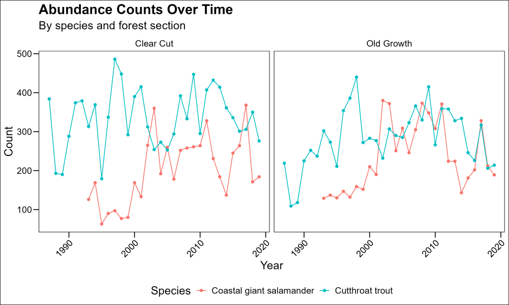
This plot shows year-to-year variation, but it might be difficult to see overall trends with so many jagged peaks. Let’s improve it with faceting and smoothed trend lines.
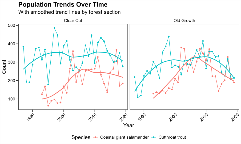
Adding Trend Lines with Smoothing
geom_smooth is not limited to scatterplots. We can use this layer to add a LOESS trendline to better visualize a kind of smoothed rolling average:
df_counts %>%
  ggplot(aes(x = year, y = count, color = species)) +
  geom_line() +
  geom_point() +
  # Add a smoothed spline to show the trend
  geom_smooth(method = "loess", se = FALSE, span = 0.8) +
  facet_wrap(
    ~section,
    labeller = labeller(section = c("CC" = "Clear Cut", "OG" = "Old Growth"))
  ) +
  labs(
    title = "Population Trends Over Time",
    subtitle = "With smoothed trend lines by forest section",
    x = "Year",
    y = "Count",
    color = "Species"
  ) +
  ggthemes::theme_base() +
  theme(
    legend.position = "bottom",
    axis.text.x = element_text(angle = 45, hjust = 1)
  )
Exploring Multiple Relationships: The GGally Package
When working with multiple variables, exploring all pairwise relationships can be time-consuming. The GGally package, particularly its ggpairs() function, makes this process much more efficient.
Let’s use the Palmer Penguins dataset, which contains morphological measurements of three penguin species:
# Load required packages
library(palmerpenguins)
library(GGally)

str(palmerpenguins::penguins)
tibble [344 x 8] (S3: tbl_df/tbl/data.frame)
$ species : Factor w/ 3 levels "Adelie","Chinstrap",..: 1 1 1 1 1 1 1 1 1 1 ...
$ island : Factor w/ 3 levels "Biscoe","Dream",..: 3 3 3 3 3 3 3 3 3 3 ...
$ bill_length_mm : num [1:344] 39.1 39.5 40.3 NA 36.7 39.3 38.9 39.2 34.1 42 ...
$ bill_depth_mm : num [1:344] 18.7 17.4 18 NA 19.3 20.6 17.8 19.6 18.1 20.2 ...
$ flipper_length_mm: int [1:344] 181 186 195 NA 193 190 181 195 193 190 ...
$ body_mass_g : int [1:344] 3750 3800 3250 NA 3450 3650 3625 4675 3475 4250 ...
$ sex : Factor w/ 2 levels "female","male": 2 1 1 NA 1 2 1 2 NA NA ...
$ year : int [1:344] 2007 2007 2007 2007 2007 2007 2007 2007 2007 2007 ...Creating a Pairs Plot
The ggpairs() function creates a matrix of plots showing relationships between multiple variables:
palmerpenguins::penguins %>%
  # Select columns of interest; in this case, numeric and species for coloring
  select(species, bill_length_mm, bill_depth_mm, flipper_length_mm, body_mass_g) %>%
  GGally::ggpairs(
    mapping = aes(color = species, alpha = 0.5),
    columns = 2:5, # Use only the numeric columns in the scatterplots
    upper = list(continuous = "cor"), # Show correlation in upper triangle
    lower = list(continuous = "points"), # Show points in lower triangle
    diag = list(continuous = "densityDiag"), # Show density plots on diagonal
    title = "Relationships Between Penguin Measurements",
    # Change labels of panel variables
    labeller = as_labeller(c(
      "bill_length_mm" = "Bill Length (mm)",
      "bill_depth_mm" = "Bill Depth (mm)",
      "flipper_length_mm" = "Flipper Length (mm)",
      "body_mass_g" = "Body Mass (g)"
    ))
  ) +
  ggthemes::theme_base() +
  theme(
    axis.text = element_text(size = 8),
    strip.text = element_text(size = 9)
  )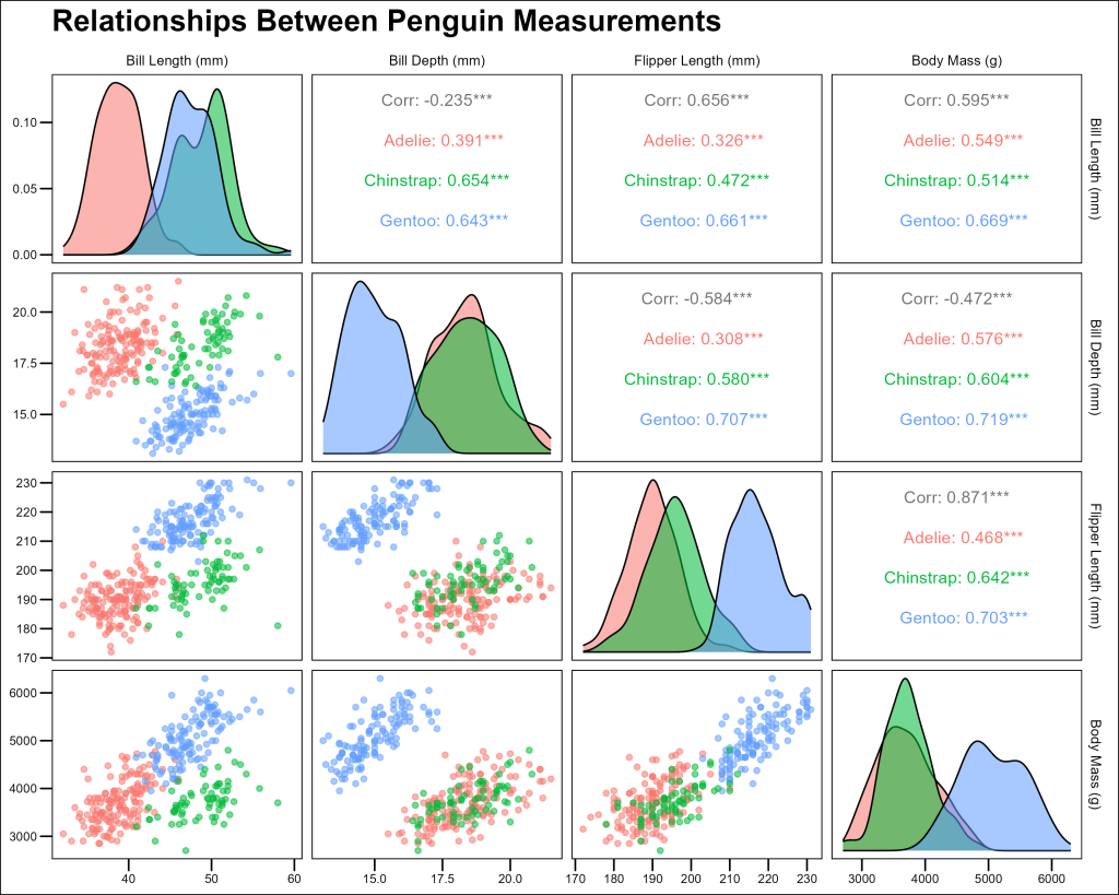
This comprehensive visualization shows us:
- Scatterplots of all variable pairs in the lower triangle
- Correlation coefficients in the upper triangle
- Distribution of each variable on the diagonal
- Clear separation of species across multiple measurements
Key Points for Plotting Relationships
- Choose the right plot type: Use scatterplots for two continuous variables, line plots for changes over time or sequences
- Consider transformations: Log or other transformations can reveal relationships that aren’t visible in the original scale
- Add trend lines: Regression lines or smoothed curves help visualize patterns
- Use faceting for clarity: When comparing multiple groups, faceting can make comparisons easier
- Explore multiple relationships: Tools like
ggpairs()can efficiently reveal patterns across many variables - Think about aesthetics: Color, shape, and transparency can add additional dimensions to your visualizations
By mastering these visualization techniques, you’ll be well-equipped to explore and communicate complex relationships in your ecological data.