Plotting with Multiple DataFrames
Learn how to create plots that use different data sources in different layers to build richer and more informative visualizations.
Using Multiple DataFrames in a Single Plot
In data visualization, sometimes the most effective way to communicate patterns is to combine different types of data in a single plot. Rather than forcing all your data into one large dataframe, you can use multiple dataframes with different geom_ layers in ggplot2. This approach is particularly useful when:
- You want to show both raw data and summary statistics
- Your data sources have different resolutions or structures
- You need to add model predictions alongside original observations
- You’re comparing datasets that share common axes
The key idea is that as long as the data layers share common variables (for example, they can be plotted on the same x and y axes), ggplot2 allows you to specify different data sources for different layers.
Introducing the Fiddler Crab Dataset
For this tutorial, we’ll use data on fiddler crabs (Minuca pugnax) collected from 13 marshes spanning from Florida to Massachusetts. The dataset contains measurements of male crab carapace width and environmental data (water and air temperature) from 2016. This data allows us to explore Bergmann’s Rule, which predicts that organisms tend to be larger in colder environments.
We’ll demonstrate how to create a plot that shows:
- Individual crab measurements (as points)
- Summary statistics (means and standard deviations) for each site
- A regression line showing the overall trend
Loading and Exploring the Data
Let’s start by loading the necessary libraries and examining the crab dataset:
# Load necessary libraries
library(tidyverse)
library(lterdatasampler)

# Load the data
df_crabs <- lterdatasampler::pie_crab
str(df_crabs)
tibble [392 x 9] (S3: tbl_df/tbl/data.frame)
$ date : Date[1:392], format: "2016-07-24" "2016-07-24" "2016-07-24" "2016-07-24" ...
$ latitude : num [1:392] 30 30 30 30 30 30 30 30 30 30 ...
$ site : chr [1:392] "GTM" "GTM" "GTM" "GTM" ...
$ size : num [1:392] 12.4 14.2 14.5 12.9 12.4 ...
$ air_temp : num [1:392] 21.8 21.8 21.8 21.8 21.8 ...
$ air_temp_sd : num [1:392] 6.39 6.39 6.39 6.39 6.39 ...
$ water_temp : num [1:392] 24.5 24.5 24.5 24.5 24.5 ...
$ water_temp_sd: num [1:392] 6.12 6.12 6.12 6.12 6.12 ...
$ name : chr [1:392] "Guana Tolomoto Matanzas NERR" "Guana Tolomoto Matanzas NERR" "Guana Tolomoto Matanzas NERR" "Guana Tolomoto Matanzas NERR" ...Creating Individual Plots
Before combining different data visualizations, let’s create two separate plots to understand what we’re working with:
Plot 1: Scatter Plot of Individual Crab Sizes
First, let’s create a scatter plot showing how crab size varies with latitude:
# Plot 1: Size vs Latitude
p1 <- ggplot(df_crabs, aes(x = latitude, y = size)) +
  geom_point() +
  geom_smooth(method = "lm") +
  labs(title = "Bergmann's Rule", x = "Latitude", y = "Carapace Width (mm)") +
  ggthemes::theme_base()

p1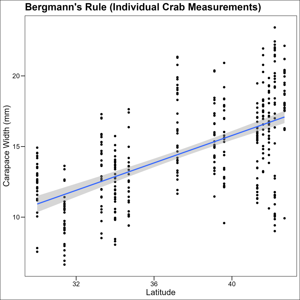
Plot 2: Summary Statistics by Site
Now, let’s create a summary dataset showing the mean and standard deviation of crab sizes at each site:
# Create a summary statistics data frame
df_summary <- df_crabs %>%
  group_by(site, latitude) %>%
  summarise(
    mean_size = mean(size),
    sd_size = sd(size)
  ) %>%
  ungroup()
df_summary
# A tibble: 13 × 4
site latitude mean_size sd_size
1 BB 41.6 14.7 2.85
2 CI 41.4 14.0 2.95
3 CTR 41.2 14.6 1.93
4 DB 43.3 17.6 3.21
5 DIK 34.2 12.3 2.11
6 GTM 30.0 13.6 1.72
7 GTM2 30.0 14.0 1.12
8 NIB 41.4 15.1 2.63
9 PIE 42.7 18.6 3.52
10 RC 33.9 12.6 2.21
11 SAP 38.9 12.8 1.44
12 VCR 37.3 14.8 3.54
13 ZI 39.4 15.2 2.39 Let’s plot just these summary statistics:
p2 <- ggplot(df_summary, aes(x = latitude, y = mean_size)) +
  geom_point() +
  geom_errorbar(aes(
    ymin = mean_size - sd_size,
    ymax = mean_size + sd_size
  ), width = 0.2) +
  labs(title = "Bergmann's Rule", x = "Latitude", y = "Carapace Width (mm)") +
  ggthemes::theme_base()

p2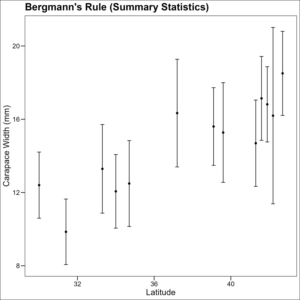
Combining Plots with Multiple DataFrames
Now comes the interesting part: we’ll combine both types of visualizations into a single plot by specifying different data sources for different layers.
First Iteration: Combined Plot Without Legend
Let’s create a combined plot with individual data points, summary statistics, and a regression line:
p3 <- ggplot(
  data = df_crabs, # The default data to use unless explicitly specified
  aes(x = latitude, y = size)
) +
  # Add points from the original data
  geom_jitter(alpha = 0.5) +
  # Add points from the summary data frame
  geom_point(
    data = df_summary, # Specify different data for this layer
    aes(x = latitude, y = mean_size),
    size = 4,
    position = position_nudge(x = 0.2) # Slightly nudge over the summary points
  ) +
  # Add error bars from the summary data
  geom_errorbar(
    data = df_summary, # Again specifying different data
    aes(
      x = latitude,
      y = mean_size,
      ymin = mean_size - sd_size,
      ymax = mean_size + sd_size,
    ),
    linewidth = 1,
    width = 0.4,
    position = position_nudge(x = 0.2) # Nudge to align with the mean points
  ) +
  # Add regression line using the original data
  geom_smooth(method = "lm", linewidth = 1.2) +
  labs(
    title = "Bergmann's Rule",
    subtitle = "Crab size increases with latitude",
    x = "Latitude",
    y = "Carapace Width (mm)"
  ) +
  ggthemes::theme_base()

p3
The plot combines:
- Individual crab measurements (light gray points)
- Mean sizes at each site with error bars (larger points, slightly offset)
- A regression line showing the overall trend
However, without a legend, it’s difficult for readers to understand what each element represents. Let’s fix that!
Final Version: Combined Plot with Legend
To add a legend, we need to assign named color aesthetics to each layer and then use scale_color_manual() to define the colors and labels:
p4 <- ggplot(data = df_crabs, aes(x = latitude, y = size)) +
  # Add named aesthetic for individual crab data points
  geom_jitter(aes(color = "Individual crabs"), alpha = 0.5) +
  # Add named aesthetic for mean points
  geom_point(
    data = df_summary,
    aes(x = latitude, y = mean_size, color = "Mean size"),
    size = 4,
    position = position_nudge(x = 0.2)
  ) +
  # Keep the same color name for error bars to match the mean points
  geom_errorbar(
    data = df_summary,
    aes(
      x = latitude,
      y = mean_size,
      ymin = mean_size - sd_size,
      ymax = mean_size + sd_size,
      color = "Mean size"
    ),
    linewidth = 1,
    width = 0.4,
    position = position_nudge(x = 0.2)
  ) +
  # Add named aesthetic for regression line
  geom_smooth(
    method = "lm",
    aes(color = "Regression line"),
    se = FALSE,
    linewidth = 1.2
  ) +
  # Define colors and labels for the legend
  scale_color_manual(
    name = "Data",
    values = c(
      "Individual crabs" = "gray60",
      "Mean size" = "red",
      "Regression line" = "blue"
    )
  ) +
  labs(
    title = "Bergmann's Rule",
    subtitle = "Crab size increases with latitude",
    x = "Latitude",
    y = "Carapace Width (mm)"
  ) +
  ggthemes::theme_base() +
  theme(
    legend.position = "bottom"
  )

p4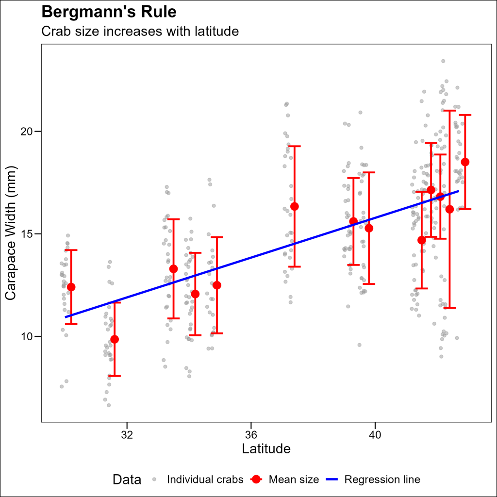
Key Techniques for Working with Multiple DataFrames
When creating plots with multiple data sources, keep these techniques in mind:
- Specify data for each layer: Use the
dataparameter within eachgeom_function to specify the data source for that layer. - Position adjustments: Use
position_nudge()to slightly offset elements to prevent overlapping. - Named color aesthetics: Include color names inside
aes()calls to generate legend entries. - Manual legend control: Use
scale_color_manual()to customize colors and labels in the legend. - Layer order matters: Place smaller or more transparent elements first so they don’t get covered by larger elements.
Conclusion
Using multiple dataframes in a single plot allows you to create richer, more informative visualizations that combine raw data with summary statistics and model predictions. This approach is particularly valuable in ecological research, where you often need to show both individual observations and broader patterns simultaneously.
The example we explored demonstrates how combining individual crab measurements with site averages and a regression line creates a more complete picture of Bergmann’s Rule in action – showing not just the overall trend of larger crab sizes at higher latitudes, but also the variation within and between sites.