Analysis of Variance
In our discussion of comparing sample means we discussed how to use R to compare two sample means. This is usually done through a t-test of some form. However, it’s not uncommon that we start asking questions wherein we want to compare the sample means across a larger number of groups. For example, say we have four groups 1-4.
This brings us to a conundrum, as statistical theory has to re-consider what to do to be able to formulate our null and alternate hypotheses in such a way that is useful. If we want to compare the means of four groups of a single grouping variable, we will use a single-factor ANOVA to do so. Our task here is to figure out how much variation among the group means should be present if the null hypothesis is true.
To be clear, when we are discussing this one-factor ANOVA, we are stating that our null hypothesis is that there is no difference between the sample means, so \(H_0: \mu_1 = \mu_2 = \mu_3 = \mu_4\). In our alternative hypothesis then, is that at least one mean is different.
F-statistic
Just like when we did t-tests and had the t-statistic, our test-statistic for the one-factor ANOVA is the F-statistic. Since our interest here is variance, the F-statistic is best thought of as a ratio of two variances, often referred to as mean squares.
We have the Group Mean Square (MSG), which represents the average variation between the means of the different groups. A larger MSG suggests that the group means are more spread out.
MSG = \frac{\sum{(y_i - \hat{y_i})^2}}{n-2}Then we have the Mean Square Error (MSE), which represents the average variation within each of the groups. This is essentially the inherent variability, or error, among individuals in the same group.
MSE = \frac{\sum{(y_i - \hat{y_i})^2}}{n-2}These two quantities can be thought of as representing the variance among group means (MSG) and the variance between subjects in the same group (MSE). Thus, it may be somewhat logical then, that since the F-statistic is the simple ratio
F = \frac{MSG}{MSE}, if the ratio is equal to 1, then the variances are in fact the same, and there is no additional variance between the sample means (represented by MSG) compared to just the error within groups (represented by MSE).
We then use our p-value as usual to determine the probability of getting our present F-statistic by chance. Then we can reject or fail to reject the null hypothesis.
Performing the ANOVA
When performing the ANOVA, similar to all statistical tests there are some processes that need to take place before we actually run the test. We first gather and organize our data as need be. Then we must check that our data meet the assumptions of the test we are planning on carrying out, then we can perform our test and interpret.
For our example here, let’s consider the sizes of penguins bills.
library(tidyverse)
library(palmerpenguins)

df_penguins <- palmerpenguins::penguins
str(df_penguins)
tibble [344 × 8] (S3: tbl_df/tbl/data.frame)
$ species : Factor w/ 3 levels "Adelie","Chinstrap",..: 1 1 1 1 1 1 1 1 1 1 ...
$ island : Factor w/ 3 levels "Biscoe","Dream",..: 3 3 3 3 3 3 3 3 3 3 ...
$ bill_length_mm : num [1:344] 39.1 39.5 40.3 NA 36.7 39.3 38.9 39.2 34.1 42 ...
$ bill_depth_mm : num [1:344] 18.7 17.4 18 NA 19.3 20.6 17.8 19.6 18.1 20.2 ...
$ flipper_length_mm: int [1:344] 181 186 195 NA 193 190 181 195 193 190 ...
$ body_mass_g : int [1:344] 3750 3800 3250 NA 3450 3650 3625 4675 3475 4250 ...
$ sex : Factor w/ 2 levels "female","male": 2 1 1 NA 1 2 1 2 NA NA ...
$ year : int [1:344] 2007 2007 2007 2007 2007 2007 2007 2007 2007 2007 ...In our example here, we may hypothesize that between the species in our dataset, there may be differences in the mean bill length. Bill length in a penguin looks vaguely like this:

So first we’ll look at the species on hand
unique(df_penguins$species)[1] Adelie Gentoo Chinstrap
Levels: Adelie Chinstrap GentooWhile this is not a strict requirement, it’s probably best to check that each species has ~roughly the same amount of samples per group before we continue. Let’s use the table() function for this:
table(df_penguins$species) Adelie Chinstrap Gentoo
152 68 124We can also plot this:
df_penguins %>%
  ggplot() +
  geom_bar(
    mapping = aes(x = species, fill = species),
    colour = "black",
    show.legend = FALSE
  ) +
  geom_text(
    mapping = aes(x = species, y = ..count.., label = ..count..),
    stat = "count",
    vjust = -0.5
  ) +
  labs(
    x = "Species",
    y = "Count",
    title = "Distribution of Penguin Species"
  ) +
  ggthemes::theme_base()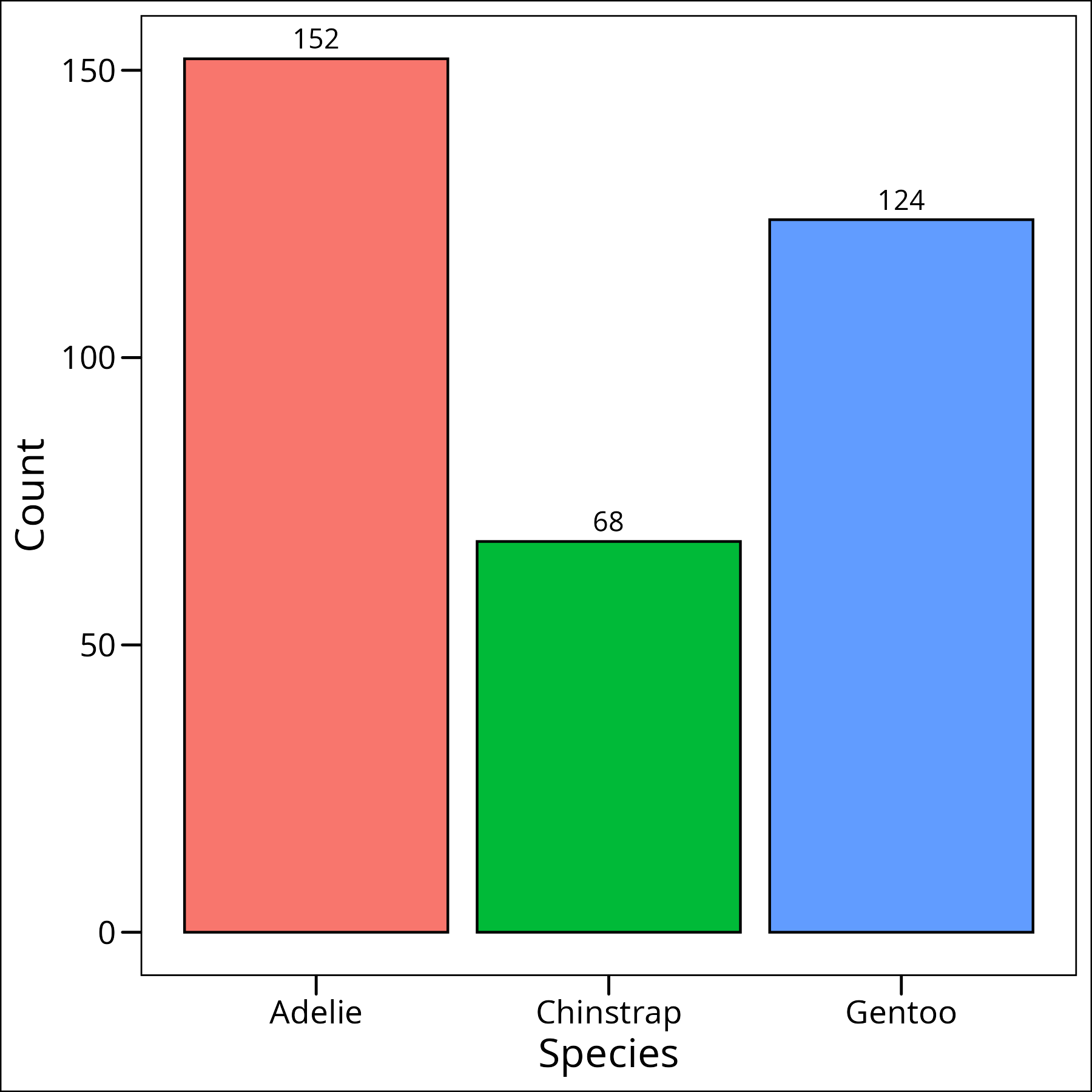
Okay so we can see that while they’re not completely equal, they’re close enough for our purposes, especially with an ANOVA, as it’s one of the less sensitive tests to number of samples per group.
Assumptions
The assumptions of this one-factor ANOVA are:
- 1) Observations are independent (i.e. each observation is not related to any other observation)
- 2) Data in each level of the groupings are normally distributed
- 3) The populations have common variances
Normality
A note: while plotting our data can be helpful, it can often lead to p-hacking and HARKing (Hypothesizing After Results are Known). We often plot our data before as part of our data exploration, but that will give us an insight, prior to performing our tests, about what the means of each group might be. Again, this in and of itself is not bad but it is important to recall that our process here should be to develop our hypothesis and then perform our statistical test. Here we’ll use QQ plots to check for normality in each of our groups:
# Combined QQ-Plot for original bill_length_mm
df_penguins %>%
  ggplot(aes(sample = bill_length_mm, colour = species)) +
  geom_qq() +
  geom_qq_line() +
  labs(
    x = "Theoretical Quantiles",
    y = "Sample Quantiles",
    title = "QQ Plot of Bill Length by Species",
    colour = "Species"
  ) +
  ggthemes::theme_base()
To formally test for normality within each group, we can use the Shapiro-Wilk test. We can apply this test to the bill_length_mm for each species:
df_penguins %>%
  group_by(species) %>%
  summarise(
    shapiro_p_value = shapiro.test(bill_length_mm)$p.value
  )
# A tibble: 3 × 2
species shapiro_p_value
<fct> <dbl>
1 Adelie 0.717
2 Chinstrap 0.194
3 Gentoo 0.0135The null hypothesis for the Shapiro-Wilk test is that the data are normally distributed. A p-value less than 0.05 suggests a deviation from normality. Here, the p-value for Gentoo penguins (0.0135) is less than 0.05, indicating that their bill lengths are not normally distributed. Adelie and Chinstrap species appear to have normally distributed bill lengths.
Since the normality assumption is violated for one of the groups (Gentoo), using a parametric ANOVA on the original bill_length_mm data might not be appropriate. A common approach to address non-normality is to transform the data. Let’s try a log transformation:
df_penguins <- df_penguins %>%
  mutate(
    log_bill_length_mm = log(bill_length_mm)
  )
Now let’s re-check normality for the log-transformed bill lengths using the Shapiro-Wilk test:
df_penguins %>%
  group_by(species) %>%
  summarise(
    shapiro_p_value = shapiro.test(log_bill_length_mm)$p.value
  )
# A tibble: 3 × 2
species shapiro_p_value
<fct> <dbl>
1 Adelie 0.900
2 Chinstrap 0.119
3 Gentoo 0.180After log transformation, the p-values for all three species are greater than 0.05. This suggests that the log-transformed bill lengths (log_bill_length_mm) meet the normality assumption for all species. We can therefore proceed with checking the other ANOVA assumptions using this transformed data for a parametric ANOVA, and we also have the option to use a non-parametric test on the original data.
An additional note is that if our assumptions are not met completely, and perhaps a transformation does not help us, it is possible to use a non-parametric alternative such as the Kruskal-Wallis test which we will cover later in this article.
Homoskedasticity
Next to check our variances.
Our second assumption was that the variances of all samples be equal (homoskedasticity). While it’s not necessary to always do so, some researchers will use a standardized test to check for homoskedasticity. We will test our homoskedasticity with Bartlett’s test. The null hypothesis of Bartlett’s test is that the variances are equal across all groups. So, if p < 0.05, we would reject the null hypothesis and conclude that the assumption of homoskedasticity is violated. As a sidenote, if our normality assumption were not quite met for the data being tested for homoskedasticity, it would be preferable to use Levene’s test, which is less sensitive to departures from normality.
First, let’s test the original bill_length_mm data. Since we will also test the log-transformed data, and both tests require the data in a ‘long’ format with the response variable and the grouping factor, we can use the df_penguins dataframe directly, as it’s already in the correct format.
# Bartlett test for original bill_length_mm
bartlett.test(bill_length_mm ~ species, data = df_penguins)
Bartlett test of homogeneity of variances
data: bill_length_mm by species
Bartlett's K-squared = 3.6481, df = 2, p-value = 0.1614The p-value (0.1614) is greater than 0.05, suggesting that the variances of the original bill_length_mm data are homogenous across species. This is interesting, as the normality assumption was violated for this data (specifically for Gentoo penguins).
Now, let’s test the log_bill_length_mm data, which we confirmed meets the normality assumption:
# Bartlett test for log_bill_length_mm
bartlett.test(log_bill_length_mm ~ species, data = df_penguins)
Bartlett test of homogeneity of variances
data: log_bill_length_mm by species
Bartlett's K-squared = 0.80327, df = 2, p-value = 0.6692Wonderful, the p-value (0.6692) is well above 0.05, so the variances for the log_bill_length_mm data are also considered equal across species. This means the log-transformed data now meets both the normality and homoskedasticity assumptions required for a parametric ANOVA.
Deciding on the Approach
Based on our assumption checking:
- The original
bill_length_mmdata violates the normality assumption for one group (Gentoo) but meets the homoskedasticity assumption. - The log-transformed
log_bill_length_mmdata meets both normality and homoskedasticity assumptions for all groups.
Therefore, for a parametric approach, we should use the log-transformed data (log_bill_length_mm) for our ANOVA. Because the original data did not meet all assumptions, it also provides a good opportunity to demonstrate a non-parametric alternative (Kruskal-Wallis test) using the original bill_length_mm data.
Parametric Approach (ANOVA)
Performing the Test
Now to perform the test itself using the aov function. It is, similarly to the t-test, very easy to compute in R, and looks pretty much identical to our syntax for the Bartlett’s test. The first argument is the column that has the values of interest, and we use the tilde (~) to denote after the column of interest, the name of the grouping column. The function itself we use comes from the stats package again. We can now proceed to our test and run it all like this:
mod <- aov(
   log_bill_length_mm ~ species,
   data = df_penguins
)
Interpretation
summary(mod) Df Sum Sq Mean Sq F value Pr(>F)
species 2 3.846 1.9230 427.6 <2e-16 ***
Residuals 339 1.525 0.0045
---
Signif. codes: 0 '***' 0.001 '**' 0.01 '*' 0.05 '.' 0.1 ' ' 1
2 observations deleted due to missingnessThe summary(mod) output provides key information about our ANOVA model. The F-statistic (427.6 on 2 and 339 degrees of freedom) is very large, and the associated p-value (<2e-16) is extremely small. This indicates that there is a statistically significant difference in the mean log-transformed bill lengths among the three penguin species (Adelie, Chinstrap, and Gentoo). In other words, we reject the null hypothesis that all species have the same mean log bill length. The term species in the output refers to our grouping variable, and its small p-value suggests it significantly explains variation in log_bill_length_mm. However, this overall test doesn’t tell us which specific species pairs differ from each other. To find that out, we need to perform post-hoc tests.
Also, it’s almost always advantageous to plot our output, but we will defer doing that for now.
Post-Hoc
When an ANOVA test yields a significant result (like ours did), it indicates that there is an overall difference between at least two of the group means. However, it doesn’t specify which particular groups are different from each other. Post-hoc tests (Latin for “after this”) are follow-up tests conducted to explore these specific differences. They perform pairwise comparisons between all group means while controlling for the family-wise error rate – the probability of making one or more Type I errors (false positives) when performing multiple comparisons.
One of the most commonly used post-hoc tests is the Tukey Honest Significant Difference (HSD) test. This test compares all possible pairs of means and is suitable when you want to compare every group mean with every other group mean. It calculates a confidence interval for the difference between each pair of means. If this interval does not include zero, the difference is considered statistically significant. Let’s apply the Tukey HSD test to our ANOVA model:
TukeyHSD(mod) Tukey multiple comparisons of means
95% family-wise confidence level
Fit: aov(formula = log_bill_length_mm ~ species, data = df_penguins)
$species
diff lwr upr p adj
Chinstrap-Adelie 0.23023589 0.20718014 0.253291643 0.000000
Gentoo-Adelie 0.20292758 0.18375262 0.222102538 0.000000
Gentoo-Chinstrap -0.02730831 -0.05116498 -0.003451639 0.020178The output of TukeyHSD(mod) gives us pairwise comparisons. Let’s break down the key columns for the $species section:
Non-parametric Approach (Kruskal)
Performing the Test
Since our original bill_length_mm data violated the normality assumption for one of the penguin species (Gentoo), we can demonstrate a non-parametric alternative to ANOVA. The Kruskal-Wallis test is suitable for this purpose. It is used to determine if there are statistically significant differences between the medians of two or more independent groups. It’s considered the non-parametric equivalent of the one-way ANOVA and is used when the assumptions of ANOVA are not met (particularly normality or homogeneity of variances, though it is somewhat robust to the latter if group sizes are similar). The test works by pooling all the data, ranking it from smallest to largest, and then comparing the average ranks of each group. The null hypothesis (H₀) is that the medians (or, more generally, the distributions) of all groups are equal. We will perform this test on the original bill_length_mm data.
kruskal.test(
  bill_length_mm ~ species,
  data = df_penguins
)
Kruskal-Wallis rank sum test
data: bill_length_mm by species
Kruskal-Wallis chi-squared = 244.14, df = 2, p-value < 2.2e-16Interpretation
The output of the kruskal.test provides us with:
- Kruskal-Wallis chi-squared: This is the test statistic (244.14 in our case).
- df: The degrees of freedom, calculated as the number of groups minus 1 (3 species – 1 = 2 df).
- p-value: The probability of observing a test statistic as extreme as, or more extreme than, the one calculated if the null hypothesis were true. Our p-value is very small (< 2.2e-16).
Since the p-value is much less than the typical alpha level of 0.05, we reject the null hypothesis. This means there is a statistically significant difference in the median bill lengths (or more broadly, the distributions of bill lengths) among the at least two of the three penguin species (Adelie, Chinstrap, and Gentoo). Like the ANOVA F-test, the Kruskal-Wallis test is an omnibus test; it tells us that a difference exists overall, but it does not specify which particular groups are different from each other. For that, we need a post-hoc test.
Post Hoc
When a Kruskal-Wallis test is significant, a post-hoc test is used to determine which specific pairs of groups are significantly different from each other. Dunn’s test is a common post-hoc procedure for Kruskal-Wallis. It performs multiple pairwise comparisons, typically adjusting the p-values to control for the increased risk of Type I errors that comes with multiple testing. We will use the dunn_test function from the rstatix package. If you haven’t used this package before, you may need to install it first by running install.packages("rstatix") in your R console, and then load it using library(rstatix). We will use the Bonferroni method for p-value adjustment, which is a conservative approach.
rstatix::dunn_test(
  bill_length_mm ~ species, # formula of syntax y ~ x
  data = df_penguins, # data frame
  p.adjust.method = "bonferroni" # p-value adjustment method
)
# A tibble: 3 × 9
.y. group1 group2 n1 n2 statistic p p.adj p.adj.signif
* <chr> <chr> <chr> <int> <int> <dbl> <dbl> <dbl> <chr>
1 bill_length_mm Adelie Chinstrap 151 68 12.8 2.98e-37 8.94e-37 ****
2 bill_length_mm Adelie Gentoo 151 123 13.1 2.06e-39 6.17e-39 ****
3 bill_length_mm Chinstrap Gentoo 68 123 -1.77 7.71e- 2 2.31e- 1 ns The output of Dunn’s test shows the pairwise comparisons. Key columns include:
.y.: The response variable (bill_length_mm).group1andgroup2: The pair of groups being compared.n1andn2: The sample sizes for each group in the comparison.statistic: The Z-statistic for the comparison of mean ranks.p: The unadjusted p-value for the comparison.p.adj: The p-value adjusted for multiple comparisons (using the Bonferroni method here).p.adj.signif: Significance codes based on the adjusted p-value (e.g.,****for p < 0.0001,nsfor not significant).
Interpreting the results based on p.adj:
- Adelie vs. Chinstrap: The adjusted p-value is extremely small (8.94e-37), indicating a highly significant difference in bill lengths between Adelie and Chinstrap penguins.
- Adelie vs. Gentoo: The adjusted p-value is also extremely small (6.17e-39), indicating a highly significant difference in bill lengths between Adelie and Gentoo penguins.
- Chinstrap vs. Gentoo: The adjusted p-value is 0.231 (or 2.31e-1), which is greater than 0.05. This indicates that there is no statistically significant difference in bill lengths between Chinstrap and Gentoo penguins after Bonferroni adjustment for multiple comparisons.
So, the non-parametric approach suggests that Adelie penguins have significantly different bill lengths compared to both Chinstrap and Gentoo penguins. However, the difference between Chinstrap and Gentoo penguins is not statistically significant when using Dunn’s test with Bonferroni correction on the original data. This is a slightly different conclusion for the Chinstrap-Gentoo comparison than what we found with the parametric ANOVA on log-transformed data (where it was significant). Such discrepancies can arise due to the different ways the tests handle data (values vs. ranks) and the impact of transformations.
Plotting the Results
Visualizing our data is a crucial step to complement the statistical tests. Although our parametric ANOVA was performed on log-transformed data to meet assumptions, plotting the distributions of the original bill_length_mm data helps provide an intuitive understanding of the differences among species. This is especially useful for comparing with the results of our non-parametric Kruskal-Wallis test, which also used the original data. We will create density plots for each species and add vertical lines to denote the mean bill length for each. This helps illustrate the distributions and central tendencies that our tests have been evaluating.
# Calculate means of the original bill_length_mm for plotting
penguin_means <- df_penguins %>%
  group_by(species) %>%
  summarise(mean_bill_length = mean(bill_length_mm, na.rm = TRUE))

df_penguins %>%
  ggplot(aes(x = bill_length_mm)) +
  geom_density(aes(fill = species),
               alpha = 0.3, colour = "black") +
  scale_fill_manual("Species",
                    values = c("Adelie" = "purple", "Chinstrap" = "goldenrod2", "Gentoo" = "steelblue2")) +
  geom_vline(
    data = penguin_means,
    aes(xintercept = mean_bill_length, colour = species),
    linetype = "dashed", show.legend = FALSE
  ) +
  scale_colour_manual("Species",
                      values = c("Adelie" = "purple", "Chinstrap" = "goldenrod2", "Gentoo" = "steelblue2")) +
  annotate(
    geom = "text",
    x = Inf, # Position to the far right
    y = Inf, # Position to the top
    label = paste("Kruskal-Wallis p < 0.001",
                  "ANOVA (log-transformed) p < 0.001", sep="\n"), # Clarified ANOVA source
    hjust = 1.05, # Adjust to bring text into plot
    vjust = 1.5,  # Adjust to bring text down from top
    size = 3.5
  ) +
  labs(
    x = "Bill Length (mm)",
    y = "Density",
    fill = "Species",
    title = "Density of Penguin Bill Lengths by Species with Means"
  ) +
  ggthemes::theme_base()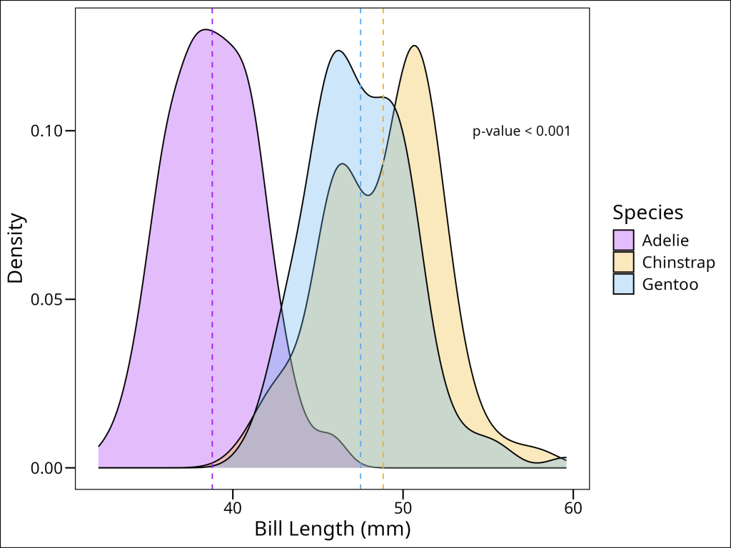
Summary
This tutorial demonstrated how to compare a continuous variable (penguin bill length) across multiple groups (species) using R. We covered two main approaches: the parametric ANOVA and the non-parametric Kruskal-Wallis test.
Key takeaways include:
- Assumption Checking is Crucial: Before ANOVA, always check for normality (e.g., Shapiro-Wilk test) and homogeneity of variances (e.g., Bartlett’s test).
- Data Transformation: If assumptions like normality are not met for ANOVA, log-transforming the data can be an effective solution. We used this for
bill_length_mm. - Parametric (ANOVA) Workflow: Perform the ANOVA (
aov()) on data meeting assumptions. If significant, use a post-hoc test like Tukey’s HSD (TukeyHSD()) to find which specific group means differ. Our results on log-transformed data showed all penguin species differed in mean bill length. - Non-Parametric (Kruskal-Wallis) Workflow: If parametric assumptions can’t be met (or as an alternative), use the Kruskal-Wallis test (
kruskal.test()) on the original data. If significant, follow up with a post-hoc test like Dunn’s test (e.g., fromrstatix::dunn_test()with p-value adjustment) for pairwise comparisons. Our results on original bill lengths showed Adelie differed from Chinstrap and Gentoo, but Chinstrap and Gentoo did not significantly differ.