Generalized Linear Models (GLMs)
In a simple linear model, we expect the response variable varies in a linear fashion. That is, a constant amount of change in the predictor variable (X) leads to a constant amount of change in the response variable (Y). We also need those two variables to be continuous and can take any value, without strict upper or lower limits. But this is not always how real data behave!! For example, let’s think about species richness. This is a zero-bounded integer value (not continuous!), but we are likely very interested in species richness for a variety of questions. Additionally, what about trying to model presence/absence data? Say we wanted to come up with a model for which the response variable is the presence or absence of a gene mutation in a lab rat? These two examples are not well described by a “continuous linear variable”. What to do!! We shall simply abandon the linear model 🙂
The generalized linear model is the more flexible and useful big brother of the simple linear regression. It still uses regression techniques (i.e. fitting a line to some data), and often also uses a version of least squares methods, but adds a bit more complexity to the equation (literally and figuratively!).
These models always contain three things:
- A linear predictor
- A link function
- An error distribution
Compared to simple linear models, GLMs introduce flexibility primarily through the latter two components: the link function and the choice of error distribution, which we will explore in detail. In a standard simple linear model, the error structure assumed is typically a normal distribution, and its linear predictor usually involves a single predictor variable, though multiple predictors can be used. As we move to talking about GLMs, we’ll almost always consider multiple predictor variables in our models, as that’s what usually makes sense biologically!
Throughout this section on GLMs, we’ll use the following example, which is an excellent example used by JJ Valletta and TJ McKinley in their “Statistical Modelling in R” book, and in Mick Crawley’s “R Book”. The data can be found here
A long-term agricultural experiment had 90 grassland plots, each 25m x 25m, differing in biomass, soil pH and species richness (the count of species in the whole plot). The plots were classified according to a 3-level factor as high, medium or low pH with 30 plots in each level.
What are we interested in? Well, in many systems, species richness can be affected by biomass, usually negatively. In this grassland, what effect does biomass have on richness? Additionally, if there is a relationship between the two, does it differ across levels of soil pH? Let’s set this out in some hypotheses:
\(H1_0\): Biomass has no effect on species richness.
\(H2_0\): Differing pH has no effect on the relationship between species richness and biomass.
Now that we can anchor our thinking with this example, let’s go back to the theory for a minute. I encourage the mathematically timid reader to NOT be afraid of the equations!! Take your time and read through them. We’ll explain in detail and maybe you will actually find it fun!!
In the most basic terms, in a regression of this nature, we have some predictor variable(s) (often denoted \(\bf{X}\)), and a single response variable (often denoted \(\bf{Y}\)). For every value of \(\bf{X}\), we want to figure out the expected value of \(\bf{Y}\). We write that like this:
\text{E(}\bf{Y}|\bf{X})which we would say as “the expected value of \(\bf{Y}\), conditional on \(\bf{X}\)”
This expected value is then found as:
\text{E}(\textbf{Y}|\textbf{X}) = \mu =g^{-1}(\textbf{X}\boldsymbol{\beta})The term \(\mu\) (mu) represents the mean of the assumed probability distribution of our response variable \(Y\), for a given set of predictor values \(\bf{X}\). How do we get this mean value? Well, here we set it equal to the value on the right-hand side of the equation, which involves the link function and the linear predictor.
The term on the right-hand side of the equation has two parts, \(\textbf{X}\boldsymbol{\beta}\) is the linear predictor and the \(g^{-1}()\) is the link function. We’ll discuss the linear predictor first.
Linear Predictor
This is the value that actually tells us how our response variable will change as our predictor variables change. Notice that here we’re now talking about multiple predictor variables, as it’s nearly always the case that a single variable will not be the only thing we’re interested in. Introducing a few equations here will be useful.
First of all, notice that both terms in \(\textbf{X}\boldsymbol{\beta}\) are bolded. That’s because they can both represent vectors or matrices: \(\textbf{X}\) is a matrix containing the values of our predictor variables (with each row typically an observation and each column a variable), and \(\boldsymbol{\beta}\) is a vector of coefficients corresponding to each predictor. The term \(\textbf{X}\boldsymbol{\beta}\) represents the linear combination of our predictor variables and their corresponding coefficients. We’ll denote this linear predictor as \(\eta\) (eta). For now, the key takeaway is that these predictors and coefficients combine to produce a single value, \(\eta\), for each observation, which is then transformed by the link function.
Link Function
This is the heart of what makes a model a GLM. This component essentially allows us to relax the assumption of normality of our response variable, by allowing other distributions, and then defining some function of the response variable that in fact DOES vary linearly with the predictor variables. The math behind how this works is both incredibly interesting, and requires some knowledge of linear algebra, so we will leave the interested reader with an encouragement to take a linear algebra class if they have room in their timetable.
Essentially, the link function, denoted \(g()\), transforms the mean of our response variable, \(\mu\), such that this transformed mean, \(g(\mu)\), has a linear relationship with the predictor variables. That is, \(g(\mu) = \eta = \textbf{X}\boldsymbol{\beta}\). The \(g^{-1}\) in our main GLM equation (\(\mu = g^{-1}(\eta)\)) is the inverse of this link function, which maps the linear predictor back to the original scale of the mean.
Error Distribution
The error distribution we define will in turn define which link function we choose. Determining what error distribution we need to choose can be crudely but often satisfactorily chosen by plotting the response variable, but a more nuanced approach is possible. See this tutorial from the Quebec Centre for Biodiversity Science for an example.
Species Richness Example – I
Back to our example stated earlier regarding if the relationship between biomass and species richness changes with soil pH. The data for this example can be found here. If you want to download the data and follow along, be sure to check out the Workflow section.
Since we already have our hypothesis stated (and therefore cannot p-hack ourselves), we can proceed to plot our data. However, we need to read it in first. It turns out, it’s actually totally easy to pull data from the web using the same readr::read_csv() we’re already familiar with. Let’s first inspect it briefly:
df_species <- read_csv(
  "https://exeter-data-analytics.github.io/StatModelling/_data/species.csv"
) %>%
  mutate(pH = factor(pH, levels = c("low", "mid", "high")))

head(df_species)
# A tibble: 6 × 3
pH Biomass Species
<fct> <dbl> <dbl>
1 high 0.469 30
2 high 1.73 39
3 high 2.09 44
4 high 3.93 35
5 high 4.37 25
6 high 5.48 29Okay, so we can see the data types. It’s important here to not be tricked by R!! It has read in the data automatically with the Species column as numeric type, but it’s in fact integer values. This doesn’t matter right now, but it will matter when we need to choose an error distribution.
Step 1 – Plot Data
Let’s plot our data to see about what we’re dealing with.
ggplot(data = df_species) +
  geom_point(mapping = aes(x = Biomass, y = Species)) +
  geom_smooth(mapping = aes(x = Biomass, y = Species), method = "lm") +
  labs(x = "Biomass", y = "Species Richness") +
  ggthemes::theme_base()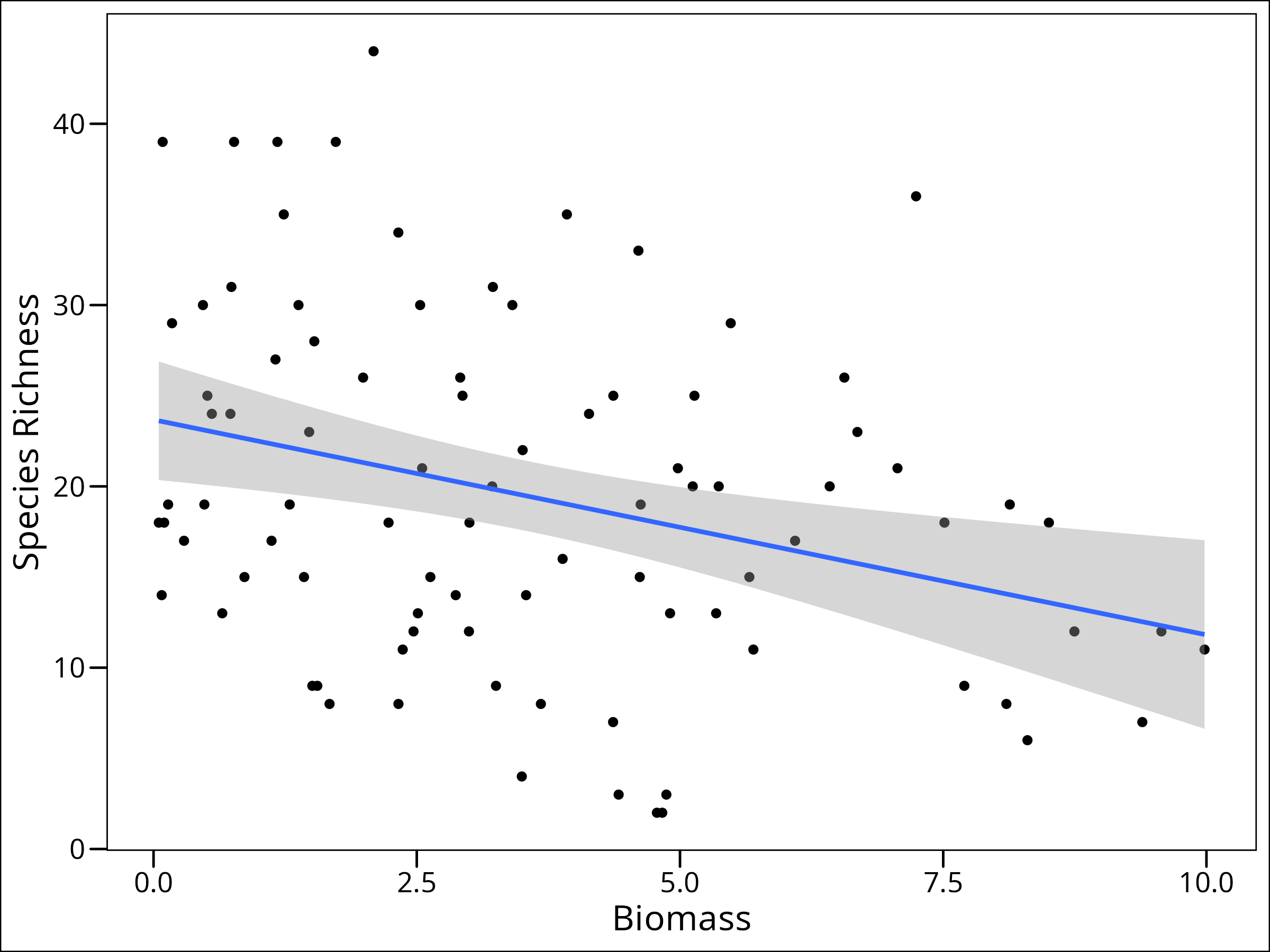
It even looks like there’s a linear decrease in richness as biomass increases. So why can’t we just assume a normal distribution here? Well, let’s take a look at it.
An Aside – Motivation for Link Functions
If we simply assume a Normal distribution, we don’t even need to specify a link function. Below, we fit this simple linear model (which is not the recommended approach for this count data, as we’ll see) and then plot its predictions, including extrapolations.
# Fit a simple linear model (NOT the recommended approach for this data)
mod_spec_simple <- lm(Species ~ Biomass, data = df_species)
Here, the lines are representing the fitted regression lines, with the predicted values of species richness for each value of biomass. What’s wrong with this? Well nothing yet! But often when we do this type of regression, we want to predict out of sample, or essentially figure out what will happen at levels of our predictor variable we haven’t observed. Let’s do that here by first creating a sequence of biomass values (including some beyond our observed range) and then predicting species richness using our simple model:
# Expand the data to predict out of sample
df_expanded_species <- expand.grid(
  Biomass = seq(min(df_species$Biomass), 30, length.out = 200)
) %>%
  mutate(Species = predict(mod_spec_simple, .))

# Plot; use the original data for the points, and the expanded data for the line
ggplot(data = df_species, aes(x = Biomass, y = Species)) +
  geom_point() +
  geom_line(data = df_expanded_species, colour = "red") +
  labs(y = "Species Richness") +
  ggthemes::theme_base()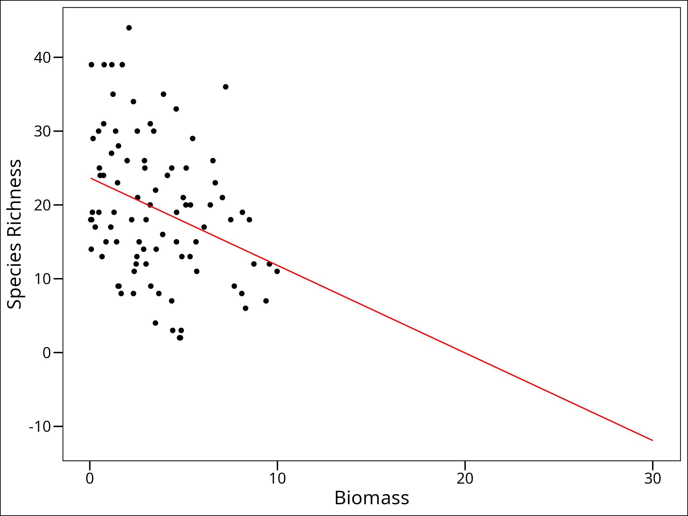
So we want to predict out of sample. We’ve done that! We can now make a guess at what values of Species Richness would be present at a Biomass value of 30. But what’s wrong with this one?
We’re predicting NEGATIVE species richness. That’s impossible! We can probably guess that as biomass gets higher, we’ll actually probably have something more like an asymptotic decline of species richness. So how can we model this? A link function.
Step 2 – Error Distribution
Now that we know we need to use a link function to appropriately deal with our data, we will start the process of finding that function by figuring out what type of error distribution our response data have.
Let’s use our crude by satisfactory method of choosing an error distribution, via plotting our response variable. We can do this a couple ways. As a density plot:
ggplot(data = df_species, mapping = aes(x = Species)) +
  geom_histogram(
    aes(y = after_stat(density)), # scale counts to density
    fill = "blue2",
    colour = "black",
    alpha = 0.3,
    bins = 30
  ) +
  geom_density(fill = "goldenrod2", alpha = 0.3) +
  labs(x = "Species Richness") +
  ggthemes::theme_base()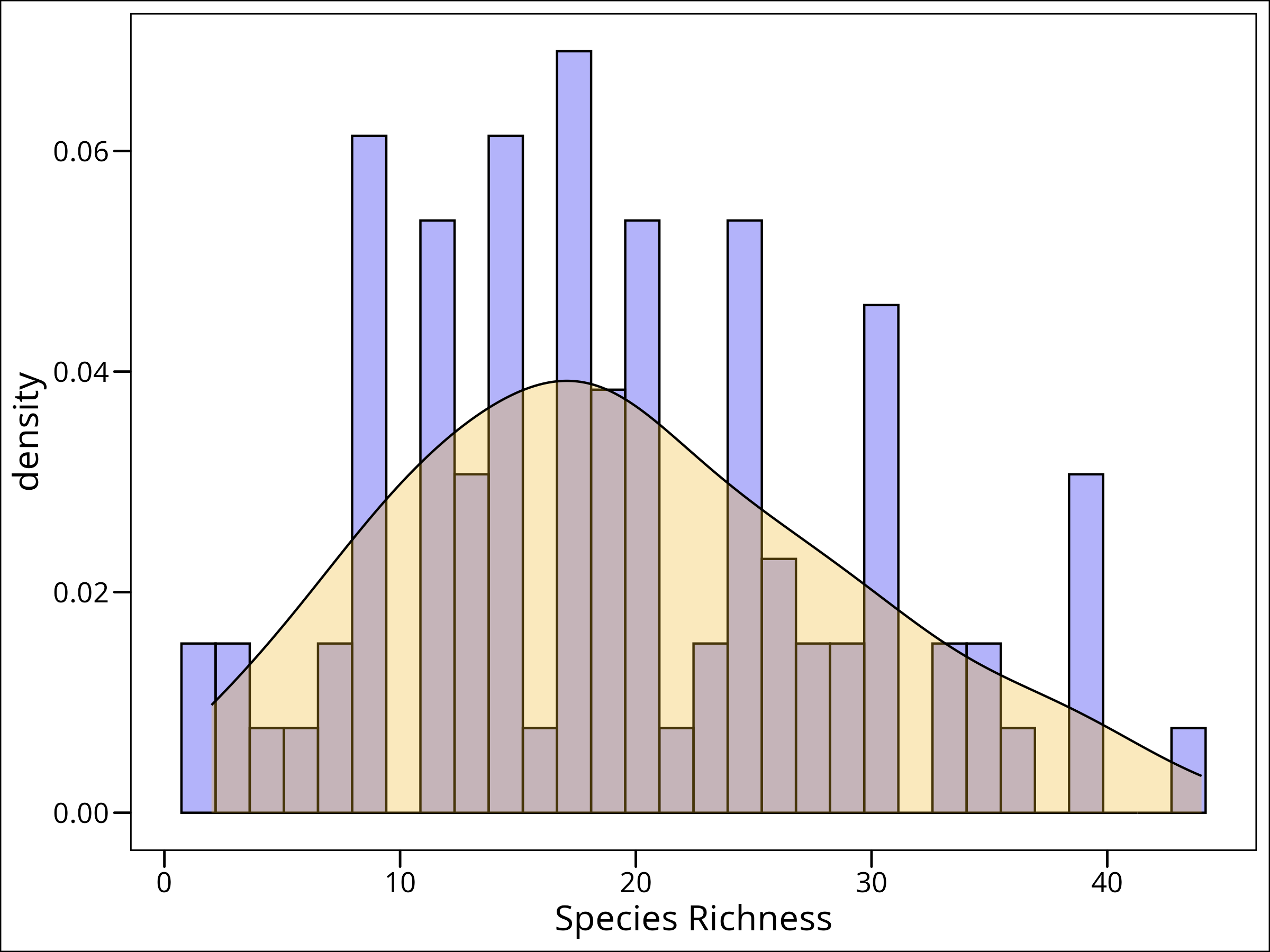
What to do? Well, this follows a slightly skewed distribution, but it’s discrete integer-valued. For this purpose, a Poisson distribution will work well.
Step 3 – Selecting a Link Function
We have to come up with a function that will allow us to continue. We can see which link functions are supported for the different distributions in the stats package:
?familyAnd a helpful page will pop up. The beginning of the help page has the following info:
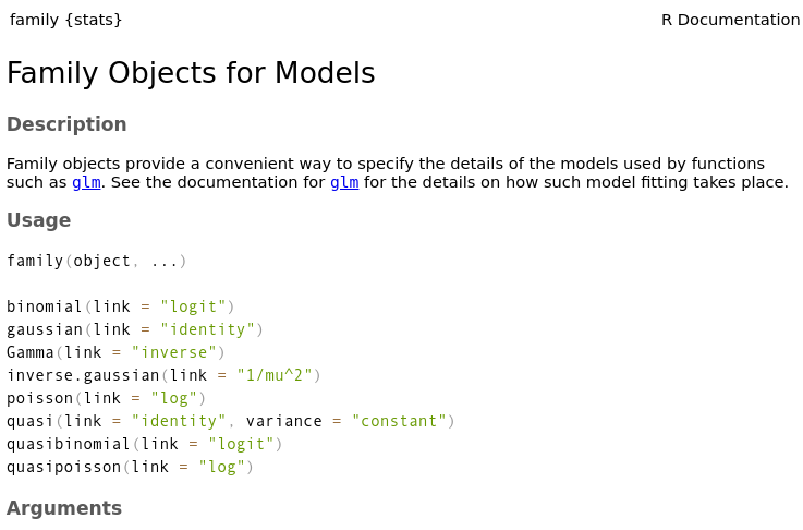
And we can see that for the Poisson distribution, we must use the log link function.
Previously we were interested in \(\mu\) to get our expected value of \(\text{E(}\bf{Y}|\bf{X})\) but we need to come up with some way to link to \(\mu\). It turns out that in this case, our \(\textbf{X}\boldsymbol{\beta}\) can be restated as \(\textbf{X}\boldsymbol{\beta} = \text{ln}(\mu)\), so in this case,
\text{E(}\textbf{Y}|\textbf{X}) = \text{exp}(\textbf{X}\boldsymbol{\beta})Recall from math class that the exponential function (e.g., \(e^x\)) is the inverse of the natural logarithm (e.g., \(\text{ln}(x)\). This means that to obtain \(\mu\) from \(\text{ln}(\mu)\), we use the exponential function.
Step 4 – Fitting the Model
Okay, let’s (Finally!) fit the model. Turns out, yet again, that it’s dead simple in R.
mod_species_poi <- glm(
  Species ~ Biomass,
  data = df_species,
  family = poisson(link = log) # log link function
)
Step 5 – Model Evaluation
When we have multiple models, we need a way to decide which one is “best” or provides the most suitable explanation of our data with reasonable complexity. The performance package in R provides a convenient function, compare_performance(), that calculates various metrics for model comparison. These metrics can help us rank models based on criteria like goodness-of-fit (e.g., Nagelkerke’s R2), predictive accuracy (e.g., RMSE), and information criteria (like AIC and BIC), which penalize model complexity. Information criteria are particularly useful as they balance model fit with the number of parameters used.
Let’s use it to compare our three models (mod1, mod2, and mod3):
par(mfrow = c(2, 2)) # this will put the plots in a grid
plot(mod_species_poi)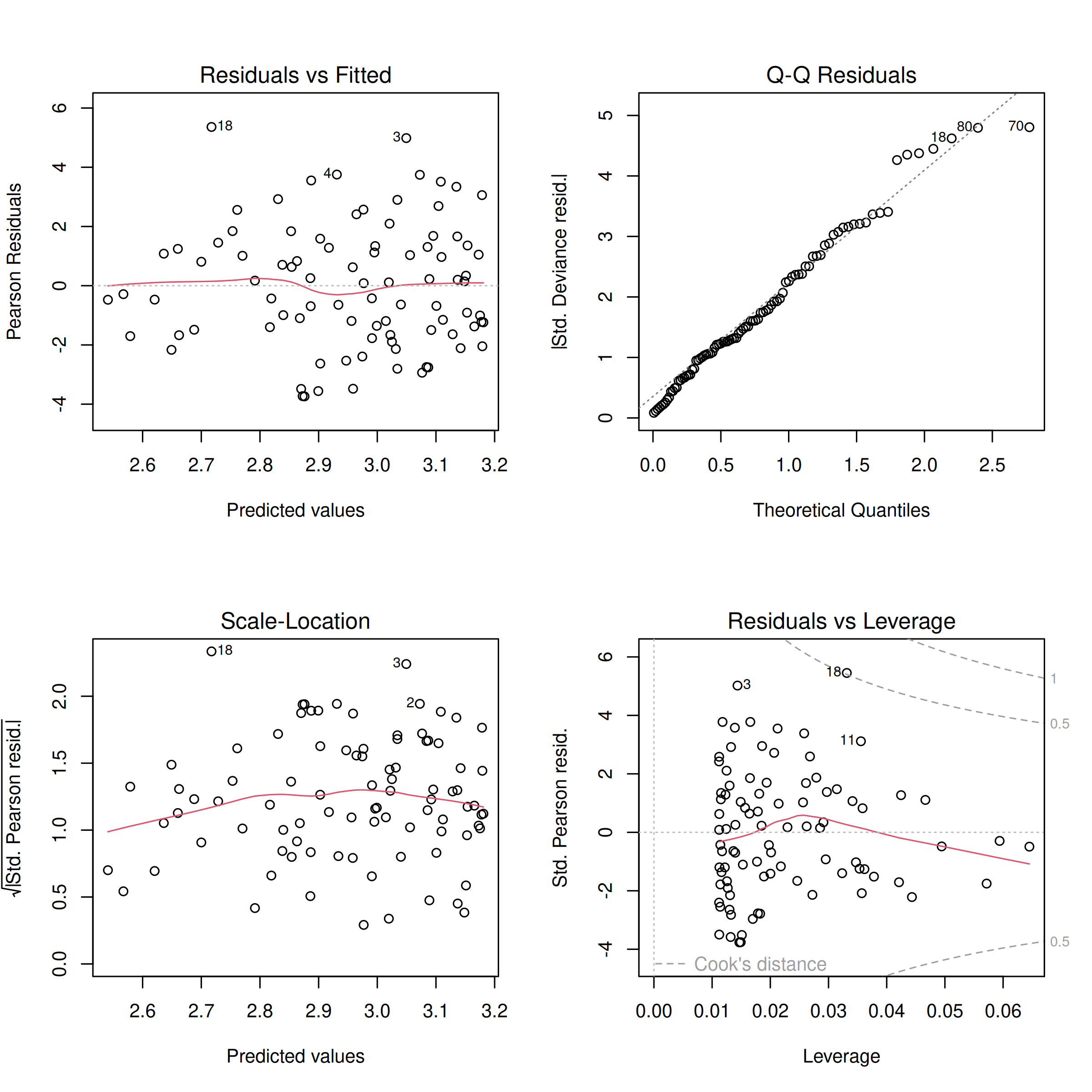
This generates four diagnostic plots. The first two, ‘Residuals vs Fitted’ and ‘Normal Q-Q’, are particularly useful for checking assumptions like linearity of the relationship (on the link scale) and normality of residuals (though for GLMs, deviance residuals have slightly different interpretations and direct normality is not strictly assumed for them in the same way as for OLS residuals). We see the line of the residuals and fitted values is relatively flat and follows the dotted line, and the Q-Q plot shows points generally following the diagonal line. These quick diagnostics suggest our model is reasonably well-behaved, so we can continue.
For more on model evaluation, there’s great texts out there, but I like Laurie Tupper’s chapter on Model Evaluation as a gentle introduction.
Step 6 – Interpreting the Output
Let’s re-call the output here:
summary(mod_species_poi)Call:
glm(formula = Species ~ Biomass, family = poisson(link = log),
data = df_species)
Coefficients:
Estimate Std. Error z value Pr(>|z|)
(Intercept) 3.184094 0.039159 81.31 < 2e-16 ***
Biomass -0.064441 0.009838 -6.55 5.74e-11 ***
---
Signif. codes: 0 ‘***’ 0.001 ‘**’ 0.01 ‘*’ 0.05 ‘.’ 0.1 ‘ ’ 1
(Dispersion parameter for poisson family taken to be 1)
Null deviance: 452.35 on 89 degrees of freedom
Residual deviance: 407.67 on 88 degrees of freedom
AIC: 830.86
Number of Fisher Scoring iterations: 4This output has a number of components
1. Call — this is the function we used in our model. So to recall, what we’re showing here is the that we’ve regressed Species ~ Biomass which we would say as “species richness regressed against biomass” or “species richness regressed with biomass”.
2. Deviance Residuals — Previously we were talking about just plain old residuals, which is for a single value of x, the distance between the predicted value on the regression line, and the observed value of y. Deviance by itself, is a measure of goodness of fit, wherein the smaller the value, the better the fit of the model and vice versa. Describing the calculation of a Deviance Residual is beyond the current scope, but we can still interpret them similarly to ordinary residuals: if a singular point has a high deviance residual, it indicates a poor fit for that particular observation by the model.
3. Coefficients — Usually the most relevant part of the output, these values represent the estimated coefficients. The (Intercept) term (\(\beta_0\)) is the predicted value of the linear predictor (which is the log of species richness in our Poisson model) when Biomass is zero. The Biomass term (\(\beta_1\)) is the estimated change in the log of species richness for a one-unit increase in Biomass. It’s good to think about whether or not the y-intercept (the intercept on the original scale after back-transformation) makes biological sense to interpret. In our case, species richness at zero biomass might be ecologically ambiguous. The interpretation of these coefficients becomes clearer when we consider them on the response scale, as discussed next.
In our case, the coefficient for Biomass is -0.064. This is the slope relating Biomass to the predicted log of the species richness. Why log? Well, because we’ve used a log link function. This is actually a really important point as it means our interpretation is not straight forward. For example, if a grassland plot (Plot A) with a certain biomass has a predicted log count of species richness, say \(\eta_A\), then a plot with one additional unit of biomass (Plot B) would have a predicted log count of \(\eta_A – 0.064\). To find the actual predicted species richness, we exponentiate these log counts. So, the predicted species richness for Plot A is \(e^{\eta_A}\), and for Plot B is \(e^{\eta_A – 0.064}\). This can be rewritten as \(e^{\eta_A} \times e^{-0.064}\). Since \(e^{-0.064}\) is approximately 0.938, this means that for each one-unit increase in biomass, the predicted species richness is multiplied by approximately 0.938 (i.e., a 6.2% decrease).
\hat{\lambda} = e^{\text{log}(s) - 0.064}which is rewritten as
\hat{\lambda} = e^{\text{log}(s)} * e^\text{-0.064}which we then can see will simplify to
s * 0.938005So the amount of species in Plot B is actually ~0.94 multiplied by \(s\). This makes sense, as since we employed a log link function, an increase or decrease in the predictor variable has not an additive but multiplicative effect on the response variable.
Hint: What if you don’t want to calculate that every time? Don’t worry, we’ll talk about how to do it in R easily, next.
Also note here that the test statistic is actually a z-value instead of a t-value from the lm(). The significance is interpreted as before.
4. Null vs. Residual Deviance — The null deviance represents the total variation in the response variable that could be accounted for by a model with only an intercept (i.e., no predictors). The residual deviance is the variation remaining after fitting your model including its predictors. A substantial reduction from the null deviance to the residual deviance indicates that your predictors are explaining a significant portion of the variation in the response variable. Thus, the lower the residual deviance compared to the null deviance, the better your model fits the data relative to a simple intercept-only model. Both deviances are reported with their respective degrees of freedom.
5. AIC — Beyond the current scope to address in sufficient detail, just know that the AIC value is meaningless for just a single model. In fact, this value tells us next to nothing about absolute model fit. It is in fact used to compare multiple candidate models to see which model best explains the data with a given level of complexity. With multiple models, we would compare the AIC values, and the lowest AIC value would generally be preferred, as it suggests the best trade-off between model fit and complexity (i.e., the most parsimonious model that still fits the data well).
Step 7 – Prediction & Conclusions
Just this model by itself is not incredibly useful, we likely want to plot some predicted values, like the plot above, but now using the proper link function. Recall how from #3 above, we had the tedious task of doing math (heaven forbid!) to find some response values. Let’s not do that, but instead ask R to do it for us. We can do this from the predict() function from the stats package. It will take in our fitted model, and some predictor data values, and predict the response value for us. Let’s do that now first by just plotting the regression line in-sample (i.e. in the range of biomass values we have data for). Note that to get the “response” value, we need to pass type = "response" to the function.
Typically the best way to do this is make our prediction and bind that to our original dataframe so we have the real observed values of our response variable alongside the predicted ones for plotting. The best way to do that is through a call to mutate() from dplyr.
df_pred_in_sample <- df_species %>%
  mutate(
    Species_pred = predict(mod_species_poi, type = "response")
  )
And now we can plot from this new dataframe:
# Plot observed vs. predicted (in-sample)
ggplot(data = df_pred_in_sample) +
  # plot the observed points
  geom_point(aes(x = Biomass, y = Species),
    colour = "black", fill = "purple", shape = 21
  ) +
  # plot regression line
  geom_line(aes(x = Biomass, y = Species_pred),
    colour = "red", size = 1.2
  ) +
  labs(y = "Species Richness") +
  ggthemes::theme_base()
“But wait! That line isn’t straight?!” True, because we’re using a link function to relate our data linearly, but accomodate for non-linearity.
Now, if we want to predict out of our sampled data, we could use the predict function again in a new way, by creating a new dataset with some extended Biomass data and the predicted species data. However, this time because we’re predicting out of sample, we need to make use of the newdata argument in predict() to tell R which values to use the model to predict across. There are a few requirements. It needs to be passed a dataframe (or derived subclasses like tibble), with columns with the same names as the predictor variables in the model fit formula originally.
# Predicting out of sample
df_pred_out_sample <- tibble(
  # make a sequence from our minimum observed amount out to 30
  Biomass = seq(min(df_species$Biomass), 30, 0.1)
) %>%
  mutate(
    # predict the response variable
    Species = predict(mod_species_poi, newdata = ., type = "response")
  )

head(df_pred_out_sample)
# A tibble: 6 × 2
Biomass Species
<dbl> <dbl>
1 0.0502 24.1
2 0.150 23.9
3 0.250 23.8
4 0.350 23.6
5 0.450 23.5
6 0.550 23.3And the plot:
# Plot out-of-sample predictions
ggplot(data = df_pred_out_sample) +
  # plot regression line
  geom_line(
    aes(x = Biomass, y = Species),
    colour = "red", size = 1.2
  ) +
  # plot the observed points
  geom_point(
    data = df_species,
    aes(x = Biomass, y = Species),
    colour = "black", fill = "purple", shape = 21
  ) +
  labs(y = "Predicted Species Richness") +
  ggthemes::theme_base()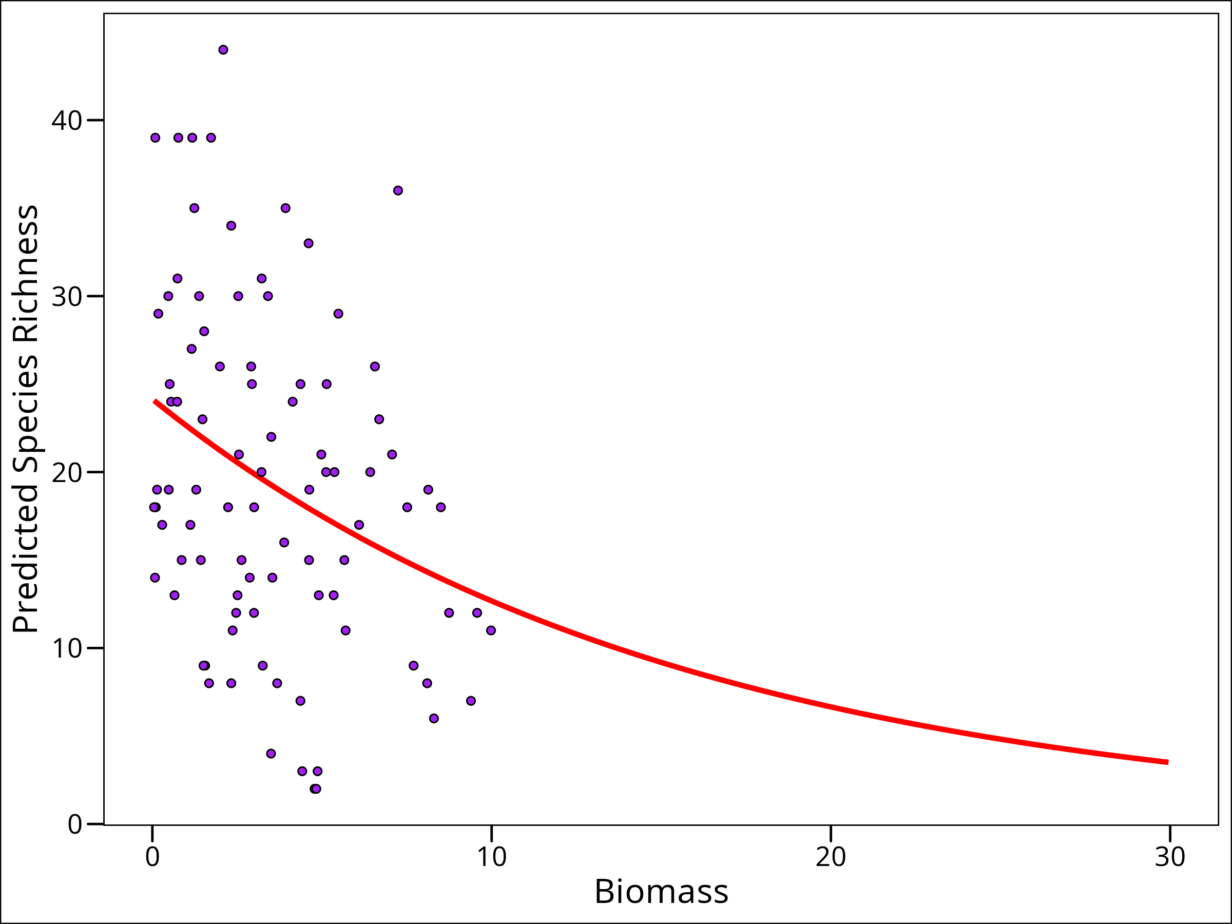
And here we go! We’ve finally showed, visually, why we need a link function! We can now predict out to a higher than observed biomass without predicting unrealistic response variable values.
Whether our question required making a prediction plot out of sample or not (ours likely didn’t, we probably can suffice with just the first plot of predictions), it’s now time to figure out if we’ve answered our question. Our null hypothesis was there was no effect of biomass on species richness. We can confidently say that we reject this null hypothesis, given the output above.
Species Richness Example – II
Recall that at the beginning of the previous section, we asked if biomass affected species richness, but also if that was the case, if that effect differed across levels of pH. Here our \(H_0\) will be that the relationship between Biomass and Species richness does not differ across levels of pH.
So that means we’re asking about the interaction between Biomass and pH. <strong>It’s important to know that in R, there are two ways to specify an interaction between two variables, \(X_1\) and \(X_2\).</strong> The more common way is to use y ~ x1*x2, but what this does mathematically? It turns out in that case, we are in fact fitting a model that looks for an effect of both variables individually, as well as their interaction, which in an R implementation would be equivalent to writing y ~ x1 + x2 + x1*x2 which we can easily see is a more complicated model than just the interaction. To specify just the interaction, we would instead write y ~ x1:x2. Now there’s nothing wrong with either of these, but it’s important to know which one we’re selecting, and why we’re selecting that one.
We’ll take a moment here and discuss what an interaction means mathematically. In our context we’re using pH.
unique(df_species$pH)[1] high mid low
Levels: low mid highThis is a categorical variable with three levels. What does that mean? Well, if we think back to when we talked about categorical variables in the linear model section, we talked about indicator functions. We’ll actually use the same concept here. In this case, we’ll create three indicator variables, one for each. So in essence for the model with just the interaction, we’re fitting this model: Y^=β0+β1pH-LOW∗Biomass+β2pH-MED∗BiomassY^=β0+β1pH-LOW∗Biomass+β2pH-MED∗Biomass
\hat{Y} = \beta_0 + \beta_1\text{pH-LOW}*\text{Biomass} + \beta_2\text{pH-MED}*\text{Biomass}
\\
+ \beta_3\text{pH-HI}*\text{Biomass}
so here we’re fitting an intercept and three beta values, one for the interaction of each level of the pH and the biomass. So if we have a new level of biomass and we want to know the species richness, we actually cannot answer that unless we also know the pH.
For the model that estimates the effect of both variables and their interaction (e.g., Species ~ Biomass * pH), R will use one level of our categorical variable (pH) as the reference level. The intercept (\(\beta_0\)) then represents the expected log species richness for this reference level when continuous predictors (like Biomass) are zero. The coefficients for other levels of the categorical variable then represent differences *from* this reference level. By default, R often chooses the first level alphabetically or the explicitly set first factor level as the reference. In our df_species, pH was factorized with levels c("low", "mid", "high"). Thus, “low” is the reference level. So then, we’ll use two indicator variables for the other levels:
I_{mid} =
            \begin{cases}
            1 & \text{if pH value is "mid"}\\
            0 & \text{otherwise}\\
            \end{cases}
and
I_{high} =
            \begin{cases}
            1 & \text{if pH value is "high"}\\
            0 & \text{otherwise}\\
            \end{cases}
so our model will end up looking like:
\hat{Y} = \beta_0 + \beta_{B} \cdot \text{Biomass} + \beta_{mid} \cdot I_{mid} + \beta_{high} \cdot I_{high}
\\
+ \beta_{B:mid} \cdot \text{Biomass} \cdot I_{mid} + \beta_{B:high} \cdot \text{Biomass} \cdot I_{high}
For us, we’ll use our model comparison and evaluation metrics from the Linear Regression section. The idea will be to take our variables of interest and compare three different models for species richness ( \(Y\): 1) model with just biomass, 2) model with just the interaction between biomass and pH, and 3) pH, biomass, and their interaction. We’ll compare our three models, and evaluate which is best.
We’ll essentially walk through all the steps from section I, but fitting each of our models.
Step 1 – Plot Data
Let’s plot our data again, but this time, since our other variable of interest is pH, we’ll look at that as well.
First, what values does pH take?
unique(df_species$pH)[1] high mid low
Levels: low mid highOkay, let’s colour our points by those levels:
ggplot(data = df_species) +
  geom_point(
    mapping = aes(x = Biomass, y = Species, fill = pH),
    shape = 21, colour = "black", size = 3
  ) +
  labs(x = "Biomass", y = "Species Richness") +
  ggthemes::theme_base()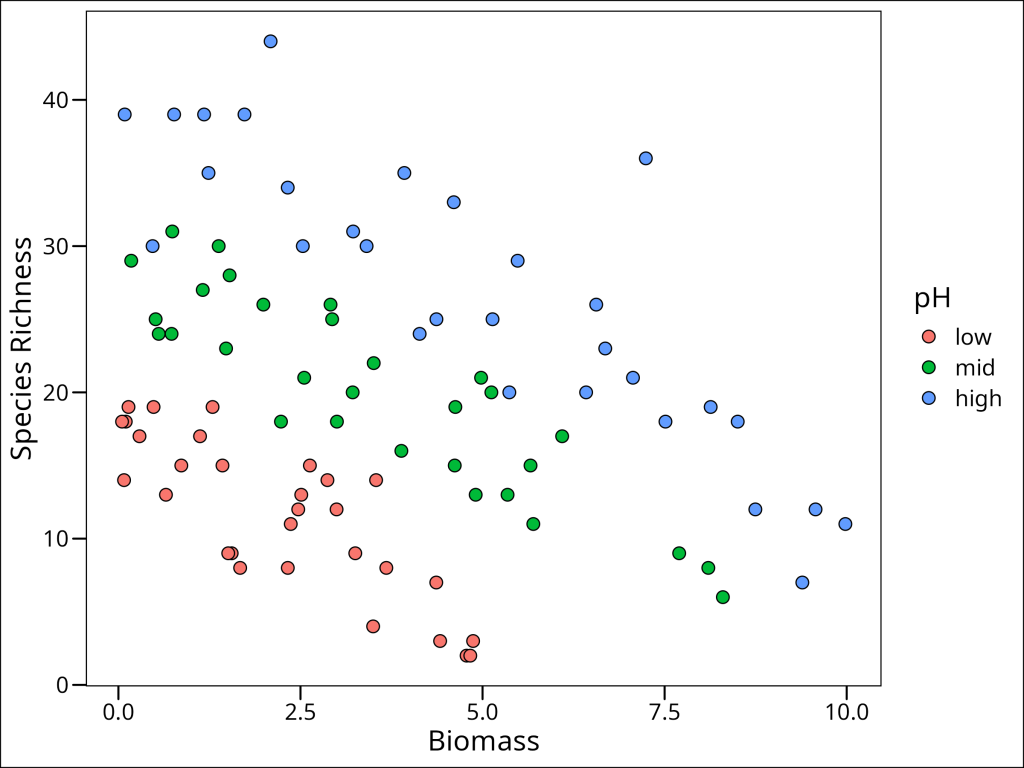
Ok so there’s a very obvious pattern here!!
Step 2 & 3
We already did this above in the first walk through section, but a poisson distribution with a log link function is sufficient for our purposes here.
Step 4 – Fitting the Model
Now, we need to fit three separate models, so we’ll go from least to most complicated:
mod1 <- glm(Species ~ Biomass,
  data = df_species,
  family = poisson(link = log)
)

mod2 <- glm(Species ~ Biomass:pH,
  data = df_species,
  family = poisson(link = log)
)

mod3 <- glm(Species ~ Biomass * pH,
  data = df_species,
  family = poisson(link = log)
)
Since we are doing model comparison, we first want to figure out which model does the best job, and then only bother looking at the results for the best one.
Step 5 – Model Evaluation
When we have multiple models, we need a way to decide which one is “best” or provides the most suitable explanation of our data with reasonable complexity. The performance package in R provides a convenient function, compare_performance(), that calculates various metrics for model comparison. These metrics can help us rank models based on criteria like goodness-of-fit (e.g., Nagelkerke’s R2, which is a pseudo-R2 suitable for GLMs), predictive accuracy (e.g., RMSE – Root Mean Square Error), and information criteria (like AIC – Akaike Information Criterion and BIC – Bayesian Information Criterion). Information criteria are particularly useful as they balance model fit with the number of parameters used, penalizing overly complex models.
Let’s use it to compare our three models (mod1, mod2, and mod3):
performance::compare_performance(mod1, mod2, mod3, rank = TRUE)Name | Model | Nagelkerke's R2 | RMSE | Sigma | Score_log | Score_spherical | AIC weights | AICc weights | BIC weights | Performance-Score
-------------------------------------------------------------------------------------------------------------------------------------------
mod3 | glm | 0.990 | 4.000 | 1.000 | -2.791 | 0.099 | 1.000 | 1.000 | 1.000 | 100.00%
mod2 | glm | 0.972 | 5.855 | 1.000 | -3.157 | 0.088 | 3.57e-14 | 4.69e-14 | 4.35e-13 | 41.14%
mod1 | glm | 0.394 | 9.122 | 1.000 | -4.594 | 0.079 | 1.90e-69 | 2.94e-69 | 2.82e-67 | 0.00%Looking at the output from compare_performance, we can see several informative columns. mod3 (which includes Biomass, pH, and their interaction) stands out:
Step 6 – Interpreting the Results
So let’s look at the summary of our model of choice:
summary(mod3)Call:
glm(formula = Species ~ Biomass * pH, family = poisson(link = log),
data = df_species)
Coefficients:
Estimate Std. Error z value Pr(>|z|)
(Intercept) 2.95255 0.08240 35.833 < 2e-16 ***
Biomass -0.26216 0.03803 -6.893 5.47e-12 ***
pHmid 0.48411 0.10723 4.515 6.34e-06 ***
pHhigh 0.81557 0.10284 7.931 2.18e-15 ***
Biomass:pHmid 0.12314 0.04270 2.884 0.003927 **
Biomass:pHhigh 0.15503 0.04003 3.873 0.000108 ***
---
Signif. codes: 0 ‘***’ 0.001 ‘**’ 0.01 ‘*’ 0.05 ‘.’ 0.1 ‘ ’ 1
(Dispersion parameter for poisson family taken to be 1)
Null deviance: 452.346 on 89 degrees of freedom
Residual deviance: 83.201 on 84 degrees of freedom
AIC: 514.39
Number of Fisher Scoring iterations: 4So we can see here the output as we’re used to seeing. However, recall, to make easy direct comparisons, we need to think about these values as relating to the predicted log of the species richness.
It’s easiest to conceptualize as thinking about predicting a value of species richness (since that what the whole model is supposed to do), given some information. With the new coefficients from our updated summary(mod3) output (where “low” pH is the reference), let’s re-state our full model with the approximate \(\beta\) values plugged in:
\hat{Y}_{log} = 2.95 - 0.26 \cdot \text{Biomass} + 0.48 \cdot I_{mid} + 0.82 \cdot I_{high}
\\
+ 0.12 \cdot \text{Biomass} \cdot I_{mid} + 0.16 \cdot \text{Biomass} \cdot I_{high}
So to get the estimated log species richness \(\hat{Y}_{log}\), we require at least two pieces of data: 1) the biomass value, and 2) the pH level (which determines if \(I_{mid}\) or \(I_{high}\) are 1 or 0). Let’s assume the biomass is 7.5, and the pH level is “mid”. For pH = “mid”: \(I_{mid}=1\) and \(I_{high}=0\). What will our equation simplify to? Well, let’s plug in our values:
\hat{Y}_{log} = 2.95 - (0.26 \cdot 7.5) + (0.48 \cdot 1) + (0.82 \cdot 0)
\\
+ (0.12 \cdot 7.5 \cdot 1) + (0.16 \cdot 7.5 \cdot 0)
Now obviously the terms with a zero being multiplied will go to zero, and the others can be simplified:
\hat{Y}_{log} = 2.95 - 1.95 + 0.48 + 0 + 0.90 + 0And now we can combine these terms:
\hat{Y}_{log} = (2.95 + 0.48 + 0.90) - 1.95Which gives us the value of:
\hat{Y}_{log} = 4.33 - 1.95 = 2.38Using the full precision coefficients from R, this calculation yields approximately 2.394. Now recall this is on the log scale! So how do we get it in terms of the number of species?
\hat{Y} = e^{2.394} \approx 10.96Step 7 – Predictions and Conclusions
As a quick sanity check – when we plot this in this step, how many prediction/regression lines will there be? (Answer: There will be three lines, one for each pH level, because our model mod3 includes an interaction between Biomass and pH, allowing the slope and intercept of the Biomass-Species relationship to differ for each pH level.)
So we’ve done some of the interpretation already, but specifically with respect to our answer above of how many species we should expect under medium pH conditions and with a biomass value of 7.5, let’s check if our answer agrees with R. To do this, we’ll recall the predict() function from the stats package:
predict(
  mod3, # the model
  newdata = tibble(Biomass = 7.5, pH = "mid"), # the new data
  type = "response" # the type of prediction
)
1
10.95721 And we can see that our answers agree! But we likely want to make some biological interpretations. So let’s make a plot of our results overall.
df_species_mrpoi_pred <- expand.grid(
  Biomass = seq(min(df_species$Biomass), max(df_species$Biomass),
    length.out = 200
  ),
  pH = levels(as.factor(df_species$pH))
) %>%
  mutate(
    # Predict the species richness using the model
    Species = predict(mod3, ., type = "response")
  )
Biomass pH Species
1 0.05017529 high 43.06662
2 0.10008280 high 42.83698
3 0.14999031 high 42.60856
4 0.19989782 high 42.38136
5 0.24980534 high 42.15537
6 0.29971285 high 41.93058Now let’s make the plot:
ggplot() +
  # plot the observed points from the original data
  geom_point(
    data = df_species,
    aes(x = Biomass, y = Species, fill = pH),
    shape = 21, size = 3
  ) +
  # plot the prediction lines using the prediction dataframe
  geom_line(
    data = df_species_mrpoi_pred,
    aes(x = Biomass, y = Species, colour = pH),
    size = 1.3
  ) +
  labs(y = "Species Richness") +
  ggthemes::theme_base()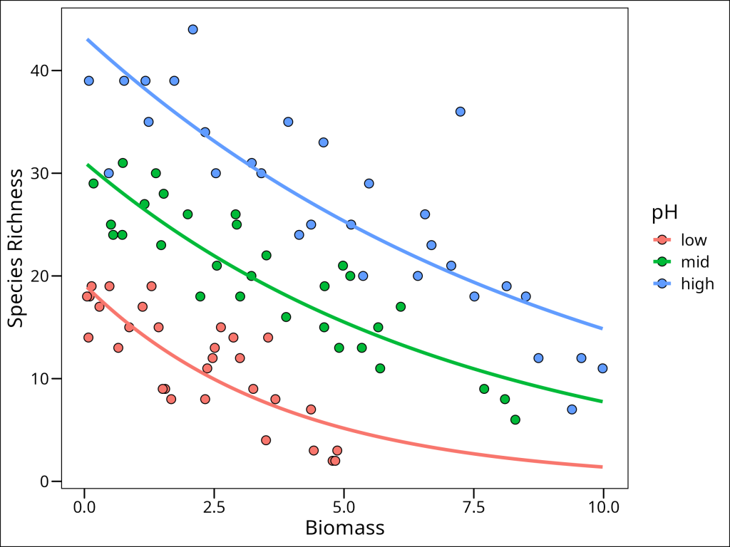
The plot visually confirms our model output: the relationship between Biomass and Species Richness (the slope of the lines) differs across the three pH levels. Specifically, we observe different intercepts and different slopes for each pH level. This addresses our second null hypothesis: \(H2_0\): Differing pH has no effect on the relationship between species richness and biomass. Based on our model comparison (where mod3, the model including the interaction, was best) and the visual evidence of distinct slopes and intercepts for each pH level in the plot of mod3‘s predictions, we can reject this null hypothesis. We conclude that pH significantly modifies the effect of biomass on species richness in this grassland ecosystem. For example, at low biomass levels, high pH environments tend to have the highest species richness, but as biomass increases, the species richness in high pH environments declines more steeply than in low or mid pH environments. Understanding such interactions is often crucial in ecological studies, as the effect of one factor can depend strongly on the level of another.
This concludes our introduction to Generalized Linear Models using a Poisson distribution for count data. We’ve seen how GLMs allow us to model non-normal response variables by using appropriate error distributions and link functions, and how to interpret models with both continuous and categorical predictors, including their interactions.