An Introduction (And Disclaimer…)
There are many excellent texts on probability and probability theory. There are numerous courses in several departments at the University of Toronto, and indeed pretty much any university, that can offer students a truly grounded view of what probability is and how to think about it. Indeed, probability itself can be interpreted in multiple ways, and multiple theories about foundational probability and how to interpret it exist. Most of the concepts in this section draw significantly from the excellent (and free!) text on probability by Blitzstein and Hwang which you can find here. Here we attempt to discuss some foundational components of probability that we think are important for students in EEB to know.
There’s many reasons why we should study probability, but perhaps most simply, the biological world around us is full of randomness, and even in the processes we think we understand the best, uncertainty abounds. Without an understanding of probability, we don’t have a framework with which to confront our understanding, or lack thereof, and actually enable a robust discussion about how much randomness we actually understand, and how certain we are about what we think we know.
In this section we’ll offer some definitions that will be useful to you in more formally discussing probability.
Key Terms
- Random Trials/Experiments
- Events
- Outcomes
- Probability (naive)
- Sample Space
- Population
Sample Spaces, Events, and Naive Probability
Probability is based on the mathematical concept of sets, from which we’ll steal some jargon. Let’s imagine an example to ground this.
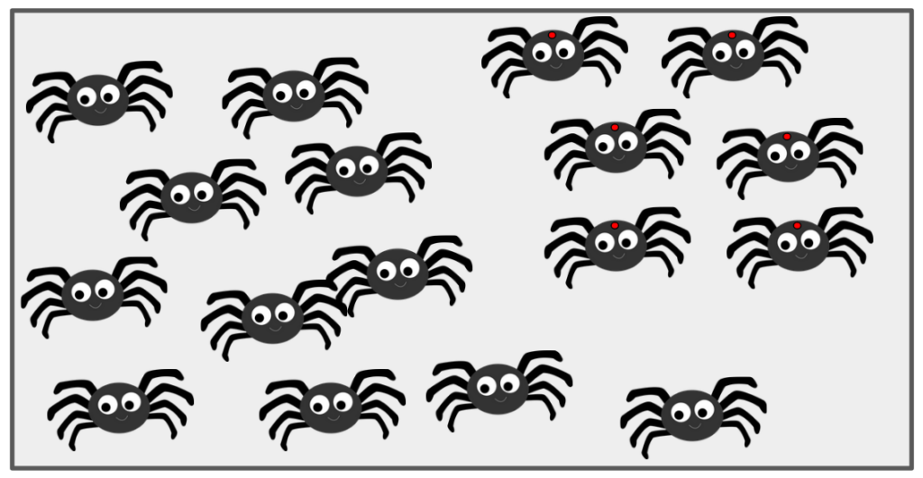
Say there are 1000 spiders in a bag. One of those spiders happens to have a red dot on its thorax. You pull a single spider out of that bag, without looking. You could have either pulled A) a spider with no red dot, or B) the spider with the red dot. What is the probability that you have selected the spider with the red dot?
In our brief description of our question here, we’ve already touched on each of our key terms and concepts. First, we’ve actually defined the sample space (the set of all possible outcomes of an experiment/trial) as being finite – the spiders in the bag that we can think of as a mathematical set. The population (related but different to a sample space) is the set of all units that some random process can select. Sample spaces can be finite, countably infinite, or uncountably infinite. Most biological applications, and all the applications we’ll consider here, have finite sample spaces. That is to say, we can construct a set containing every single outcome of an experiment or random trial. In this example, each spider represents an outcome, and an event is some set of spiders. Side note: sets can have one or even no items in them. The events are what we would mathematically consider subsets of the sample space. So here we have two events of interest: The subset A) 999 spiders with no red dots, and B) 1 spider with a red dot.
Here, we have a simple version of a probability, wherein we can actually just define the probability of choosing the spider with the red dot as a simple proportion. To state this clearly, the probability of performing the experiment, and the B) being the outcome can be defined as:
[P(\text{B}) = \frac{\text{number of outcomes favourable to B}}{\text{Total number of outcomes in the sample space }\textit{S}}which specifically means:
P(\text{B}) = \frac{\text{number of spiders with red dots}}{\text{total number of spiders in }\textit{S}}Or
P(\text{B}) = \frac{1}{1000}\\P(\text{B}) = 0.001So, P(B) = 0.001. Now, to add more conditions, we’re assuming here that when we put our hand into the bag to select a spider, there are absolutely no defining features that make one spider more or less likely to be chosen. However, there is a case where some spiders are bigger, or perhaps less afraid of the hand coming into the bag, and these traits may make some spiders more or less likely to be chosen.
This is easy enough to replicate in R, as it’s simply a division calculation:
size_b = 1
size_sample_space = 1000
prob_b = size_b / size_sample_space

# show the result
prob_b
## [1] 0.001The image to the right, sets.png, illustrates basic set theory concepts relevant to probability: the sample space (all possible outcomes), events (specific outcomes of interest, which are subsets of the sample space), and the relationships between them.

Two Events
Let’s continue with our two events of interest: event A (selecting a spider with no red dot) and event B (selecting a spider with a red dot). If we now assume there are 234 spiders with red dots (event B) and thus 766 without red dots (event A), the image to the right visually represents this scenario, notionally grouping the red-dotted spiders within the larger population in the bag.
The Venn diagram to the right illustrates the sample space S (all spiders) composed entirely of the two mutually exclusive events: A (no red dot) and B (red dot). There is no overlap between A and B, and together they encompass all possible outcomes.
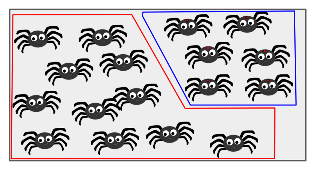
We can now see clearly that all of the spiders (i.e. all of S) is contained within the two event subsets A and B. Further, there are actually no spiders that fall within both subsets.
What we have defined here are two mutually exclusive events. With only one experiment, the outcome cannot satisfy both events. Formally, we say that the probability of both A and B is zero:
P(\text{A} \cap \text{B}) = 0But also, since there are are no spiders that fall outside of A or B, the probability of either one event OR the other occurring with one experiment is actually 1:
P(\text{A} \cup \text{B}) = 1Naive Vs. Standard Probability
The reason to differentiate between these two definitions is one of caution. We defined above the naive probability, which has two incredibly important assumptions:
- The sample space is finite
- Each outcome is equally likely
This clearly serves us well for our current example, and in fact from here on we will refer to the naive probability simply as probability, but it’s useful to recognize that as soon as we care to make more interesting conditions surrounding our sample space, we must adjust our definition of probability (we won’t cover that here).
Probability Distributions
Our above example was primarily focused on an example where two possible events covered the entire sample space. A commonly used example in the same vein would be flipping a coin – there are only two possibly outcomes: heads or tails. However, this is usually not the case. While it’s possible we may only be interested in a handful of the events possible, it’s rare that those encompass the entire sample space.
To think about the probability of a variety of events occurring, we can differentiate between discrete probabilities and continuous probabilities.
Discrete Probability Distributions
As the name implies, discrete probability distributions are distributions that describe the probabilities of each possible event in the sample space.
For example, let’s consider the basic building blocks of DNA, the nucleotide bases adenine (A), cytosine (C), guanine (G) and thymine (T). Imagine we were able to “zoom in” on some random part of our own DNA, we would see something like this:
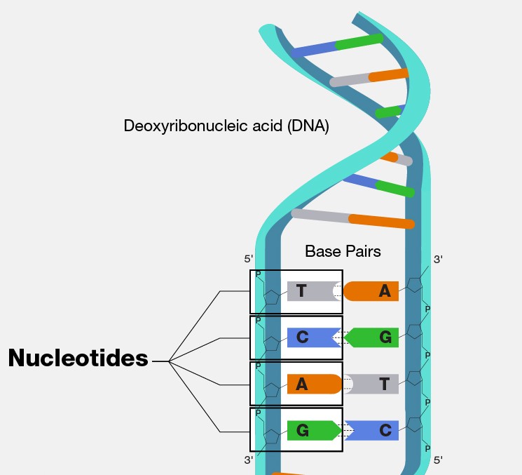
If we zoom in on a single base, we can only “see” one of A, C, G, or T. So, our sample space SS is made up of the four mutually exclusive events, which is seeing either A, C, G, or T. If we assume that bases are distributed with even frequency, we can imagine that the probability of each would be the same:
P(\text{A}) = 0.25
\\
P(\text{C}) = 0.25
\\
P(\text{G}) = 0.25
\\
P(\text{T}) = 0.25
which would result in a probability distribution that may look like this:
library(ggplot2)
# Note: If you haven't used ggthemes before, you may need to install it first:
# install.packages("ggthemes")
library(ggthemes)

df <- data.frame(
  base = c("A", "C", "G", "T"),
  prob = 0.25
)

ggplot(data = df) +
  geom_col(aes(x = base, y = prob, fill = base)) +
  ggthemes::theme_base() +
  labs(x = "Nucleotide Base", y = "Probability") +
  ylim(c(0,1))
This is intuitive. Any way that the distribution is partitioned, the sum of probabilities of each event must sum to 1.0 without exception. The most common discrete probability distributions are the Poisson and Bernoulli distributions.
Discrete distributions typically are described by their probability mass functions, which give the probabilities of a discrete random variable being exactly equal to some values. These probabilities must always sum to 1.0 and have a general form of
p_{X}(x) = P(X = x)It’s helpful to know how to plot probability distributions, as it’s visually easiest to see when different parameters result in different probability distributions when we can compare parameter values.
The probability mass function for the Poisson distribution is actually fairly simple, as there’s only one parameter (lambda, often denoted \(\lambda\)), this parameter simply indicates the “shape” of the function, or how many average events happen in a given time interval. Conveniently in R, there are functions for most common distributions. R follows a common convention for naming these functions, typically using a prefix to denote the type of function: d for the density or mass function (e.g., dpois for the Poisson probability mass), p for the cumulative distribution function (probability of X \(\le\) x), q for the quantile function (inverse of p), and r for generating random numbers from the distribution. This pattern (d, p, q, r) applies to many other distributions like Normal (norm), Gamma (gamma), Binomial (binom), etc. For now, we’ll use the dpois function to get the probability mass for specific values. Let’s take a look at ?rpois (which shows help for all Poisson functions) and then choose three different \(\lambda\) parameter values to see how that changes our probability density. In addition, it’s actually much easier to make plots of discrete distributions in base R so we’ll do that:
# first make a sequence of values to construct our density across:
x <- seq(0, 100, 1)
plot(x, dpois(x, lambda = 1),
    type = "h",
    lwd = 3,
    main = "lambda = 1",
    ylab = "Probability Mass",
    xlab = "X")
Now note here that we’ve plotted this as these vertical lines, instead of some continuous curve. Why? Well, recall this is a discrete probability distribution. There are no probabilities in the continuous space between integer values. So to plot this as a curve would actually be incorrect. That’s why it’s better to be explicit in this fashion and plot them as such here. Other \(\lambda\) values:
plot(x, dpois(x, lambda = 5),
    type = "h",
    lwd = 3,
    main = "lambda = 5",
    ylab = "Probability Mass",
    xlab = "X")
plot(x, dpois(x, lambda = 25),
    type = "h",
    lwd = 3,
    main = "lambda = 25",
    ylab = "Probability Mass",
    xlab = "X")
We can see how the mass function changes given our changing values for \(\lambda\).
Continuous Probability Distributions
Again as the name implies, between two variables which are both continuous, an infinite number of other values are possible. To think about these distributions, we often think of probability densities. It’s useful to be able to plot probability densities for a handful of common continuous distributions. We’ll plot probability densities for the Gaussian/Normal, Exponential, and Gamma distributions. As a good reminder, to recall what forms the probability density functions for some given distribution look like, the NIST/SEMATECH e-handbook of Statistical Methods has a great set of descriptions on probability distributions. Let’s refresh our minds about the Normal Distribution. The Normal or Gaussian distribution is the classic “bell-shaped curve” we’re used to seeing when we think of any distribution at all.
Conveniently in R, there are density functions for most common distributions. In fact, if we take a look at ?rnorm, we see a helpful set of functions to do with the normal distribution. We have functions for the density dnorm, the distribution function pnorm, the quantile function qnorm and a random deviate sample rnorm. This exists for other distributions too (HINT: try ?rgamma)
Let’s plot the density of a few normal distributions showing how a difference in parameters gives different probability density curves. The probability density function for the normal distribution is
f(x) = \frac{e^{-(x-\mu)^2/(2\sigma^2)}}{\sigma \sqrt{2\pi}}This looks a bit complicated, but in reality, there are only two parameters! The ones we’re used to for the normal distribution, mu (\(\mu\)) the mean, and sigma (\(\sigma\)) the standard deviation. The rest of the values you see here are actually just constants. Similarly to how we did with the Poisson distribution above, let’s see how changing these variables will change our probability density curves.
Let’s first see how changing the \(\sigma\) will affect the curves. Again, base plotting actually has an advantage here:
x <- seq(-5, 5, 0.1)
fx <- dnorm(x, mean = 0, sd = 1) # mu = 0 and sd = 1 is the "standard" normal

plot(x = x, y = fx,
    type = "l",
    xlab = "X",
    ylab = "density")
Now let’s add some other standard deviations:
# make the plot then add on the other lines
x <- seq(-5, 5, 0.1)
fx <- dnorm(x, mean = 0, sd = 1) # mu = 0 and sd = 1 is the "standard" normal

plot(
  x,
  fx,
  type = "l",
  xlab = "X",
  ylab = "density",
  ylim = c(0, 0.9)
)

# add new lines on for each of our new sd's
lines(x, dnorm(x, mean = 0, sd = 0.75), col="red")
lines(x, dnorm(x, mean = 0, sd = 0.5), col="blue")
lines(x, dnorm(x, mean = 0, sd = 1.2), col="green")

# now let's add a legend
legend("topleft", title = "Standard Deviations",
      c("sd = 1", "sd = 0.75", "sd = 0.5", "sd = 1.2"),
      lwd = 2, lty = 1,
      col = c("black", "red", "blue", "green"))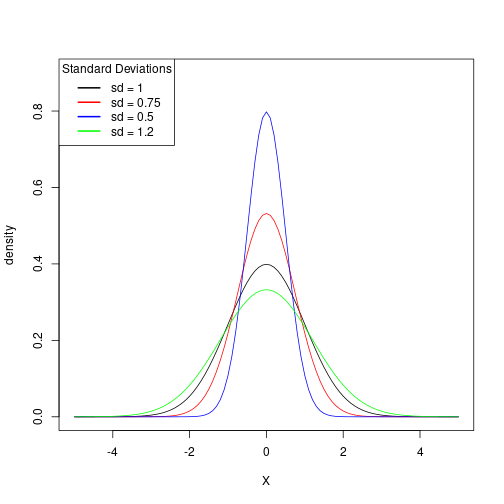
We can also hold the standard deviation constant and plot different mean values. Let’s try that now:
# make the plot then add on the other lines
x <- seq(-5, 5, 0.1)
fx <- dnorm(x, mean = 0, sd = 1) # mu = 0 and sd = 1 is the "standard" normal

plot(
  x,
  fx,
  type = "l",
  xlab = "X",
  ylab = "density",
)

# add new lines on for each of our new sd's
lines(x, dnorm(x, mean = 2, sd = 1), col="red")
lines(x, dnorm(x, mean = 1, sd = 1), col="blue")
lines(x, dnorm(x, mean = -1, sd = 1), col="green")

# now let's add a legend
legend("topleft", title = "Mean Values",
      c("mu = 0", "mu = 2", "mu = 1", "mu = -1"),
      lwd = 2, lty = 1,
      col = c("black", "red", "blue", "green"))
This likely looks much as we may have anticipated. We are simply shifting the plot left or right depending on the mean.