Sampling & Sampling Distributions
Generally, in biology we want to learn something about the world as we define it (e.g., all pine trees in North America, Anoles in the Caribbean, Drosophila in Africa), but we usually can’t measure all individuals in the populations we care about in order to calculate the parameters of interest (e.g., mean weight of all the Anoles, etc). When we can’t do that, we need to take a sample of the population, learn something about the sample, and use what we have learned to generalize outward to the population. In fact, if we could sample the entirety of a population of interest, we wouldn’t need most types of statistical models (e.g., regression)! We could just calculate our parameters of interest, and be on our way. However, therein lies the problem, since we want usually to make some statement about the whole population, but we don’t usually have data on the whole population. So, we take a sample, and try to figure out how best to extrapolate the knowledge we learned from that sample back to the rest of the population.
Ideally, when we take some sample of a population it’s unbiased, that is, we can take some measurement from the sample such as a mean value, and that value is in fact the same as the population-level value. If we don’t collect our sample properly, it’s possible that we systematically over or underestimate our population parameter of interest, hence making our estimate biased. It’s useful to think of some examples of when our sampling protocol might yield biased samples. Say we want to know the mean size of Anoles in the Caribbean. If our sampling method was to do ground observations of Anoles that we could see on a gridded sampling site, it’s likely we’re more likely to see, and therefore sample, Anoles that are more brightly coloured, and ones that are lower down in trees or on the ground. Is this a problem for our subsequent statistical calculations? Well, only if we know that our sample is biased and a) we don’t do anything to change our sampling protocol, and/or b) we don’t account for it in our statistical models/tests.
Why is this important from a statistical perspective? Well, the methods we present in this section usually rely on a random sample of the population. Now in reality sometimes a random sample is impossible, and we work with data that have known limitations. An interesting example of this in an observational sample context is camera trap data. There are known biases (the interested reader can refer to this paper on the subject) in camera trap data, but, wildlife researchers who have no choice but to use these data have come up with clever methods to account for these biases statistically. These techniques are outside the scope of this manual, but are interesting nonetheless.
Since dealing with biased samples is difficult, we will constrain our discussion of sampling to random samples, the premise on which a great many common statistical tests are based.
Statistically, we will think of sampling as referring to the drawing of a subset of data points from some larger set (population). How we sample can be the subject of an entire course, but it is helpful to know enough to perform sampling in R, and then to compile those samples together into a sampling distribution.
Common Distributions
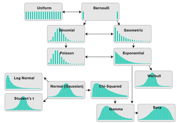
Before we go any further, let’s remind ourselves of the shapes and names of some of the common distributions that we’ll want to have fresh in our minds for this section. As another reminder, we need to be conscious of whether we’re dealing with a continuous distribution or a discrete distribution. Here’s a visual to remind us of this:
Random Sampling
So when we want to sample some set of numbers, we have to usually define what kind of distribution we want to draw from. When we ask R to randomly sample a number for us, we need to at least provide it with some guidelines about what kind of number we want. Do we want only integers? Decimals? If so, how many significant digits? What are the limits?
The way we would typically think about sampling in our brains is similar to the example of having a set of balls in a bag, all labeled with a unique number from 1-10. Assuming all else about the balls is equal, we could guess that there would be an equal probability we would draw any given ball from the bag. While this feels intuitive, this is actually thinking in distributions! We have actually just stated that we believe the distribution we are sampling from is uniform, that is, that all possible values have the same probability of being chosen.
Contrast that with something like a Normal (Gaussian) distribution, and we will be more likely to select a value that lands closer to the center of the distribution, at the mean.
Random Sampling in R
It’s actually quite easy to perform random sampling in R, given that it’s a statistical programming language, the basic version of R that comes installed contains the stats package which includes random sampling functions for a variety of distributions. Let’s use an example with the normal distribution. Since the normal distribution takes two parameters, 1) a mean, and 2) a standard deviation, we need to provide those two parameters to the function, along with the number of samples we’d like to draw.
# Draw 10 samples from a normal distribution with mean = 5 and sd = 1.5
stats::rnorm(n = 10, mean = 5, sd = 1.5)
## [1] 2.012703 4.735336 7.774550 1.796493 2.102768 4.735893 5.427244 4.673579 4.225146 3.122918And we see R has selected 10 values for us from the specified normal distribution. Often we want to be able to plot the distribution of values that we’ve sampled, especially with a larger number of samples, to see how well it approximates the theoretical distribution. This is most easily done as a simple histogram, using the hist() function which is in the base graphics package. Let’s try this with 1000 samples:
# Draw 1000 samples from a normal distribution with mean = 5 and sd = 1.5
sampled_values <- stats::rnorm(n = 1000, mean = 5, sd = 1.5)

# Plot a histogram of the sampled values
hist(sampled_values,
     main = "Histogram of 1000 Samples from N(5, 1.5)",
     xlab = "Value",
     col = "lightblue")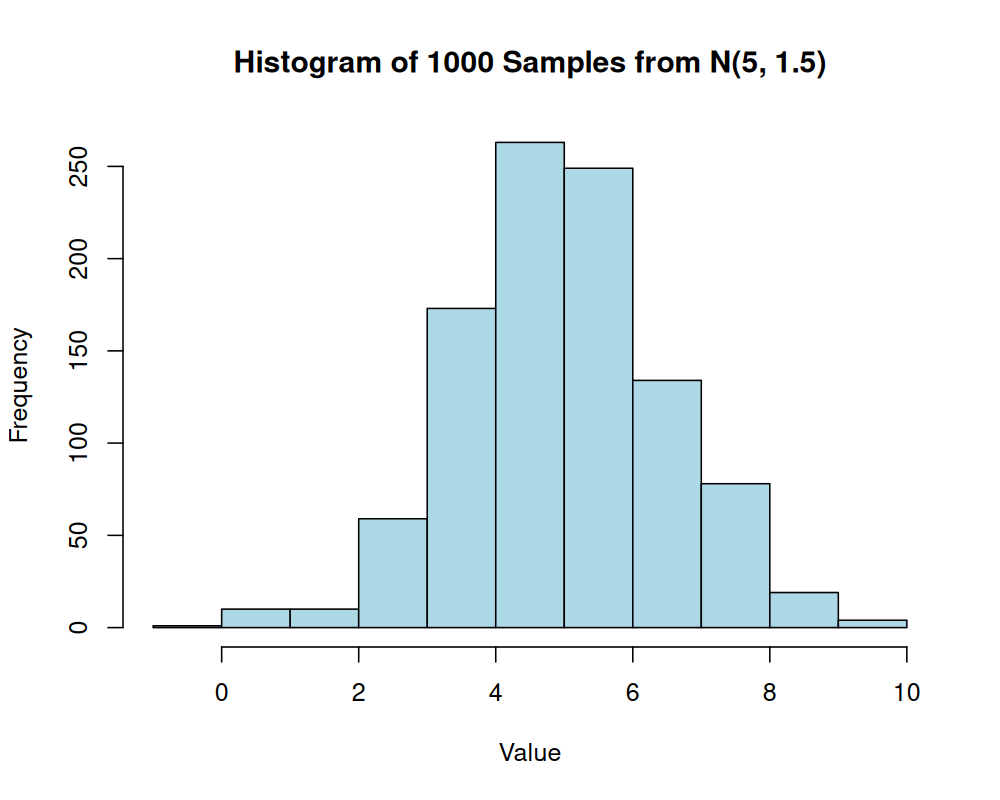
With 1000 samples, the histogram provides a good approximation of the bell shape characteristic of a normal distribution.
Sampling Distributions
A sampling distribution refers to the probability distribution of a particular statistic that we might get from a random sample.
Discrete Sampling Distributions
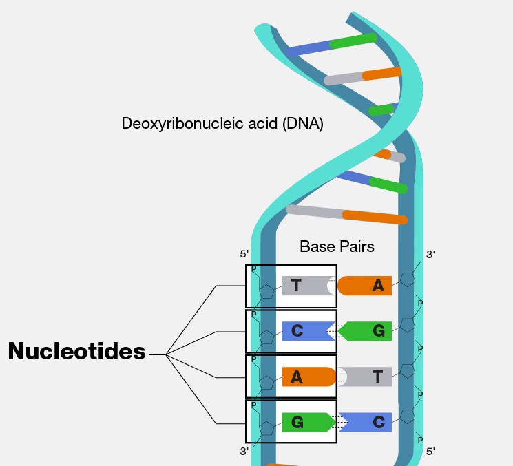
Let us think back to our example in Probability 101 of a discrete probability distribution involving nucleotide base frequencies. Imagine we were able to “zoom in” on some random part of our own DNA, we would see something like this:
We could imagine that the frequency of each nucleotide base may be equivalent. However, research has shown (i.e. Louie et al. (2003)) that nucleotide frequency is not uniform across human genes. So given some particular gene, it may be the case that we see a non-uniform probability distribution for the bases, perhaps one that looks like this:
library(tidyverse)
library(ggthemes)

set.seed(1234) # for reproducibility
nucleotide_bases <- c("A", "C", "G", "T")
prob_vector <- c(0.1, 0.2, 0.45, 0.25) # Probabilities of nucleotide bases

df_theoretical_probs <- data.frame(
  base = nucleotide_bases,
  prob = prob_vector,
  sample_size_group = "Theoretical"
)

ggplot(data = df_theoretical_probs) +
  geom_col(aes(x = base, y = prob, fill = base)) +
  geom_text(aes(x = base, y = prob, label = round(prob, 2)),
    vjust = -0.5,
    size = 3 # Adjusted size for potentially better fit
  ) +
  ggthemes::theme_base() +
  labs(x = "Nucleotide Base", y = "Probability (Theoretical)", fill = "Nucleotide") +
  ylim(c(0, 1))

ggsave(
  "src/Statistics_in_R/images/fig_theoretical_nucleotide_base_probabilities.png",
  width = 8,
  height = 6,
  dpi = 300
)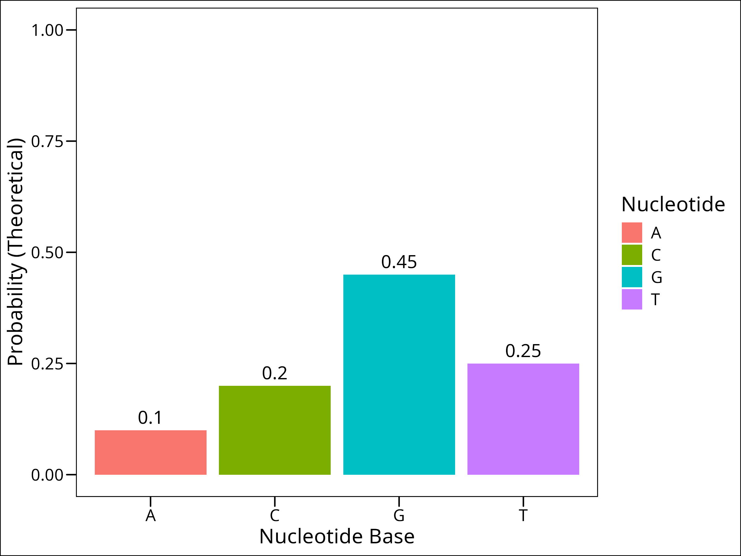
As a fun little game, let’s build a gene. There approximately 1000 nucleotide pairs of coding sequence per gene according to google, and let’s imagine that the gene we’re building has a probability distribution of nucleotides that is given above, where the probabilities of each base appearing given a random sample are: 0.1, 0.2, 0.45, and 0.25 respectively for A, C, G, and T.
Using R’s functionality, let’s sample a variable number times from our weighted set, and see if the distribution we get from our sample matches the theoretical probabilities. We’ll sample 20, 100, 1000, and 10,000 times. The Law of Large Numbers indicates that the more samples we take, the closer we’ll get to our theoretical probabilities. Let’s try!
To do this, we’ll use R’s sample() function from the base package, and alter only the size argument which says how many times to sample.
# Generate samples of different sizes
sample_20 <- sample(nucleotide_bases, size = 20, replace = TRUE, prob = prob_vector)
sample_100 <- sample(nucleotide_bases, size = 100, replace = TRUE, prob = prob_vector)
sample_1000 <- sample(nucleotide_bases, size = 1000, replace = TRUE, prob = prob_vector)
sample_10000 <- sample(nucleotide_bases, size = 10000, replace = TRUE, prob = prob_vector)
Now let’s take these vectors and turn them into dataframes so we can plot them. We can use the convenient table() function to get counts of how many of each base there is:
# Process samples into dataframes for plotting
# Helper function to process each sample into a dataframe with columns: base, prob, sample_size_group
process_sample_to_df <- function(sample_vector, size_label) {
  as.data.frame(table(sample_vector)) %>%
    dplyr::rename(base = sample_vector, freq = Freq) %>%
    dplyr::mutate(
      sample_size_group = as.character(size_label),
      prob = freq / sum(freq)
    ) %>%
    select(base, prob, sample_size_group)
}

df_20 <- process_sample_to_df(sample_20, 20)
df_100 <- process_sample_to_df(sample_100, 100)
df_1000 <- process_sample_to_df(sample_1000, 1000)
df_10000 <- process_sample_to_df(sample_10000, 10000)
Now we’ll combine all these data frames into one, add a reference of the real values, and plot the result with a grouped bar chart:
# Combine sampled data
df_all_samples <- rbind(df_20, df_100, df_1000, df_10000)

# Combine all data for plotting and set factor levels for legend order
df_combined <- rbind(df_all_samples, df_theoretical_probs) %>%
  mutate(
    sample_size_group = factor(sample_size_group, levels = c("20", "100", "1000", "10000", "Theoretical"))
  )

# Plot the results (Law of Large Numbers)
ggplot(data = df_combined, aes(x = base, y = prob, fill = sample_size_group)) +
  geom_bar(position = "dodge", stat = "identity") +
  geom_text(aes(label = round(prob, 2)),
    position = position_dodge(width = 0.9),
    vjust = -0.25,
    size = 2.5
  ) +
  scale_fill_manual(
    name = "Sample Size",
    values = c(
      "20" = "#FF9999", # Lighter Red
      "100" = "#FF6666",
      "1000" = "#FF3333",
      "10000" = "#CC0000", # Darker Red
      "Theoretical" = "grey30" # Dark Grey for real values
    )
  ) +
  labs(x = "Nucleotide Base", y = "Probability") +
  ggthemes::theme_base() +
  theme(legend.title = element_text(size = 10), legend.text = element_text(size = 8)) +
  labs(
    y = "Probability"
  )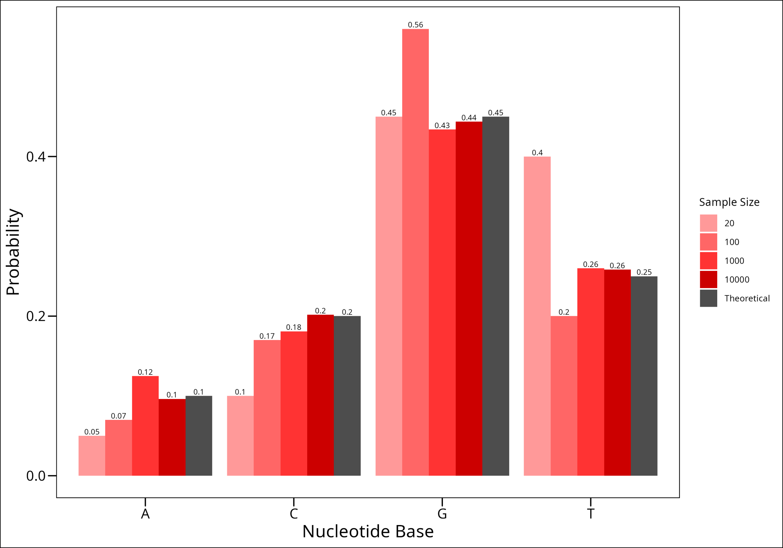
Here we have shown intuitively the Law of Large Numbers!!!!
Continuous Sampling Distributions
Consider records for aquatic vertebrates (cutthroat trout and salamanders) in Mack Creek, Andrews Experimental Forest, Oregon (1987 – present). This dataset is present in the lterdatasampler package.
# Note: If you haven't used lterdatasampler before, you may need to install it:
# install.packages("lterdatasampler")
library(lterdatasampler)
df_vertebrates <- lterdatasampler::and_vertebrates
head(df_vertebrates)
# A tibble: 6 × 16
year sitecode section reach pass unitnum unittype vert_index pitnumber species length_1_mm length_2_mm weight_g clip sampledate notes
<dbl> <chr> <chr> <chr> <dbl> <dbl> <chr> <dbl> <dbl> <chr> <dbl> <dbl> <dbl> <chr> <date> <chr>
1 1987 MACKCC-L CC L 1 1 R 1 NA Cutthroat trout 58 NA 1.75 NONE 1987-10-07 NA
2 1987 MACKCC-L CC L 1 1 R 2 NA Cutthroat trout 61 NA 1.95 NONE 1987-10-07 NA
3 1987 MACKCC-L CC L 1 1 R 3 NA Cutthroat trout 89 NA 5.6 NONE 1987-10-07 NA
4 1987 MACKCC-L CC L 1 1 R 4 NA Cutthroat trout 58 NA 2.15 NONE 1987-10-07 NA
5 1987 MACKCC-L CC L 1 1 R 5 NA Cutthroat trout 93 NA 6.9 NONE 1987-10-07 NA
6 1987 MACKCC-L CC L 1 1 R 6 NA Cutthroat trout 86 NA 5.9 NONE 1987-10-07 NA Let us look at the distribution of cutthroat trout sizes in our database:
hist(df_vertebrates$length_1_mm,
  main = "Histogram of Cutthroat Trout Lengths",
  xlab = "Length (mm)",
  col = "skyblue"
)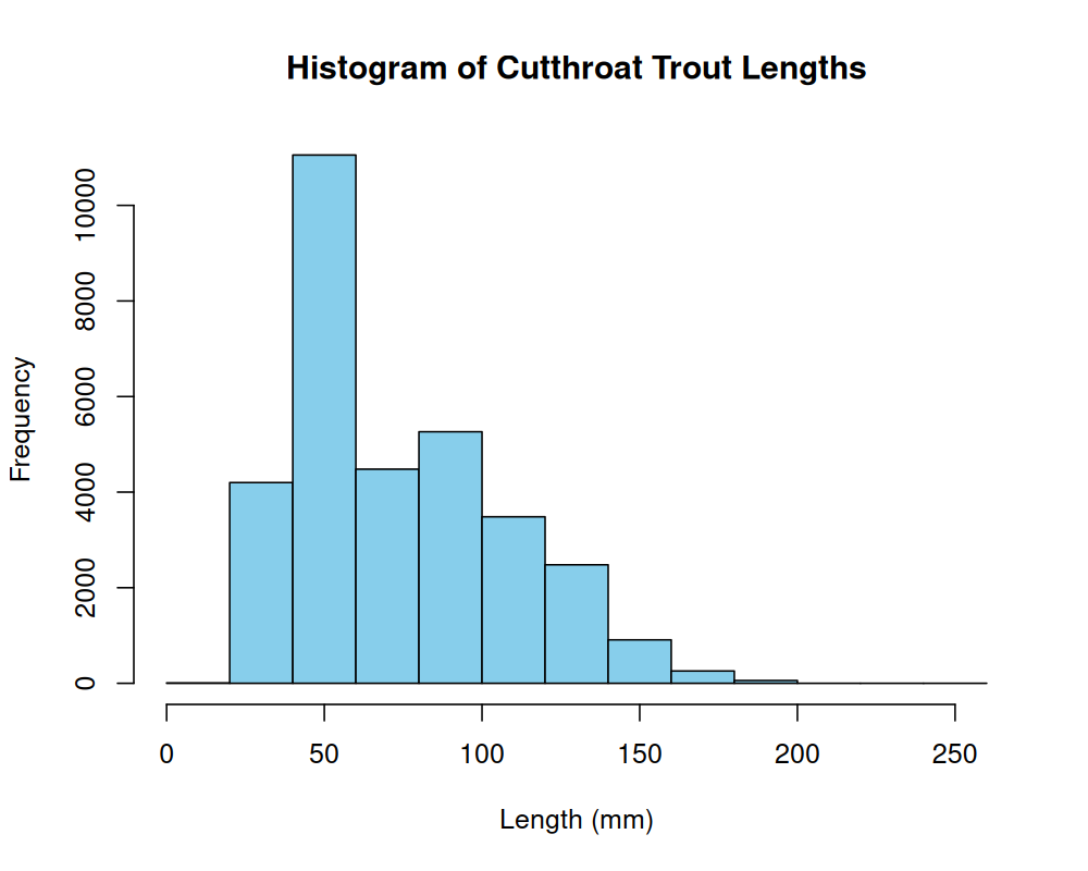
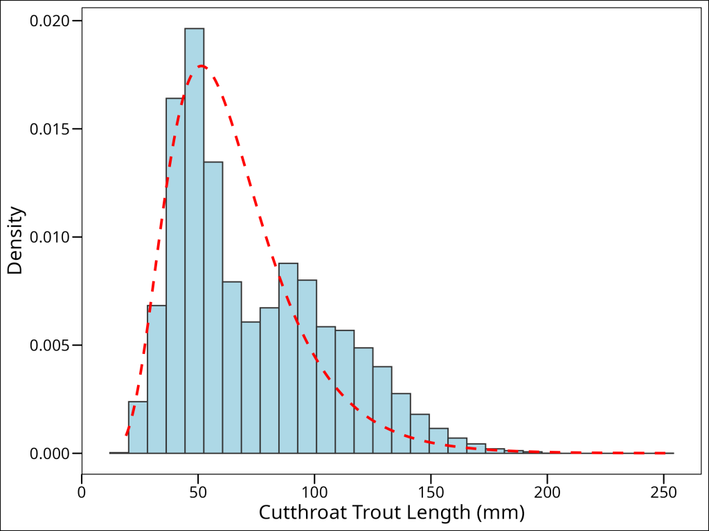
We can see that this distribution isn’t quite normal, but is continuous, and right-skewed. It could be approximated by a log-normal distribution. To compare the histogram with the theoretical log-normal density, we can scale the histogram to represent density and then overlay the log-normal probability density function (PDF):
# Log-normal distribution overlay
# X and Y values for log-normal distribution
x_vals_density <- seq(
  min(df_vertebrates$length_1_mm, na.rm = TRUE),
  max(df_vertebrates$length_1_mm, na.rm = TRUE),
  length.out = 500
)
y_vals_density <- dlnorm(x_vals_density, meanlog = 4.1, sdlog = 0.4)
dist_df <- data.frame(x = x_vals_density, y = y_vals_density)

# Plot the histogram of trout lengths with the log-normal distribution overlay
ggplot(data = df_vertebrates, aes(x = length_1_mm)) +
  geom_histogram(aes(y = after_stat(density)),
    colour = "grey20", fill = "lightblue", bins = 30
  ) +
  geom_line(
    data = dist_df, mapping = aes(x = x, y = y),
    colour = "red", linetype = "dashed", linewidth = 1
  ) +
  ggthemes::theme_base() +
  labs(
    x = "Cutthroat Trout Length (mm)",
    y = "Density"
  )
What will happen if we draw a number of random samples from this distribution and calculate the sample mean? What will the resulting distribution of sample means look like?
What we are doing here is constructing a sampling distribution. We can do this by randomly drawing samples from our population (in this example, every fish in our data set is the “population”), then calculating the mean for each random sample.
As we discuss in the programming concepts section on pseudo-coding, let’s think about how to accomplish this before we start blindly writing code. There are steps to our process here:
- Define Simulation Parameters:
- Set the total number of random samples to draw (let’s call this
num_samples, e.g., 100 or 10,000). - Set the size of each individual sample (i.e., how many observations per sample, let’s call this
sample_size, e.g., 10).
- Set the total number of random samples to draw (let’s call this
- Prepare for Storing Results:
- Pre-allocate an object (e.g., a vector) to hold the calculated mean from each of the
num_samples.
- Pre-allocate an object (e.g., a vector) to hold the calculated mean from each of the
- Perform the Sampling and Calculation (Loop):
- Repeat
num_samplestimes:- Draw one random sample of
sample_sizeobservations from the population data (e.g., trout lengths). - Calculate the mean of this individual sample.
- Store this calculated mean in the pre-allocated object at the current iteration’s position.
- Draw one random sample of
- Repeat
- Analyze Results:
- Once the loop is complete, plot the distribution (e.g., a histogram) of all the stored sample means. This plot represents the sampling distribution of the mean.
The easiest way to actually accomplish this is through a for-loop. We’ll start this and do it in order:
# first, we'll draw 100 samples
num_samples_1 <- 100

# let's pull 10 observations in each sample
sample_size_1 <- 10

# preallocate object to hold sample means
vec_sample_means_1 <- vector(mode = "numeric", length = num_samples_1)
So how would we perform step 3 (the loop)? We’d sample sample_size (10) values from df$length_1_mm, calculate the mean, and assign the mean value to our storage vector, vec_sample_means[i], where i is the current iteration of the loop. Then, we simply repeat this num_samples (100) times. Here’s that code:
for (i in 1:num_samples_1) {
  # Draw a sample of sample_size from the trout lengths, calculate its mean, and store it
  current_sample <- sample(df_vertebrates$length_1_mm, size = sample_size_1, replace = FALSE, na.rm = TRUE)
  vec_sample_means_1[i] <- mean(current_sample, na.rm = TRUE)
}
head(vec_sample_means_1)
## [1] 80.5 79.2 63.6 82.3 73.6 59.9Okay, so this worked! Excellent. Now, let’s plot a histogram of our results:
hist(vec_sample_means_1,
  main = "Sampling Distribution of Mean (50 samples of size 10)",
  xlab = "Sample Mean Length (mm)",
  col = "coral"
)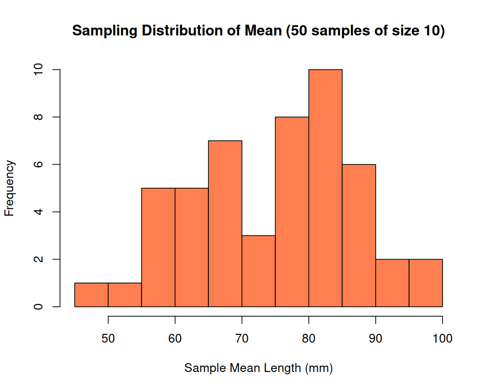
Hmm!! A confusing distribution. This doesn’t really resemble any interesting or meaningful distribution. Let’s try the process again, but with a much larger value of n, and see if that changes the result:
num_samples_2 <- 100000
sample_size_2 <- 10
vec_sample_means_2 <- vector(mode = "numeric", length = num_samples_2)

for (i in 1:num_samples_2) {
  current_sample <- sample(df_vertebrates$length_1_mm, size = sample_size_2, replace = FALSE)
  vec_sample_means_2[i] <- mean(current_sample, na.rm = TRUE)
}

hist(vec_sample_means_2,
  main = "Sampling Distribution of Mean (100,000 samples of size 10)",
  xlab = "Sample Mean Length (mm)",
  col = "lightgreen"
)
Wow! This distribution is remarkably normal! What’s going on here?
We have just stumbled upon the Central Limit Theorem.
Central Limit Theorem
The Central Limit Theorem is an incredibly important theorem that states the following:
Taking a population with some mean \(\mu\) and a standard deviation \(\sigma\), we can sample from the population (with replacement), and with a number of samples that is sufficiently large, the distribution of the sample means will be normally distributed.
We have just demonstrated this above with our cutthroat trout example. This is a surprisingly important theorem, because it provides us a path forward to work with statistical tests that assume normal distributions. As you will learn as you move further through your statistical training, normality of data makes our lives infinitely easier.
I strongly recommend that if you care to learn more about statistics, to think deeply about the central limit theorem, and try to come up your own intuitive understanding of why it is true. There are many excellent descriptions of proofs of the central limit theorem. For the advanced and interested student, there’s an excellent recorded lecture by John Tsitsiklis at MIT that goes into detail on this theorem and why it is central not only to inferential statistics but how it links statistics to calculus.
Law of Large Numbers
In the example we gave on discrete sampling distributions, we have already discovered what this law states. Essentially, it states that if you repeat an experiment some number, n, of times and average the result, as n gets larger, the averaged result will get closer and closer to the expected value.
We saw this in our example, as the sampling option with 10,000 samples was the closest one to the expected value. We could deduce a short proof for this, but that’s beyond the scope of this short piece.
What is an important takeaway is that this law says something valuable to us about what we need to keep in mind when we deal with small numbers. That is, the smaller the sample size at hand, the further we are from actually getting a representative sample of the population. While this may seem intuitive, it’s helpful to understand that there is a provable way to understand this concept (We can also think about this as it relates to statistical power.)